
Excel Chart Tutorials
Candlestick Chart Using Excel
Stock Data Analysis is no easy feat! Once you have a lot of historical stock data it’s hard to visualize the trend using technical analysis.
And you thought Excel is all about column and bar charts? Continue reading!
Excel has a surprising array of stock charts and one of them is the Candlestick Chart that we are going to use!
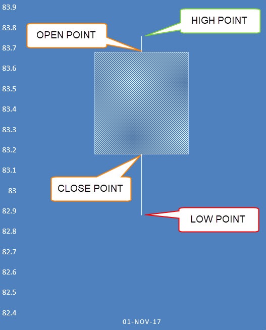
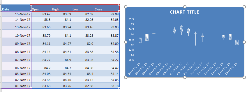
A Candlestick Chart has a vertical line that indicates the range of low to high prices and a thicker column for the opening and closing prices as shown here:
Here is the data source we are going to use:
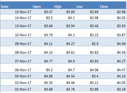
The prerequisite before setting this up is you need a Date column as the first column.
Then this should be followed by a Open, High, Low, and Close column. This is the exact order that needs to be followed in order to create the Candlestick Chart.
Let us work on our awesome Excel Chart!
STEP 1:Highlight your data of stock prices:
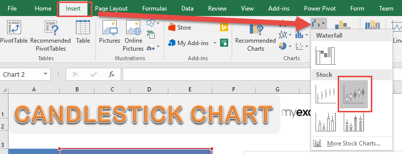
STEP 2: Go to Insert > Stock Charts > Open-High-Low-Close
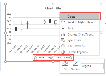
STEP 3: Right click on your Legend and choose Delete as we do not need this.
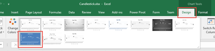
STEP 4: Go to Chart Tools > Design and select the preferred design to make your chartmore presentable!
And now you have your own Candlestick Chart in just a few easy steps!

Add Trendlines to Excel Charts
Now that you know how to create a chart in Excel and I’m sure you agree that making charts in Excel is fun, however did you know that it’s not just the individual Excel Charts that you can create?
It is very easy to create Trendlines for your data. Trendlines show which direction the trend of your data is going, and gives you the trajectory as well. Now you can have it added on top of your Excel Chart!
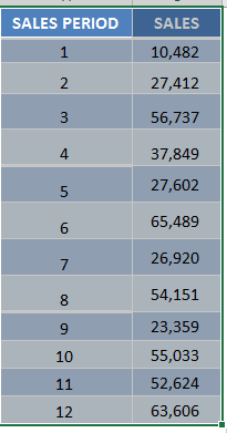
STEP 1:Highlight your table of data, including the column headings:
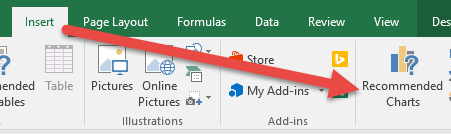
Go to Insert > Recommended Charts (Excel 2013 onwards)
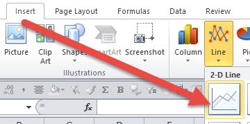
Go to Insert > Line > 2-D Line (Excel 2010)
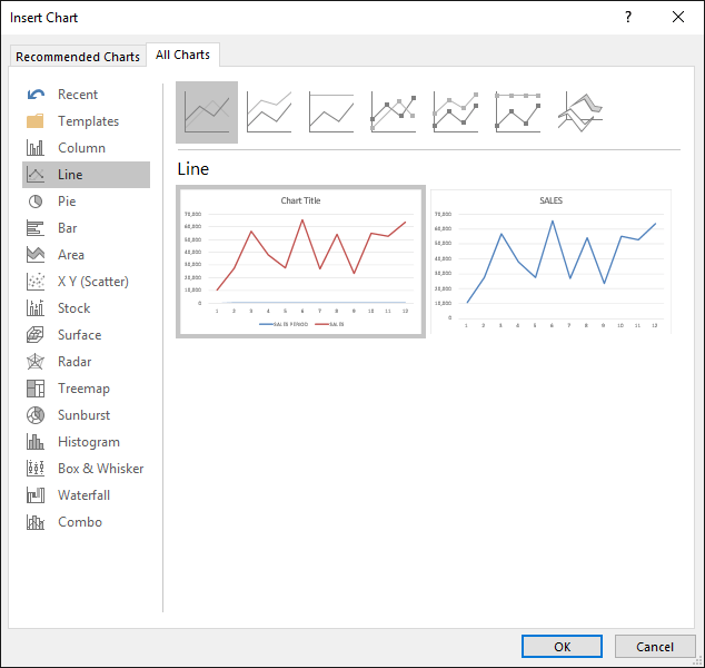
STEP 2: Select All Charts > Line > OK (Excel 2013 onwards)
This will add our line chart first, setting up the stage for our Trendline!
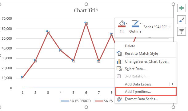
STEP 3: Right click on the line of your Line Chart and Select Add Trendline.
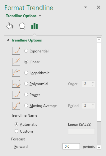
STEP 4: Ensure Linear is selected and close the Format Trendline Window
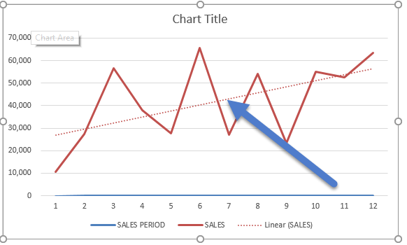
Now you have your Trendline in your chart, and you can predict on where the trajectory is going in the succeeding periods. This is a nice supplementary visual sign on your Excel chart to show where it is heading!
Overlap Graphs in Excel
Now this is one of my favorite tricks, as did you know you can even combine Excel graphs together? This takes your visualization on a whole new level!
Overlapping graphs in Excel is used to compare two sets of data in one graph, like Actual vs Plan results.
This overlay of graphs may seem like a difficult exercise but it is a very easy process. As it seems like a complicated process to use both at the same time. But fret not! I will show you how to do this!
First you need to edit your “Plan” graph by clicking on its series and pressing CTRL+1 shortcut. Then within the Format box you need to choose:
FILL: NO FILL
BORDER COLOR: SOLID LINE & DARK
BORDER STYLE: 2pt WIDTH
Then you need to edit your “Actual” graph by clicking on its series and pressing CTRL+1 shortcut. Then within the Format box you need to choose:
FILL: SOLID FILL & LIGHT COLOR
SERIES OPTIONS: 100% OVERLAPPED
GAP WIDTH: 60%
Watch this video and I’ll show you step by step! You will be amazed in record time!

And here are more of our top Excel Chart videos. Enjoy learning!

 Subscribe to our channel
Top 10 Tutorials
- Add an Interactive Vertical Column in Your Excel Line Chart– With Excel Charts, it is very easy to create a Vertical Column in your Line Chart and make it interactive with a Scroll Bar!The reason why I do this, is to use the vertical column to highlight a specific point in my Excel chart whilst I am presenting the data to my stakeholders.Read more
- Candlestick Chart Using Excel– Stock Data Analysis is no easy feat! Once you have a lot of historical stock data it’s hard to visualize the trend using technical analysis. Thankfully Excel has a lot of stock charts to help you with that, and one of them is the Candlestick Chart!Read more
- Add Trendlines to Excel Charts– With Excel Charts, it is very easy to create Trendlines for your data. Trendlines show which direction the trend of your data is going, and gives you the trajectory as well.Read more
- Area Chart: Highlight Chart Sections– When you are showing 12 month sales results using a Line Chart and want to highlight certain values within the chart to make them stand out (like Q2 & Q3 results), then an Area Chart will be needed.Read more
- Overlap Graphs in Excel– Overlapping graphs in Excel is used to compare two sets of data in one graph, like Actual v Plan results. This overlay of graphs may seem like a difficult exercise but it is a very easy process.Read more
- Create a Box and Whisker Chart With Excel 2016– Box and Whisker Charts are one of the many new Charts available only in Excel 2016 and were originally invented by John Tukey in 1977. They show you the distribution of a data set, showing the median, quartiles, range and outliers.Read more
- Bubble Chart: 3 Variables On A Chart– A Bubble Chart is an extension of the XY Scatter Chart. It adds a 3rd variable to each point in the XY Scatter Chart. For example, if you have a Scatter Chart that shows the relationship between the age of a house and its proximity to the city and want to add the value of the house (the 3rd variable), then a Bubble Chart will get you there.Read more
- Project Milestone Chart Using Excel– Project Management is no easy feat! There are lots of moving parts, long hours and constant reporting. It requires you to keep everybody on the same page and focused on the goals and timelines. One of the key reporting tools needed is the project milestone or timeline chart. Luckily you can create a project milestone chart in Excel in just a few steps…well, 11 to be exact!Read more
- Clustered Bar Chart: Year over Year Comparison– If you want to compare products or businesses Year over Year and have category names which are way too long, then the Clustered Bar chart is the one for you.Read more
- Logarithmic Scale In An Excel Chart– You can use the logarithmic scale (log scale) in the Format Axis dialogue box to scale your chart by a base of 10. What this does is it multiplies the vertical axis units by 10, so it starts at 1, 10, 100, 1000, 10000, 100000, 1000000 etc.Read more


