Creating visually compelling charts in Excel can transform raw data into insightful narratives. However, the real power of any spreadsheet lies in its ability to combine numbers with graphical elements, like lines, that help illustrate trends, expectations, or key metrics. Whether aiming to highlight average values, benchmark performance, or simply enhance clarity, adding line to Excel graph is an essential skill for any data-driven task.
Key Takeaways:
- Adding lines like targets or averages to Excel charts helps highlight key metrics and trends clearly.
- You can insert manual lines using Shapes for quick visual guides without altering data.
- Trendlines are great for showing patterns over time and don’t need extra data columns.
- Formatting lines with bold colors, styles, or markers makes them stand out and improves clarity.
- Excel allows flexibility to add, customize, or remove lines easily to match your data storytelling needs.
Table of Contents
Introduction: Why Excel Charts Are Powerful
When it comes to making sense of numbers, nothing beats a good chart. I use Excel charts all the time to turn dry data into something visual and understandable. Whether I’m tracking monthly sales, analyzing trends, or presenting goals to my team, charts help me communicate insights clearly — no complex explanations needed.
But sometimes, I need more than just a basic bar or line chart. That’s where adding custom lines comes in handy. A line might represent a target, an average, a forecast, or even just a visual reference. It can instantly make a chart more meaningful and impactful.
In this guide, I’ll walk you through the different methods I personally use to add lines to Excel graphs — from simple target lines to more dynamic and formula-driven ones. Let’s get into it!
Different Methods to Add Line to Excel Graph
Adding a Target or Benchmark Line
Incorporating a target or benchmark line in your Excel chart can spotlight performance goals or standards. Here’s how to add it effectively:
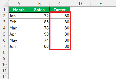
STEP 1: Next to your existing data, create a new column labeled “Target” and populate it with the target value or values you wish to represent. This column will provide a consistent line across the chart, indicating benchmark levels.
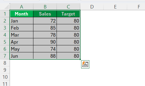
STEP 2: Highlight the entire dataset, including your new target column, to ensure that your current data and targets are both part of the chart.
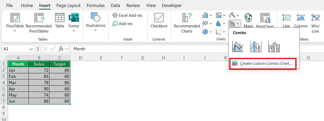
STEP 3: Navigate to the ‘Insert’ tab, click on ‘Combo Chart,’ and choose ‘Create Custom Combo Chart’. This allows you to have different styles for your primary data and the target line.
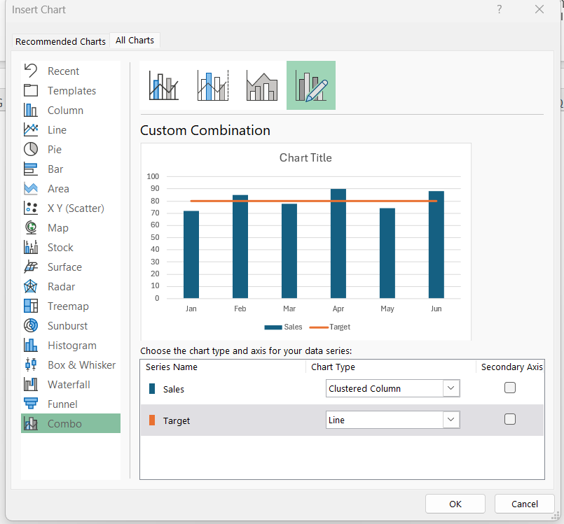
STEP 4: Set your primary data to display as a line or bar, while selecting a line style for the target column. This separation makes your benchmark distinct and easy to identify.
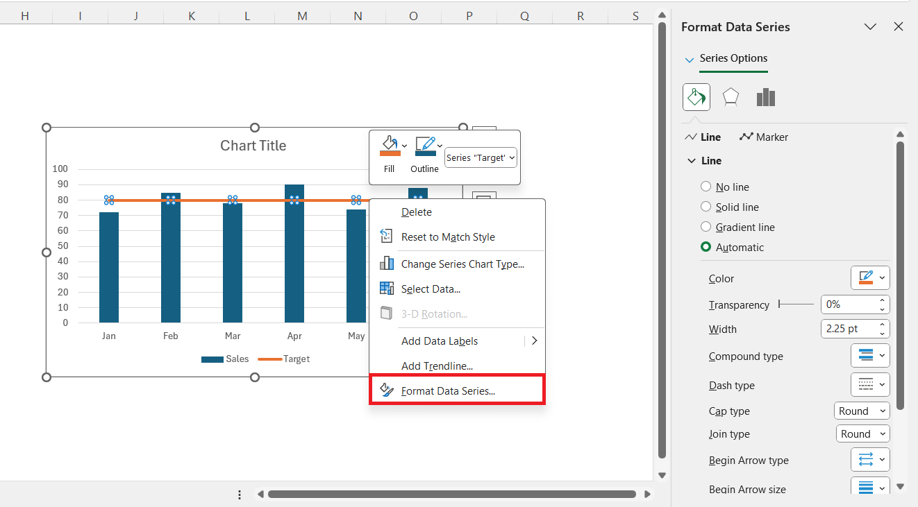
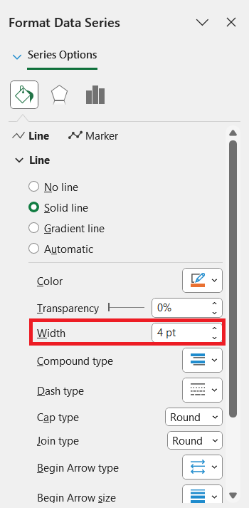
STEP 5: Use the ‘Format Data Series’ options to change the target line’s color and thickness. A bold, contrasting color will enhance visibility and ensure the benchmark line stands out in comparison to your data points.
Adding this visual guide can powerfully highlight areas meeting or falling short of your desired goals, facilitating quicker data insights and informed decision-making.
Drawing a Manual Line Using Shapes
Sometimes, I need a simple line without modifying data. Here’s how I do it:
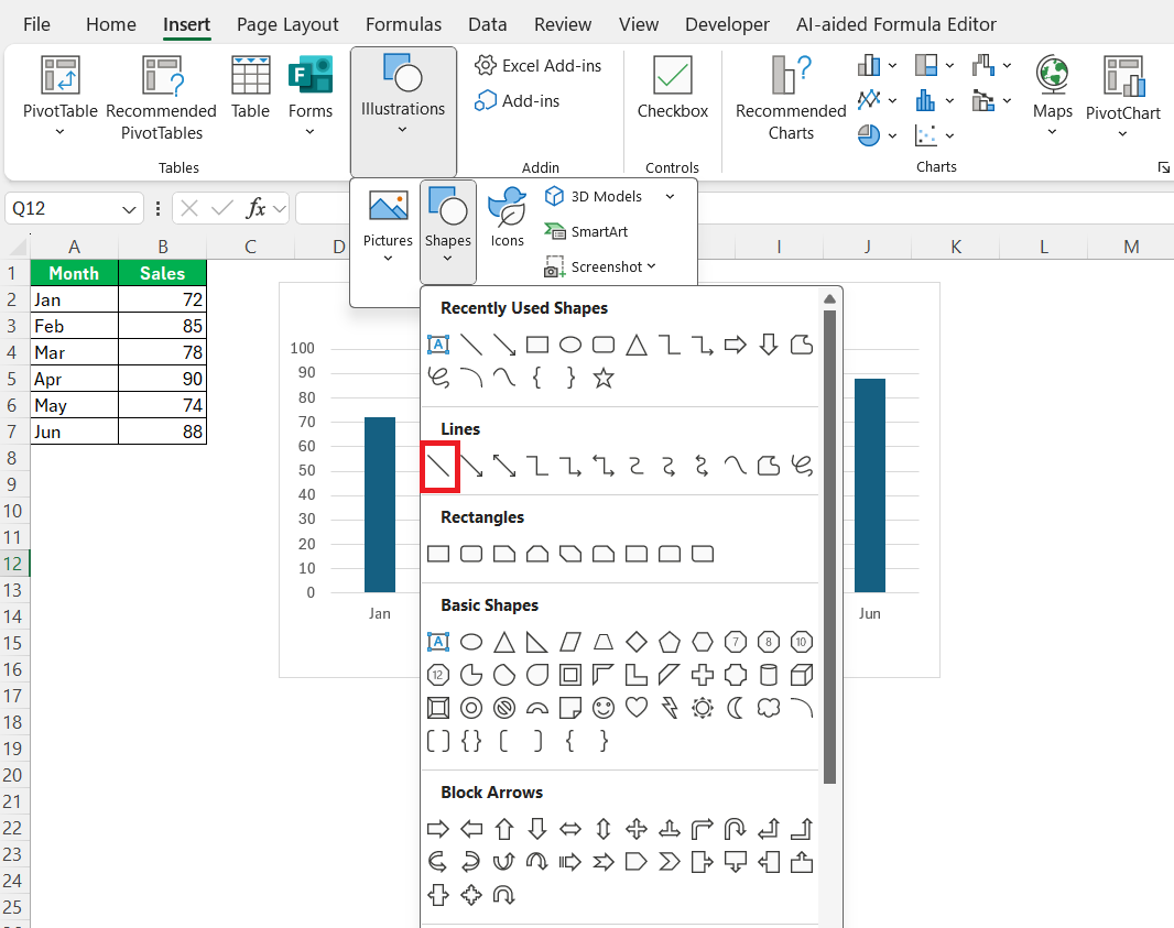
STEP 1: I select Insert > Illustrations > Shapes and pick a Line.
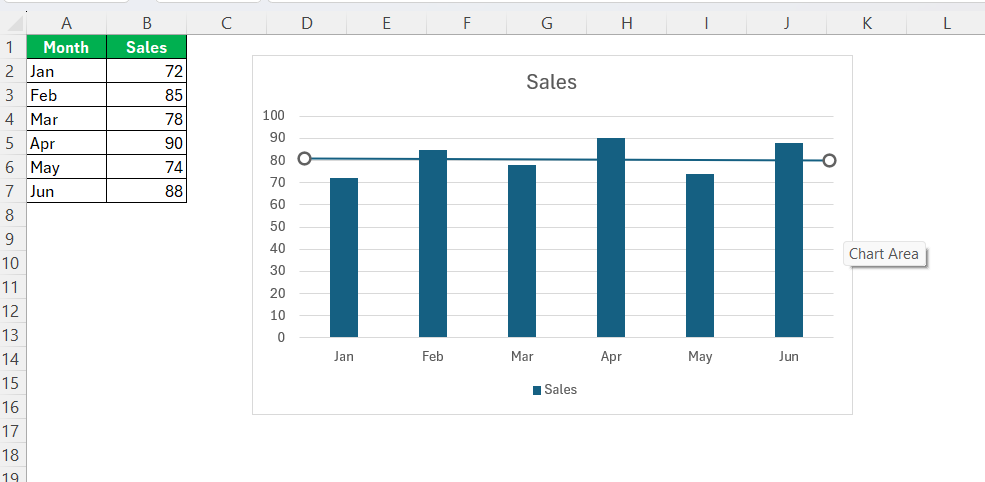
STEP 2: I click and drag to position the line on my chart.
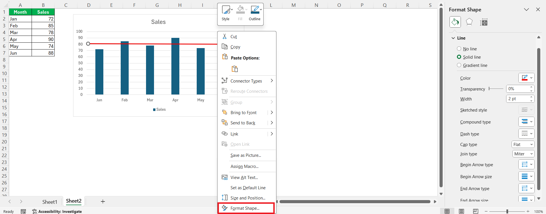
STEP 3: I change its color, thickness, or style using the Shape Format tab.
By following these steps, the line to Excel graph will seamlessly reach the chart’s borders, offering a comprehensive view that enhances interpretability and appeal.
Using a Trendline (Best for Analyzing Patterns)
If I want to visualize trends — like upward or downward movement over time, trendline can be very useful. follow the steps belwo to insert a trendline in an Excel Chart.
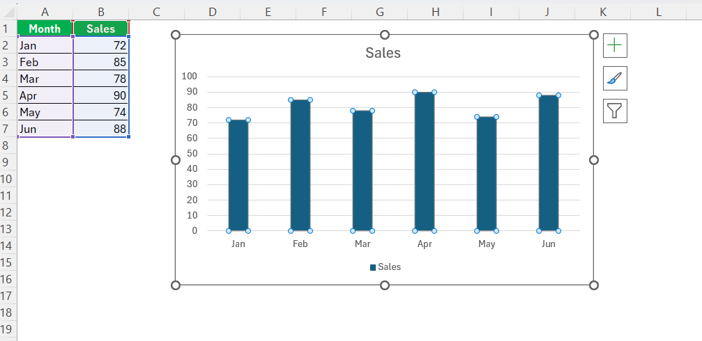
STEP 1: I click on the data series in the chart.
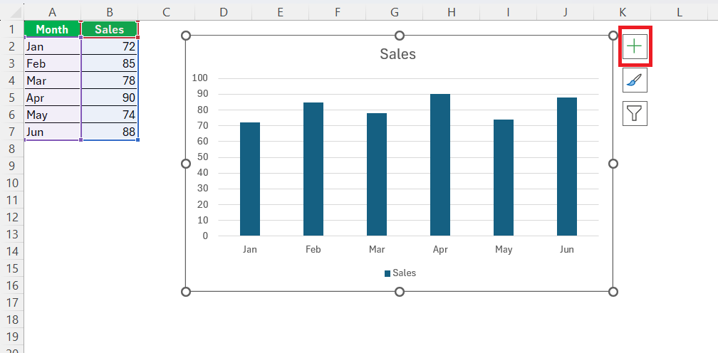
STEP 2: I click the green Chart Elements (+) icon.
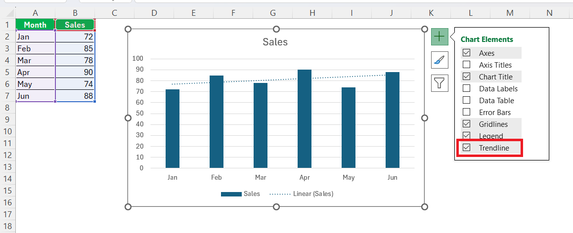
STEP 3: I check the Trendline.
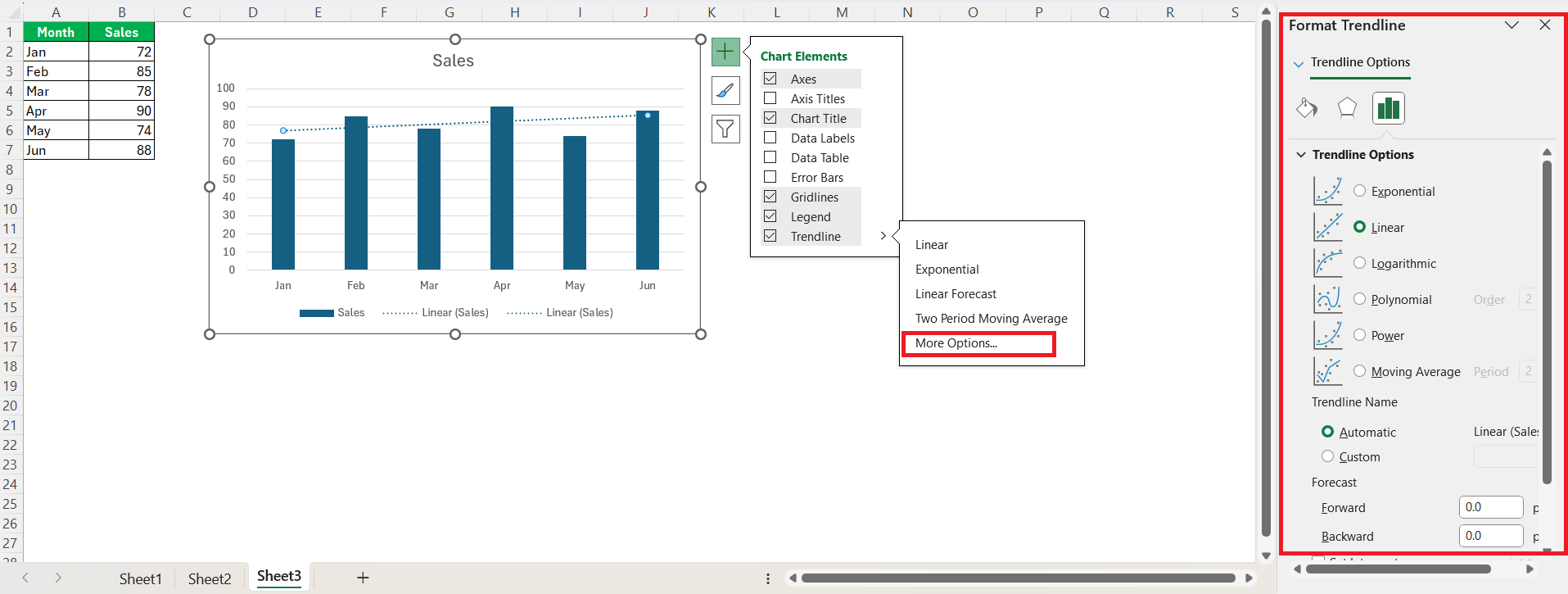
STEP 4: If I want more control (linear, exponential, etc.), I click the arrow next to it and choose More Options.
This doesn’t require adding new data, which is super convenient.
Tips for Making Your Lines Stand Out
To make your lines stand out in an Excel chart, consider the following tips to enhance visibility and appeal:
- Use Contrasting Colors: Choose colors that starkly contrast with your chart’s background and other elements. Bright or bold colors are effective for emphasizing specific lines.
- Increase Line Thickness: Navigate to the ‘Format Data Series’ options and adjust the line width. Thicker lines naturally draw more attention, especially against numerous data points.
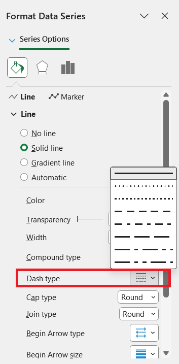
- Apply Different Line Styles: Experiment with solid, dashed, or dotted lines. Differing styles can differentiate various data series or highlight particular trends.
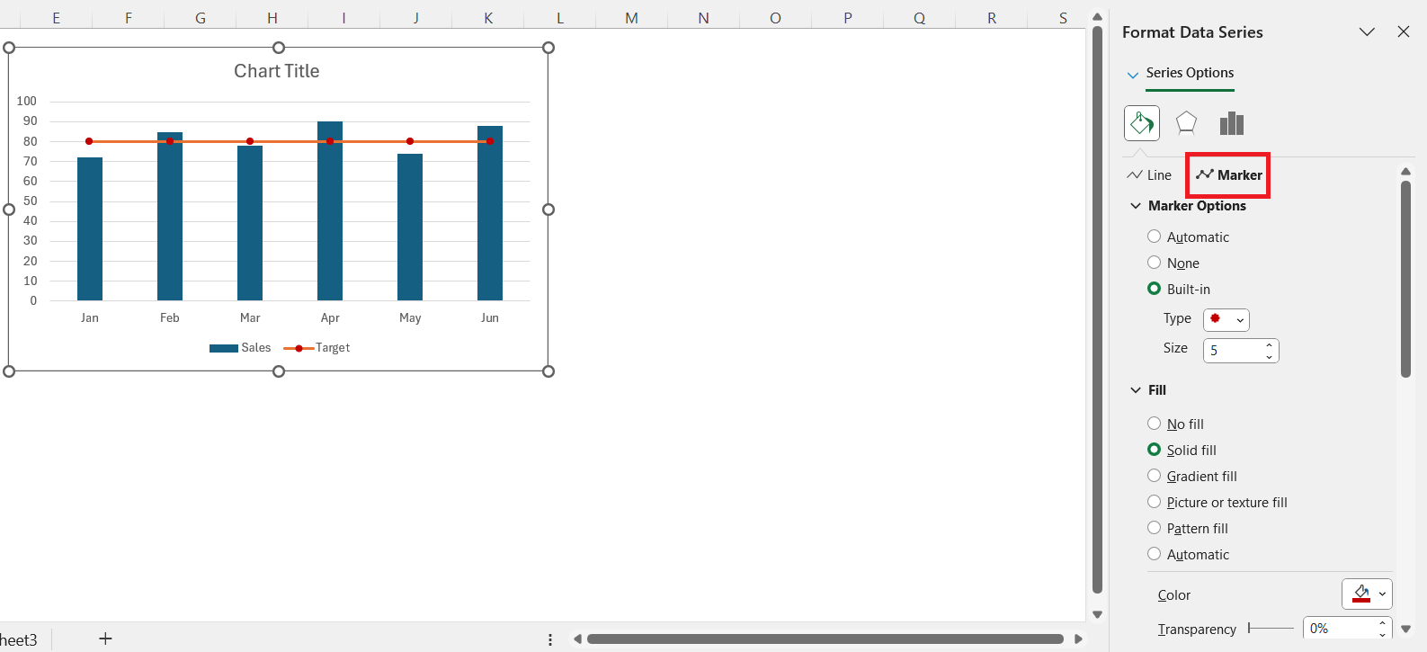
- Add Markers: Use distinct markers on data points to accentuate important values or trends. Select from a variety of shapes and sizes in the ‘Format Data Series’ options.
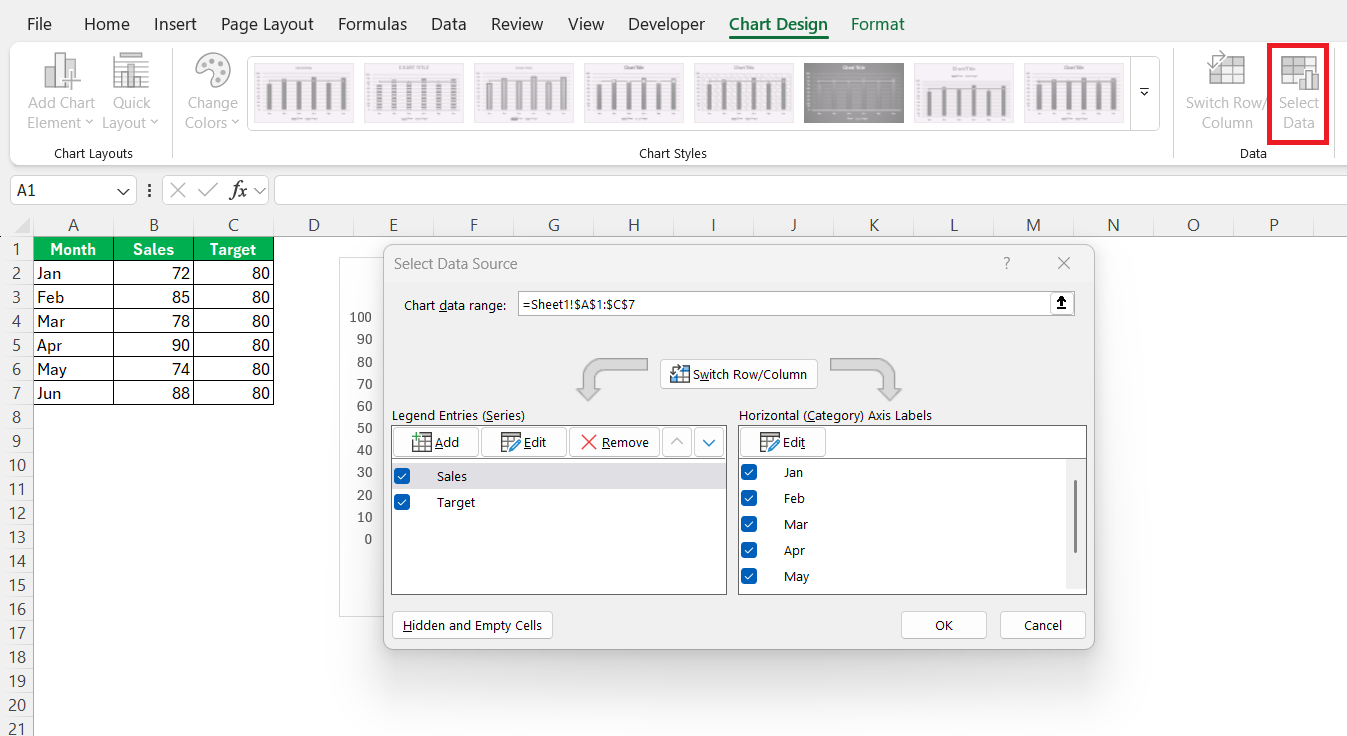
- Layer Lines Smartly: If multiple lines overlap, consider layering the most important line on top. This can be achieved by adjusting the series order in the ‘Select Data Source’ window.
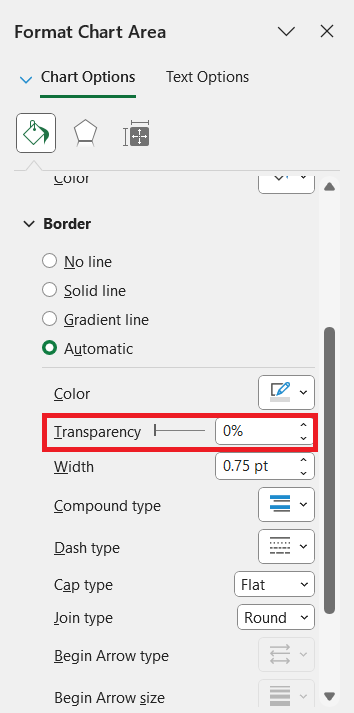
- Use Transparency: Apply transparency strategically to subtle lines, helping prominent ones stand out more significantly.
- Incorporate Data Callouts: Add data labels or callout boxes to provide additional context or highlight critical points directly on the chart. This not only improves comprehension but also directs attention precisely where needed.
By implementing these techniques, your lines can effectively capture attention and convey the intended message more powerfully in your Excel charts.
FAQs
How do I add line to Excel graph?
To add line to Excel graph, select your chart, right-click, and choose ‘Select Data’. Click ‘Add’, enter the series name, select your data range for the series values, and click ‘OK’. This inserts a new line series onto your graph.
How do I add an average line to my chart?
To add an average line, calculate the average using the AVERAGE function, create a new column with this average value for each data point, select the entire dataset, and insert a Combo Chart. Set your main data as bars and the average data as a line for clarity.
What is the difference between scatter and line charts?
Scatter charts plot individual data points using two numerical values to show relationships or patterns, whereas line charts connect data points over a sequence, such as time, to illustrate trends or progressions.
Can I remove specific lines from my chart?
Yes, you can remove specific lines by selecting the line in your chart, right-clicking it, and choosing ‘Delete’ from the context menu. This action will remove the line from the chart without altering your source data.
How can I make my target line more visible?
To make your target line more visible, increase its thickness, use a contrasting, bold color, and adjust its style to a solid or distinctly patterned line. You can also add markers or annotations to draw attention to it.
John Michaloudis is a former accountant and finance analyst at General Electric, a Microsoft MVP since 2020, an Amazon #1 bestselling author of 4 Microsoft Excel books and teacher of Microsoft Excel & Office over at his flagship MyExcelOnline Academy Online Course.

