Benchmark Charts or Budget Charts are a great way to show your actual sales versus your benchmark in a graphical way, highlighting the strong v weak months. There are a few steps but in Excel 2013 it has been made much easier to create these charts with the new Combo charts.
Key Takeaways
-
Benchmark Charts Help Compare Performance – A Benchmark Chart visually compares actual performance against a target, making it ideal for business analysis.
-
Combination Charts Make Benchmarks Clearer – In Excel 2013, you can use a combination of bar and line charts to create an effective benchmark visualization.
-
Error Bars Can Represent Benchmarks – Using error bars in bar charts is an alternative way to display benchmark targets clearly.
-
Data Labels Improve Readability – Adding data labels to benchmark charts enhances clarity, making it easier to interpret comparisons.
-
Conditional Formatting Can Highlight Gaps – Use conditional formatting to visually emphasize where actual values fall short or exceed benchmarks.
Table of Contents
How to Create Benchmark Chart in Excel 2013
STEP 1: Enter your data into three columns, the month, the actual sales and the benchmark sales
STEP 2: Click inside your data and go to the ribbon and choose Insert > 2-D Clustered Column
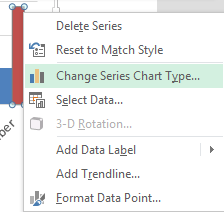
STEP 3: Select the Benchmark series chart and Right Click and choose the Change Series Chart Type
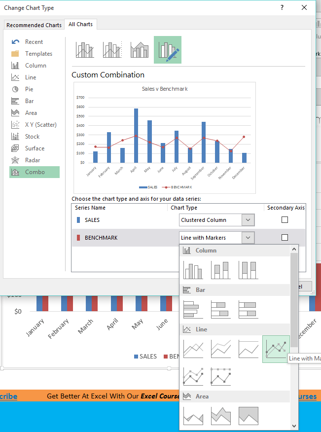
STEP 4: This will automatically take you to the Combo chart box and you need to select the drop down for the Benchmark and select Line with Markers
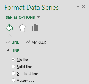
STEP 5: Click on the line chart and press CTRL+1. This will open up the Format Chart dialogue box
STEP 6: Select the Line option and choose No Line
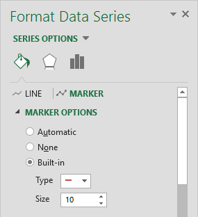
STEP 7: Select the Marker Options and choose Built In, select the horizontal line type and increase the Size to 10. You can also format the color of the line.
Frequently Asked Questions
What is a benchmark chart in Excel?
A benchmark chart visually compares actual data points to target or benchmark values, helping track performance goals.
How do I create a benchmark chart in Excel 2013?
You can create a benchmark chart by combining a clustered column chart with a line chart representing the benchmark values.
Can I use conditional formatting in a benchmark chart?
Yes! You can highlight differences by applying conditional formatting or using color-coded bars for values above or below the benchmark.
What are the best chart types for benchmarking in Excel?
Common choices include bar charts with a benchmark line, bullet charts, or combination charts to show target vs. actual values.
Is it possible to update the benchmark dynamically?
Yes! If you link the benchmark value to a cell, updating the cell will automatically refresh the chart with new benchmark data.
John Michaloudis is a former accountant and finance analyst at General Electric, a Microsoft MVP since 2020, an Amazon #1 bestselling author of 4 Microsoft Excel books and teacher of Microsoft Excel & Office over at his flagship MyExcelOnline Academy Online Course.


