Pinterest Pixel

Clustered Bar Chart – Year on Year Comparison Chart Excel

John Michaloudis
If you want to compare products or businesses using Year on Year Comparison Chart Excel, then the Clustered Bar chart is the one for you.
Clustered Bar Chart in Excel is used to display more than one series of data in clustered horizontals columns or bars.

They are one of the most common tools used for a year on year comparison chart.

It is used to compare values across different category or time periods.
Clustered Bar Chart - Year on Year Comparison Chart Excel | MyExcelOnline Clustered Bar Chart - Year on Year Comparison Chart Excel | MyExcelOnline

Key Takeaways:

  • A Clustered Bar Chart excellently displays year-on-year comparisons, allowing for a visual representation of data across multiple years broken down into smaller periods, such as quarters.
  • Customization and formatting of Clustered Bar Charts are critical for enhancing readability and presentation. Steps such as assigning varied colors to each data point, adjusting the Gap Width and Series Overlap to 0%, and rearranging the vertical axis data improve the chart’s aesthetics and clarity, as demonstrated in the step-by-step example. This process transforms an initially unattractive chart into a polished and informative visualization.

Advantages and Disadvantages

Advantages of Clustered Bar Chart

  • It is easy to create a bar chart with just a few clicks.
  • It can convert complicated numbers into simple charts that are easy to understand.
  • It can be used when the category name is too long.
  • It can be used to compare multiple categories.

Disadvantages of Clustered Bar Chart

  • If data is too large, it can make the chart confusing.
  • It cannot be used when you want to show a portion of a whole.
    Here, a Pie Chart would be a better option.


Create a Year on Year Comparison Chart Excel

Clustered Bar Chart can be used for a year on year comparison chart template. Each bar representing a year is clustered together making the comparison more clear.

Want to know how to create a Clustered Bar Chart: Year on Year comparison Chart Excel?

*** Watch our video and step by step guide below with free downloadable Excel workbook to practice ***

Watch on YouTube and give it a thumbs up 👍

Clustered Bar Chart - Year on Year Comparison Chart Excel | MyExcelOnline


Follow the step-by-step tutorial on How to create a Clustered Bar Chart: Year on Year comparison Chart Excel Template and make sure to download the exercise workbook to follow along:

download workbookClustered-Bar.xlsx

Example 1:

In the example below the category names relate to companies and I am comparing their sales for 2013 and 2014. Simply looking at this data table will not be very helpful in comparing the data over the year.

Clustered Bar Chart - Year on Year Comparison Chart Excel

Let’s create a Clustered Bar Chart and make this year on year comparison chart easy to understand.

STEP 1: Select the table on where we want to create the chart.  

Clustered Bar Chart - Year on Year Comparison Chart Excel


STEP 2: Go to Insert > Bar Chart > Clustered Bar.

Clustered Bar Chart - Year on Year Comparison Chart Excel

Your Clustered Year over Year Excel Template is now ready:

Clustered Bar Chart - Year on Year Comparison Chart Excel

Example 2:

You can also create this Bar Chart to show Year over Year Growth Chart in Excel and it will look something like this:

Clustered Bar Chart - Year on Year Comparison Chart Excel

In this chart, the original orange bars shown the sales amount for the year 2013 and the additional bar on top of that is the additional sales for the year 2014.

Now, let’s understand how to create this year over year comparison chart using a step-by-step tutorial:

STEP 1: Select the Table containing the Sales Data for the year 2013 & 2014.

Clustered Bar Chart - Year on Year Comparison Chart Excel

STEP 2: Go to Insert > Recommended Charts.

Clustered Bar Chart - Year on Year Comparison Chart Excel

STEP 3: From the Insert Chart dialog box, select the All Charts > Bar Chart > Clustered Bar Chart.

Clustered Bar Chart - Year on Year Comparison Chart Excel

You can even select 3D Clustered Bar Chart from the list.

STEP 4: This will insert a Simple Clustered Bar Chart.

Clustered Bar Chart - Year on Year Comparison Chart Excel

Now let’s move to the advanced steps of editing this chart.

STEP 5: Right-click on the Bar representing Year 2014 and select Format Data Series.Clustered Bar Chart - Year on Year Comparison Chart Excel

STEP 6: In the Format Data Series dialog box, under Series Overlap scroll to the right towards 100%.

Clustered Bar Chart - Year on Year Comparison Chart Excel

STEP 7: Under the Fill Icon tab, select No Fill.

Clustered Bar Chart - Year on Year Comparison Chart Excel

STEP 8: Under the Border section, select Solid Line.

Clustered Bar Chart - Year on Year Comparison Chart Excel

STEP 9: Your Year over Year Growth Chart in Excel is ready!

Clustered Bar Chart - Year on Year Comparison Chart Excel

Interpretation:

The solid blue bars indicate the sales amount for each company for the year 2013 and the additional transparent bar on the top indicates the additional sales amount reported in the year 2014.

This chart helps you focus on the growth achieved by each company and know which company has performed better than the other.

Now that you know how to create year on year comparison chart excel using clustered bar, you should read through the next section and understand how to format them.


Formatting a Clustered Bar Chart

You can customize the layout of this year on year comparison chart Excel by following the guide provided below.

Change Color of the Bar

STEP 1: Right-click on the Bar (Here, Bar for Year 2014)

Clustered Bar Chart - Year on Year Comparison Chart Excel

STEP 2: Select the Fill Icon and choose the appropriate color.

Clustered Bar Chart - Year on Year Comparison Chart Excel

You can do the same for the bar representing the year 2013.

Clustered Bar Chart - Year on Year Comparison Chart Excel

Move Series Up

The clustered chart shows the year 2014 on the top. Let’s change that and push it below:

STEP 1: Select the Chart

Clustered Bar Chart - Year on Year Comparison Chart Excel

STEP 2: Go to Chart Design > Select Data

Clustered Bar Chart - Year on Year Comparison Chart Excel

STEP 3: In the Select Data Source dialog box, click on Year 2013 and then select the Arrow Down button.

Clustered Bar Chart - Year on Year Comparison Chart Excel

The Year 2014 is pushed to the bottom. This is how you can rearrange the data bars as per your requirement.

Clustered Bar Chart - Year on Year Comparison Chart Excel

Switch Row/Column

This will swap data over the axis and data plotted on the x-axis will be moved to the y-axis and vice versa. Something doing like, makes the chart easier to comprehend.

STEP 1: Select the Chart

Clustered Bar Chart - Year on Year Comparison Chart Excel | MyExcelOnline

STEP 2: Go to Chart Design > Switch Row/Column

Clustered Bar Chart - Year on Year Comparison Chart Excel

This is how the swapped chart will look like:

Clustered Bar Chart - Year on Year Comparison Chart Excel

Advanced Techniques for Year-On-Year Clustered Bar Charts

Incorporating Conditional Formats for Enhanced Insights

Utilizing conditional formatting in your year-on-year clustered bar charts can bring clarity and highlight significant trends or anomalies. For example, you might want to apply a different color to bars that represent exceptional sales growth or declines. Here’s the exciting part: you can also use data bars or color scales to provide an at-a-glance view of how each year’s data points compare to the rest. Imagine being able to spot that one outlier instantly! Conditional formatting creates a visual cue that can be enhanced further by integrating Excel’s vast library of icons and ratings.

Managing Leap Year Data for Accurate Comparisons

When dealing with leap years, they can introduce an extra day in February, potentially skewing your year-on-year comparisons when crafting clustered bar charts. To ensure your insights remain accurate, you’ll need to factor in this variance; you could adjust your data to reflect per-day averages in February, or separate leap years into their own category for clarity. Remember, attention to detail can dramatically alter the accuracy of your analysis. By clearly annotating leap years within your charts, you enable viewers to understand the context behind any data spikes or drops.

Tips and Tricks to Master Excel Charting

Quick Shortcuts for Efficient Chart Creation

To speed up your chart creation, mastering keyboard shortcuts in Excel is a game-changer. They can streamline your workflow and minimize the need for mouse clicks. For instance, pressing Alt + F1 instantly creates a new chart from selected data embedded on your worksheet, while F11 does the same but opens the chart in a new worksheet. Don’t forget the power of Ctrl + Z to quickly undo any mistakes – a true lifesaver. And, if you’re frequently adjusting chart types, tapping Alt + J, A, C can take you straight to the Change Chart Type dialog in newer versions of Excel. Jot these down to transform your Excel charting into an efficient and smooth process.

Pivot Chart Settings

Customizing Charts to Reflect Branding and Report Themes

Personalizing your clustered bar charts to align with your brand or report themes can make your presentations more professional and engaging. You can start by applying company colors to the chart elements — just right-click on a data series and choose a fill color that matches your brand palette. Customizing fonts for titles and labels to match your brand’s typography fosters consistency across your materials. Additionally, consider embedding company logos or trademarks within the chart area for that extra touch of personalization. Not only does this approach make your charts more visually appealing, but it also reinforces brand identity.

Alternatives to Clustered Bar Charts for Annual Data

Pros and Cons: Clustered Bar vs. Other Chart Types

When you’re weighing the options between using a clustered bar chart and other types of charts for annual data, there are clear advantages and disadvantages to consider. Clustered bar charts excel in illustrating differences between categories and are superb for direct comparisons of multiple series within those categories. They’re especially useful when the categories are discrete and legibility is essential.

However, as the number of categories or series increases, clustered bar charts may become cluttered and challenging to interpret. Herein lies the limitation: too much complexity can lead to a loss of clarity. On the flip side, line charts or stacked bar charts might be a more prudent choice when tracking trends over time or when data sets are numerous.

How to add Trendline in Excel Charts

Innovative Chart Types for Year-On-Year Visualization

Exploring innovative chart types can offer refreshing insights for year-on-year data visualization. Why settle for the ordinary when you can engage your audience with something more captivating? For starters, consider a waterfall chart to display the cumulative impact of sequential data changes. Alternatively, a slope chart can brilliantly demonstrate the rise and fall of data points between two time periods.
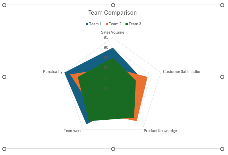
For a trendy take, try out radar charts when comparing multiple variables, or grab attention with a sentiment trend chart to showcase the ebbs and flows of data sentiment over time. And if you’re dealing with performance data, a progress chart can beautifully track milestones against time targets. Each of these charts offers a unique lens through which to view your data, making them compelling choices beyond the conventional clustered bar.

Clustered Bar Chart - Year on Year Comparison Chart Excel | MyExcelOnline

Frequently Asked Questions

How Do You Ensure Data Accuracy in Clustered Bar Charts?

Ensuring data accuracy in clustered bar charts begins with meticulously checking and preparing your data before plotting. You want to verify that you’re using the right scale, that the data is sorted correctly, and there are no errors in your dataset. It’s wise to double-check the calculations that underpin the figures displayed, especially if they’re derived from other data sets. Limit the use of 3D effects, as they can distort the perception of data points. Lastly, always include clear labels and legends, so viewers understand exactly what each part of your chart represents. Accurate and credible data is the cornerstone of any impactful visual representation.

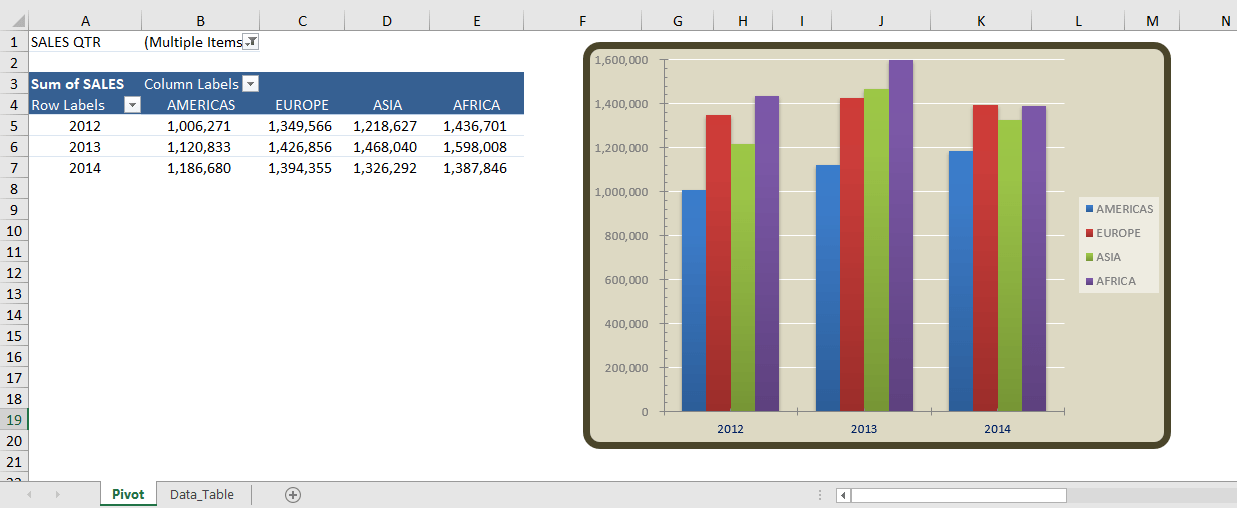
Can You Automate Year-On-Year Comparisons in Excel?

Absolutely! Automation in Excel comes handy for year-on-year comparisons. PivotTables accompanied by Pivot Charts are particularly powerful for this. You can set up your PivotTable to group data by year, and subsequently create a chart that automatically updates as you add new data. Even slicers can be integrated to swiftly switch between years without manually filtering. To take things up a notch, consider using Excel macros or writing VBA scripts that can automate the entire process of updating your data and refreshing the chart. This approach saves you time and keeps your comparisons consistent and error-free.

Pivot Chart Settings

If you like this Excel tip, please share it
Founder & Chief Inspirational Officer at

John Michaloudis is a former accountant and finance analyst at General Electric, a Microsoft MVP since 2020, an Amazon #1 bestselling author of 4 Microsoft Excel books and teacher of Microsoft Excel & Office over at his flagship MyExcelOnline Academy Online Course.

See also  Adding Data Labels To An Excel Chart

Get Video Training

Advance your Microsoft Excel & Office Skills with the MyExcelOnline Academy!

Dramatically Reduce Repetition, Stress, and Overtime!
Exponentially Increase Your Chances of a Promotion, Pay Raise or New Job!

Learn in as little as 5 minutes a day or on your schedule.

Learn More!

Share to...