Free Practice Workbook
Table of Contents
Introduction to Ranking Charts
A ranking chart is a chart type in Excel used to compare items based on their values. It arranges data from the highest value to the lowest value or vice versa. This helps users easily identify top and bottom performers.
Excel has many functions like RANK, RANK.AVG and RANK.EQ that can rank data based on their values.
How to Create a Ranking Chart in Excel
Method 1: Ranking Chart Using Sort Command
STEP 1: Prepare Your Data
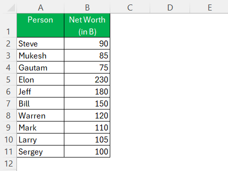
STEP 2: Go to Home Tab > Click Sort & Filter > Choose Sort.

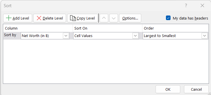
STEP 3: In the dialog box, select:
- Sort by – Net Worth
- Order – Z to A
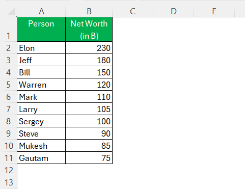
Excel will rearrange that table and place the person with maximum net worth at the top.
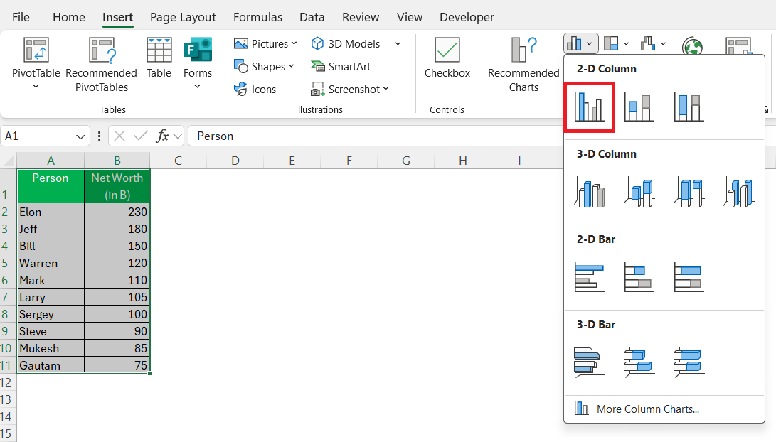
STEP 4: Click on Insert Tab → Charts → 2-D Column Chart
The tallest bar belongs to the richest guy.
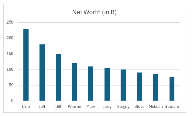
Method 2: Ranking Chart Using LARGE Function
STEP 1: Create a new column with Rank Numbers like this:
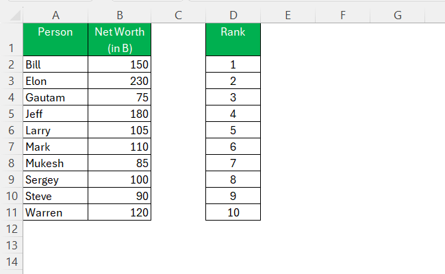
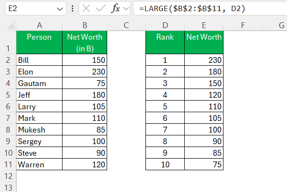
STEP 2: Use LARGE Formula to Pull Top Values
STEP 3: Use INDEX-MATCH To Get The Corresponding Names
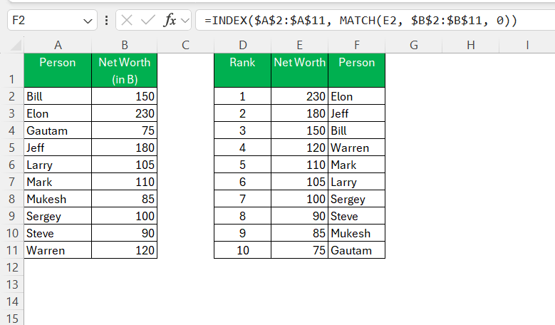
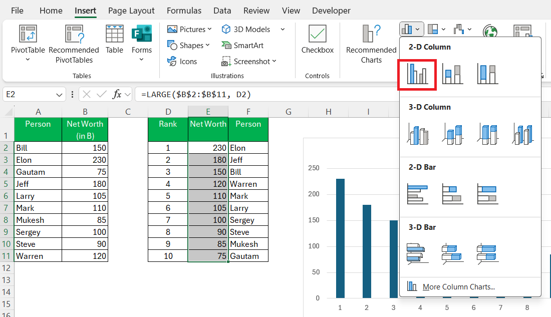
STEP 4: Select the data and go to Insert → Choose 2-D Column Chart.
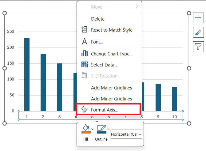
STEP 5: Right-click on the axis and select Format Axis.
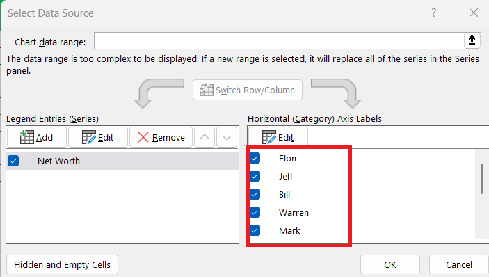
STEP 6: Select the range containing the person names as the Axis.
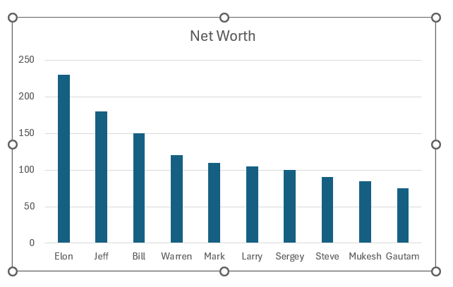
Now my Ranking Chart is ready and is dynamic — any change in Net Worth values updates the chart automatically!
Method 3: Ranking Chart Using SMALL Function
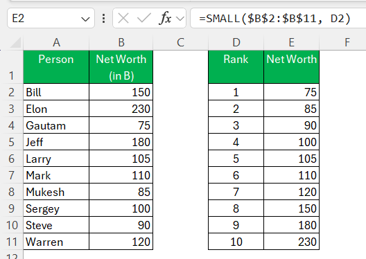
STEP 1: Use SMALL Formula To Pull Lowest Values
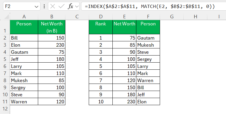
STEP 2: Use INDEX-MATCH To get names
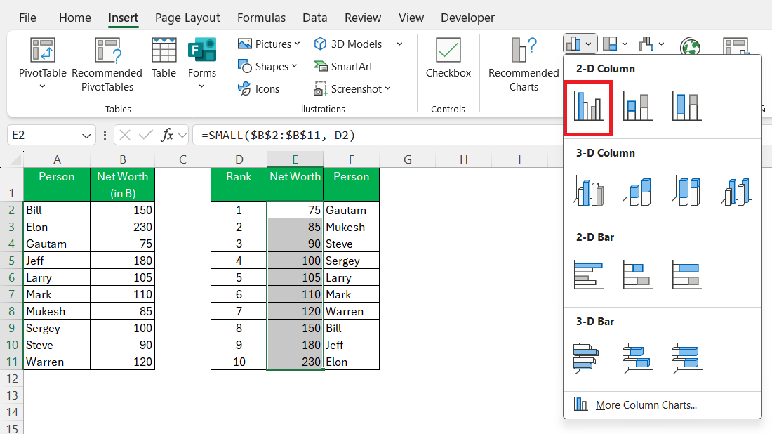
STEP 3: Insert a 2-D Column Chart as before.
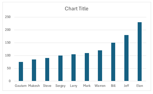
Now my chart shows the smallest values on the top. It is perfect for performance tracking.
Best Practices for Effective Ranking Charts
Avoiding Common Pitfalls
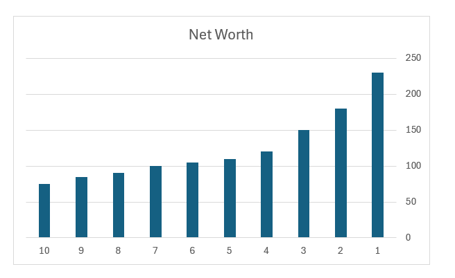
1. Forgetting to Reverse the Y-Axis (For Rank Charts)
When creating a Line Chart or Bar Chart to show rankings, I sometimes forgot to reverse the Y-axis. This will mean that Rank 1 was at the bottom of the chart. It will make the chart look weird and confusing.
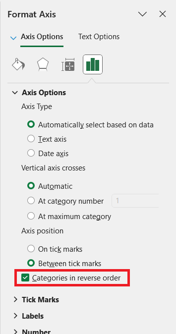
Quick Fix: Right-click on Y-axis → Format Axis → Check Categories in Reverse Order
2. Not Locking Ranges in Formulas
When using LARGE or SMALL functions, I forgot to lock the data range with $ signs. This will break the formula and the formula will change when I drag it down.
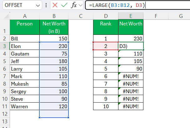
Quick Fix:
Place $ signs when typing the range to fix it.
LARGE($B$2:$B$11, A2)
3. Cluttered Charts with Too Many Data Labels
If I add many data labels to a chart, it will become unreadable. To make it look cleaner, show only rank or name.
FAQs
1. What is a ranking chart in Excel?
A ranking chart displays items from highest to lowest or lowest to highest based on their values.
2. How to create a dynamic ranking chart?
You can use the LARGE or SMALL function with a chart. This will make sure that the chart updates when the source data changes.
3. Which chart type works best for rankings?
Bar and column charts are the most common choices for showing rankings.
4. Why is Rank 1 showing at the bottom of my chart?
If Rank 1 is showing at the bottom of the chart, you can reverse the chart axis. This will change the display and make the highest rank at the top.
5. How to rank the lowest values instead of the highest?
You can use the SMALL function to rank values from lowest to highest.

John Michaloudis is a former accountant and finance analyst at General Electric, a Microsoft MVP since 2020, an Amazon #1 bestselling author of 4 Microsoft Excel books and teacher of Microsoft Excel & Office over at his flagship MyExcelOnline Academy Online Course.

 30 Days - Full Access