When I first started using Excel, one of the most intuitive and visually appealing ways to represent data was through a column chart. It quickly became my go-to tool for comparing different sets of data side by side. In this article, I’ll walk you through how to create and customize a column chart in Excel, helping you to make your data more understandable and engaging. Let’s dive into the steps and tips that make this process straightforward and effective.
Key Takeaways:
- Column charts in Excel provide an intuitive way to visually compare data across categories.
- Organizing and cleaning your data is essential for creating effective column charts.
- Customization options, such as adding data labels and adjusting colors, enhance chart readability.
- Common issues with column charts can be resolved by checking data accuracy and simplifying categories.
- Excel shortcuts and macros can significantly speed up the creation and customization of column charts.
Table of Contents
Introduction to Column Charts in Excel
Unveiling the Versatility of Column Charts
Column charts in Excel are a powerful, straightforward way to visually compare data. We quickly appreciate their versatility as they showcase differences among items based on height, making contrasts perceptible at first glance.
These charts are particularly helpful when summarizing different categories, enabling us to digest complex data with ease.
Quick Start Guide to Creating Your First Column Chart
Creating your first column chart in Excel is an exciting moment. It’s incredibly simple, with a process that’s both quick and user-friendly. Here’s a concise guide to getting started:
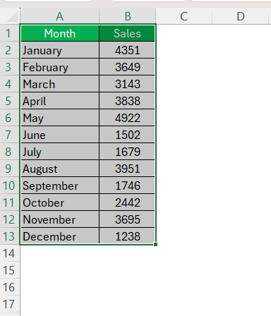
To begin, arrange your data in rows or columns on the Excel sheet. Click and drag to select the data to include in the chart.
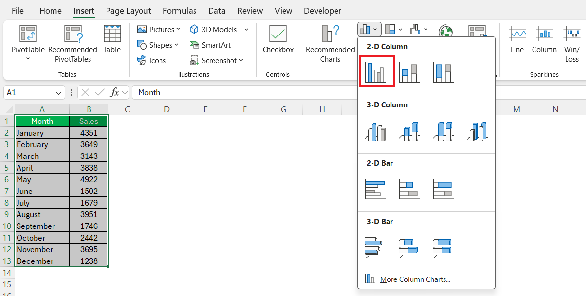
Head over to the ‘Insert’ tab and look out for the Charts group. Click on the Column Chart icon and select the desired chart type from the dropdown menu.
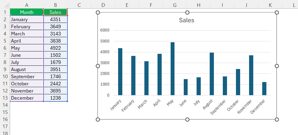
Voila! Your first column chart materializes and is ready to be tailored with elements and styles.
Preparing Your Data for the Perfect Column Chart
Essential Data Organization Tips
Organizing data is key before embarking on chart creation in Excel, as a well-structured dataset ensures a coherent and effective column chart. Start by arranging the data in columns or rows in a logical order, with the categories you want to compare listed either vertically in a single column or horizontally in a single row.
Make sure there are no blank rows or columns within your range. It’s best to have the data segregated clearly – separate columns or rows for different categories and separate entries for the values associated with each category.
Ensure consistency in data units to avoid confusion when interpreting the chart later.
Cleaning and Sorting Data Like a Pro
Before creating striking visuals, cleaning and sorting the data is a must. Remove any duplications or irrelevant information that could skew the results or create confusion.
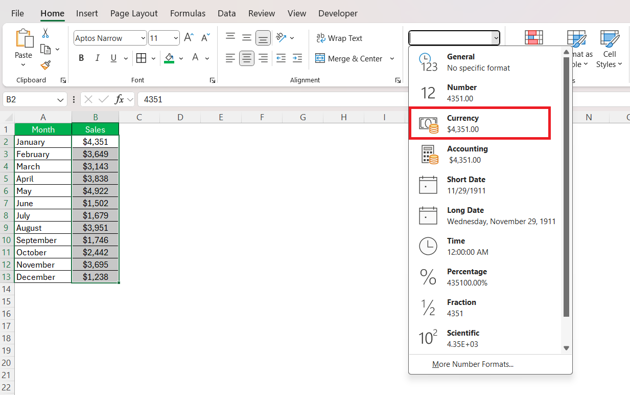
Confirm that all numerical data is formatted consistently, whether it’s currency, percentages, or simple integers.
Sorting data is also crucial; decide how to display it – ascending, descending, or custom order – to best reflect the story behind the numbers.
Customizing Your Column Chart for Maximum Impact
Adding Finishing Touches with Data Labels and Legends
After forming the basic structure of a column chart, adding the finishing touches, such as data labels and legends, is where the details come to life, enhancing understanding and readability.
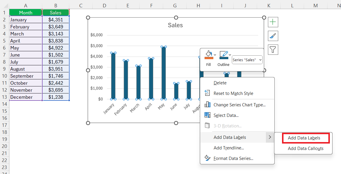
Data labels offer instant insight into the specific values represented by each column, which can be added by right-clicking on the data series and choosing “Add Data Labels”.
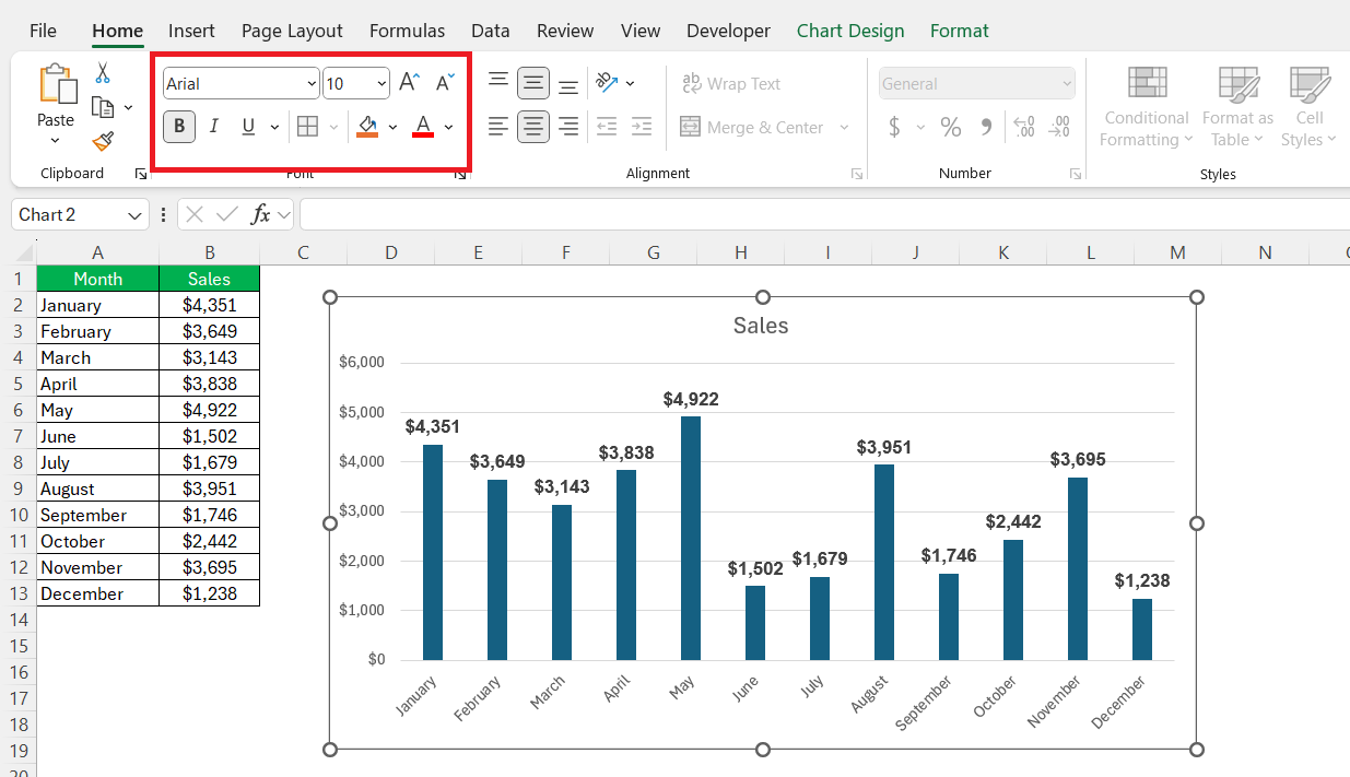
Legends serve as a guide, explaining what each color or pattern represents. It’s important to keep the text clear, concise, and readable by setting the font and size, often at 10 pt, Arial, and Bold for optimal legibility.
Stylish Modifications: Adjusting Colors and Fonts
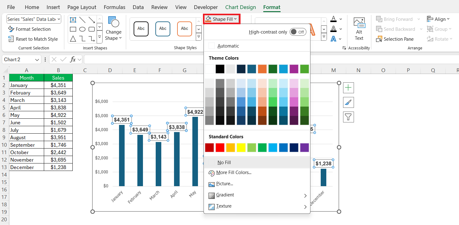
To distinguish your column chart from the rest, stylish modifications can be your ally. Adjust the chart’s color scheme to align with your branding or purpose – this can be done from the ‘Format’ tab.
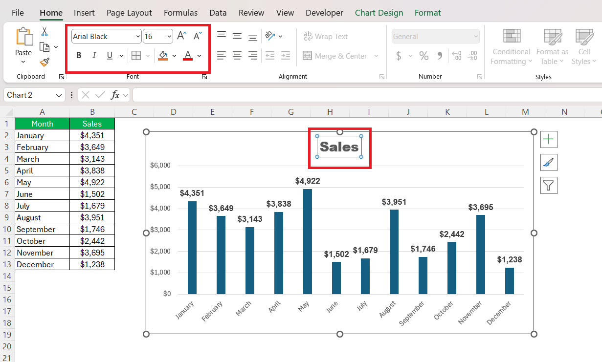
Keep in mind, that colors must complement each other and ensure that each column stands out distinctly. Swapping fonts can also make a significant impact; for instance, changing the chart title to Arial Black and increasing the size to 16 pt helps it demand attention.
The font color is crucial too; I prefer to switch to a darker shade when dealing with a lighter background for enhanced contrast.
Common Pitfalls and How to Avoid Them
Troubleshooting Common Column Chart Issues
When it comes to troubleshooting common column chart issues, I’ve found that it’s usually about addressing data discrepancies or adjusting chart elements. If a column isn’t displaying correctly, I double-check the data source for accuracy and consistency.
Ensuring Data Accuracy and Readability
Ensuring data accuracy and readability boils down to meticulous preparation and sensible design choices. To guarantee accuracy, we always fact-check the dataset prior to chart creation, noting any outliers or discrepancies.
For readability, I advocate for using a minimalist approach to avoid overwhelming the viewer. This may involve reducing the number of data points displayed, selecting contrasting colors, and implementing clear, legible fonts. Labels should be concise, axes rightly scaled, and the legend positioned to aid, not obstruct comprehension.
Saving Time with Excel Column Chart Shortcuts and Tricks
Keyboard Shortcuts to Speed Up Chart Creation
Excel aficionados love keyboard shortcuts to speed up chart creation. Here’s a quick tip: with data selected, pressing ‘Alt’ + ‘F1’ instantly crafts a new chart in the same worksheet, while ‘F11’ beams it to a brand new sheet.
Once the chart is active, navigate through chart elements using the arrow keys.
And don’t forget, ‘Ctrl’ + ‘Z’ is always there to undo any mishap, preserving our peace of mind as we refine our masterpiece.
Automating Column Chart Generation with Macros
Automating column chart generation with macros in Excel can be a game-changer for productivity. Macros records and executes repetitive actions, and with a simple macro, we can automate the entire process of creating a column chart.
To create a macro, go to the ‘Developer’ tab, select ‘Macros’, and choose ‘Record Macro’.
Proceed with the steps to create a chart as you normally would. Once completed, stop the recording.
Next time, running this macro will replicate the steps, instantly producing a chart with a single command.
FAQs on How to Create a Column Chart in Excel
Q1: What is a column chart?
A column chart is a visual tool within Excel that displays data as vertical bars, with the height of each bar proportional to the value it represents, making it easy to compare different items.
Q2: What is the ideal scenario to use a column chart?
A column chart is ideal when you need to compare data across categories, highlight differences between discrete groups, or illustrate changes over time if the time intervals are consistent.
Q3: Can I create a column chart with multiple data series in Excel?
Yes, Excel allows for multiple data series in a column chart, which is great for comparing different datasets across the same categories or time periods side by side.
Q4: How can I change the appearance of my column chart?
To change the appearance, select the chart, then use the Chart Tools to adjust styles, colors, and effects, or right-click elements for more customization options.
Q5: What are some tips for presenting a clear and concise column chart?
For a clear and concise column chart, keep data organized, limit the number of categories, use contrasting colors, provide clear labels, and avoid unnecessary chart elements.
John Michaloudis is a former accountant and finance analyst at General Electric, a Microsoft MVP since 2020, an Amazon #1 bestselling author of 4 Microsoft Excel books and teacher of Microsoft Excel & Office over at his flagship MyExcelOnline Academy Online Course.

