When we think about document design in Microsoft Word, we must not overlook the significance of typography. Effective typography breathes life into our content, setting the tone and elevating the overall visual appeal. It speaks volumes before the reader even begins to process the words. Crafting a document with the right font can turn mundane text into a captivating narrative and hold the reader’s attention from start to finish.
Key Takeaways
- Cute fonts often have unique features like unusual letter shapes, playful curls, or a handwritten appearance, which can make text appear more personal and engaging. Fonts like Curlz MT with its spirals and curls, or Lucida Handwriting with its youthful cursive look, are excellent examples of cute fonts that add personality to documents aimed at younger audiences or for informal purposes.
- To use cute fonts in Microsoft Word, users can simply select the text they wish to change and then choose their preferred cute font from the font options menu. This personalizes the document to match the intended tone or theme, whether it’s for children’s books, invitations, or creative projects.
- Downloading and using new fonts in Microsoft Word involves finding a credible source such as WPS Academy, selecting the desired font, and installing it on the system. Once installed, these fonts become available in the font options menu in Word, allowing users to enhance their documents with fresh and appealing typography.
Deciphering What Makes a Font ‘Cute’
Deciphering what exactly makes a font ‘cute’ is like capturing the essence of what makes a doodle endearing or a handwritten note personal. Cute fonts typically exhibit soft, rounded edges, playful quirks in their letterforms, and a general sense of whimsy. They often mimic handwriting or calligraphy, suggesting a touch of human warmth and intimacy. A font is declared cute when it evokes a sense of comfort, familiarity, or nostalgia, making it perfect for crafting messages that feel personal and gentle.
Table of Contents
Top 10 Adorable Fonts for Your Charming Document
1. Bradley Hand ITC – Playful and Personable
My first pick for a playful and personable font is Bradley Hand ITC. Its hand-drawn aesthetic stems from the handwriting of British designer Richard Bradley, giving it a casual and approachable feel. With varying stroke widths and large curves, this font exudes a delightful charm, making any document seem friendly and handwritten.
Best For: Casual correspondence, fun header titles, and personal blog entries.
Top 5 Features:
- Hand-drawn appearance
- Irregular stroke widths
- Large, expressive curves
- Casual vibe suitable for informal settings
- Excellent for mimicking personal handwriting
Five Benefits:
- It adds a human touch to digital text.
- Great for engaging and informal communications.
- Helps to soften the voice of the document.
- Makes text appear more inviting.
- Suitable for a wide range of creative projects.
Two Cons:
- May not be suitable for formal or corporate documents.
- Can be difficult to read in smaller sizes.
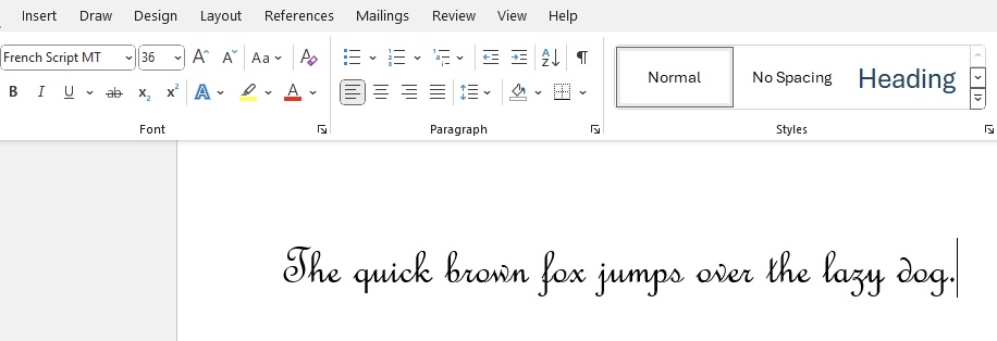
2. French Script MT – Elegantly Whimsical
French Script MT steals the second spot on my list for its elegantly whimsical charm. Its calligraphic style was inspired by nineteenth-century penmanship, exuding an air of formality and grace. This typeface carries the sophistication of old-world French handwriting, making it perfect for documents that require an aristocratic touch.
Best For: Wedding invitations, formal correspondence, and stylish branding.
Top 5 Features:
- Elegant calligraphy-inspired letterforms
- Refined and sophisticated design
- Excellent for elevated presentation
- Rich in historic character and style
- Legible while maintaining decorative flair
Five Benefits:
- Conveys a high-class and cultured vibe
- Instantly adds elegance to any document
- Remains readable despite its intricate design
- Versatile for a variety of formal occasions
- Captures attention with its unique appearance
Two Cons:
- Can be less suitable for long blocks of text due to ornate details
- May not fit casual or modern-themed documents well.
3. Segoe Print – Casual and Friendly
Segoe Print easily fits into my lineup with its casual and friendly appearance. Crafted to mirror the nuances of hand-printed letterforms, it provides that sought-after human touch without the rigidity of formal fonts. This font offers a modern and legible look, making it an exceptional choice for almost any print project that aims to be informal yet professional.
Best For: Informal cards, notes with a personal touch, and creative educational materials.
Top 5 Features:
- Reflects the imperfection of hand-printing
- Strong legibility across sizes
- Contemporary feel with a friendly tone
- Clear character spacing
- Part of the Segoe family, known for its modern appeal
Five Benefits:
- Adds personalization to documents without sacrificing professionalism
- Easy to read, making it practical for various applications
- Keeps the document light-hearted and approachable
- Suitable for digital and print mediums
- Newer and less overused compared to similar fonts
Two Cons:
- May not convey the necessary gravitas for very formal documents
- Some may prefer a less stylized font for dense text
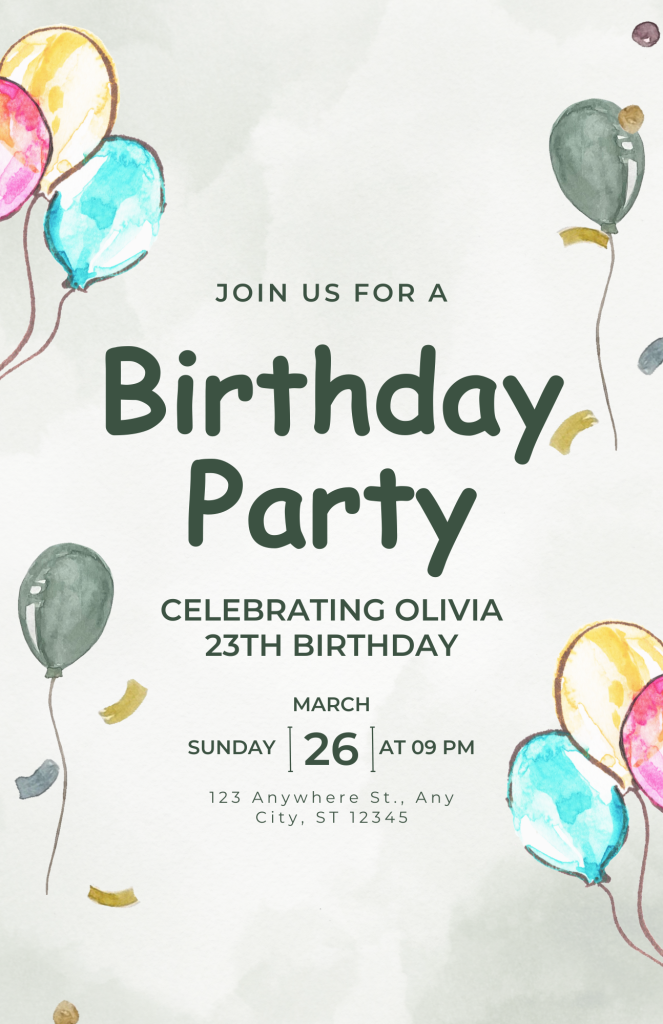
4. Comic Sans MS – The Controversial Cutie
Comic Sans MS undoubtedly earns its reputation as the ‘controversial cutie’ among fonts. Designed with the intention of being light-hearted and fun, it’s reminiscent of comic book lettering, which is where it gets its name. Despite its critics, Comic Sans MS maintains a steadfast popularity in informal settings due to its playful and child-friendly character.
Best For: School newsletters, informal event flyers, and engaging presentations.
Top 5 Features:
- Fun and comic book-inspired style
- Highly readable even at smaller sizes
- Familiar to many users as a Microsoft staple
- Rounded, sans-serif typeface with a soft aesthetic
- Widely recognized and available
Five Benefits:
- Helps create engaging and approachable content
- Can make reading easier for dyslexic individuals
- Invites an informal, relaxed context for the reader
- Offers excellent on-screen readability
- Maintains its clarity when printed in color or black and white
Two Cons:
- Often deemed unprofessional in formal or corporate environments
- Its popularity has led to overuse and backlash in design circles
5. Kristin ITC – Sweet and Quirky
Kristin ITC is a sweet and quirky font choice that caught my eye for its charming irregularities and playful design. Designed to appear as though written by a child, its letters are bubbly and animated, with the kind of endearing imperfection that gives off a homemade vibe. This font is fantastic for injecting personality and fun into projects.
Best For: Themed party invitations, children’s books, and creative branding elements.
Top 5 Features:
- Childlike handwriting feel
- Lively and uneven letter shapes
- Bold for increased visibility
- Whimsical tone for engaging content
- Friendly and inviting to readers of all ages
Five Benefits:
- Instills a sense of joy and creativity into documents
- Perfect for audiences that appreciate a touch of fun
- Helps text stand out due to its bold form
- Fosters a playful atmosphere in textual communication
- Ensures your message won’t be missed or forgotten
Two Cons:
- Can be less appropriate for serious or formal documents
- Overuse within a document may lead to a decrease in readability
6. Tempus Sans ITC – Soft and Approachable
Tempus Sans ITC makes an appearance on my list as a soft and approachable choice. Its story is quite unique, having been designed on inexpensive, porous paper with a fountain pen, which contributes to its organic and hand-drawn appearance. This font truly captures a contemporary feel while being easy on the eyes, making it a versatile asset in my font collection.
Best For: Modern brochures, stylish advertisements, and expressive digital content.
Top 5 Features:
- Hand-drawn aesthetic with modern craftsmanship
- Unique look due to the creation process
- Soft edges and approachable design
- Maintains legibility across various applications
- Less formal than traditional serif fonts
Five Benefits:
- Brings a personal touch to professional documents
- Stands out without being overwhelming
- Easy to integrate into various design schemes
- Excellent for both headers and body text
- Conveys a sense of innovation and creativity
Two Cons:
- Might not match the tone of extremely formal or traditional projects
- Could be less impactful in situations requiring a bolder statement
7. Baguet Script – Bubbly and Artistic
Baguet Script is a gem in the world of cute fonts, offering a bubbly and artistic flair that I find simply irresistible. With its script-like flow and decorative alternates, it can transform any project into a piece of art. This font radiates a sense of romance and creativity, perfect for those who wish to leave a lasting impression with their designs.
Best For: Special invitation cards, creative logotypes, and unique branding initiatives.
Top 5 Features:
- Script font with alternates and washes
- Bubbly and fluid letterforms
- Artistic touches that add unique flair
- Groovy and romantic vibe perfect for distinct projects
- Offers a range of customization for various uses
Five Benefits:
- Elevates the aesthetics of any project
- Suitable for custom and special occasion designs
- Adds a personal and handcrafted feel
- Delivers versatility through alternate characters
- Engages audiences with its fun and lively appearance
Two Cons:
- May not be ideal for contexts requiring high readability, like dense text
- Its decorative nature might not align with conservative brand images
8. MS Gothic – Innocent and Fun
MS Gothic is like a breath of fresh air in the font world, bringing with it an innocent and fun vibe that is perfect for projects geared towards a youthful audience. Its unique bouncy character invites readers into a whimsical world, making it an excellent choice for social media posts, greeting cards, and any design that aims to bring a smile to the viewer’s face.
Best For: Blogging, social media graphics, branding for kid-centric businesses.
Top 5 Features:
- Unique script signature font with a bouncy character
- Appears handcrafted and personable
- Perfect for youthful and playful designs
- Suitable for digital and print mediums
- Radiates an entertaining and approachable personality
Five Benefits:
- Creates a lighthearted mood in communication
- High charm factor increases engagement
- Keeps content looking fresh and modern
- Ideal for making memorable brand impressions
Two Cons:
- Might not be taken seriously in formal or traditional business contexts
- The playful quirks may reduce legibility in smaller print sizes
9. Candara Light – Sleek and Graceful
Candara Light is absolutely worth mentioning when we talk about sleek and graceful fonts. As a sans-serif typeface with slightly angled verticals, it radiates modernity and sophistication. It possesses a unique blend of readability and style that makes it a brilliant choice for both digital and print use.
Best For: Professional presentations, contemporary print media, and user interfaces.
Top 5 Features:
- Modern humanist sans-serif
- Slightly angled vertical strokes for a dynamic look
- Excellent readability
- Clean lines that convey elegance
- Designed to perform well on screens and in print
Five Benefits:
- Imparts a contemporary elegance to documents
- Balances legibility with aesthetic appeal
- Versatile font for a broad range of applications
- Light and airy feel suitable for large bodies of text
- Supports a user-friendly experience in digital designs
Two Cons:
- Might not provide enough personality for more whimsical or thematic designs
- Its subtleties can be lost when printed at very small sizes
10. Jokerman – Cheerful and Exciting
Jokerman is a font that’s bubbly with a fun personality, making it the perfect closer for my roundup of cute fonts. With its embellishments and unique character accents, Jokerman provides that upbeat and enthusiastic vibe to any project. It’s whimsical enough to make any text spring to life which is why I find it ideal for anything that should scream fun and excitement.
Best For: Display text for themes parks, children’s birthday invitations, and funky branding initiatives.
Top 5 Features:
- Highly decorative with unique character designs
- Playful embellishments and accents
- Bold and attention-grabbing
- Exudes a fun, casual vibe
- Particularly impactful for titles and headings
Five Benefits:
- Instantly injects energy and enthusiasm into documents
- Makes a memorable impact on audiences
- Stands out in marketing and promotional materials
- Transforms ordinary text into eye-catching statements
- Conveys cheerfulness and friendliness in visual communication
Two Cons:
- Limited in terms of readability for lengthy text passages
- Its distinctive style may not be versatile enough for more serious contexts
Matching Cute Fonts with Your Document’s Purpose
Personal Projects and Party Invitations
I’ve always felt that personal projects and party invitations offer the perfect opportunity to give free rein to your creativity with fonts. For instance, creating invitations with fonts like French Script MT or Baguet Script adds a bespoke elegance that makes your guests feel special. Cute fonts like Bradley Hand ITC and Ink Free embody the essence of personality and warmth, perfect for personal letters or homemade greeting cards that touch the heart.
For vibrant party invitations, Jokerman or Comic Sans MS will capture the festive spirit with their fun and lively essence. These fonts make the event details stand out, and it’s a surefire way to build excitement and set the tone for the party.
Here, I enjoy aligning the font choice with the party’s theme—be it playful and quirky, or chic and sophisticated, the right font sets expectations and intrigues guests.
Educational Materials and Children’s Activities
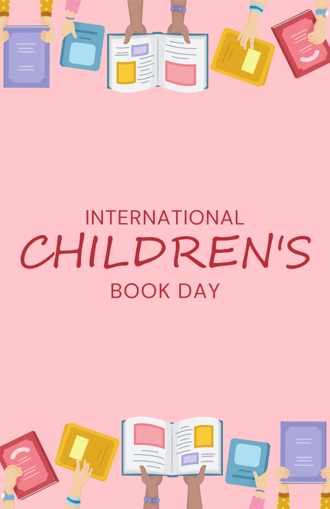
When I turn to creating educational materials and children’s activities, cute fonts like Kristin ITC and Comic Sans MS jump to the forefront, primarily for their readability and appeal to the young eye. These fonts can take learning materials from mundane to engaging, stimulating students’ interest with their friendly and approachable style.
Moreover, fonts like Segoe Print and Baguet Script offer an excellent balance between fun and function. They are easy for children to read, and their playful nature can transform worksheets, eBooks, and classroom decorations into inviting materials that promote joy in learning.
Besides readability, I also prioritize font personality to complement the subject matter. Using fonts like these can enhance thematic learning units—imagine teaching about the environment with a font that echoes the playfulness of nature, or a history lesson in a font that feels historic yet approachable.
Tips and Tricks for Using Cute Fonts Effectively
Balancing Legibility with Personality
When I advise on using cute fonts, balancing legibility with personality is paramount. To achieve this harmony, I select fonts that maintain readability while injecting the desired flair into the text. For instance, Candara Light and Segoe Print provide that balance perfectly—they carry character without compromising the clarity of the message.
This balance is critical because text must be accessible and easy to read, particularly in professional or educational contexts. Utilizing these fonts in headers or highlights can draw attention without overwhelming the content. The key is to let the font enhance the message, not overshadow it.
For longer stretches of text or where detailed information is crucial, choose fonts that lean more towards legibility, such as Tempus Sans ITC. For accents or sections where personality can shine, I might opt for a font like French Script MT to add a touch of elegance.
Pairing Fonts to Create Aesthetic Harmony
In my experience, pairing fonts is an art that can dramatically enhance the aesthetic of a document. To create harmony, I often combine a more expressive font with a simpler, more legible one. For headings, a playful font like Bradley Hand ITC pairs beautifully with a clean sans-serif font like Candara Light, balancing personality with simplicity.
The trick here is contrast; I use one font to capture attention and a second one to support the main content without competing for attention. When done correctly, this technique guides the reader’s eye through the document and emphasizes the most important elements.
I also keep in mind that a good font pair shares a certain design chemistry—whether it’s a similar x-height or complementary letter shapes. By doing so, the fonts work together to convey a cohesive and deliberate design. Remember, though, not to overdo it; usually, two or three typefaces are sufficient to establish a visually interesting hierarchy without cluttering the page.
How to Access and Install These Cute Fonts
Steps To Follow for Adding New Fonts
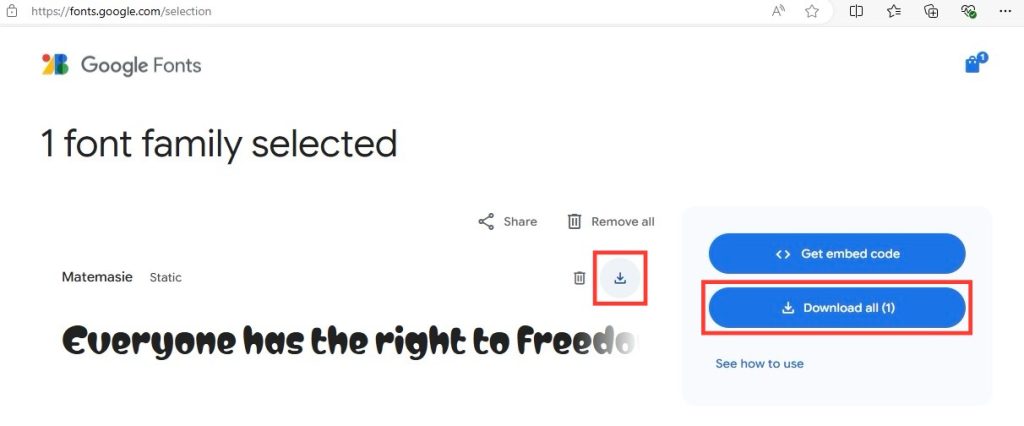
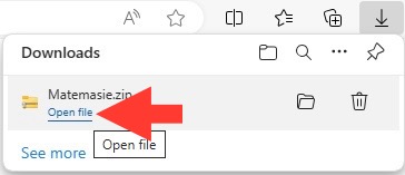
To embark on adding new fonts to your Microsoft Word, the process is quite straightforward. Firstly, ensure you download the font file from a trustworthy source; I’ve found that sites like Google Fonts or DaFont are gold mines for this.
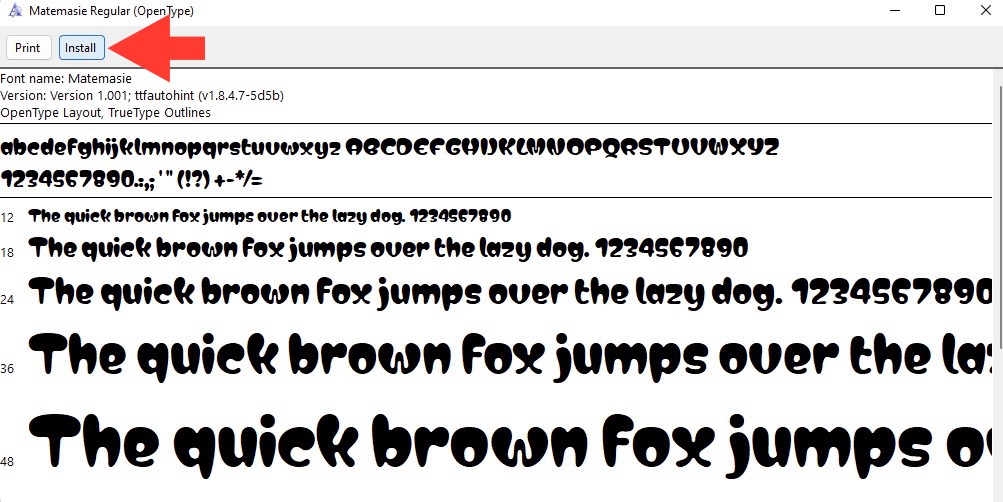
Once downloaded, right-click on the file and select ‘Install’—this will seamlessly integrate the new font into your Word font library.
For Mac users, simply open the font file and click ‘Install Font.’ After installation, do remember to restart Microsoft Word to refresh the font list and make your newly acquired font available for use.
It’s exhilarating to see your document garner a fresh perspective just by introducing new typography elements.
Ensuring Compatibility across Versions of Microsoft Word
Ensuring compatibility across different versions of Microsoft Word is critical, especially when sharing documents. To do this, I always stick with fonts that are widely available across all versions, such as Arial or Times New Roman. However, when using unique fonts, I recommend embedding them into the document before sharing. This can be done by clicking ‘File,’ then ‘Options,’ followed by ‘Save,’ and finally checking the box for ‘Embed fonts in the file’ under Preserve fidelity.
Keep in mind that not all fonts are licensed to be embedded, so double-check the font’s usage rights. Alternatively, I save the document as a PDF to maintain the design integrity. It’s a good practice to have a PDF copy, ensuring the recipient views the document as intended, regardless of the Word version they use.
FAQs About Using Cute Fonts in Microsoft Word
What Makes a Font Suitable for Professional Documents?
For professional documents, a font should primarily offer excellent readability and convey a sense of formality. Serif fonts such as Times New Roman and Garamond are often preferred for their traditional look and academic associations. Additionally, sans-serif fonts like Arial or Calibri are favored for their clean lines and modernity. The key is to choose a font that aligns with the professional image of the document, whether it’s for a business report, a resume, or official correspondence.
Are Custom Fonts Safe to Download?
Yes, custom fonts can be safe to download, but it’s paramount to use reputable font websites like Google Fonts or Font Squirrel to avoid malware. Always scan your download with antivirus software as an additional precaution. Furthermore, ensure that you understand the font licensing, which should be clearly stated on the download page, to avoid any potential intellectual property issues.
How Do I Choose the Right Cute Font for My Project?
To choose the right cute font, consider the tone and readability of your project first. Match the font’s personality with the theme of your work. For playful and informal projects, fonts like Bradley Hand ITC or Comic Sans MS could be ideal. For something that requires a touch of elegance, French Script MT might be just the ticket. Always preview the font with your content to ensure it conveys the right message.
Can I Use These Fonts on Other Platforms Beyond Microsoft Word?
Absolutely, you can use these fonts beyond Microsoft Word on various platforms, as long as the font license permits it. Make sure to check if the font is labeled for commercial use or restricted to personal projects. Once installed on your system, many fonts become available in other software like Adobe Photoshop or even web design tools, extending your creative possibilities across multiple platforms.
John Michaloudis is a former accountant and finance analyst at General Electric, a Microsoft MVP since 2020, an Amazon #1 bestselling author of 4 Microsoft Excel books and teacher of Microsoft Excel & Office over at his flagship MyExcelOnline Academy Online Course.


