Excel charts offer robust functionality for visual data representation, making it easier to identify trends and patterns. Understanding how to manage data series effectively can transform raw data into insightful visuals. In this post, I’ll guide you through mastering data series in Excel, from organizing them efficiently to utilizing advanced techniques to enhance chart clarity. Whether you’re a novice or seasoned user, these strategies will help you communicate information more effectively.
Key Takeaways:
- Well-organized data is essential for creating accurate and effective Excel charts.
- A data series is a set of related values that Excel uses to plot charts.
- You can add, remove, or edit data series from the “Select Data” dialog box.
- Editing series formulas fine-tunes chart accuracy and data presentation.
- Rearranging and styling series enhances chart clarity and storytelling.
Table of Contents
Mastering Excel Chart Series
The Importance of Data Organization
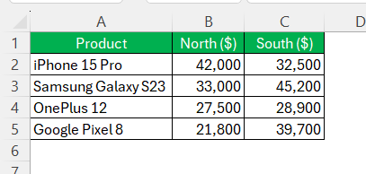
Organizing your data effectively is crucial for creating meaningful and accurate Excel charts. Well-organized data ensures that the charts reflect true relationships and trends without misrepresentations. Start by structuring data logically, with headers clearly labeling each column or row.
Consistency is key, so keep the data format uniform throughout. Proper organization not only helps Excel automatically recognize data series but also simplifies the process of adding or editing them later. By maintaining well-arranged data, you’ll ensure efficient chart creation and easy analysis, leading to better decision-making.
Understanding Data Series Basics
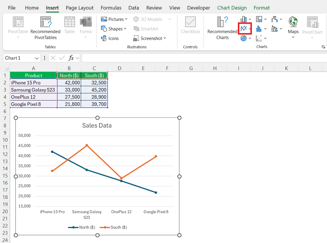
In Excel, a data series is essentially a set of related data points that Excel charts use to visualize information. Each series is often defined by a unique set of values within a row or column and is usually associated with a specific color or pattern in the chart. For example, in a line chart, each data series could represent different categories over time, making it easier to compare trends across those categories.
By grasping the fundamental concept of data series, you can begin to manipulate and customize your charts to accurately reflect your data’s story.
Step-by-Step Guide to Managing Data Series
Adding and Removing Data Series
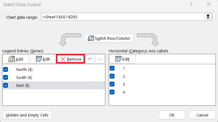
Adding or removing data series in Excel charts is a straightforward process that can significantly impact the stories your visuals tell. To add a data series, select the chart and navigate to the “Design” tab, where you can click on “Select Data.”
Here, you can add a new data series by specifying the name and selecting the data range.
Removing a series is just as simple; in the same “Select Data” dialog box, highlight the series you wish to remove and click the “Remove” button.
These simple steps allow you to fine-tune your charts, making them more relevant and tailored to your data analysis needs.
Modifying Series Formula for Precision
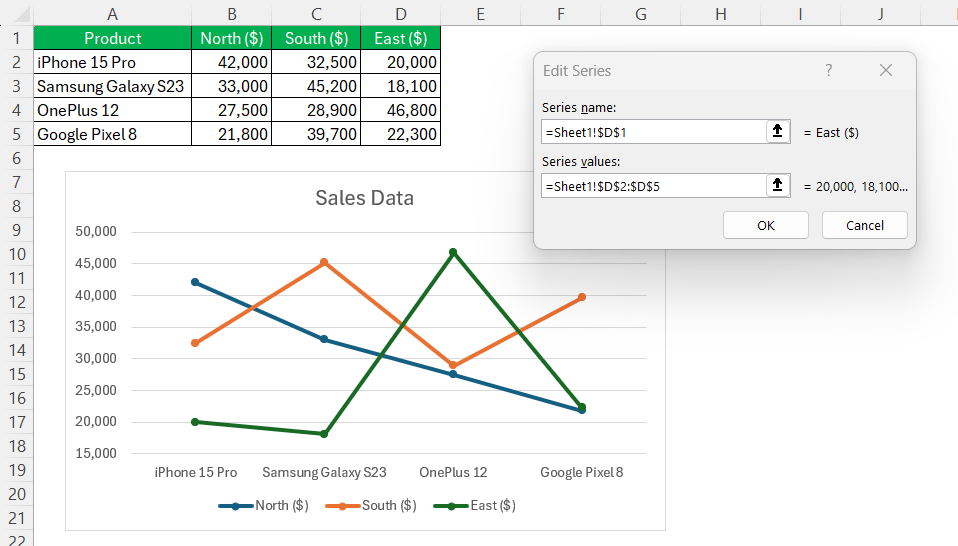
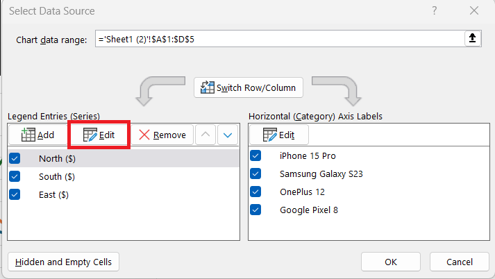
Precision in data representation often hinges on the correct use of formulas within Excel. Modifying a series formula can enhance the precision with which data is presented in your charts. To edit these formulas, click on the chart, go to the “Design” tab, and select “Select Data.”
Here, you can pick a series and click “Edit” to adjust the formula, specifying new ranges or adjusting labels.
Ensuring the series formula accurately reflects your intended data set is critical. This modification allows you to refine the chart to better convey specific insights, ensuring your visualizations align with your analytical goals.
Tips for Editing and Rearranging Data Series
Editing and rearranging data series can greatly improve the clarity and effectiveness of your Excel charts. Here are some useful tips:
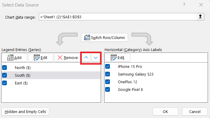
- Reorder Series: Use the “Select Data” dialog to drag series up or down, changing their order to prioritize more critical information.
- Adjust Series Labels: Click on a series label to edit it, ensuring each data series is clearly described and easily identifiable.
- Use Series Styles: Apply different styles or colors to distinguish data series visually, enhancing the interpretability of the chart.
- Change Data Range: Modify the range of data for a series directly in the formula bar for quick updates without opening multiple dialogs.
- Lock Series: For dynamic charts, consider locking series settings to prevent automatic changes when underlying data updates.
These techniques can bolster your chart presentations, making them more intuitive and visually appealing.
Practical Applications and Examples
Use Cases for Multiple Data Series in One Graph
Using multiple data series in a single graph allows for detailed comparative analysis within one visual. This approach is ideal for situations where contrasting datasets can provide deeper insights. One common use case is tracking sales performance across different regions. Multiple series can represent each region, allowing for instant comparison of sales trends and identifying areas for improvement.
Another scenario is monitoring project timelines against budgets. By plotting schedules as one series and financial data as another, discrepancies between time and cost can be easily identified. Additionally, educational institutions might use this approach to compare student performance across different subjects, with each series reflecting distinct assessment areas. These examples illustrate how using multiple data series in one chart facilitates an efficient and comprehensive understanding of complex datasets.
Real-World Examples of Series Formulation
In the real world, the formulation of data series in Excel charts is invaluable across various fields. Consider financial analytics, where data series are used to track stock prices over time. An individual series might represent opening prices, while another highlights closing prices, allowing investors to visualize market trends effectively.
In business operations, sales data series might illustrate monthly or quarterly performance, enabling comparison against past periods or future projections. This helps businesses strategize by highlighting growth patterns or identifying sales dips that need addressing.
In the health sector, data series can track patient statistics, like the incidence rates of specific conditions over a span of time. This enables healthcare professionals to identify trends and allocate resources accordingly. These real-world examples underscore how smart series formulation can provide meaningful insights, driving informed decision-making across industries.
FAQs
What is a data series in an Excel chart?
A data series in an Excel chart is a collection of related data points that Excel uses to create a visualization. Each series is typically displayed in the chart with specific identifiers like colors or patterns, representing elements such as categories, quantities, or values within your dataset. This allows for detailed comparison and analysis within the graph.
How do I add or remove a data series in an existing chart?
Click on your chart, then go to the “Chart Design” tab and select “Select Data.” Here, you can add a new series by specifying the name and range or remove any existing ones with the “Remove” button. This helps you tailor the chart to show only what’s relevant to your analysis.
Can I change the range or labels of a data series after the chart is made?
Yes, absolutely. In the “Select Data” dialog box, choose the series you want to modify and click “Edit.” You can then update the data range or label directly, ensuring the chart reflects updated or corrected data without needing to recreate it.
What’s the benefit of using multiple data series in one chart?
Using multiple data series allows you to compare different categories, time periods, or variables in one visual. It brings depth to your analysis, like comparing regional sales trends or tracking performance across departments. This makes it easier to spot patterns and discrepancies at a glance.
How do I make my data series visually distinct in a chart?
You can apply different colors, line styles, or marker shapes to each data series. Right-click the series and choose “Format Data Series” to customize its appearance. A visually distinct setup helps readers quickly identify and differentiate between the series, improving comprehension.
John Michaloudis is a former accountant and finance analyst at General Electric, a Microsoft MVP since 2020, an Amazon #1 bestselling author of 4 Microsoft Excel books and teacher of Microsoft Excel & Office over at his flagship MyExcelOnline Academy Online Course.

