Pivot Tables are a powerful way to summarize and analyze data in Excel. But sometimes you need to move beyond the summary and see the detailed breakdown behind the totals. This process is called disaggregation, and Excel gives you multiple ways to disaggregate data directly within your Pivot Table setup.
Key Takeaways
- Disaggregating means breaking down summary data into its individual components
- Add lower-level fields (like names) below groupings (like departments) to see more detail
- Right-click options let you show or hide subtotals and grand totals
- You can expand or collapse individual sections in Pivot Tables to control granularity
- Drilling down into values reveals the raw data behind the numbers
Table of Contents
What Is Disaggregation in Pivot Tables?
In Excel, Pivot Tables usually aggregate data using functions like SUM, AVERAGE, or COUNT. For example, you might group sales data by department and only see the totals. Disaggregation allows you to dig deeper and show the specific entries that make up those totals, such as individual employees and their sales amounts.
What is Disaggregation?
Disaggregation is the process of breaking down data into smaller, detailed components. In the context of Pivot Tables, you’ll be separating aggregated totals into their individual data points to gain deeper insights into the underlying data patterns. Disaggregation helps identify specific trends, anomalies, or outliers within large datasets, thereby allowing for more nuanced analysis. For instance, instead of simply viewing total sales revenue, you might disaggregate by region, product, or time period to uncover hidden performance drivers.
Understanding Pivot Table Structure
To effectively disaggregate data using Pivot Tables, it’s important to first understand their structure. Pivot Tables arrange data into a dynamic table format, allowing you to pivot, group, and summarize information effortlessly. At the core of a Pivot Table are four main components: Rows, Columns, Values, and Filters.
- Rows: These are the categories of data you want to analyze, such as “Region” or “Product Type.”
- Columns: These can help create a cross-tabulated report for comparisons, like different time periods.
- Values: This is where the quantitative data is summed, averaged, or counted, often from numeric fields.
- Filters: These allow you to isolate specific sets of data for a detailed view, such as filtering by a particular month.
By manipulating these components, you can easily customize how information is displayed, helping to dissect and view intricate data layers. For example, by adjusting row labels, you can shift from viewing overall sales to seeing sales by individual products.
How to Disaggregate Data in Pivot Tables
Step 1: Start with Raw Data
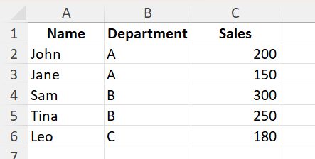
Begin with a structured dataset. For this example, we’ll use:
| Name | Department | Sales |
|------|------------|-------|
| John | A          | 200   |
| Jane | A          | 150   |
| Sam  | B          | 300   |
| Tina | B          | 250   |
| Leo  | C          | 180   |
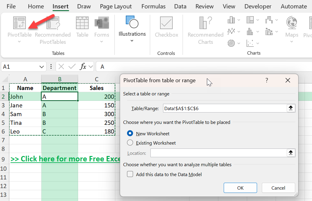
Step 2: Insert a Pivot Table
1. Select the data range
2. Go to the Insert tab and click PivotTable
3. Choose to place the Pivot Table in a new worksheet
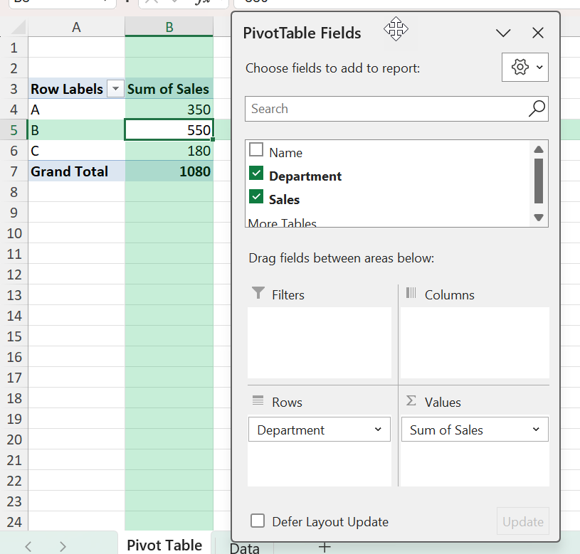
Step 3: Add Aggregated Fields
In the PivotTable Field List:
Drag Department to the Rows area
Drag Sales to the Values area
You’ll now see a summary of total sales by department.
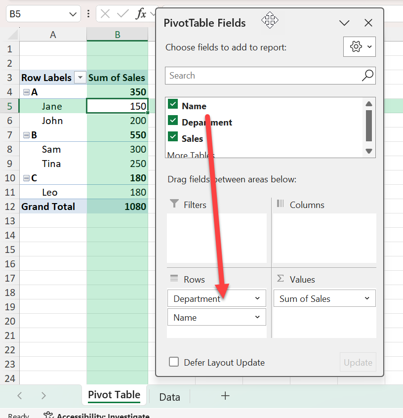
Step 4: Disaggregate by Adding Detail
To disaggregate the totals, drag Name into the Rows area beneath Department.
This will show individual sales per employee under each department. You’ve now broken down the aggregate department totals into person-level detail.
Common Mistakes or Tips
Subtotals still showing: Use right-click > Subtotals > Do Not Show Subtotals to fully flatten the view
Data not sorting as expected: Use the drop-down arrows to sort by fields such as Sales or Name
Over-aggregation: If your data is too summarized, double-check the order of fields in the Rows area
Collapsed groups: Use the small plus/minus buttons to expand or collapse detailed levels
Drilling into wrong level: Make sure you’re clicking on a value cell, not a label, when double-clicking to see raw data
Bonus Tips and Advanced Scenarios
Drill Down to Raw Data: Double-click any total value in the Pivot Table to create a new sheet with the raw rows that make up that value
Use Power Query to Unpivot: If you need to unstack columns into rows before analysis, Power Query’s Unpivot feature can help prepare your data
Apply Value Filters: Right-click a row label, go to Value Filters, and filter for specific conditions like sales above 200
Real-World Applications of Disaggregated Data
Enhancing Business Reporting
Using disaggregated data in Pivot Tables significantly enhances business reporting by providing a more granular view of business operations. This allows you to customize reports to focus on specific operational details, like sales performance by individual team members or customer demographics by product category. By breaking down data, you can tailor reports to align with KPIs, aiding in targeted strategy development.
Additionally, disaggregated data enables quicker identification of operational weaknesses or strengths by removing the noise found in aggregate summaries. For example, rather than viewing overall product sales, disaggregate to see which products perform best in particular regions or seasons. This actionable insight facilitates more informed decision-making and strategic planning.
Improving Data Insights in Research
Disaggregated data in Pivot Tables can transform research by uncovering granular insights that would otherwise be lost in aggregated data. By focusing on detailed data points, researchers can identify specific patterns, correlations, and variations within the dataset, which enhances the accuracy and depth of their findings. For example, in a demographic study, disaggregating data by age, gender, and socioeconomic status can reveal nuanced trends and disparities.
This level of detail aids in hypothesizing and testing more precise research questions. Moreover, it supports rigorous data validation and replication studies, crucial for ensuring robust research outcomes. By presenting complex data in an understandable format, Pivot Tables also facilitate clearer communication of findings to varied audiences, including policymakers and stakeholders.
Frequently Asked Questions
What does disaggregating a Pivot Table mean?
It means breaking down summary totals into their individual components, such as showing every person’s data under a department total.
Can I remove totals and only show detailed data?
Yes. You can right-click row labels to hide subtotals, and use the PivotTable Analyze tab to turn off grand totals.
How do I see the raw data behind a Pivot Table value?
Double-click any total value to generate a new sheet containing the rows that make up that number.
Can I disaggregate by multiple fields?
Yes. You can stack multiple fields in the Rows area to see multi-level breakdowns, such as Region > Department > Name.
Is this the same as unpivoting data?
No. Unpivoting is done before analysis to reshape data. Disaggregating is done within the Pivot Table to show detailed breakdowns of summary values.

John Michaloudis is a former accountant and finance analyst at General Electric, a Microsoft MVP since 2020, an Amazon #1 bestselling author of 4 Microsoft Excel books and teacher of Microsoft Excel & Office over at his flagship MyExcelOnline Academy Online Course.


