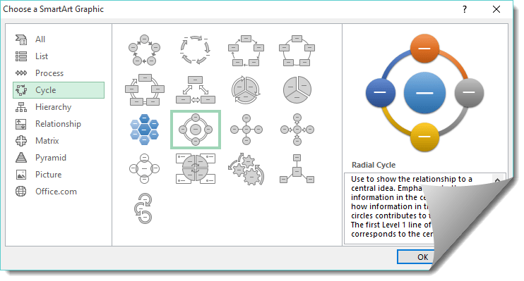
Cycle Charts in Excel are easy to create using the Smart Art feature. There are several cycle process charts to choose from, some have arrows, like the Basic Cycle, and others show the relationship to a central idea, like the Radial Cycle.
Key Takeaways
-
Visualize Cyclical Processes Effectively – Radial cycle charts are great for illustrating circular or repeating processes like project phases, feedback loops, or annual cycles.
-
Not a Built-In Chart Type – Excel doesn’t offer a radial cycle chart natively, but you can create one using a combination of doughnut charts and creative formatting.
-
Customize for Maximum Impact – You can change colors, segment labels, and spacing to clearly show each step or stage in the cycle.
-
Ideal for Presentations – These charts are visually engaging and ideal for slides or dashboards where traditional linear charts may be less effective.
-
Requires Structured Data – Organize your data in stages or categories, then use helper columns and doughnut chart settings to get the radial layout just right.
Here is how you insert a Radial Cycle:
Table of Contents
How to Insert a Radial Cycle Chart
STEP 1: Click on Insert > Smart Art > Cycle > Radial Cycle
STEP 2: Enter the cycle title by clicking on a shape
STEP 3: To enter a new cycle, you need to click on a shape and select SmartArt Tools > Design > Add Shape (You can also right click on the shape and choose this option)
STEP 4: To move the cycle upwards or downwards, you need to click on a shape and select SmartArt Tools > Design > Move Up or Move Down
STEP 5: To change the cycle from right to left, you need to click on a shape and select SmartArt Tools > Design > Right to Left
STEP 6: To change the color of the cycle, you need to click on a shape and select SmartArt Tools > Design > Change Colors
STEP 7: Under SmartArt Tools > Design > SmartArt Styles drop down you can change the style of your cycle
Watch the tutorial below to see how easy a Cycle Chart is created in Excel:
Frequently Asked Questions
What is a radial cycle chart used for in Excel?
It’s used to represent processes or workflows that are cyclical, such as monthly tasks or iterative stages in a project.
Can I create a radial chart directly in Excel?
No, Excel doesn’t offer it as a default chart type, but you can simulate it using a doughnut chart with some formatting tricks.
What kind of data works best for radial cycle charts?
Categorical data representing stages or parts of a repeating process—especially when the order of steps matters.
Is it hard to build a radial cycle chart in Excel?
It’s not difficult but does require some manual setup—like arranging your data and formatting the doughnut chart creatively.
Can I use radial cycle charts in dashboards or reports?
Yes, they’re excellent for storytelling and process visualization in professional presentations and dashboards.
John Michaloudis is a former accountant and finance analyst at General Electric, a Microsoft MVP since 2020, an Amazon #1 bestselling author of 4 Microsoft Excel books and teacher of Microsoft Excel & Office over at his flagship MyExcelOnline Academy Online Course.


