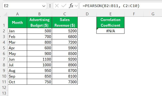
In today’s data-driven world, understanding the relationships between variables is crucial for making informed decisions. Whether you’re a student, a business analyst, or a researcher, calculating correlation coefficients is an essential skill. Excel, with its powerful built-in functions, offers an accessible platform for performing these analyses. This guide will walk you through how to find correlation coefficient in Excel, making complex data relationships easier to decipher.
Key Takeaways:
- Excel simplifies correlation analysis using functions like CORREL and PEARSON.
- The correlation coefficient measures the strength and direction of the relationship between two variables.
- Values range from -1 (negative correlation) to +1 (positive correlation), with 0 indicating no correlation.
- The Data Analysis ToolPak enables correlation analysis for multiple variables.
- Accurate data formatting and error handling ensure reliable correlation results.
Table of Contents
Understanding Correlation Coefficient in Excel
What is a Correlation Coefficient?
A correlation coefficient is a statistical measure that defines the strength and direction of a linear relationship between two variables. Represented as ‘r’, this coefficient ranges from -1 to +1. A value of +1 indicates a perfect positive correlation, where both variables move in tandem.
Conversely, a -1 signifies a perfect negative correlation, meaning as one variable increases, the other decreases. A value of 0 implies no linear correlation, indicating the variables do not have a tendency to move together. These coefficients are instrumental in understanding how variables are connected, aiding in various analytical and decision-making processes.
Why Use Excel for Correlation Analysis?
Excel is a powerful tool for correlation analysis due to its versatility and user-friendly interface. It provides built-in functions like CORREL and PEARSON, which allow for quick and accurate calculation of correlation coefficients without the need for complex statistical software. Excel is readily accessible and widely used across different industries, making it practical for anyone who wants to analyze data trends and relationships.
Additionally, Excel’s Data Analysis ToolPak further enhances its capabilities, making it easier to generate detailed reports and visualize data correlations through charts and graphs. This accessibility and capability make Excel an ideal choice for anyone looking to perform correlation analysis efficiently.
Getting Started with Excel
Preparing Your Data
Before diving into correlation analysis in Excel, it’s essential to prepare your data properly to ensure accuracy and reliability. Start by collecting raw data for the variables you intend to analyze. Organize this data in an Excel spreadsheet, preferably with each variable in its own column and labeled clearly with headers.
Ensure uniformity in the data, checking for any empty cells, inconsistent formats, or outliers that might skew results. Each variable should have a consistent number of observations, as discrepancies can lead to errors in calculations. By taking these steps to clean and format your data, you lay a solid foundation for accurate correlation analysis.
Enabling the Data Analysis ToolPak
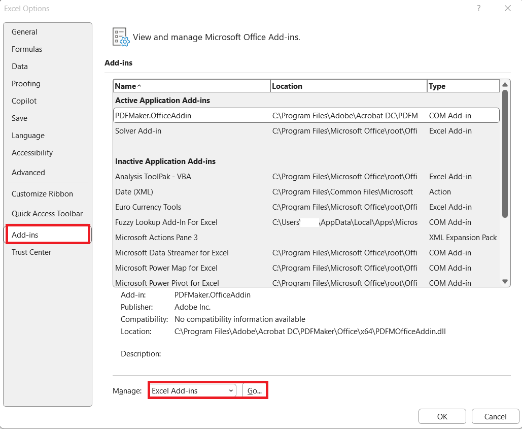
To harness the full potential of Excel for statistical analysis, including calculating correlation coefficients, enabling the Data Analysis ToolPak is essential. Start by opening Excel and clicking on the “File” tab at the top left corner of the screen. Select “Options” from the drop-down menu to open the Excel Options dialog box.
Here, navigate to “Add-Ins” on the left-hand side. At the bottom, you’ll see the “Manage” drop-down menu; choose “Excel Add-ins” and click “Go.”
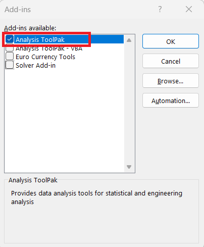
This action will open the Add-Ins dialog box. Check the box next to “Analysis ToolPak,” then click “OK.”
Once done, you should see a “Data Analysis” option under the “Data” tab in the ribbon.
This tool is now ready for use, enabling more sophisticated data analysis processes, including correlation.
How to Find Correlation Coefficient in Excel
Method 1: CORREL Function Walkthrough
The CORREL function in Excel is a straightforward way to calculate the Pearson correlation coefficient between two sets of data. This function helps assess the linear relationship between variables, simplifying analysis. The syntax is easy: CORREL(array1, array2), where array1 is the range for the first dataset, and array2 is the range for the second. These arrays must contain an equal number of data points for accurate calculation.
Using the CORREL function in Excel to determine correlation coefficients is a seamless process when followed step-by-step. Here’s a detailed walkthrough:
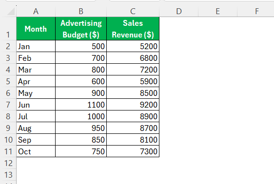
STEP 1: Begin by organizing your data into two columns. Ensure each column represents one variable, with data points aligning across rows.
STEP 2: Choose a blank cell where you want the correlation result to be displayed. This is often placed below or beside your data range for easy reference.
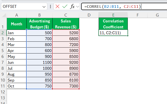
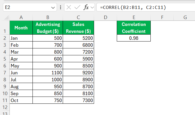
STEP 3: Click into your chosen cell and type =CORREL(. Follow this with the range for your first dataset, then add a comma. Next, highlight the range for your second dataset. For example, if your data spans cells B2 to B11 for the first variable and C2 to C11 for the second, your formula will appear as =CORREL(B2:B11, C2:C11).
STEP 4: Press “Enter” to calculate. Excel will return a single numeric value ranging from -1 to +1, indicating the correlation’s strength and direction.
A positive value signifies a positive correlation, meaning the variables tend to increase or decrease together. A negative value indicates an inverse relationship, where one variable increases as the other decreases. A result close to zero suggests little to no linear correlation.
Following these steps with the CORREL function allows for quick and accurate analysis of data relationships, offering insights necessary for effective decision-making and further research.
Method 2: Data Analysis Tool for Correlation
Using the Data Analysis Tool for correlation in Excel is a powerful way to examine relationships between multiple variables simultaneously. Here’s a step-by-step guide to accomplish this:
STEP 1: Ensure your dataset is organized in columns, each representing a variable. Clear and concise headers should label each column.
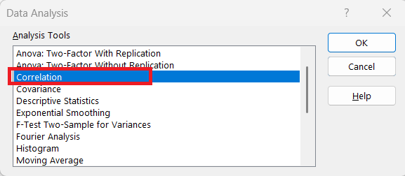
STEP 2: Navigate to the “Data” tab on the Excel ribbon and click on “Data Analysis.” If you don’t see this option, you may need to enable the Data Analysis ToolPak in Excel.
STEP 3: In the Data Analysis dialog box, scroll down and select “Correlation.” Click “OK” to proceed.
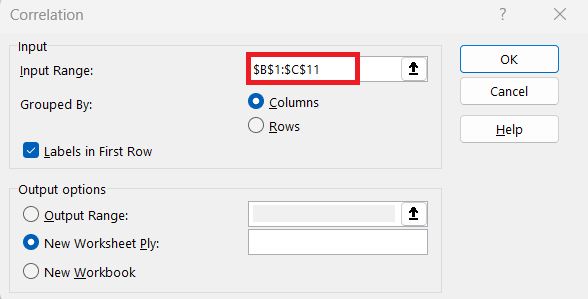
STEP 4: In the Correlation dialog, set your Input Range by selecting the data range that includes your variable arrays. Ensure “Labels in First Row” is checked if your data range includes headers.
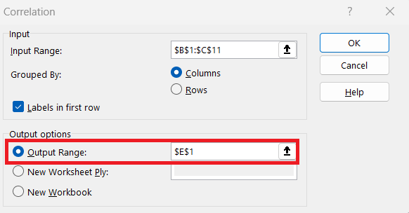
STEP 5: Decide where you want the output to appear. You can either specify a cell in the existing worksheet, choose a new worksheet, or source a new workbook entirely.
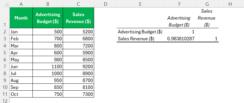
STEP 6: Click “OK” to execute the command. Excel will generate a correlation matrix, displaying the correlation coefficients between each pair of variables in your dataset.
Examine the matrix to understand the linear relationships. Each cell in the matrix shows the correlation coefficient between two corresponding variables. Values close to +1 or -1 indicate strong correlations, either positive or negative, respectively, while values near zero suggest weak or no linear correlation.
This method is particularly helpful when dealing with datasets that involve several variables, as it provides a comprehensive view of all potential correlations at a glance, facilitating informed decision-making and analysis.
Method 3: PEARSON Function Explained
The PEARSON function in Excel offers another method for calculating the Pearson correlation coefficient, providing results identical to the CORREL function. It is particularly useful for those familiar with statistical terminology. The syntax for the PEARSON function is PEARSON(array1, array2)where array1 and array2 represent the ranges of the two variables you wish to examine. This function calculates the degree to which changes in one variable are associated with changes in another.
The PEARSON function in Excel is an efficient tool for calculating the Pearson correlation coefficient between two sets of data. Here’s a step-by-step explanation of how to use it:
STEP 1: Arrange your datasets in two adjacent columns, ensuring that each column corresponds to one variable. Ensure all data points are aligned across rows.
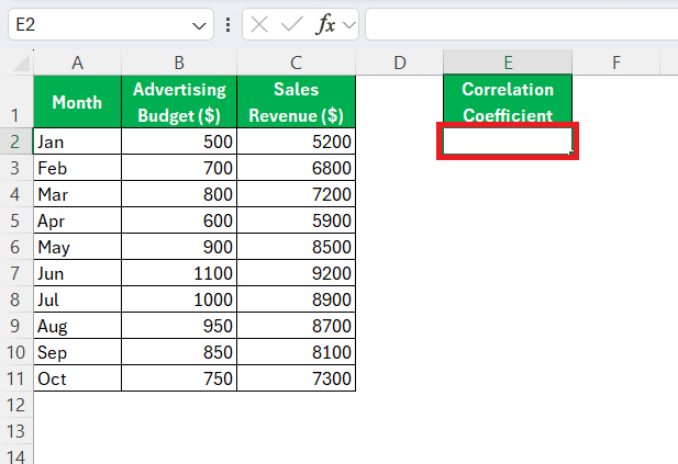
STEP 2: Choose an empty cell where you’d like the correlation coefficient to be shown. Typically, this is near your datasets for easy reference.
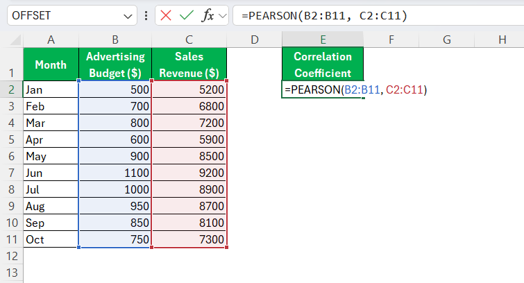
STEP 3: Click into your selected display cell and type =PEARSON(. Select the range for your first data series, followed by a comma, then highlight the range for your second data series. For instance, =PEARSON(B2:B11, C2:C11) if your data is within those cell ranges.
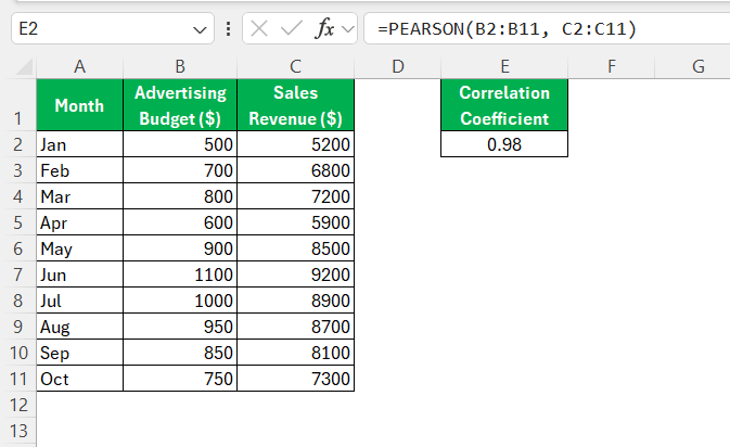
STEP 4: Press “Enter” to compute. Excel will output the Pearson correlation coefficient, offering a numerical value between -1 and +1.
A positive value represents a direct relationship between the variables, meaning they tend to increase or decrease together. A negative value indicates an inverse relationship, where one variable increases as the other decreases. A value near zero signifies little to no linear relationship.
The PEARSON function is identical in result to the CORREL function, making it an excellent alternative for users familiar with statistical terms. It’s reliable in most Excel versions, though minor discrepancies might occur in Excel 2003 and earlier due to potential rounding differences. This method is particularly useful for users who require precision and clarity in understanding linear relationships between datasets.
Troubleshooting Common Issues
Handling Data Errors
Handling data errors is critical to ensuring accurate correlation analysis in Excel. Here are some strategies to effectively manage common issues you might encounter:
- Check for Missing Values: Any blank cells in your dataset can cause errors or skew results. Fill in missing values with appropriate estimates or remove these entries entirely, ensuring both datasets remain of equal length.
- Detect and Remove Outliers: Outliers can significantly affect the correlation result. Scan your data for anomalies and determine if they should be excluded based on the context of your analysis.
- Consistent Formatting: Ensure all data entries are consistently formatted. Mixed data types, such as combining text and numbers in a single column, can lead to errors. Convert all data points to a numerical format if possible.
- Validate Data Accuracy: Double-check your data for input errors or inconsistencies. Simple typos or incorrect entries can alter the outcome of your analysis.
- Range Verifications: Confirm that your function ranges are correct. Selecting incorrect cell ranges can result in a flawed calculation or a #N/A error.
- Enable Error Checking: Use Excel’s built-in error-checking features. Excel flags cells with errors in formulas with small triangles in the corner, helping you identify problems quickly.
Addressing these issues proactively ensures your correlation analysis is based on reliable and clean data, enhancing the credibility and accuracy of your findings. Proper data management is crucial for drawing valid conclusions and making informed decisions.
Interpreting Results Correctly
Interpreting correlation coefficients accurately is vital for understanding the nature of the relationships between variables. Here’s how to analyze the results meaningfully:
- Strong Correlation: Values closer to +1 or -1 indicate a strong linear relationship. In a strong positive correlation, variables tend to increase together. Conversely, in a strong negative correlation, one variable decreases as the other increases.
- Moderate Correlation: Coefficients between ±0.3 and ±0.7 suggest a moderate relationship, where the variables might generally trend together, but not consistently.
- Weak or No Correlation: Values near 0 imply a weak or non-existent linear relationship, signifying the variables do not follow a predictable pattern together.
- Positive Correlation: Indicates that as one variable increases, the other also tends to increase.
- Negative Correlation: Suggests that as one variable increases, the other tends to decrease.
By following these guidelines, you can make more informed judgments based on your correlation analysis, enabling you to apply the insights effectively within your specific area of interest.
Avoiding Common Pitfalls
Avoiding common pitfalls in correlation analysis ensures that your results are both accurate and meaningful. Here are some key points to keep in mind:
- Assuming Causation: Never infer causation from correlation alone. A strong correlation between two variables does not mean one causes the other. Always explore further to understand any underlying factors or third variables.
- Overlooking non-linear Relationships: A linear correlation coefficient might not capture non-linear relationships. Consider using scatterplots to visualize data trends, which can reveal non-linear patterns that a correlation coefficient might not.
- Ignoring Data Quality: Ensure data integrity by checking for errors, missing values, and outliers before analysis. Poor data quality can lead to misleading results and false interpretations.
- Misinterpreting the Magnitude: Understand that a high correlation does not guarantee practical significance. Consider the context of your analysis to determine if the strength of the relationship is impactful.
- Sample Size Concerns: Small sample sizes can lead to unreliable correlation coefficients. Ensure your dataset is sufficiently large to obtain a representative and robust analysis result.
- Data Range Issues: Correlation coefficients are sensitive to the range of the data. Make sure the variable ranges are suitable for the analysis and do not truncate datasets without justification.
By being aware of these pitfalls and applying careful judgment and complementary analyses, you enhance the validity and utility of your correlation results, allowing for more deliberate and reliable decision-making based on your findings.
Practical Applications of Correlation in Excel
Business Decision-Making
Correlation analysis in Excel is a powerful tool to aid business decision-making. By determining the relationships between variables, businesses can make more informed choices regarding strategy and operations. Here’s how correlation can play a crucial role:
- Sales and Marketing: Analyzing the correlation between marketing spend and sales revenue can reveal the effectiveness of campaigns. A strong positive correlation suggests that increased marketing investment may lead to higher sales, guiding budget allocation.
- Customer Behavior Analysis: Businesses can examine the correlation between customer demographics and purchasing patterns. Understanding these relationships helps tailor products and services to meet consumer demand, enhancing satisfaction and loyalty.
- Risk Management: Identifying correlations between different financial assets or economic indicators can help in assessing risk and diversifying investment portfolios. A negative correlation between assets, for instance, can mitigate risks during market volatility.
- Operational Efficiency: Analyzing correlations between production variables, such as machine down-time and output levels, can pinpoint opportunities for industrial improvement. This knowledge enables process optimization and cost reduction.
- Market Trend Analysis: Correlating sales data with external factors like seasonality, economic indicators, or competitor actions provides insights into market trends, enabling proactive adjustments to business strategies.
By leveraging Excel’s correlation analysis, businesses enhance their ability to make data-driven decisions, laying a foundation for strategic growth and a competitive edge in the marketplace. With these insights, businesses can align operations closely with their goals, driving success and sustainability in various domains.
Analyzing Market Trends
Analyzing market trends using correlation analysis in Excel provides businesses with valuable insights into patterns and potential opportunities. This type of analysis can uncover how various market factors interact and influence business outcomes. Here’s how it can be leveraged effectively:
- Trend Detection: By correlating historical sales data with periods or seasonal markers, businesses can identify patterns like peak sales seasons or cyclical trends. Recognizing these patterns allows for better inventory and resource planning.
- Pricing Strategies: Investigating the relationship between price changes and sales volume can help businesses understand price elasticity. A strong negative correlation might suggest that price increases lead to reduced sales, guiding optimal pricing strategies.
- Customer Preferences: Correlating customer feedback or social media metrics with sales data can shed light on how consumer opinions impact buying behavior. This insight can drive product development and marketing strategies.
- Competitor Analysis: By analyzing correlations between competitor pricing or promotional activities and one’s own sales performance, businesses can assess their competitive positioning and improve strategic planning.
- Economic Impact: Examining the correlation between economic indicators (e.g., employment rates, consumer confidence indices) and sales performance can provide insights into how broader economic conditions affect business. This information can aid in economic forecasting and risk management.
Utilizing Excel for these analyses not only enhances a business’s understanding of market dynamics but also equips decision-makers with the ability to adapt strategies for changing conditions. This level of analysis ensures that companies remain competitive by tailoring their efforts to market trends and consumer demands effectively. With these insights, businesses can anticipate shifts and capitalize on emerging opportunities.
FAQs
What does a correlation coefficient tell me?
It quantifies the strength and direction of the relationship between two variables, helping to determine how one variable changes with respect to another. A value close to 1 indicates a strong positive correlation, meaning both variables increase together, while a value close to -1 indicates a strong negative correlation, meaning one increases as the other decreases. A correlation of 0 suggests no linear relationship between the variables.
Which Excel function is best for correlation?
Both the CORREL and PEARSON functions calculate the Pearson correlation coefficient, yielding the same result. The CORREL function is more commonly used because it is straightforward and requires fewer parameters, making it a convenient choice for quick correlation analysis in Excel.
How do I enable the Data Analysis ToolPak in Excel?
To enable the Data Analysis ToolPak, go to File > Options > Add-ins, then choose Excel Add-ins from the Manage dropdown and click Go. Check the Analysis ToolPak box and click OK. Once activated, the Data Analysis option will appear in the Data tab, allowing access to advanced statistical tools, including correlation analysis.
Why am I getting an error in my correlation calculation?
Errors in correlation calculations can arise from missing values, non-numeric data, or unequal dataset sizes. Ensure both columns contain numerical values without blank cells or text. Also, verify that both datasets have the same number of entries, as mismatched ranges can cause calculation errors.
Can I calculate correlation for more than two variables?
Yes, Excel allows correlation analysis for multiple variables using the Data Analysis ToolPak. This tool generates a correlation matrix, displaying correlation coefficients for all possible variable pairs in a dataset. This is useful for identifying relationships among multiple variables simultaneously.
John Michaloudis is a former accountant and finance analyst at General Electric, a Microsoft MVP since 2020, an Amazon #1 bestselling author of 4 Microsoft Excel books and teacher of Microsoft Excel & Office over at his flagship MyExcelOnline Academy Online Course.


