In today’s data-driven world, understanding distributions is crucial for meaningful analysis. Excel, a powerful tool for data manipulation, offers various features to visualize and interpret data trends effectively. One specific trend is negative skewness, where the data tails off more to the left. By exploring how to create a negatively skewed distribution in Excel, we can gain insights and make informed decisions.
Key Takeaways:
- Negative skewness means the data tail is longer on the left.
- Use Excel’s SKEW() function to calculate skewness easily.
- Histograms in Excel help visualize the skew clearly.
- Cleaning and preparing your dataset is essential for accuracy.
- Negative skewness is common in income, real estate, and survey data.
Table of Contents
Understanding Negative Skewness
Defining Skewness in Statistical Terms
Skewness in statistics measures the asymmetry of a probability distribution around its mean. When we talk about a distribution being skewed, we refer to whether the data tails more toward one side of the peak than the other. A perfectly symmetric dataset would have a skewness of zero, indicating a normal distribution.
In contrast, positive skewness means the tail is on the right side, while negative skewness indicates a longer or fatter tail on the left side, often implying that the mean is less than the median. Understanding these concepts helps us appreciate the shape and implications of our data distribution.
Characteristics of a Negatively Skewed Distribution
A negatively skewed distribution, sometimes referred to as left-skewed, exhibits distinct characteristics that differentiate it from other data distributions. Firstly, its long tail extends to the left, indicating that there are more low-value outliers in the dataset. In these distributions, the mean is typically less than the median and mode, showing that the average is pulled down by those lower values.
Additionally, the bulk of the data is concentrated on the right-hand side, resulting in a peak closer to higher values. This skewness suggests caution, as interpreting averages might lead to misleading conclusions if the skew isn’t considered.
Setting Up Your Data in Excel
Preparing Your Dataset
Before diving into the mechanics of creating a negatively skewed distribution in Excel, it’s essential to properly prepare your dataset. Start by collecting data relevant to your analysis, ensuring it’s comprehensive and includes both lower and higher values to capture potential skewness.
Next, input this data into an Excel spreadsheet, organizing it in a single column or row for simplicity.
Cleaning the data is crucial: verify there are no errors, duplicates, or entries that may distort the results, like non-numeric values in a numeric dataset. Consistency and accuracy at this stage are vital for producing a meaningful and reliable analysis.
Common Challenges and How to Overcome Them
Creating a negatively skewed distribution in Excel can present several challenges. One frequent issue is dealing with outliers, which can disproportionately affect the skewness measure. To mitigate this, consider using data visualization tools, such as histograms, to visually inspect and decide how to address outliers, possibly by capping extreme values.
Another challenge is data entry errors, like incorrect data formats or missing values, which can distort your analysis. Prevent this by employing Excel’s data validation tools to ensure uniform data entry practices.
It’s also important to stay aware of understating or overstating skewness due to rounding errors. Always use Excel’s built-in functions to maintain precision.
By diagnosing these challenges early and employing these strategies, you can streamline the process of creating a negatively skewed distribution and ensure more reliable results.
Creating a Negatively Skewed Distribution
Using the SKEW() Function Effectively
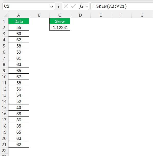
The SKEW() function in Excel is a powerful tool for assessing the skewness of a dataset. It calculates the degree of asymmetry from the mean of a dataset. To employ it effectively, first highlight the relevant data range. Then, type =SKEW( followed by your data range in parentheses (e.g., =SKEW(A2:A21)) and press Enter.
This will yield a numerical output indicating skewness: values less than zero represent negative skewness.
Ensure that your dataset is continuous and sizeable enough, as skewness calculations can be sensitive to small sample sizes and might provide misleading results. A rule of thumb is to use datasets with at least 30 observations for more reliable skewness measures. With the SKEW() function, you can swiftly and accurately assess the extent of skewness, aiding in more nuanced data interpretation.
Step-by-Step Guide to Plotting the Distribution
To effectively plot a negatively skewed distribution in Excel, follow these steps:
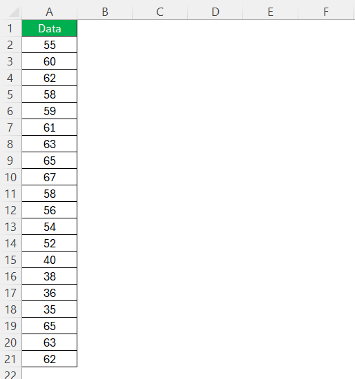
STEP 1: Start by entering your prepared dataset into a single column in an Excel worksheet.
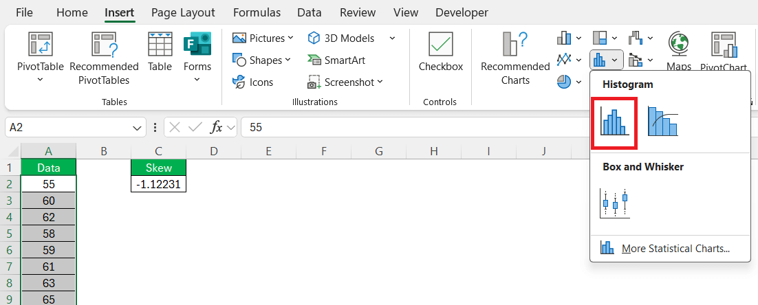
STEP 2: Highlight your data, then navigate to the ‘Insert’ tab. Choose ‘Histogram’ from the Charts group under the ‘Insert Statistic Chart’ dropdown.
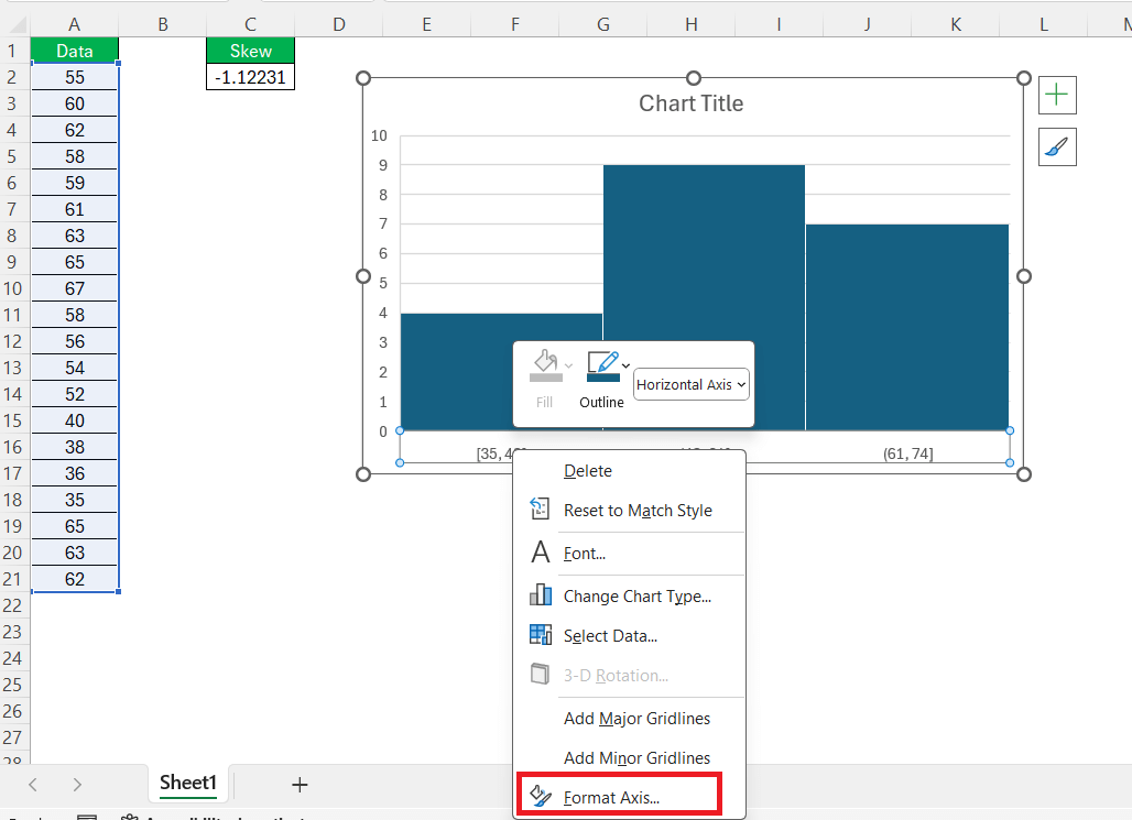
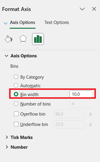
STEP 3: Click on your histogram and use the ‘Format Axis’ option to adjust bin sizes. This can be found by right-clicking the axis and selecting ‘Format Axis’ to refine the representation of your data’s distribution.
STEP 4: Adjust bin size.
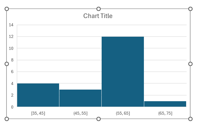
STEP 5: Observe the histogram to ensure it visually represents negative skewness, with a longer tail on the left side.
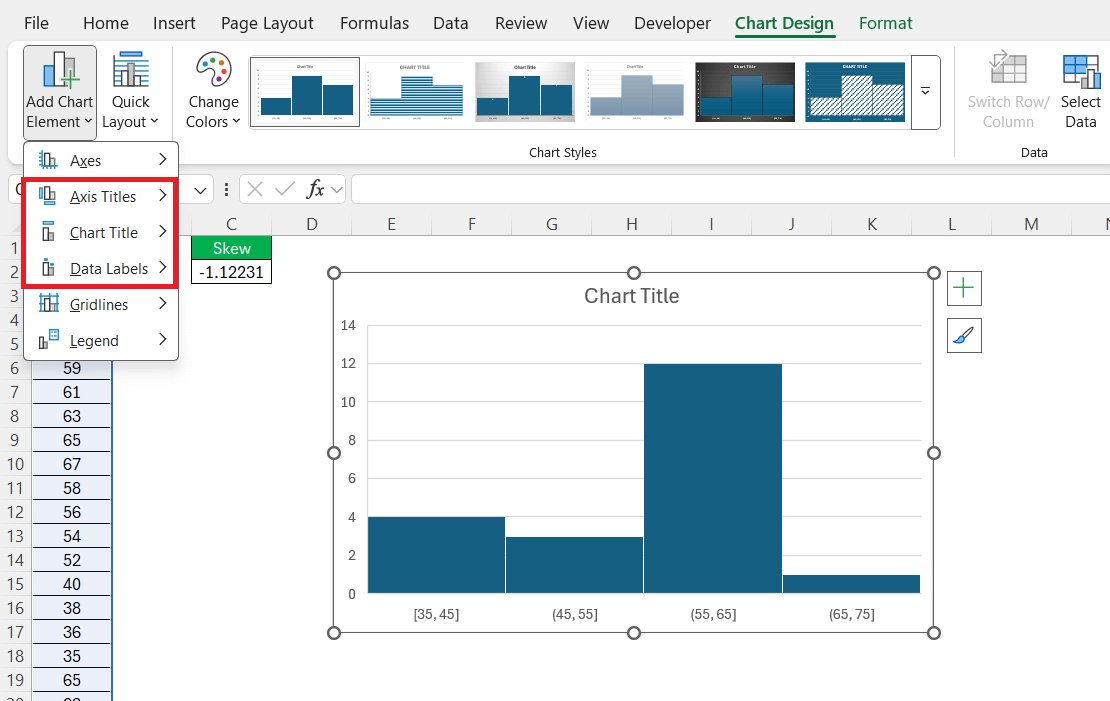
STEP 6: Enhance your chart by adding titles and labels. This makes your visualization clearer and more informative.
By following these steps, you can effectively visualize negatively skewed data, facilitating easier analysis and comprehension.
Tips for Accurate Skewness Visualization
Achieving accurate skewness visualization in Excel requires attention to detail. Here are some tips to enhance your analysis:
- Use Consistent Scales: Ensure that both axes are appropriately scaled to provide a true representation of the data distribution.
- Optimize Bin Widths: Experiment with different bin widths to capture the shape of your distribution without over-smoothing or introducing noise.
- Add Data Labels: Including data labels can provide precise value insights, making the skewness easier to interpret directly from the graph.
- Color Code Based on Value: Utilize different colors for various data ranges to highlight where most of your values lie and emphasize skewness.
- Utilize Secondary Plots: If needed, complement histograms with box plots for a second perspective on data spread and outliers.
By applying these techniques, you’ll ensure your visualization is both accurate and insightful, giving a clearer picture of your dataset’s skewness.
Practical Applications of Negative Skewness
Real-World Examples
Real-world examples of negatively skewed distributions can be found across various domains, showcasing their practical significance:
- Housing Market Prices: In real estate, you might encounter negatively skewed distributions where a few low-cost homes skew the price distribution leftwards, but most properties’ prices are high, concentrating the data on the right.
- Income Levels: While discussing salaries, especially in organizations with high executive pay, a few lower earners can create a negative skew, whereas the majority earn well, which shifts the average downwards.
- Exam Scores: In some advanced-level exams, a distribution where most students achieve high scores, but a few outliers score significantly lower, can result in negative skewness.
- Customer Satisfaction Ratings: A company’s survey may show that most customers rate their experience as excellent, with only a few providing very low ratings, skewing the distribution left.
- Retail Discounts: A product line where deep discounts are applied to a limited number of items while the majority remain at regular prices can reflect a negatively skewed sales discount distribution.
These examples illustrate how negative skewness offers insights into data trends, assisting with strategic decisions and understanding population behaviors.
Insights Through Data Analysis
Analyzing negatively skewed distributions can yield important insights that inform decision-making processes. Primarily, such distributions highlight anomalies where a minority group affects the average significantly, necessitating nuanced interpretation beyond just the mean. For example, in markets, a negatively skewed income distribution suggests higher wealth concentration among the majority, which could impact product targeting and marketing strategies.
Moreover, recognizing negative skewness in user satisfaction data can prompt organizations to investigate the underlying causes of dissatisfaction, pushing for improvements or policy adjustments. It also helps identify whether resources are being optimally allocated. By acknowledging the bulk of positive outcomes amidst a few negative anomalies, analysts can better strategize on enhancing overall performance while addressing specific outliers.
Ultimately, understanding these insights supports more effective resource allocation and strategic planning, ensuring decisions are grounded in a comprehensive view of the dataset.
Troubleshooting Common Issues
Adjusting Your Data for Better Results
Adjusting your data is key to ensuring accurate results, especially when dealing with negatively skewed distributions. Here are several strategies you can employ:
- Remove Outliers: Identify and consider removing or adjusting outliers that disproportionately influence skewness. Use box plots to visually determine these extremes.
- Normalize Data: Transform your data using techniques such as logarithmic transformation to stabilize variance and reduce skewness, making it easier to analyze.
- Impute Missing Values: Consider using statistical methods to fill in missing data points. Methods can range from mean substitution to more advanced techniques like regression imputation.
- Refine Data Binning: In histograms, adjust the bin sizes to better represent the data’s natural grouping and reveal underlying patterns more clearly.
- Sample Boosting: Increase the size of your sample set if feasible, as smaller samples can lead to more pronounced skewness, which might not reflect the actual distribution.
Implementing these adjustments can significantly enhance the quality of your data analysis, offering more reliable visualizations and interpretation of skewness.
FAQs
What does a negatively skewed distribution indicate?
A negatively skewed distribution indicates that the tail on the left side of the probability density function is longer or fatter than the right side. This suggests that there are more low-value outliers in the data. In such distributions, the mean is typically less than the median, highlighting potential disparities within the dataset.
Why is it important to clean and prepare data before analyzing skewness?
Unclean data—like typos, missing values, or inconsistent formats—can severely distort skewness measurements. For instance, a single non-numeric value in a numerical dataset can break formulas or return inaccurate results. Cleaning ensures consistency and reliability when using Excel’s statistical functions. Always validate and normalize your dataset before running any skewness calculations.
How do I plot a negatively skewed distribution in Excel step by step?
First, input your clean data into a single column. Then go to the Insert tab and choose Histogram from the chart options. Right-click the axis to adjust bin sizes so your histogram accurately reflects the data distribution. Ensure the visual shows a concentration of values on the right and a left-leaning tail. Lastly, label your axes and title the chart for clarity.
What challenges might I face when working with skewed data in Excel?
Common issues include the presence of extreme outliers, which can inflate skewness measurements, and errors due to small sample sizes. Incorrect bin sizes in histograms can also mislead interpretations. Excel might return misleading skewness if your dataset is too small or improperly formatted. Mitigate this by increasing your sample size, using data validation, and applying transformations like logarithmic scaling when appropriate.
In what real-world scenarios is understanding negative skewness useful?
Negative skewness shows up in markets like real estate, where most homes are expensive but a few cheap ones drag the average down. In salaries, especially within hierarchical organizations, most employees might earn well, but a few very low salaries can skew the data. It’s also relevant in exam scores or customer satisfaction, where a few poor outcomes contrast with generally high performance. Recognizing this skew helps in making balanced decisions without over-relying on averages.
John Michaloudis is a former accountant and finance analyst at General Electric, a Microsoft MVP since 2020, an Amazon #1 bestselling author of 4 Microsoft Excel books and teacher of Microsoft Excel & Office over at his flagship MyExcelOnline Academy Online Course.

