When I first delved into financial modeling and data analysis, one of the concepts that stood out to me was sensitivity analysis. Sensitivity analysis is crucial in understanding how the output of a model is affected by changes in input variables. Whether you’re assessing the potential profitability of a business venture or forecasting future sales, being able to analyze how sensitive your results are to changes in key assumptions is invaluable.
Key Takeaways:
- Sensitivity analysis helps assess the impact of changes in input variables on a model’s output.
- It is crucial to understand risks and opportunities in financial modeling.
- Using Excel’s Data Tables, one can efficiently analyze the effects of varying assumptions.
- A well-structured sensitivity analysis enhances informed decision-making and strategic planning.
- Visual representation of results is key to communicating the analysis effectively.
Table of Contents
Introduction to Sensitivity Analysis in Excel
What is Sensitivity Analysis?
At its core, sensitivity analysis involves tweaking one or more input variables in a model to observe how these changes impact the output. This process helps to identify which variables have the most significant effect on the outcome, and it allows you to better understand the risks and opportunities associated with your decisions.
The Role of Sensitivity Analysis in Financial Modeling
When we delve into financial modeling, sensitivity analysis emerges as an indispensable part of the process. Its importance cannot be overstated, as it adds layers of credibility to our models. By allowing us to project and understand the impact of varying conditions on different financial variables, sensitivity analysis stands as a beacon of informed decision-making.
For instance, it helps us comprehend how a change in interest rates might affect bond prices – providing us with the flexibility to run simulations over multiple scenarios with surgical precision.
With sensitivity analysis, I can create data-driven narratives that have the persuasive power to guide corporate strategies and investment choices. It’s the lens that brings into focus the tangible effects of the abstract variables that we, as analysts, often juggle with.
Step-By-Step Implementation Guide
When I first learned how to conduct sensitivity analysis in Excel, breaking it down into steps helped me grasp the concept and apply it effectively. Here’s a detailed, step-by-step guide to conducting sensitivity analysis, using a simple example.
Example:
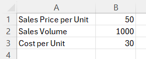
Let’s say I’m evaluating the profitability of a new product. The main factors that could impact profitability are:
- Sales Price per Unit: $50
- Sales Volume: 1,000 units
- Cost per Unit: $30
The goal is to calculate the Profit using the formula:
Profit=(Sales Price per Unit×Sales Volume)−(Cost per Unit×Sales Volume)
Now, I want to perform a sensitivity analysis to see how changes in the Sales Price and Sales Volume impact Profit.
STEP 1: Enter the sales price per unit, sales volumne and cost per unit.
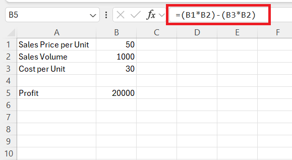
STEP 2: Calculate the Profit using the formula below –
=(B1 * B2) – (B3 * B2)
This formula multiplies the Sales Price per Unit by the Sales Volume, subtracts the Cost per Unit multiplied by the Sales Volume, and gives you the Profit.
Create a One-Variable Data Table
Let’s start by analyzing how changes in the Sales Price affect Profit, assuming Sales Volume and Cost per Unit remain constant.
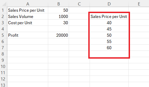
STEP 3: List the Variable Values
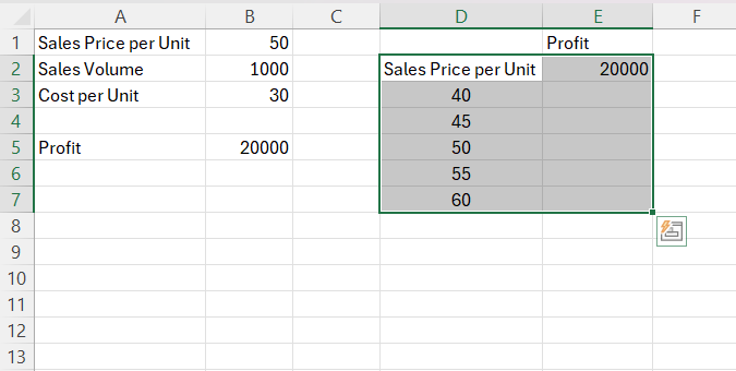
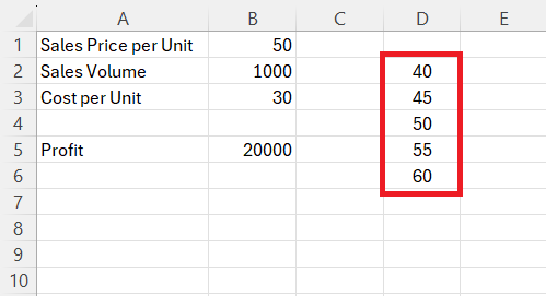
In column D, starting from cell D3, list a range of sales prices you want to test, e.g., 40, 45, 50, 55, 60.
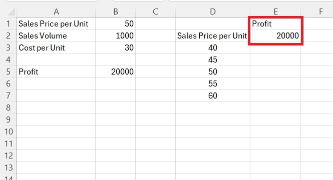
In cell E2, enter the profit value = B5.
STEP 4: Set Up the Data Table: Highlight the range D2:E7 (where you’ve listed the sales prices and the Profit formula).
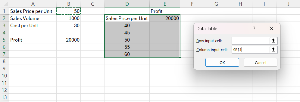
STEP 5: Go to the Data tab, click on What-If Analysis, and choose Data Table.
STEP 6: In the Column Input Cell field, select the cell B1 (Sales Price per Unit). Click OK.
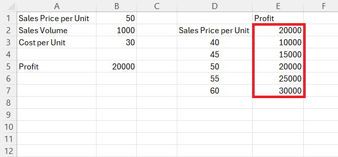
Excel will fill in the profit values for each sales price, allowing you to see how changes in the Sales Price affect Profit.
Create a Two-Variable Data Table
Now, let’s analyze how changes in both Sales Price and Sales Volume affect Profit.
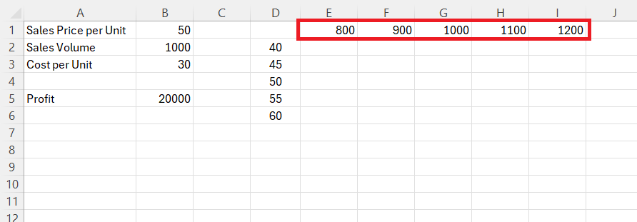
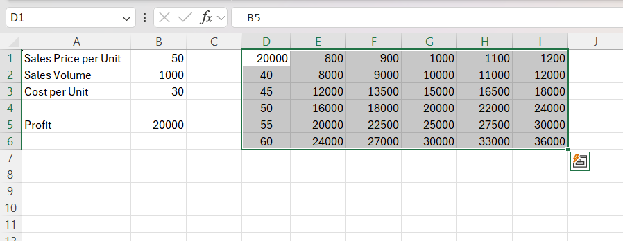
STEP 3: Set Up the Table Structure:
In cells D2 through D6, enter the sales prices you want to test (e.g., 40, 45, 50, 55, 60).
In cells E1 through I1, enter the sales volumes you want to test (e.g., 800, 900, 1000, 1100, 1200).
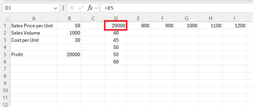
STEP 4: Reference the Output (Profit): In cell D1, reference the Profit cell by typing =B5.
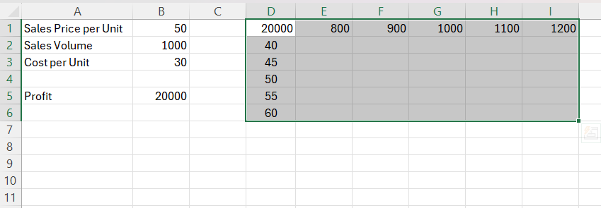
STEP 5: Highlight the range D2:I6 (including the Sales Prices, Sales Volumes, and the Profit formula).
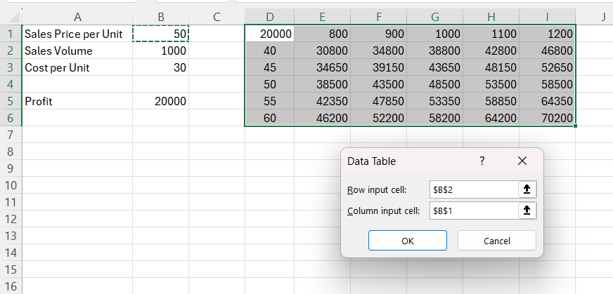
STEP 6: Go to the Data tab, click on What-If Analysis, and choose Data Table.
STEP 7: In the Row Input Cell field, select the cell B2 (Sales Volume). In the Column Input Cell field, select cell B1 (Sales Price). Click OK.
Excel will fill in the profit values for each combination of Sales Price and Sales Volume.
Analyze the Results
Once the data tables are populated, I usually examine the results to identify which inputs have the most significant impact on profit.
- One-Variable Data Table: Here, I can see how changes in Sales Price alone affect Profit.
- Two-Variable Data Table: This gives me a more comprehensive view, showing how different combinations of Sales Price and Sales Volume impact Profit.
Tips & Tricks for Sensitivity Analysis
Essential Components of a Sensitivity Analysis Template
To construct an effective sensitivity analysis template in Excel, I always ensure it comprises several essential components. The core of the template rests upon a clear and intuitive structure that distinguishes inputs from outputs, creating a transparent workflow. Here are the indispensable parts I incorporate:
- Assumptions Area: This is where all the variable inputs that will be tested live. I place them separately from the rest of the model to avoid confusion.
- Data Tables: They form the heart of the template, allowing me to input different values for the variables and generate outcomes. Both one-variable and two-variable data tables are included for comprehensive testing.
- Results Section: Directly linked to the data tables, this section shows the outcomes of the analysis clearly, allowing immediate interpretation of the impact each variable has on the model.
- Charts and Graphs: A picture speaks a thousand numbers; hence, I integrate visuals that automatically update with the data tables to graphically represent the analysis.
- Documentation Area: An often-overlooked section where I note the purpose of the analysis, the rationale behind the choice of variables, and any specific instructions on how to use the template.
- Sensitivity Analysis Range Area: It is here where I tabulate the different scenarios to be evaluated against each input variable.
By combining these components, I create not just a tool, but a communication aid that speaks to the dynamics of the financial model with clarity and depth. I’ve found that such templates become invaluable assets that enhance understanding and drive strategic insights for all users.
Designing an Intuitive Layout for Your Data Table
When designing a data table layout for sensitivity analysis in Excel, I always prioritize ease of use and clarity. My aim is to craft an environment where the flow of information is logical and outcomes are clear at a glance. Here’s how I create an intuitive layout:
- Logical Grouping: I start by grouping related variables and results, segmenting the worksheet to avoid confusion. This makes the structure comprehensible, even for someone unfamiliar with the model.
- Clear Labeling: Every variable, assumption, and outcome is clearly labeled to ensure transparency in what is being analyzed. I avoid jargon to make the table accessible to all stakeholders involved.
- Consistent Formatting: To differentiate between inputs, outputs, and calculated fields, I use a consistent color-coding scheme. This visual cue quickly guides the eye to the right spots on the table.
- Sufficient Spacing: I avoid making the table too dense. Ample spacing between sections prevents the crisscross of lines and numbers from overwhelming the user.
- Direct Linkage: All inputs in the table link directly to outputs in the financial model. Changes in the data table reflect immediately in the results area, allowing for instant visual feedback.
Creating a data table that’s easy to navigate and understand is not just about visual appeal; it’s about building a powerful analysis tool that enhances comprehension and facilitates smarter business decisions. It’s about turning the complex into the manageable.
FAQs
What is the purpose of sensitivity analysis in Excel?
The purpose of sensitivity analysis in Excel is to investigate how different input values of variables affect a model’s outputs. It enables the forecasting of financial outcomes under various scenarios, thereby aiding in risk assessment and decision-making.
Can I perform sensitivity analysis with more than two variables?
Yes, you can perform sensitivity analysis with more than two variables in Excel, although it becomes more complex. Using advanced tools like Scenario Manager or simulations can handle multiple variable adjustments.
How do you ensure accuracy when building a sensitivity table?
To ensure accuracy when building a sensitivity table, thoroughly validate all input data, use consistent formulas, and double-check your table against the financial model for alignment. Conduct peer reviews or audits for an extra layer of verification.
Are there any shortcuts or tools that can simplify the process?
Yes, Excel has shortcuts and tools like Data Tables, Scenario Manager, and Goal Seek that simplify sensitivity analysis. Third-party add-ins and Excel’s Analysis ToolPak can also streamline the process and enhance functionalities.
Can you do sensitivity analysis in Excel?
Yes, Excel is well-equipped to perform sensitivity analysis through features like Data Tables, Scenario Manager, and various charting tools, making it a suitable platform for such financial modeling tasks.
John Michaloudis is a former accountant and finance analyst at General Electric, a Microsoft MVP since 2020, an Amazon #1 bestselling author of 4 Microsoft Excel books and teacher of Microsoft Excel & Office over at his flagship MyExcelOnline Academy Online Course.

