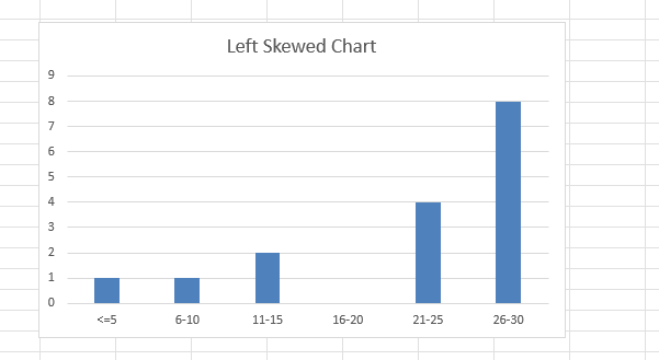
Understanding data distribution is an important part of data analysis in Excel. A common situation is when your data is not symmetrical and instead shows skewness. In this guide we focus on a left-skewed graph, also called negatively skewed. This type of distribution has a longer tail on the left side, meaning more of the data points are clustered toward higher values with fewer small values pulling the mean downward. Visualizing this correctly in Excel as a skewed left graph helps you interpret your data more accurately, whether you are analyzing sales, exam scores, or business metrics.
Key Takeaways
- A left-skewed graph (negatively skewed) has a longer tail on the left side.
- Excel does not label skewness directly, but you can build histograms and charts to show it.
- Using functions like
COUNTIFSandFREQUENCYhelps calculate distribution bins. - Formatting the chart properly highlights the skewed pattern clearly.
- You can also compute skewness with the
SKEWfunction in Excel for numeric analysis.
Table of Contents
What is a Left-Skewed Distribution?
A left-skewed distribution is one where the mean is less than the median and mode. The tail of the graph extends to the left because of a smaller set of very low values. For example, if you measured ages of people in a senior center, a few very young visitors may pull the graph’s tail to the left.
How to Create a Skewed Left Graph in Excel
Enter your raw dataset in a column. For this example we use values such as 5, 6, 6, 7, up to 30 with more higher numbers than lower.
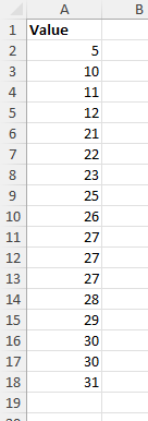
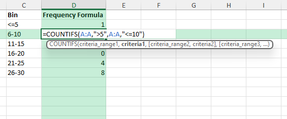
Create bins for grouping the values, for example 0–5, 6–10, 11–15, and so on.
Use the COUNTIFS function to count how many values fall into each bin.
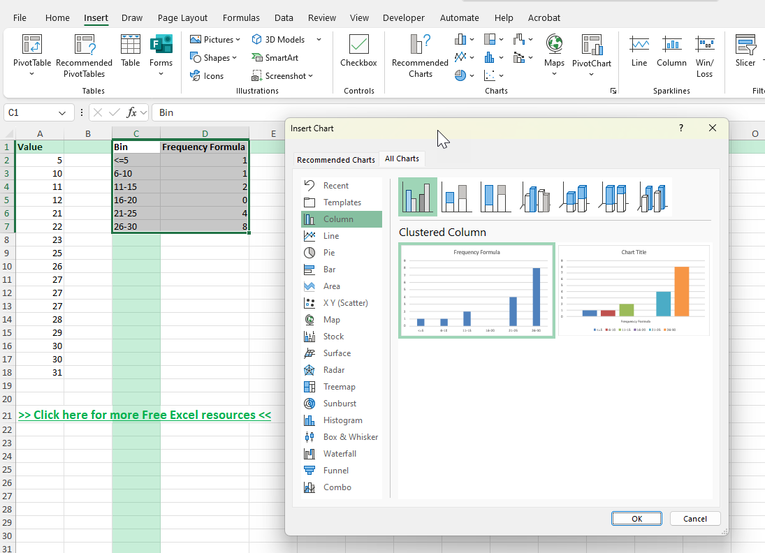
Go to Insert >Charts > Clustered Column to create the distribution graph.
Using COUNTIFS for Histogram Data
Below is an example formula for counting values between 6 and 10:
=COUNTIFS(A:A,">5",A:A,"<=10")
This will count how many values fall between 6 and 10 in column A. Repeat with different ranges to create all the bins you need.
Calculating Skewness with Excel
Excel provides the =SKEW(range) function. For a left-skewed dataset the result will be negative. This is a quick way to confirm the direction of skewness without relying only on the chart.
Common Mistakes or Tips
Wrong bin sizes: Choosing too wide or too narrow bins can hide the skewness. Start with equal intervals such as 5 or 10 units.
Confusing left with right skew: Remember that left-skew has the longer tail on the smaller value side, not the larger side.
Forgetting to label axes: Always label your axes so the chart is clear to others reading it.
Not checking skew numerically: Use the SKEW function to confirm what the graph suggests.
Bonus Tips and Advanced Scenarios
Use Conditional Formatting: Highlight the lowest values in the dataset to visualize which ones create the left tail.
Power Query: Load data into Power Query, group by ranges, and then load it back for an automated histogram table.
VBA Macro: Automate bin calculation or histogram creation with VBA if you handle skewed data often.
Use Cases for Left-Skewed Graphs
Income distribution: In many populations, most individuals may earn moderate to high incomes, while only a small number earn very low incomes. This results in a concentration of data points at the higher end with a tail extending toward the lower incomes. When graphed in Excel, the histogram will show most bars clustered on the right side and a stretched left tail. Analysts can use this to highlight income inequality or detect outliers in salary data during workforce or economic studies.
Test scores: Imagine a classroom where most students score between 70 and 100 on an exam, but a few students receive scores under 40. The majority of scores fall in the higher bins, but the few very low results extend the distribution leftward. A histogram in Excel would show a peak around the higher marks and a tail dragging toward the lower marks. This can help teachers identify whether the exam was generally well understood, while also flagging students who may need additional support.
Manufacturing defect rates: In a production environment, most items might last for their expected lifespan of several years, but a small number of products fail very early. These early failures pull the distribution toward the lower end, creating left skew. When charted in Excel, the histogram would have a long tail toward the shorter lifespans. Engineers often review such charts to study the cause of premature failures, evaluate quality control measures, and plan preventive maintenance schedules.
Survey responses: In customer satisfaction or employee engagement surveys, the majority of participants may give high ratings such as 8, 9, or 10 out of 10. However, a few participants may rate their experience very low, such as 1 or 2. Even if these low scores are rare, they create a left-skewed distribution by extending the lower tail. Visualizing this in Excel allows managers to see that although the overall sentiment is positive, a minority of very dissatisfied responses could significantly impact averages or reputation. This insight is useful for planning targeted follow-ups to address specific concerns.
Frequently Asked Questions
What does left-skewed mean in Excel?
It means the graph has a longer tail on the left side, with more values concentrated at the higher end.
How do I make a left-skewed graph in Excel?
By creating a histogram with bins and plotting the distribution. If the data is naturally left-skewed, the chart will show a long left tail.
Which function tells me skewness directly?
You can use the =SKEW(range) function. A negative result indicates left skew.
Can I adjust bin size in Excel histograms?
Yes. Right-click the horizontal axis, choose Format Axis, and set the bin width or number of bins.
What chart type is best for skewed data?
A histogram is the most direct way to show skewness, but you can also use box plots to highlight skewed distributions.

John Michaloudis is a former accountant and finance analyst at General Electric, a Microsoft MVP since 2020, an Amazon #1 bestselling author of 4 Microsoft Excel books and teacher of Microsoft Excel & Office over at his flagship MyExcelOnline Academy Online Course.


