How to Add Secondary Axis in Excel Fast – Step by Step Guide
Adding a secondary axis in Excel allows you to compare two sets of data with different scales within the same chart, enhancing data visualization.
This feature is particularly useful when you have varying data ranges that need to be displayed together for a comprehensive analysis.By adding a secondary axis, you can create a more informative and easily interpretable chart.
To add secondary axis, you can use the built-in options in Excel's chart tools, which provide a straightforward way to customize your chart's appearance and functionality. Key Takeaways:
Table of Contents
Introduction: Enhancing Your Excel Charts
The Need for a Secondary Axis
In my experience with complex data, I’ve often observed the necessity of a secondary axis in Excel charts to amplify understanding and presentation quality. When working with datasets featuring variables measured in different units or ranges, representing them clearly on a single graph becomes challenging.
Here is where a secondary axis comes into play, offering a separate scale for distinct data sets, thus ensuring both accuracy and visual clarity in the charts I create.
Understanding the Basics of Excel Charting
Embarking on the journey of Excel charting begins with grasping its core principles. I’ve learned that the foundation lies in selecting the right data and chart type that corresponds to the story the data is telling. Excel offers a plethora of chart options, but understanding when and how to use basic elements like the X-axis for categorical data and the Y-axis for numerical values is crucial.
For beginners, I recommend experimenting with the ‘Recommended Charts’ feature, which serves as a helpful guide. As you delve deeper, you’ll discover the power of customization, from simple bar charts to intricate dynamic ranges, all aimed to make your data speak volumes.
When to Use a Secondary Axis in Excel
Comparing Different Data Scales
When it comes to comparing different data scales, we face the unique challenge of showcasing variables that aren’t calibrated evenly.
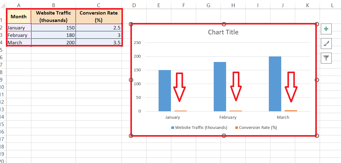
Take, for example, a dataset where one variable is in the range of thousands and another just between zero and one. Traditional single-axis charts would be inadequate, as they could either overemphasize one scale or underrepresent the other.
To depict such disparate scales coherently, I rely on Excel’s capability to create a secondary axis. This approach allows for an unbiased, side-by-side comparison, which enhances the decision-making process by providing a clearer picture of the relationship between the datasets.
Improving Chart Readability and Impact
Improving chart readability and impact is something I focus on intensely. After all, the more understandable a chart is, the more powerful its impact. By incorporating a secondary axis in Excel, we cater to the viewer’s ability to swiftly comprehend the data presented. This is especially critical when dealing with variables that can easily be overshadowed by larger scales.
The result is an amplified visual message that enables viewers to identify trends, correlations, and discrepancies with ease. I’ve seen first-hand how a well-structured dual-axis chart can turn an overwhelming spreadsheet into a compelling story, driving engagement and facilitating strategic decisions.
Step-by-Step Guide to Add a Secondary Axis
Adding Secondary Axis in Recent Versions of Excel (2013 and Above)
For those of us using the more recent versions of Excel, such as Excel 2013 and later, adding a secondary axis is a breeze, thanks to the intuitive design of the application. Here’s how I typically do it:
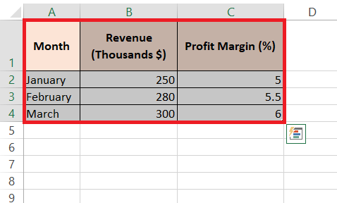
STEP 1: I start by selecting the dataset I want to represent.
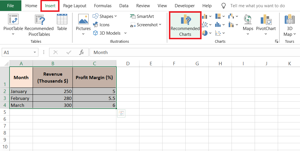
STEP 2: Next, I go to the Insert tab and look for the ‘Recommended Charts’ option within the Charts group. This opens up a world of pre-configured chart selections that Excel believes suit my data.
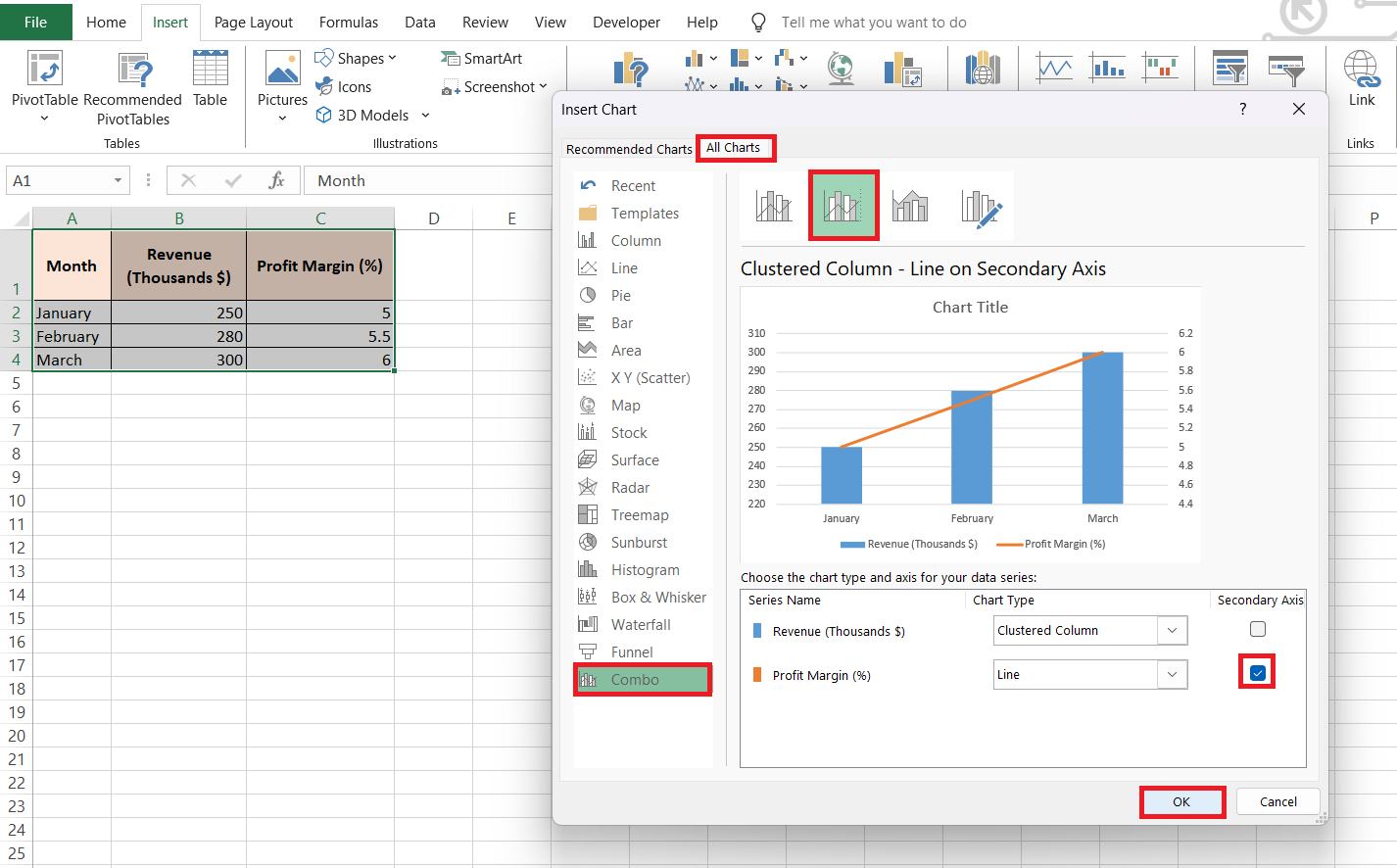
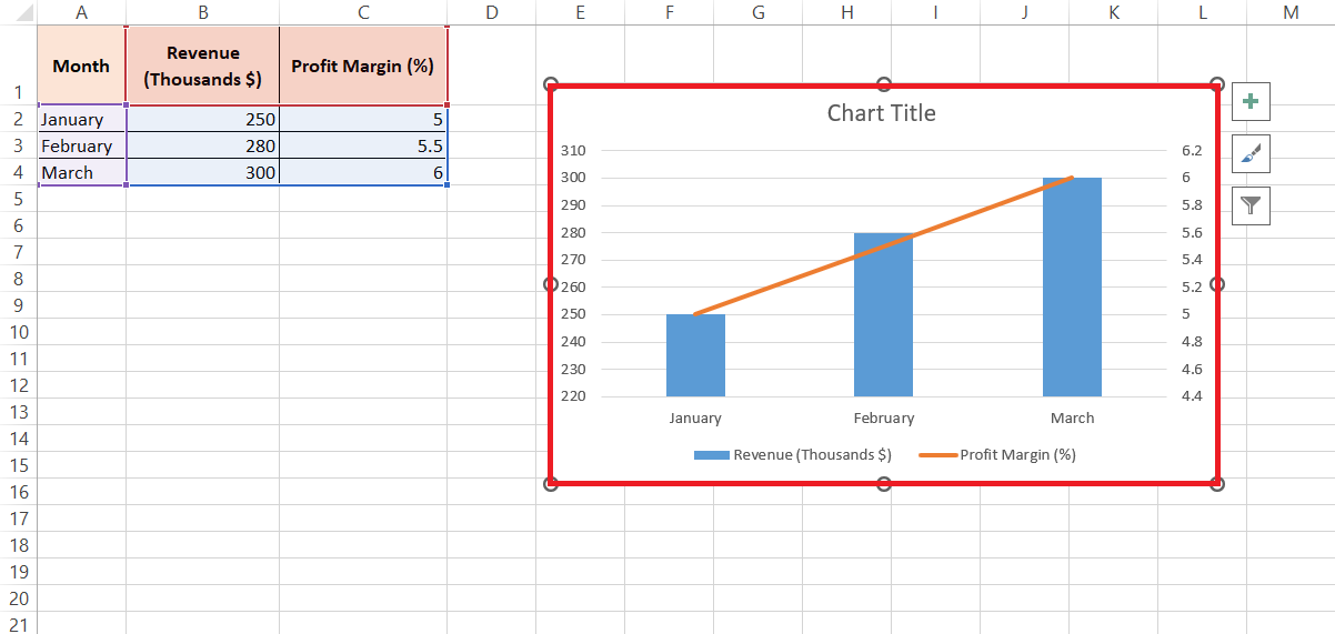
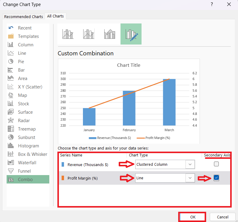
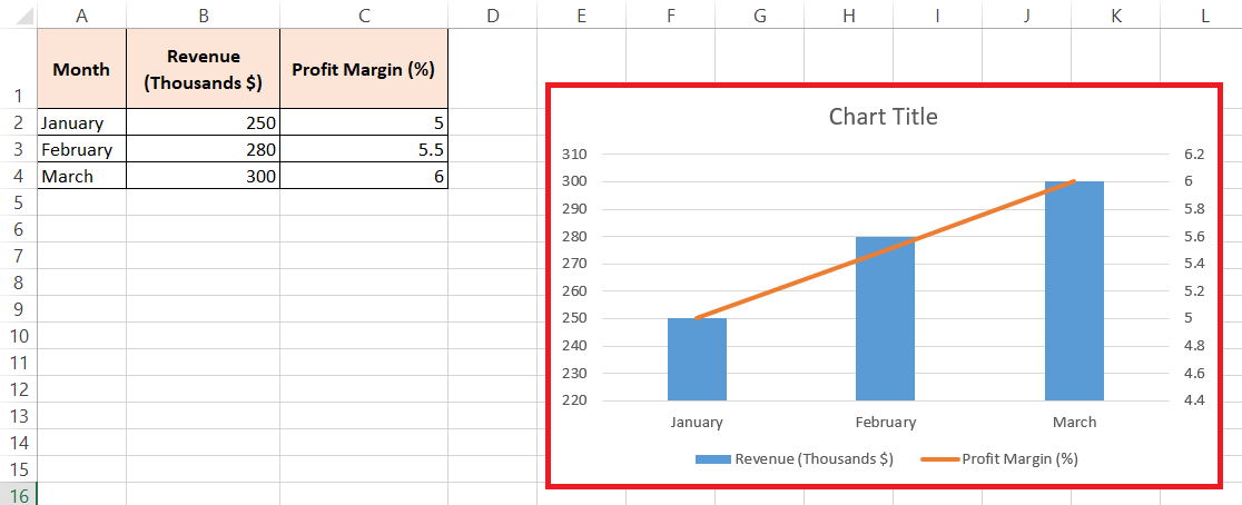
STEP 3: Scanning through the suggestions, I pick the one that already comes with a secondary axis, should it be available. If not then hover ‘All Charts’ > ‘Combo’ > Select 2nd Chart option > Check Line chart for Profit Margin (%). With just a click on OK, my chart takes shape, complete with a secondary axis, ready for any necessary adjustments.
RESULT:
This feature not only streamlines the creation of complex graphs but also ensures that time-based data, such as years or months, is automatically recognized and accurately placed on the axis, which is something I might have to do manually otherwise.
Customizing Your Secondary Axis
Changing the Chart Type for Secondary Data
Altering the chart type for data associated with the secondary axis is something I often do to enhance the visual distinction between two sets of data. Here’s what I generally recommend:
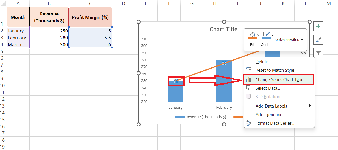
STEP 1: Once I’ve introduced a secondary axis to my Excel chart, I right-click on the data series that’s now linked to it. I select ‘Change Series Chart Type’ from the context menu.
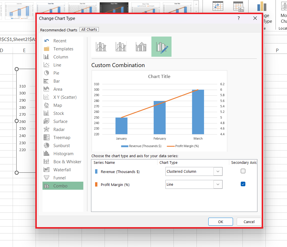
STEP 2: This now opens a new dialog.
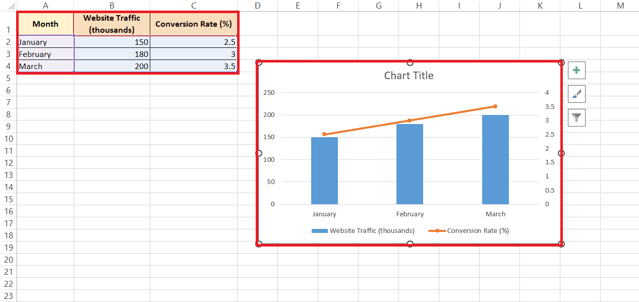
STEP 3: Here, I can choose a different chart type for my secondary data. Combining a column chart for my primary data with a line chart for my secondary data is a trick that tends to work wonders for contrast and clarity. After making my selection, a click on OK enacts the changes.
RESULT: Utilizing contrasting chart types in this manner doesn’t just help avoid confusion, it also captures attention where I intend.
This approach is a clever way to improve not only the readability of the chart but also its capacity to communicate key insights at a glance.
Formatting Tips for Clarity and Professionalism
In my pursuit of clarity and professionalism in Excel charts, I’ve gathered a few formatting tips along the way:
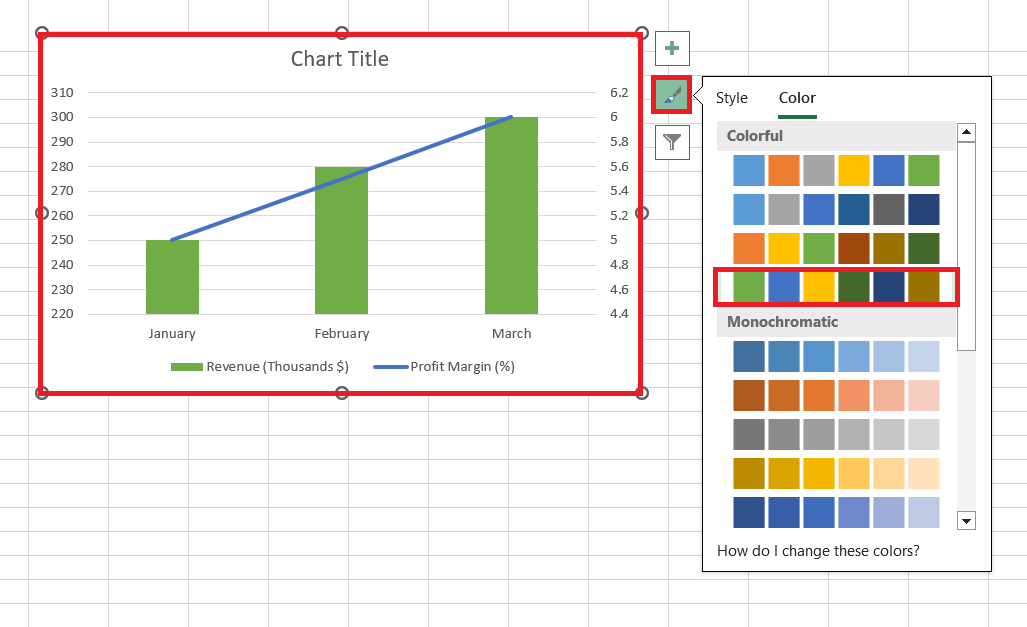
- Consistent Color Coding: I assign distinct, contrasting colors to the primary and secondary data series to differentiate them at first glance.
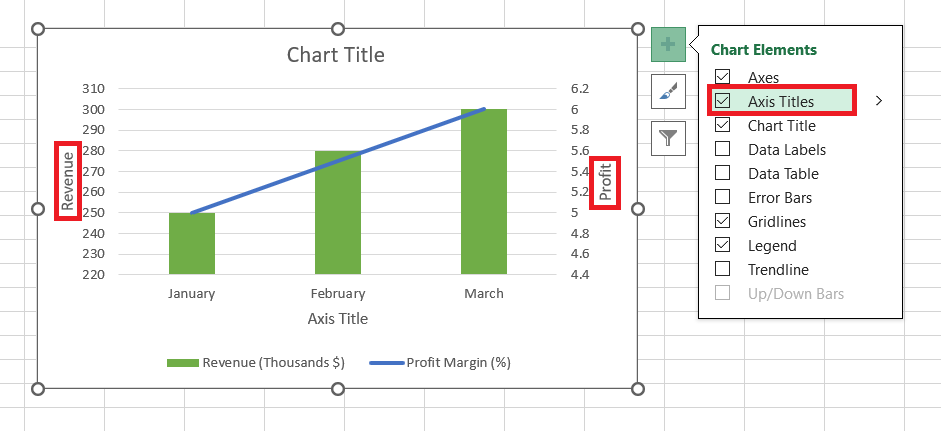
- Axis Labels: Ensuring that both axes are clearly labeled with their respective units of measurement demystifies any potential confusion.
- Gridlines and Tick Marks: I fine-tune these so they align with the primary data, adding a subtle guide without cluttering the chart.
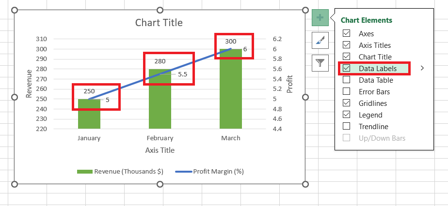
- Data Labels: When needed, I selectively add data labels to highlight specific points, but always keep them minimal to maintain a clean look.
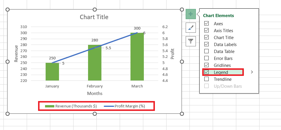
- Legend Customization: I make sure the legend accurately reflects the data series and their corresponding axes, usually placing it in a position where it complements the chart layout.
By adhering to these tips, I strive to transform raw data into charts that are not only analytically useful but also visually compelling and intuitive for any audience.
FAQ: Mastering Dual Axes in Excel
What is secondary axis in Excel chart?
A secondary axis in an Excel chart is an additional axis that allows for the representation of two scales of data within the same chart. This is particularly beneficial when you have data series with different units or scales that you want to compare simultaneously without skewing the graphical representation.
How do I add secondary series to an Excel graph?
To add a second series to an Excel graph, first insert your initial chart with the primary series. Then right-click on the data series that you want to display on a secondary axis, choose ‘Format Data Series,’ and select ‘Secondary Axis.’ Your second data will appear on a new axis, providing a clearer comparison.
How do I decide if my chart needs a secondary axis?
You’ll know your chart needs a secondary axis if you’re trying to compare data sets that have different measurement units or vastly different scales. If plotting them on a single axis causes one data set to be either dwarfed or overstated, that’s your cue to add secondary axis for accurate and meaningful comparison.
Can I add more than one secondary axis to an Excel chart?
Yes, you can add more than one secondary axis in Excel. However, it’s usually best to keep your charts simple for clarity. If you must compare multiple series with different scales, consider using multiple secondary axes judiciously to prevent your chart from becoming cluttered or confusing.
How to put the y-axis on the left side in Excel?
To position the Y-axis on the left side of an Excel chart, right-click on the axis you want to change, select ‘Format Axis,’ and under ‘Axis Options,’ look for ‘Labels.’ Choose ‘Low’ to move the axis labels to the left side of the chart, aligning them with the Y-axis on that side.
John Michaloudis is a former accountant and finance analyst at General Electric, a Microsoft MVP since 2020, an Amazon #1 bestselling author of 4 Microsoft Excel books and teacher of Microsoft Excel & Office over at his flagship MyExcelOnline Academy Online Course.


