Benchmark Charts or Budget Charts are a great way to show your actual sales versus your benchmark in a graphical way, highlighting the strong v weak months.
I will show you how to do this using Using Excel 2010.
Download excel workbookBenchmark-Chart-Excel-2010.xlsx
STEP 1: Enter your data into three columns, the month, the actual sales and the benchmark sales
STEP 2: Click inside your data and go to the ribbon and choose Insert > 2-D Clustered Column
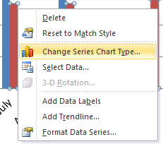
STEP 3: Select the Benchmark series chart and Right Click and choose the Change Series Chart Type
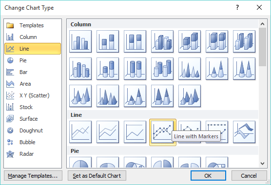
STEP 4: This will bring up the Change Chart Type dialogue box and you will need to select Line and Line with Markers
STEP 5: Click on the line chart and press CTRL+1. This will open up the Format Data Series dialogue box
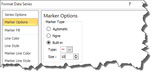
STEP 6: Select the Marker Options and choose Built In, select the horizontal line type and increase the Size to 10. You can also format the color of the line.
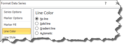
STEP 7: Select the Line Color and choose No Line and press OK!
HELPFUL RESOURCE:
John Michaloudis is a former accountant and finance analyst at General Electric, a Microsoft MVP since 2020, an Amazon #1 bestselling author of 4 Microsoft Excel books and teacher of Microsoft Excel & Office over at his flagship MyExcelOnline Academy Online Course.


