Stock Data Analysis is no easy feat! Once you have a lot of historical stock data it’s hard to visualize the trend using technical analysis. Thankfully Excel has a lot of stock charts to help you with that, and one of them is the Candlestick Chart!
In this example I show you how easy it is to insert this using Excel.
Key Takeaways
- Candlestick charts are primarily used for visualizing stock market trends, showing open, high, low, and close prices over a specific period.
- To create a candlestick chart in Excel, the dataset must include four columns: Open, High, Low, and Close prices for each time period (e.g., days, weeks).
- Excel has a Stock Chart option under the Insert tab, making it easy to generate candlestick charts without additional tools.
- Candlesticks are typically color-coded (e.g., green for price increases and red for price decreases) to help quickly identify market trends and reversals.
Table of Contents
The Data Setup
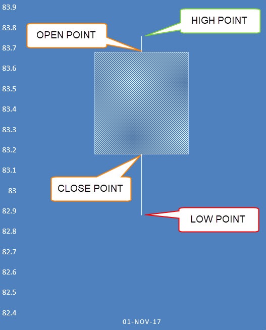
A Candlestick Chart has a vertical line that indicates the range of low to high prices and a thicker column for the opening and closing prices:
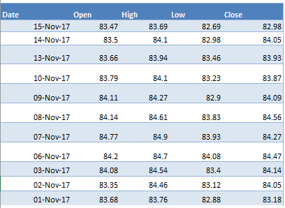
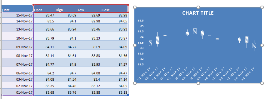
Below is the data source that we are going to use in Excel:
You need a Date column which should be the first column.
Then this should be followed by a Open, High, Low, and Close column. This is the exact order that needs to be followed in order to create the Candlestick Chart.
Candlestick Chart Using Excel
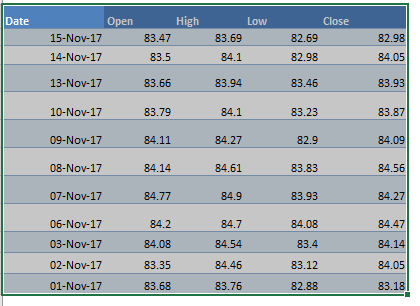
STEP 1: Highlight your data of stock prices:
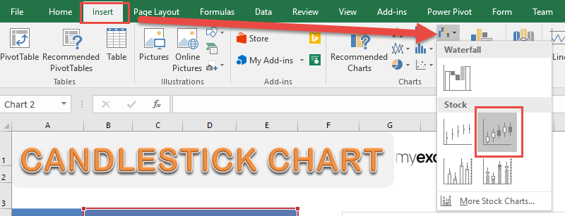
STEP 2: Go to Insert > Stock Charts > Open-High-Low-Close
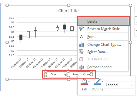
STEP 3: Right click on your Legend and choose Delete as we do not need this.
STEP 4: Go to Chart Tools > Design and select the preferred design to make your chart more presentable!
And there you have it! Your own Candlestick Chart!
Frequently Asked Questions
Why is my candlestick chart not displaying correctly?
It could be an issue with the formatting – Ensure that the Open, High, Low, and Close values are in the correct order and formatted as numbers.
Can I change the colors of the candlestick chart?
Yes, you can customize the colors of the candlestick chart. Right-click on the chart, select Format Data Series, and modify the fill colors for up (bullish) and down (bearish) candlesticks to improve visibility.
Can I add trend lines or technical indicators to my candlestick chart in Excel?
Yes, Excel allows you to add trend lines by selecting the chart and choosing Chart Elements > Trendline. However, for more advanced indicators like moving averages or Bollinger Bands, you may need to manually calculate and overlay them using additional data series.

Bryan
Bryan Hong is an IT Software Developer for more than 10 years and has the following certifications: Microsoft Certified Professional Developer (MCPD): Web Developer, Microsoft Certified Technology Specialist (MCTS): Windows Applications, Microsoft Certified Systems Engineer (MCSE) and Microsoft Certified Systems Administrator (MCSA).
He is also an Amazon #1 bestselling author of 4 Microsoft Excel books and a teacher of Microsoft Excel & Office at the MyExecelOnline Academy Online Course.
