When your data contains very large and very small values, and you plot a graph, it may look like a skewed chart. In such situations, a logarithmic scale can make the chart easier to read and understand. In this article, you will learn all about the Logarithmic Scale In An Excel Chart.
Key Takeaways:
- A logarithmic scale displays small and large values clearly on the same chart.
- You can enable it using the Format Axis option.
- Excel uses base 10 by default, but you can change it if needed.
- It is useful for growth trends and large data ranges.
- It does not support zero or negative values.
*** Watch our video and step by step guide below with a free downloadable Excel workbook to practice ***

Table of Contents
Introduction to Logarithmic Scale
What is Logarithmic Scale?
When a dataset contains both very small and very large values, a regular chart can become skewed. The smaller data becomes difficult to read.

You will have to change the scale of such data so that the chart is legible.
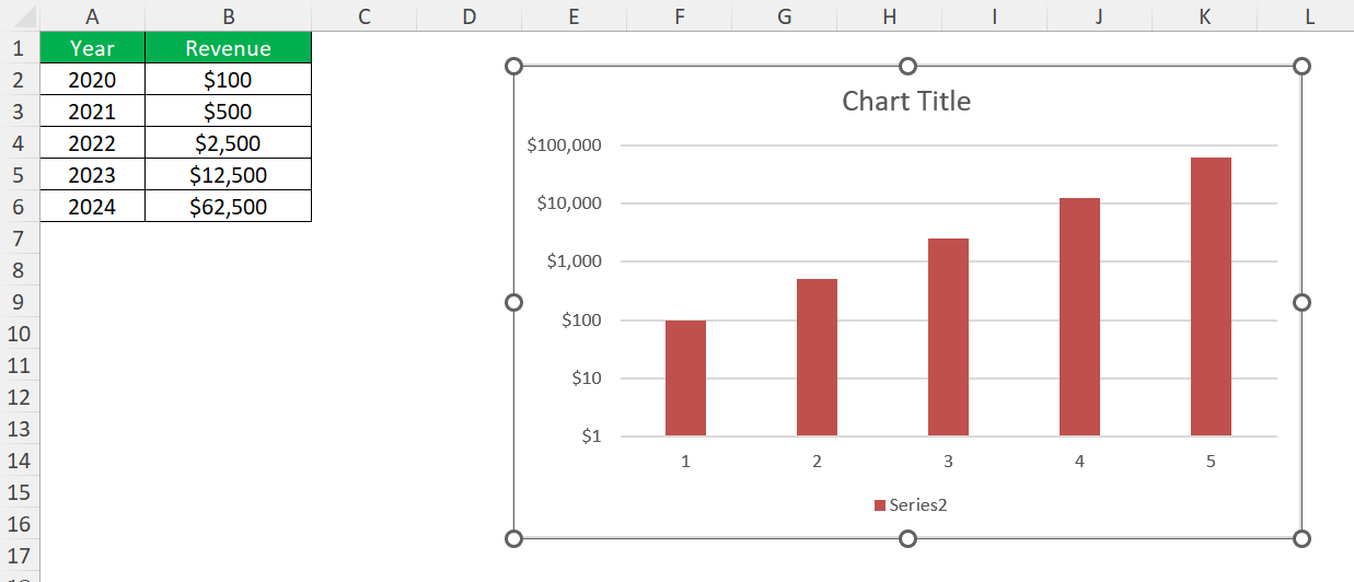
A logarithmic scale is a scale that increases by multiplication and not addition. It multiplies the vertical axis units by 10, so it starts at 1, 10, 100, 1000, 10000, 100000, 1000000 etc. This scales the chart to show a more even spread, like the image below:

Why Use a Logarithmic Scale?
- It allows very small and very large values to appear on the same chart.
- It can be used to show growth trends.
- It allows easy comparison when values differ significantly.
- Equal percentage changes appear as equal distances on a logarithmic scale.
How to use Logarithmic Scale In An Excel Chart
Step-by-Step Guide
Follow the steps below to use a logarithmic scale in an Excel Chart:
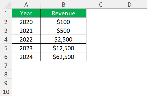
STEP 1: Enter your data into a worksheet.
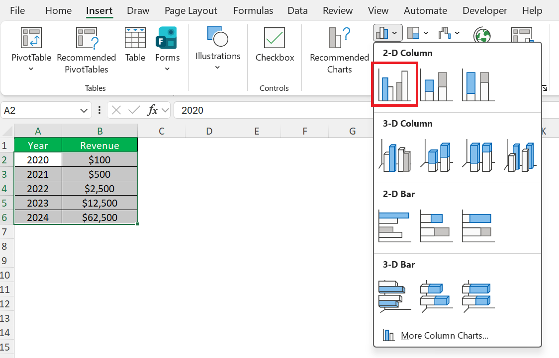
STEP 2: Go to the Insert tab and create a chart.
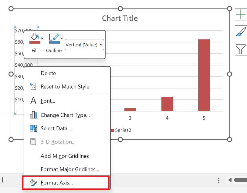
STEP 3: Click the vertical axis, right-click it, and select Format Axis.
STEP 4: Under Axis Options, enable Logarithmic Scale.
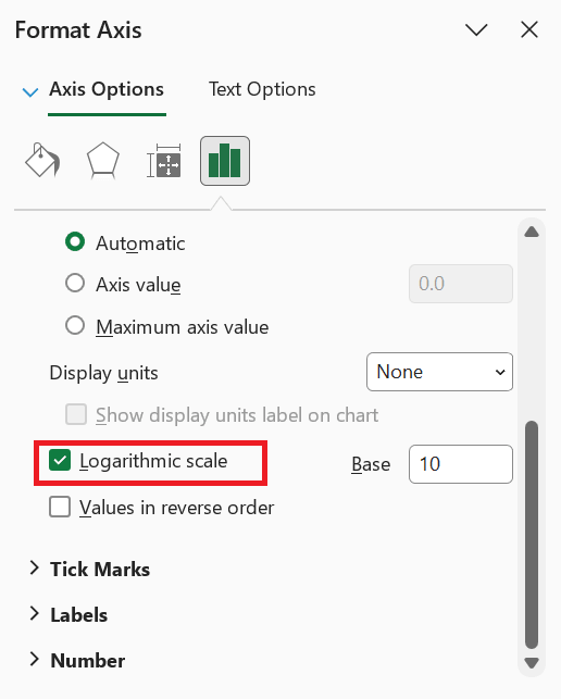
Once enabled, Excel automatically adjusts the chart axis to display values using a logarithmic progression.
Logarithmic Base
The base determines how values increase on the scale. By default, the value is set to 10.
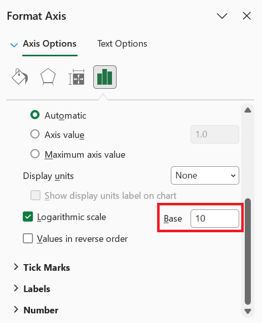
If you change the value to 2, the values will increase by multiples of 2.
Limitations of Logarithmic Scale
- A logarithmic scale cannot handle zero because the logarithm of zero is undefined.
- Negative numbers cannot be plotted on a standard logarithmic axis.
- Some users may not understand logarithmic scales.
- If the values are already close together, a linear scale is usually better.
FAQs
How to apply a logarithmic scale to an Excel chart?
- Right-click the axis
- Select Format Axis
- Check the Logarithmic scale option under Axis Options.
What base should I use for a logarithmic scale in Excel?
The default base is 10, but you can change it to another value depending on your data distribution.
Can I use a logarithmic scale if my data contains zero or negative values?
No, logarithmic scales only work with positive numbers. You may need to adjust your data or use a different visualization approach.
Why would I use a logarithmic scale instead of a linear one?
A logarithmic scale is useful when your data spans a wide range. It compresses large values and expands small values for better visualization.
Can I apply a logarithmic scale to both axes in an Excel chart?
Yes, you can set both the X-axis and Y-axis to logarithmic by formatting each axis separately in the chart settings.


John Michaloudis is a former accountant and finance analyst at General Electric, a Microsoft MVP since 2020, an Amazon #1 bestselling author of 4 Microsoft Excel books and teacher of Microsoft Excel & Office over at his flagship MyExcelOnline Academy Online Course.


