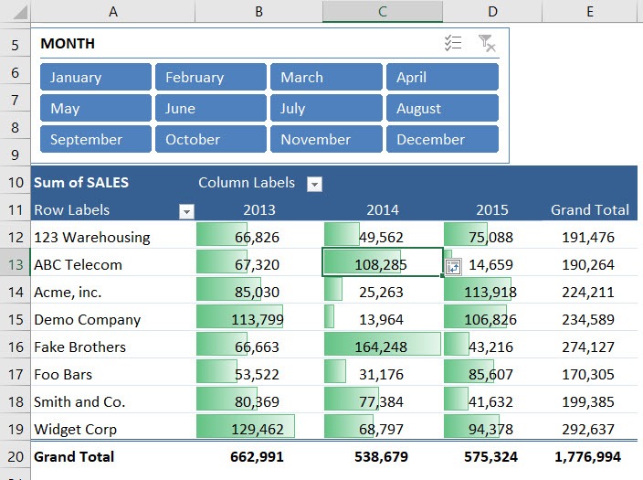
I still remember the first time I discovered Data Bars in Excel. I was fully immersed in spreadsheet mode, surrounded by rows of numbers from a quarterly sales report, and desperately needed a better way to make the trends stand out. Highlighting top values wasn’t effective enough, and using color scales made the entire sheet look like it belonged in a rainbow factory. That’s when I stumbled upon Data Bars — clean, intuitive, and visually powerful. Since then, I’ve never looked at Pivot Tables the same way.
In this guide, I’ll show you how I conditionally format a Pivot Table with Data Bars in Excel. This process isn’t just about making your spreadsheet look attractive — it’s about turning raw numbers into clear, visual insights, all without writing a single formula or line of code.
Key Takeaways:
- Data Bars turn Pivot Table values into visual bars, making comparisons easier at a glance.
- You can choose from Gradient or Solid Fill styles, and customize colors through ‘More Rules’.
- Use the Formatting Options icon to apply Data Bars across the entire Pivot Table.
- Exclude Grand Totals from the formatting to prevent them from skewing the visual scale.
- Data Bars work best with numeric values and remain intact even after refreshing your Pivot Table.
Table of Contents
Understanding Data Bars and Their Purpose
What Are Data Bars?
As someone who spends way too much time staring at Excel, I’m always hunting for ways to make my data more readable — and honestly, less soul-crushing. That’s how I discovered Data Bars — a super slick feature under Conditional Formatting that lets your numbers do more than just sit there.
Here’s what makes them awesome: Data Bars add a colored bar inside a cell based on the value it contains. The longer the bar, the higher the value. Simple, but very effective. It’s kind of like turning your spreadsheet into a mini bar chart — no separate chart needed.
Even better, these bars don’t replace your data; they sit behind the number. You still get to see the raw value, but now with a visual cue that says, “Hey, this one’s bigger!”
And you’ve got choices:
- Gradient Fill: A sleek fade from color to transparent.
- Solid Fill: Bold and direct.
- Color options: Blues, greens, oranges, and more — or go full custom with the “More Rules” menu.
I usually start with a gradient fill and tweak as needed — because yeah, I’m that Excel nerd who wants the bars to look good too.
Why Use Data Bars in Pivot Tables?
Okay, now you might be wondering: “Why apply these to Pivot Tables?”
Pivot Tables are the bread and butter of data analysis in Excel — they summarize massive data sets, make patterns easier to spot, and let you slice and dice numbers like a pro. But let’s face it, they can look bland. Especially when you’re presenting to someone who isn’t used to reading tabular data.
That’s where Data Bars come in. They act as a visual assistant, bringing out the high and low performers instantly.
For example:
- Sales data across regions? You’ll spot your top market in seconds.
- Monthly performance metrics? See which month broke records at a glance.
- Inventory reports? Know which item is understocked without squinting.
I find Data Bars especially useful when I’m sharing dashboards with teams who don’t live in Excel. The visuals tell the story before I even start talking.
Steps to Conditionally Format a Pivot Table with Data Bars
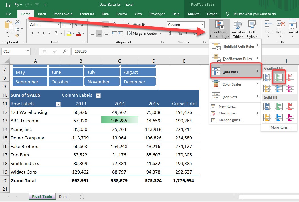
STEP 1: Select any value inside the Pivot Table. Go to Home > Conditional Formatting > Data Bars > Any Gradient Fill
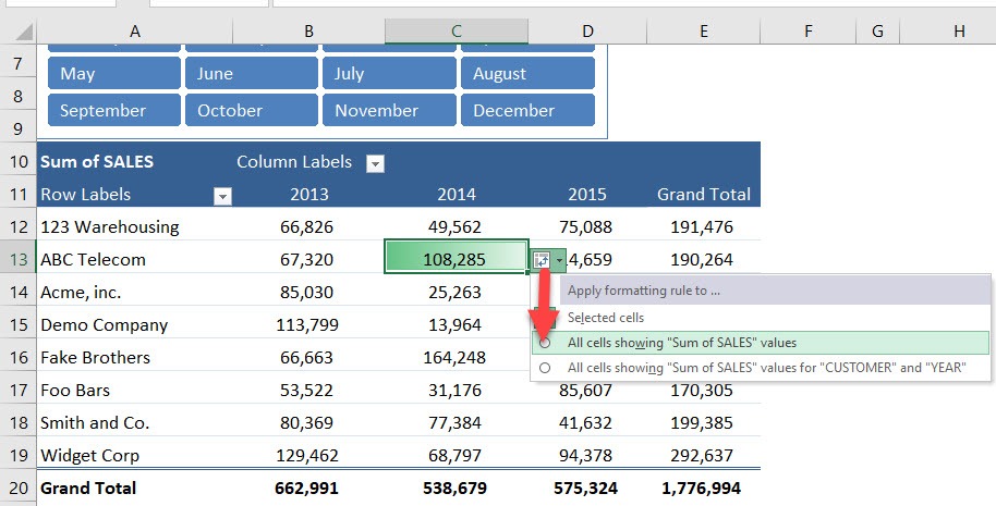
STEP 2: Go to Formatting Options Icon and select the second option to apply the data bar formatting to the entire table.
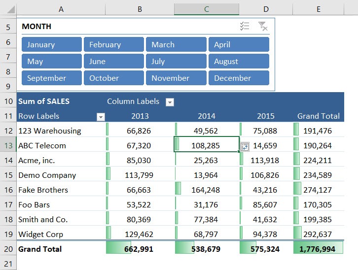
Now you have data bars showing up for the entire pivot table.
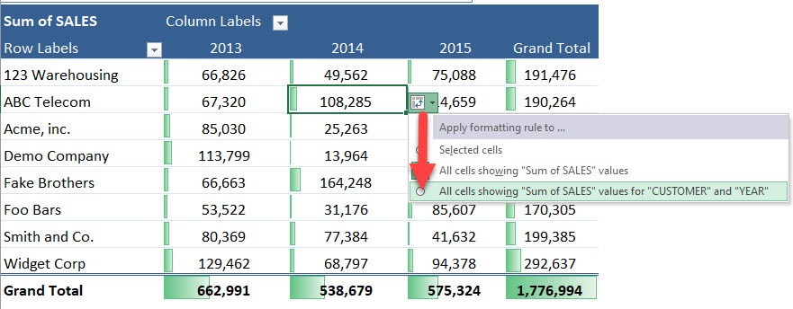
STEP 3: Go to Formatting Options Icon and select the third option to apply the data bar formatting to the entire table while excluding the total column and row.
You get a better visual representation as the totals do not affect the data bars!
Advanced Tips & Tricks
Let me throw in a few quick pointers I’ve learned the hard way:
- Only Numeric Values Work: You can’t apply Data Bars to text fields. Pivot Table value fields only.
- Use “Show Values As” Smartly: If you’re showing values as percentages of total or running totals, the Data Bars still work — but make sure the scale makes sense visually.
- Don’t Use Too Many Conditional Formats: It might look cool, but your workbook will get sluggish if you stack a hundred formatting rules.
- Copy Formatting with Format Painter: Want the same Data Bar style on multiple Pivot Tables? Use the Format Painter and spread the style like butter.
- Pivot Table Refresh Won’t Remove the Bars: Formatting stays even when you refresh the Pivot Table — unless you remove fields or mess with the layout drastically.
FAQs
1. Can I conditionally format a Pivot Table with Data Bars in one go?
Yes! After applying a Data Bar to a single cell, you’ll see a small formatting icon pop up near it. Click this icon and select the second option: “Apply formatting rule to entire table.” This extends the visual formatting across the full Pivot Table instantly. No need to manually select every cell.
2. Why should I exclude totals from Data Bar formatting?
Grand Totals are usually much higher than individual values, which skews the Data Bar scale. This causes bars for the normal values to appear disproportionately small, making the whole table harder to read. By excluding the total row and column using the third option in the Formatting icon, you get a cleaner, more accurate visual. It helps highlight individual performance without totals drowning everything else.
3. Can I customize the look and behavior of Data Bars?
Absolutely. Go to Conditional Formatting > Manage Rules > Edit Rule to open up advanced options. There, you can choose custom colors, decide how minimum and maximum values are calculated, and even reverse bar direction. This is especially useful if your data includes negative values or if you want the bars to match a specific color scheme or branding.
4. Will my Data Bars disappear when I refresh the Pivot Table?
Nope, they stay right where you left them! As long as you don’t remove fields or drastically change the layout, the formatting will persist even after a refresh. That means your visual enhancements survive data updates — which is exactly what you want in a dynamic reporting setup.
5. Do Data Bars work with percentages or non-numeric values in Pivot Tables?
Data Bars are designed for numeric values only — they won’t apply to text fields or categories. However, they do work with percentage-based fields, such as “% of Grand Total” or “Running Total”, as long as the data type remains numeric. Just double-check that the visual scale still makes sense with how percentages are distributed in your data.
John Michaloudis is a former accountant and finance analyst at General Electric, a Microsoft MVP since 2020, an Amazon #1 bestselling author of 4 Microsoft Excel books and teacher of Microsoft Excel & Office over at his flagship MyExcelOnline Academy Online Course.

