Free Practice Workbook
A Sunburst Chart is a hierarchical data visualization tool that displays categories in a circular layout. They show hierarchical data, like a table with different levels of categorization. In this article, you will learn how to create an Excel sunburst chart.
Key Takeaways
- A Sunburst Chart displays hierarchical data in a circular format.
- It helps compare categories and their subcategories in one chart.
- Your data should be organized into multiple hierarchy levels.
- You can customize the chart using Excel’s Design and Format tools.
- Sunburst Charts work best for showing relationships within grouped data.
Table of Contents
What is an Excel Sunburst Chart?
The Excel Sunburst Chart is a built-in chart in Excel 2016 used to display hierarchical data in a circular format.
Just like a doughnut chart, a sunburst chart is also used to display a part of the whole data and compare relative sizes. But it can also show the relationships in the hierarchy.
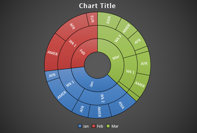
This is what an Excel Sunburst Chart looks like:
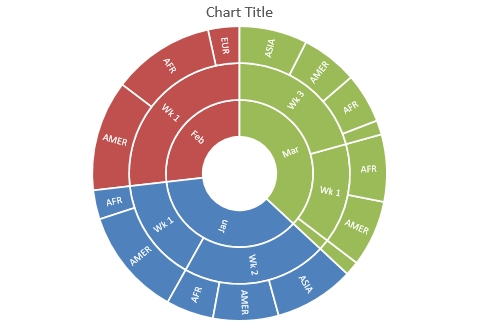
Since this chart looks somewhat like an exploding sun, it is called a Sunburst Chart.
Each level of the hierarchy is represented by a circle or ring, with the innermost ring representing the top of the hierarchy data and the outermost ring representing the last hierarchy.
Each group is represented by a different color, and the subgroups are represented by a division. In the example above, January is represented by the blue color, and the subgroups like week and region are represented by different divisions.
How to Create a Sunburst Chart in Excel 2016?
Example 1:
In the table, you have sales data containing the month, week, region, and sales amount.
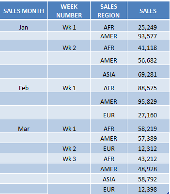
Using this table, I show you how easy it is to insert an Excel Sunburst Chart using Excel 2016.
To upgrade to Excel 2016 you can use this link here: Microsoft Office 2016
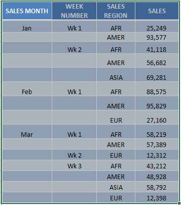
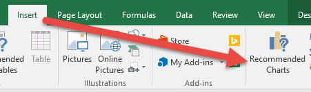
STEP 1: Highlight your table and go to Insert > Recommended Charts
STEP 2: Select All Charts > Sunburst > OK
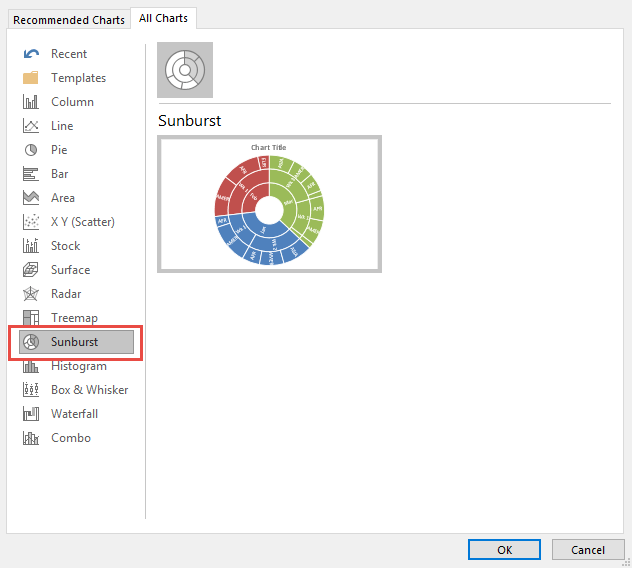
STEP 3: Now you have your Sunburst Chart.
STEP 4: You can further customize the look and feel of your Sunburst Chart by going to Chart Tools > Design / Format

STEP 5: In our example, let us go to Chart Tools > Design and pick one of the alternate designs.

Now you have your beautiful looking Sunburst chart and you can quickly point out to your management where the biggest slice of the pie would be on…
Let’s take a look at another example!
Example 2:
In the table below, you have the number of employees in a company based on the company’s organizational structure.
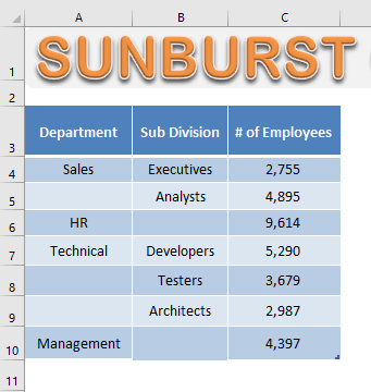
STEP 1: Select the Data Table.
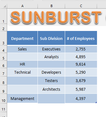
STEP 2: Go to Insert > Hierarchy Chart > Sunburst Chart.
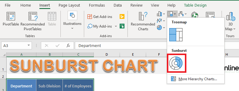
STEP 3: Your Sunburst Chart is ready!
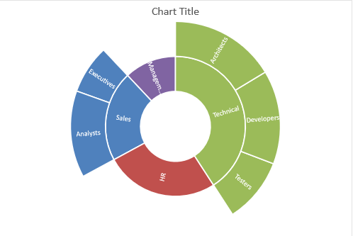
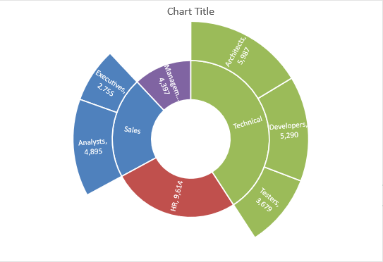
In this chart, you can see the proportionate number of employees in each department and subdivision.
It is clear that the maximum number of employees is in the technical department and the least number is in the Management department.
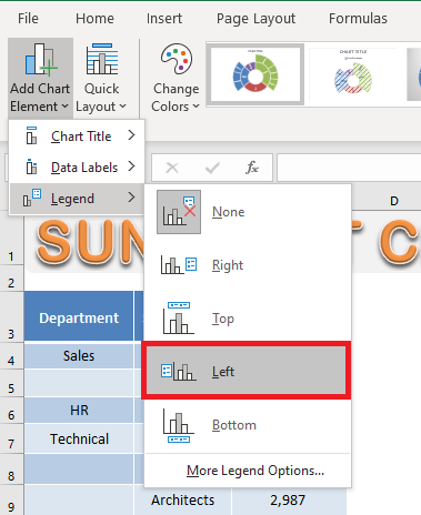
You can even add Legends to your chart.
STEP 4: Go to Chart Design > Add Chart Element > Legend > Left.
STEP 5: Legend will be added to the left of your Chart.
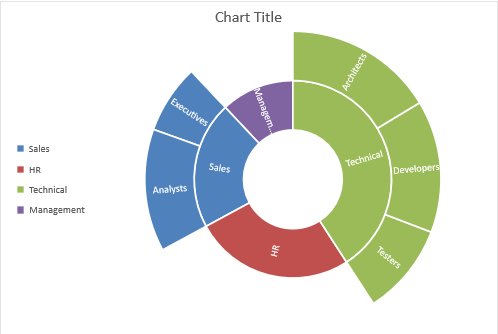
By default, the category name will be displayed on the chart. You can even add value to it.
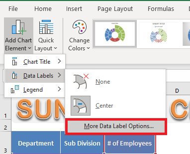
STEP 5: Go to Chart Design > Add Chart Element > Data Labels > More Data Label Options.
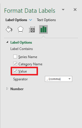
STEP 6: In the Format Data Labels dialog box, check the Value box.
Value will be displayed next to the category name:
Now that you have learned how to create a Sunburst Chart in Excel, let’s move forward and know about the advantages and disadvantages of using them.
Advantages and Disadvantages
The advantages of using an Excel Sunburst Chart:
- It can be used to show relationships in the hierarchy.
- It can be used to show the breakdown of different categories.
The disadvantages of using a Sunburst Chart in Excel are:
- It is hard to display labels on the Sunburst Chart.
- Data must be sorted by category.
- Not many options for formatting and customization.
Tips & Tricks
- There should be at least two levels of hierarchy for Excel to create these charts.
- Your data should not contain subtotal values, as this will distort your chart.
Excel only needs data at the lowest level of the hierarchy to create Sunburst Charts. - Do not sort the data based only on the lowest level of hierarchy.
First, sort them based on the first level of the hierarchy and then the last level.
Frequently Asked Questions
What is a Sunburst Chart in Excel?
A Sunburst Chart is a hierarchical data visualization tool that displays categories in a circular layout. It helps in understanding relationships between different levels of data.
How to create a Sunburst Chart in Excel 2016?
To create a Sunburst Chart,
- Select your hierarchical data
- Go to the Insert tab
- Click on Insert Hierarchy Chart
- Choose Sunburst
Excel will generate the chart automatically.
What kind of data works best for a Sunburst Chart?
A Sunburst Chart is ideal for hierarchical data where multiple subcategories fall under a main category. Data should be structured with different levels for best visualization.
Can I customize the appearance of a Sunburst Chart?
Yes, you can customize colors, labels, and styles using the Chart Tools Format and Design tabs. Right-clicking on sections also provides options for further modifications.
What is the main difference between a Sunburst Chart and a Pie Chart?
A Pie Chart shows only one level of data distribution, while a Sunburst Chart displays multiple hierarchical levels, making it more useful for analyzing complex datasets.

Bryan
Bryan Hong is an IT Software Developer for more than 10 years and has the following certifications: Microsoft Certified Professional Developer (MCPD): Web Developer, Microsoft Certified Technology Specialist (MCTS): Windows Applications, Microsoft Certified Systems Engineer (MCSE) and Microsoft Certified Systems Administrator (MCSA).
He is also an Amazon #1 bestselling author of 4 Microsoft Excel books and a teacher of Microsoft Excel & Office at the MyExecelOnline Academy Online Course.

 30 Days - Full Access