Marimekko charts in Microsoft Excel merge visual elegance with analytical depth, transforming complex datasets into accessible, quilt-like visuals that narrate the story within your data. They excel in showcasing the relative sizes and contributions of data segments in a vibrant, intuitive manner, making intricate data relationships both understandable and visually appealing.
Key Takeaways:
- Marimekko charts uniquely display data dimensions, offering insights into market segments and category relationships at a glance.
- While Excel lacks a direct Marimekko chart feature, creating one involves steps like preparing data, crafting a 100% stacked column chart, and manually adjusting gaps and borders for clarity.
- These charts are ideal for depicting complex categorical data, revealing distributions and proportions across diverse attributes without overcrowding.
- From market analysis to healthcare, Marimekko charts serve numerous sectors by illustrating segment sizes and relationships, aiding strategic decision-making.
Table of Contents
Unlocking the Power of Marimekko Charts in Excel
Exploring the Beauty of Data Visualization with Marimekko
Visualize intricate data relationships with Marimekko charts—a tool that combines aesthetics with analytics. These charts not only display relative sizes and distributions but also colorfully enhance your presentation. They tap into our innate ability to perceive differences in areas, making complex data more digestible. Imagine colorful quilt-like patterns that tell a data story.
What Sets Marimekko Charts Apart from Traditional Graphs?
Marimekko charts stand out due to their unique capacity to illustrate the size and relationship within market segments or categories simultaneously. Unlike pie charts or bar graphs that show data in more traditional formats, Marimekko charts present a two-dimensional view, highlighting both the proportion of categories and their contribution to the whole in one glance.
This makes them particularly useful when you need to compare the impact of varying segments and understand their individual and collective significance. Here lies the power of Marimekko charts: one visual tells a multifaceted story.
Step-by-Step Guide to Crafting Your First Marimekko Chart
Creating a Marimekko chart, also known as a Mekko chart or market map, in Excel involves several steps since Excel does not have a built-in Marimekko chart type. This chart type is useful for visualizing variable-width columns that show relative sizes of segments in different categories. Here are the steps to create a Marimekko chart in Excel manually:
STEP 1: Prepare Your Data
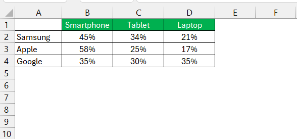
First, ensure your data is in a suitable format. You’ll need a table with categories (in row), sub-categories (in column), and values (as %) for each sub-category.
STEP 2: Create 100% Stacked Column Chart
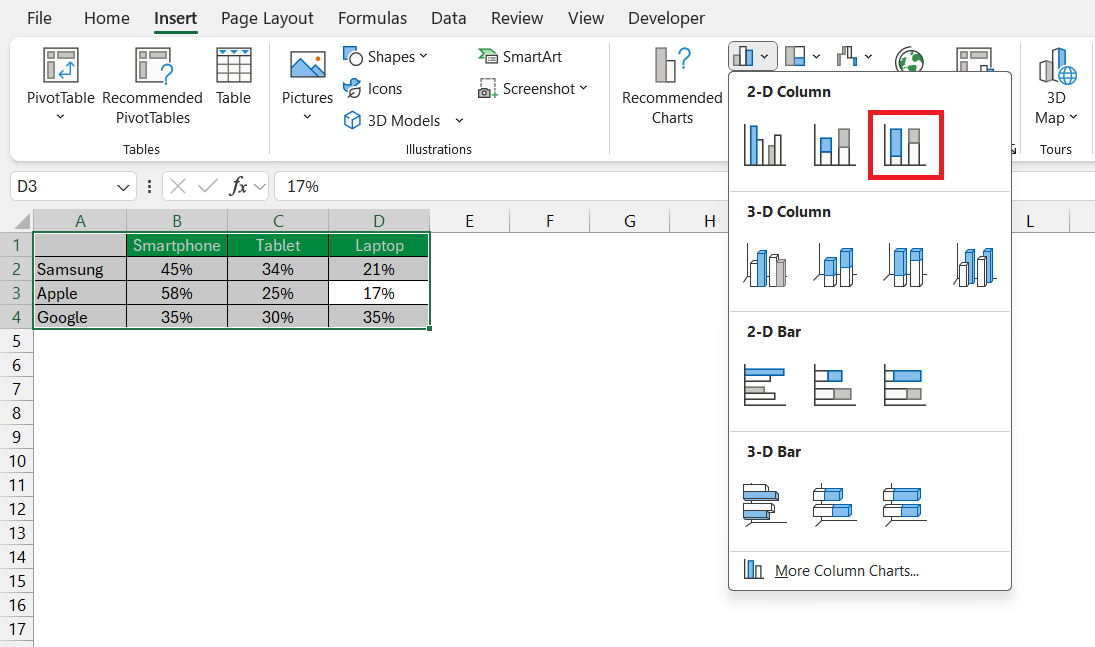
Go to the Insert tab on the Excel ribbon > Click on the Column Chart icon > Select 100% Stacked Column.
STEP 3: Adjust the Gap Width
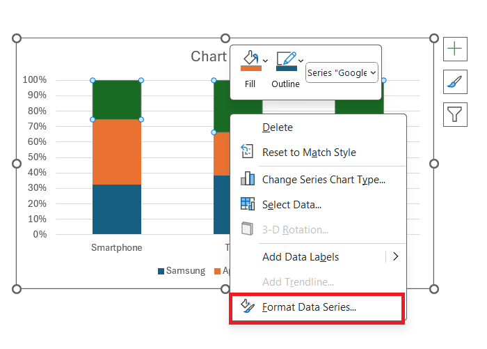
Right-click on any of the bars in the chart and choose Format Data Series.
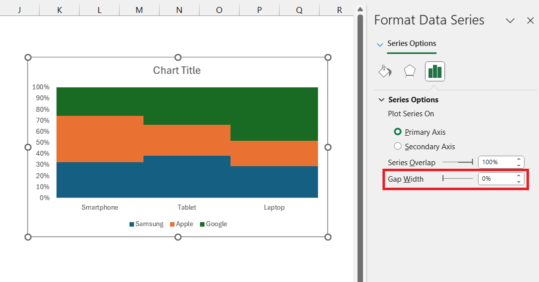
Reduce the Gap Width to 0% (or as close to 0% as you prefer). This will make the bars in the chart touch each other, resembling the structure of a Marimekko chart.
STEP 4: Add Borders
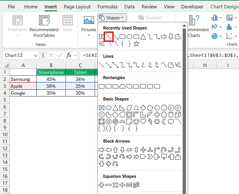
To precisely mark the borders of each company’s sales segments, we can add lines along their respective boundaries. Go to Insert > Shapes > Line.
STEP 5: Format Borders
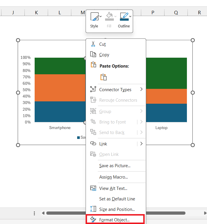
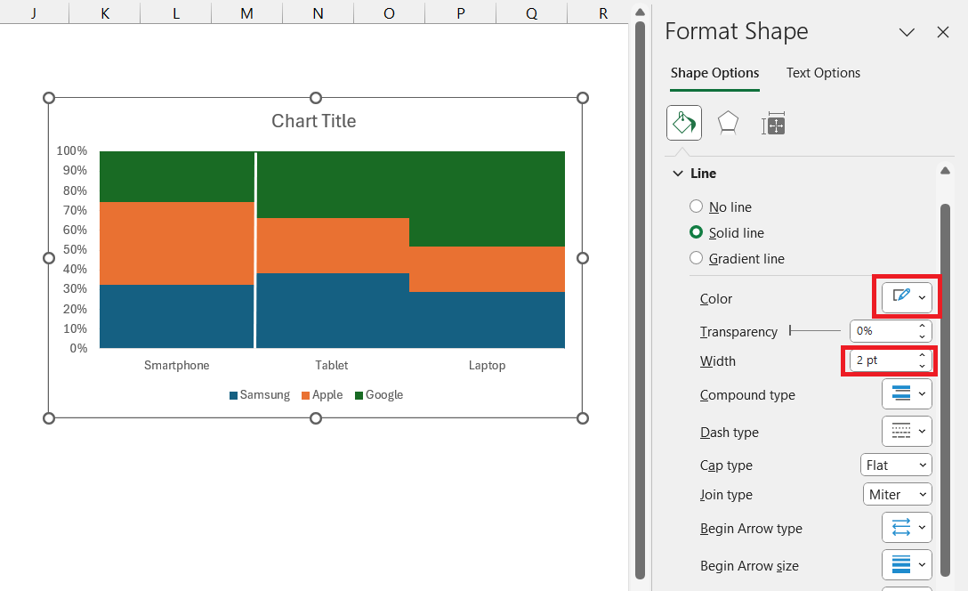
Right click on the line and select Format Object.
In the Format dialog box, select color as white and width as 2 pt.
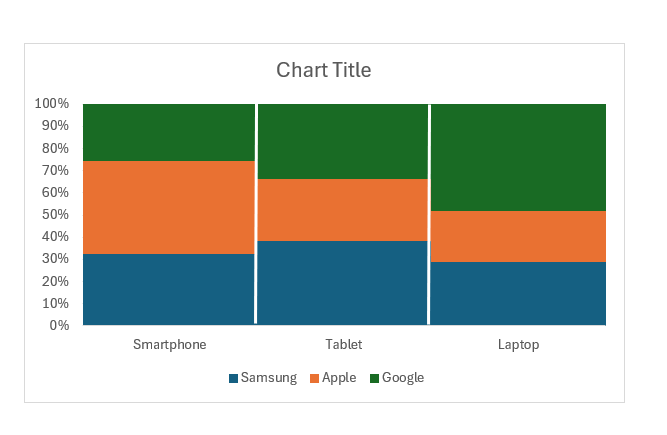
STEP 6: Add another border. The Marimekko chart is now ready!
The Role of Marimekko Charts in Data Analysis
When to Choose Marimekko Over Other Chart Types
Marimekko charts might be your best choice when faced with complex categorical data showing distribution across diverse attributes. They shine in scenarios where you need to visualize the comparative proportions and relationships within a dataset at a single point in time. If you notice overplotting or overcrowding in other chart types, like scatter plots, then the Marimekko’s clean layout will offer a refreshing clarity.
However, for analyzing trends across time, consider line or bar charts instead, as Marimekko charts are less suited for time-series data. Use these charts to uncover hidden patterns and distributions that might not be evident in more standard visualizations.
Real-world Examples: Marimekko Charts in Action
Real-world applications of Marimekko charts are vast and illustrative of their utility in business and market analysis. For instance, consider a company monitoring its product performance across various regions. A Marimekko chart could showcase each product’s market share within each region, side-by-side, reflecting both regional preferences and performance.
In market research, Marimekko charts are valuable for visualizing consumer demographic distributions across different product categories, practically linking customer attributes with buying behaviors.
Even in health care, professionals might employ these charts to show patient distributions across various disease categories, with sub-segments reflecting age ranges or treatment types.
These real-world cases underscore how Marimekko charts provide a snapshot that’s detailed yet easily interpretable, an asset for any data-driven decision-making process.
Frequently Asked Questions (FAQs)
What is a Marimekko chart?
A Marimekko chart, sometimes known as a Mekko chart, is an innovative data visualization tool that displays different dimensions of data through variable column widths and heights, presenting a combination of a 100% stacked bar and column chart. It’s especially adept at showcasing how segments contribute to the whole and is valuable for market share analysis.
What is the purpose of using a marimekko chart in excel?
The purpose of using a Marimekko chart in Excel is to depict and compare varied data categories and their sub-segments in an integrative manner. It visually represents two sets of data, combining their distribution and comparative sizes, which is ideal for market analysis and strategic planning.
What data is suitable for a marimekko chart?
Data suitable for a Marimekko chart includes categorical information that can be split into segments and sub-segments. It’s ideal for visualizing distribution across multiple attributes, such as market share, product performance, or demographical statistics, encompassed within proportionate categories.
How Do I Convert My Chart Data to Whole Numbers for Marimekko?
To convert chart data to whole numbers for Marimekko, create a new table and link it to the percentage values, then multiply each by 100. For instance, a formula in cell C12 would be C6 * 100, changing 25% to the whole number 25. These whole numbers are then used to build your Marimekko chart.
Can Marimekko Charts Be Used in PowerPoint for Business Presentations?
Absolutely, Marimekko charts can be used in PowerPoint for business presentations to effectively communicate complex data insights. By copying the chart from Excel and pasting it into your slide, you can maintain data links to update the chart dynamically if numbers change. They’re a visually compelling addition to your storytelling toolkit, perfect for conveying strategic business insights.
John Michaloudis is a former accountant and finance analyst at General Electric, a Microsoft MVP since 2020, an Amazon #1 bestselling author of 4 Microsoft Excel books and teacher of Microsoft Excel & Office over at his flagship MyExcelOnline Academy Online Course.

