Logarithmic curves are useful when you’re analyzing data that changes rapidly at first and then stabilizes over time. This is common in fields like biology, economics, and engineering. Excel makes it easy to plot logarithmic trends and generate logarithmic curves using built-in charting and formula tools.
Key Takeaways
- Use a scatter chart to plot data before applying a logarithmic trendline
- Excel’s built-in LOG and LN functions help compute log values manually
- You can display the logarithmic equation and R-squared value directly on the chart
- Logarithmic scales are ideal for data that spans multiple orders of magnitude
- Power Query and VBA can automate logarithmic transformations
Table of Contents
Diving into Logarithmic Curves
Unpacking the Basics of Logarithms
Logarithms are a unique mathematical concept used to understand and interpret data that spans several orders of magnitude. They transform exponential growth, turning multiplicative relationships into linear ones, making complex calculations more manageable. In essence, a logarithm answers the question: “To what power must a base be raised to produce a given number?” This approach simplifies otherwise cumbersome calculations in real-world scenarios. One exciting aspect of logarithms is their ability to handle tiny and massive numbers with equal ease, a vital function for anyone familiar with exponential functions or large-scale data analysis.
Why Use Logarithmic Curves in Excel?
Logarithmic curves in Excel are powerful tools for analyzing data that involve exponential relationships. These curves help reveal patterns and trends that linear models might miss, especially when dealing with multiplicative processes. By plotting data on a logarithmic scale, you gain insights into growth rates and variability, which are essential for making informed predictions. Excel provides an intuitive framework to apply logarithmic transformations through its charting features. This ease of use streamlines the analytical process, allowing you to swiftly convert raw data into meaningful graphs and models.
Step-by-Step: Create a Logarithmic Curve in Excel
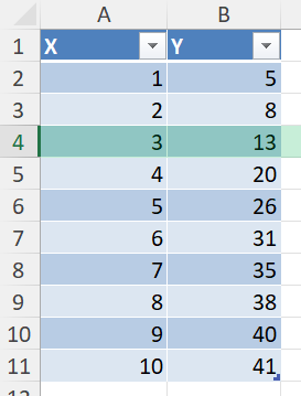
Step 1 – Input Your Data
Enter your X and Y values into two columns. For example:
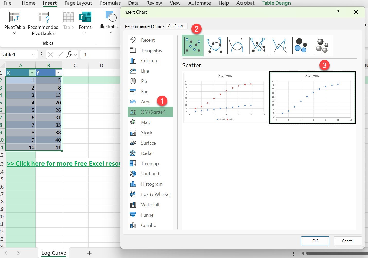
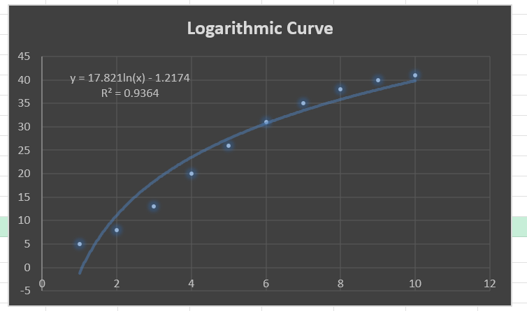
Step 2 – Insert a Scatter Plot
Select your data range (A2:B11)
Go to Insert > Charts > Scatter > Scatter
Excel creates a scatter plot of your data
Step 3 – Add a Logarithmic Trendline
Click on any data point on the chart
Right-click and choose Add Trendline
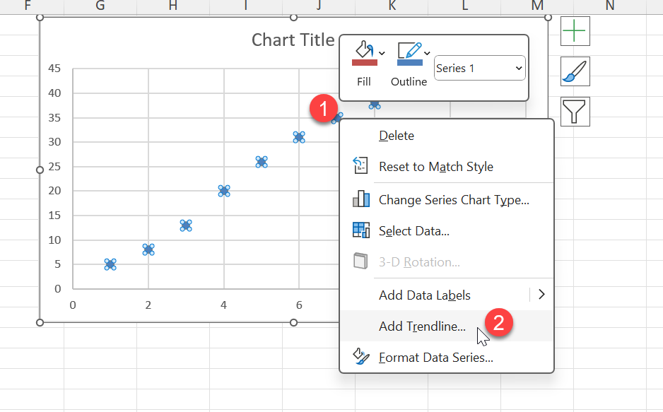
In the Trendline options, choose Logarithmic
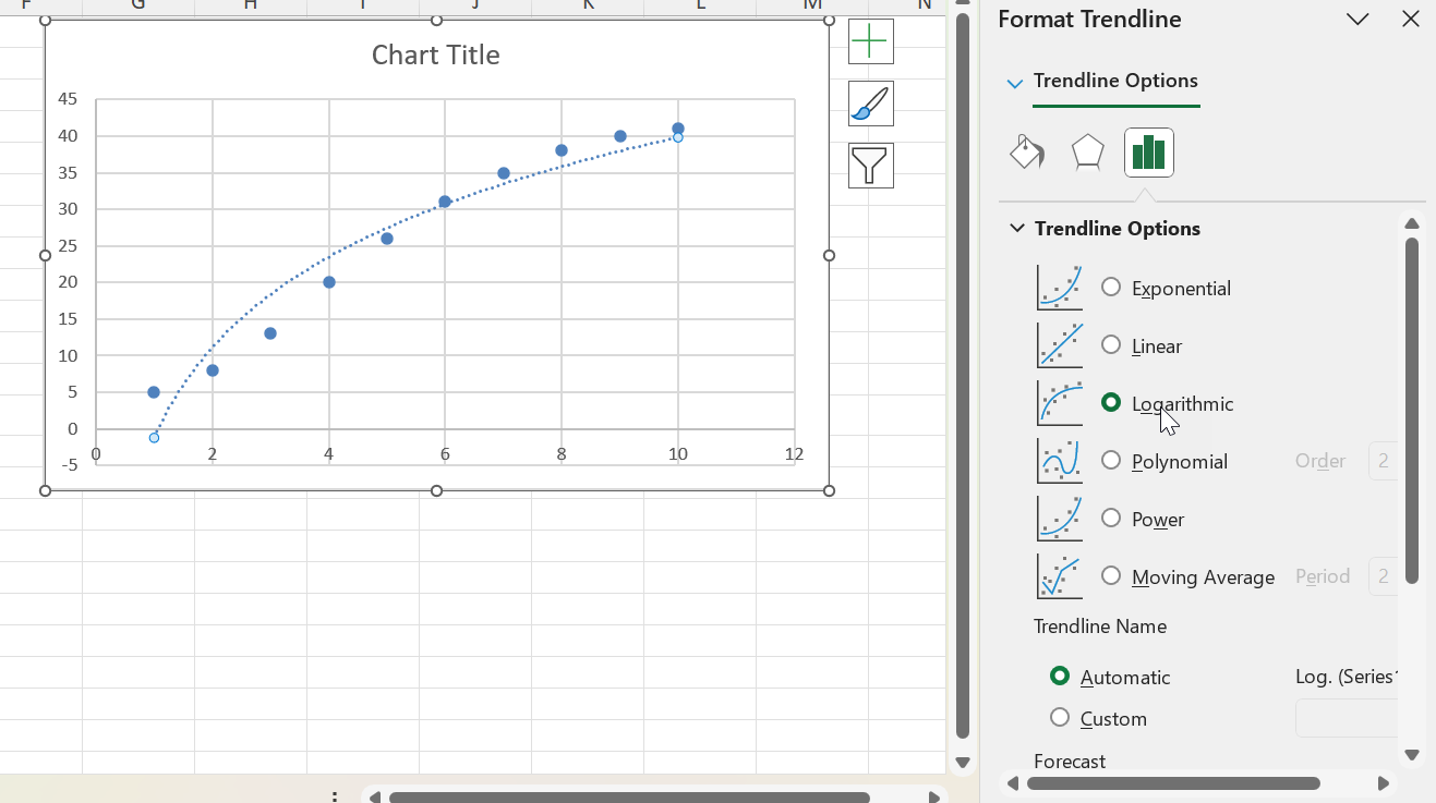
Check the box for Display Equation on chart
Check Display R-squared value on chart (optional)
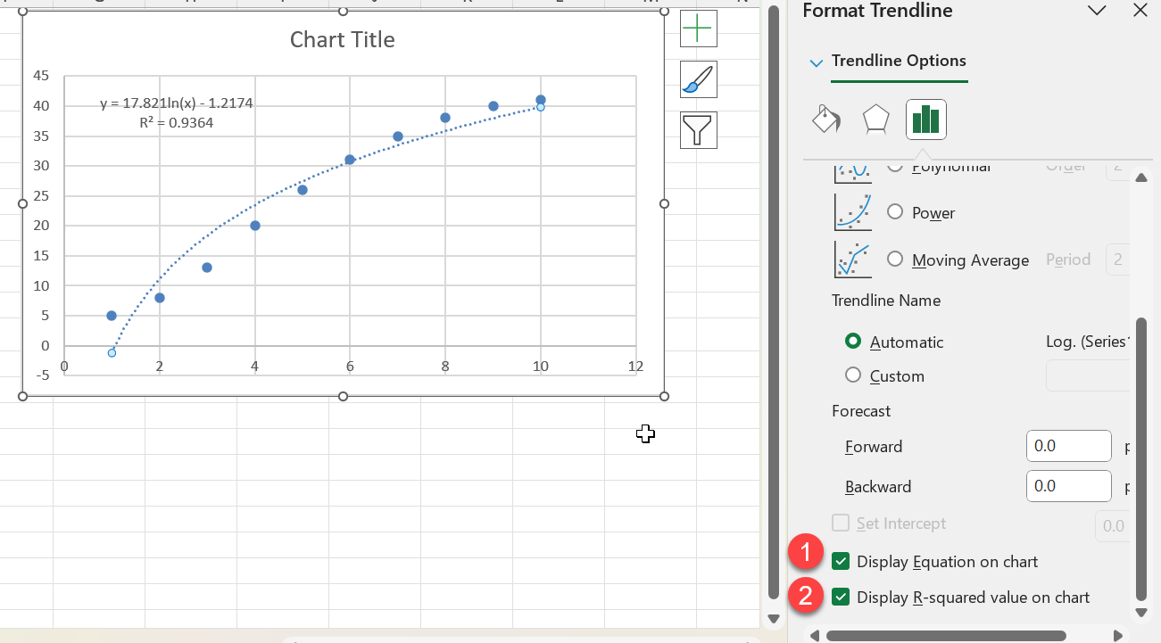
Now you have your Logarithmic Curve!
Common Mistakes or Tips
- Using 0 or negative values in X – Logarithmic functions are undefined for non-positive numbers
- Applying a linear trendline to log data – Use the correct trendline type
- Forgetting to format axes – Adjusting axis scale improves clarity
- Not labeling chart components – Always label axes and trendline equation for readability
Bonus Tips and Advanced Scenarios
1. Use Power Query to Apply LOG10 Transformation
Select your data range and create a table (Ctrl + T)
Go to Data > Get & Transform > From Table/Range
In Power Query, add a custom column: = Number.Log10([X])
Close and load to Excel
2. Use Excel Formulas for Custom Transformation
If you want to build your own logarithmic model:
=a*LN(x)+b
Use Excel Solver to estimate parameters a and b based on your data set.
3. Use VBA to Apply a Logarithmic Calculation
Sub ApplyLogarithmic()
    Dim ws As Worksheet
    Set ws = ActiveSheet
    Dim i As Long
    For i = 2 To 11
        If ws.Cells(i, 1).Value > 0 Then
            ws.Cells(i, 3).Value = WorksheetFunction.Ln(ws.Cells(i, 1).Value)
        Else
            ws.Cells(i, 3).Value = "Invalid"
        End If
    Next i
End Sub
Real-World Applications of Logarithmic Curves
Analyzing Growth and Decay Patterns
Logarithmic curves are particularly adept at illustrating growth and decay patterns found in various fields such as biology, physics, and economics. By transforming exponential growth or decay into a linear format, logarithmic functions make it easier to visualize and interpret data that involves rapid changes. When you analyze data for population growth, radioactive decay, or interest rate fluctuations, the linearization provided by logarithmic curves allows for better insight into underlying trends and projections. Excel’s ability to plot these curves means you can easily forecast future growth trends or predict when a process will halve or double in size.
Financial Modeling with Logarithms
In financial modeling, logarithms play a crucial role in analyzing and predicting market trends. By utilizing logarithmic curves, you can better understand volatility, compound interest, and investment growth. For instance, stock market analyses often rely on logarithmic returns to evaluate performance over time, as they more accurately reflect percentages rather than absolute changes. When you convert financial data into logarithmic scales in Excel, you can seamlessly identify peaks, troughs, and trends that help in strategic decision-making and risk assessment. This approach keeps your analyses aligned with the multiplicative nature of financial processes.
FAQ
What is a logarithmic trendline used for?
It models data that grows or decays quickly at first and levels off over time
Can I apply logarithmic scaling to the axis instead of the trendline?
Yes, format the axis and check “Logarithmic scale”
Why does Excel return an error when I use LOG with 0 or negative values?
Because log is undefined for those inputs. Filter your data first
What is the difference between LOG and LN?
LOG is base 10, LN is base e (natural logarithm)
Can I use logarithmic curves for forecasting?
It’s possible, but logarithmic models are best for data that stabilizes over time
Summary
Logarithmic curves are powerful tools for analyzing data with quick changes and gradual stabilization. Excel offers several ways to create, customize, and automate these charts, from built-in charting tools to Power Query and VBA. With the steps above, you’ll be able to visualize trends more effectively and make better data-driven decisions.

John Michaloudis is a former accountant and finance analyst at General Electric, a Microsoft MVP since 2020, an Amazon #1 bestselling author of 4 Microsoft Excel books and teacher of Microsoft Excel & Office over at his flagship MyExcelOnline Academy Online Course.


