- Ogive graphs display cumulative frequencies, helping to visualize data distribution and identify trends.
- Preparing your data correctly, including setting accurate class intervals and cumulative frequencies, is essential for an effective ogive graph.
- Creating an ogive in Excel involves using a combination of scatter plots and cumulative frequency calculations.
- Customizing your ogive graph with clear labels, titles, and proper formatting enhances readability and professionalism.
- Avoid common mistakes like incorrect class intervals and cluttered formatting to ensure accurate and clear data representation.
How to Make Ogive Graph in Excel for Data Analysis – Step by Step Guide
Ogive graphs, also known as cumulative frequency graphs, are a valuable tool for displaying the cumulative frequencies of data points in a dataset.
In Excel, creating an ogive graph can help visualize the overall distribution and identify trends, such as the median or percentiles.This article will guide you through the steps to construct an ogive graph in Excel, from organizing your data to customizing the final chart for better clarity and presentation.
Understanding ogive graphs enhances your ability to analyze data distribution effectively and make informed decisions. Key Takeaways:
Table of Contents
Introduction to Ogive Graphs in Excel
Understanding the Basics of an Ogive Graph
Ogive graphs might sound complex, but they’re a popular and straightforward way for me to visualize cumulative frequencies in a dataset. They let me quickly see how many values fall above or below certain thresholds, which is invaluable when I’m dealing with large amounts of data.
The Importance of Data Analysis
In data analysis, ogive graphs in Excel serve as an essential tool for providing quick insights into the distribution of my dataset. They help me understand and identify trends, patterns, and even outliers that might require further investigation. By summarizing large datasets into a single curve, ogive graphs make it much easier for everyone, from stakeholders to team members, to infer valuable information without getting lost in the weeds of raw data.
Preparing Your Data for an Ogive Graph
Collating and Structuring Your Data
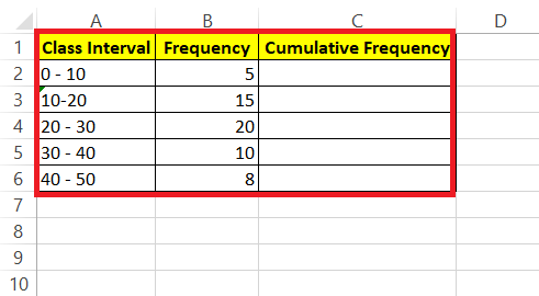
Before you can create an ogive graph, your data needs to be in order. Start by organizing all relevant information into a single spreadsheet. This means ensuring that your dataset is clean—free from duplicates or irrelevant entries—and sorted in ascending order if it isn’t already.
Structure your data into clear, discrete columns which you will use to calculate cumulative frequencies.
Setting Class Intervals and Limits
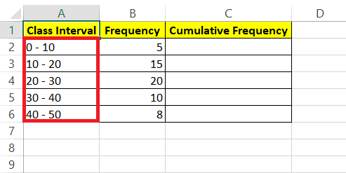
Determining the right class intervals and limits is the groundwork for crafting an insightful ogive graph. To set class intervals, decide on a range of values that each class will contain. Be methodical—each interval should be equal in size to maintain consistency across the dataset.
The lower-class limit will be the smallest number in each range, while the upper-class limit is the largest number that falls within that range.
Step-by-Step Guide to Creating an Ogive in Excel
Plotting Cumulative Frequencies
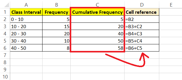
To get started with plotting cumulative frequencies, create a helper table alongside your collated data. Add a column for class limits to define the intervals, then compute the cumulative frequency for each class. This involves adding the frequency of a class to the total of the frequencies of all classes that came before it.
Be vigilant with your calculations; accurate cumulative frequencies are crucial for a correct ogive graph.
Adjusting Axis Scales for Clarity
Once your cumulative frequencies are ready, the clarity of your ogive graph hinges upon how you adjust the axes.
To Create the Ojive Graph I’m following the steps below:
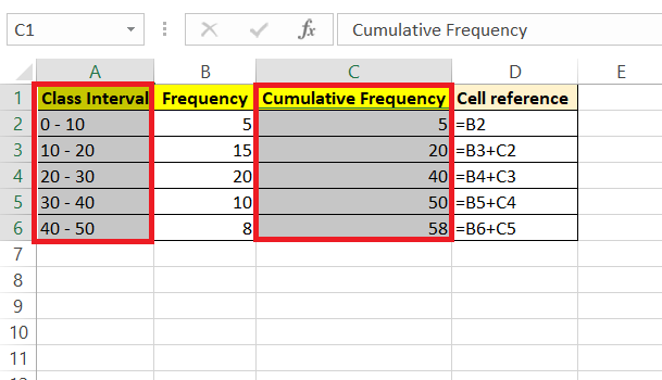
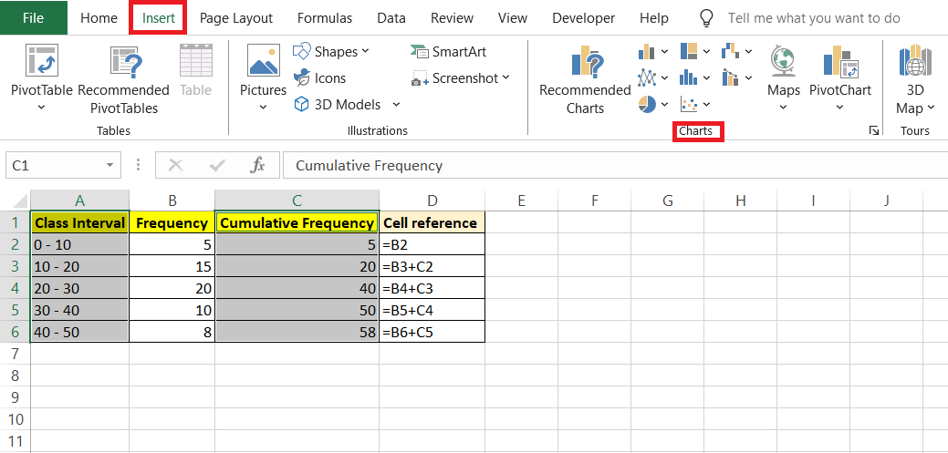
STEP 1: Select the data range for the class intervals and cumulative frequencies.
STEP 2: Go to the “Insert” tab in Excel.
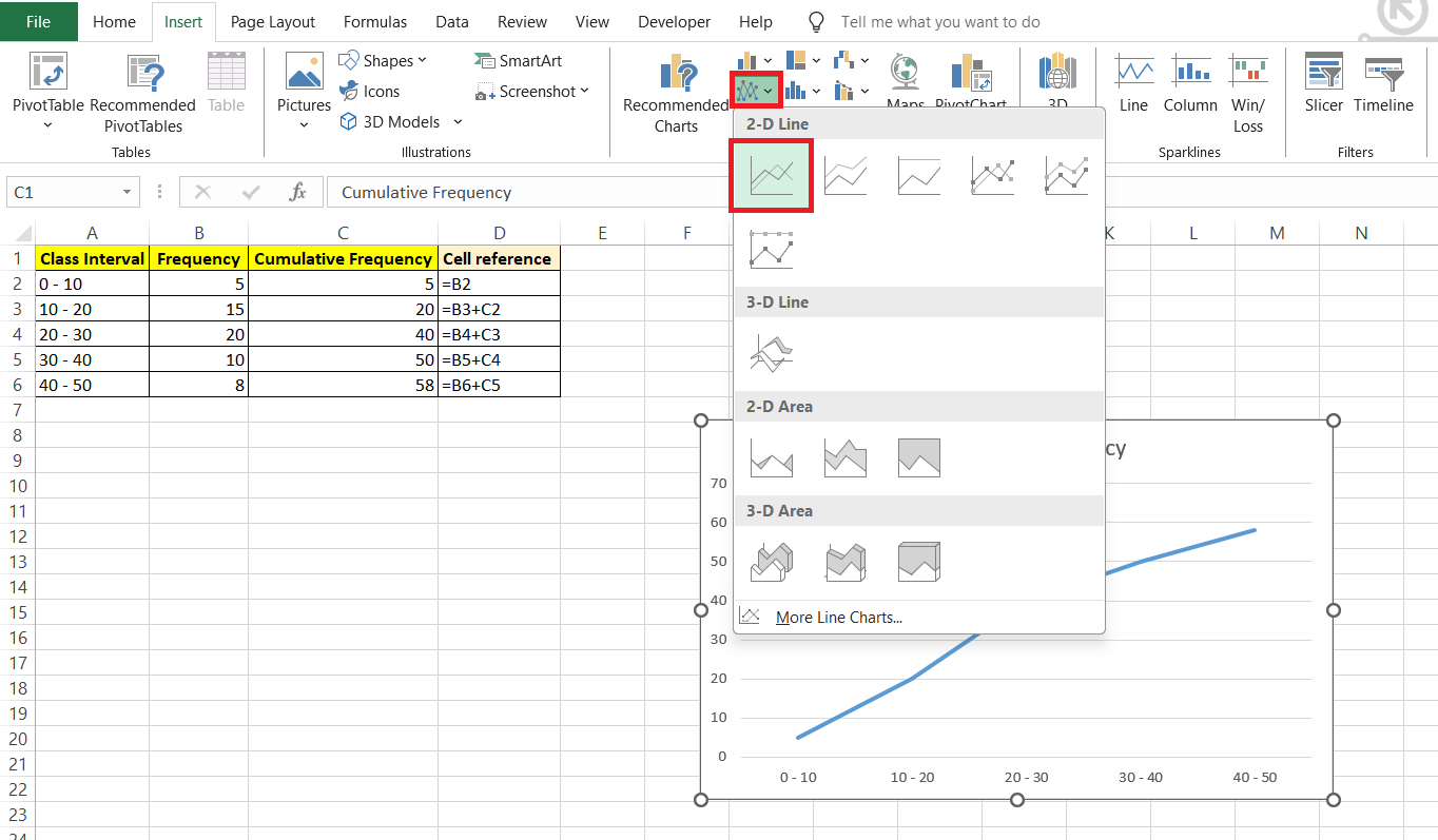
STEP 3: Choose “Line Chart” from the chart options. A line chart will plot the cumulative frequencies against the class intervals, effectively creating the ojive graph.
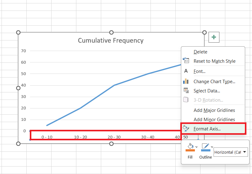
STEP 4: Format the chart as needed, adding titles and labels to make it clear. When you right-click on the horizontal axis and select “Format Axis,” you’ll be fine-tuning the graph’s readability.
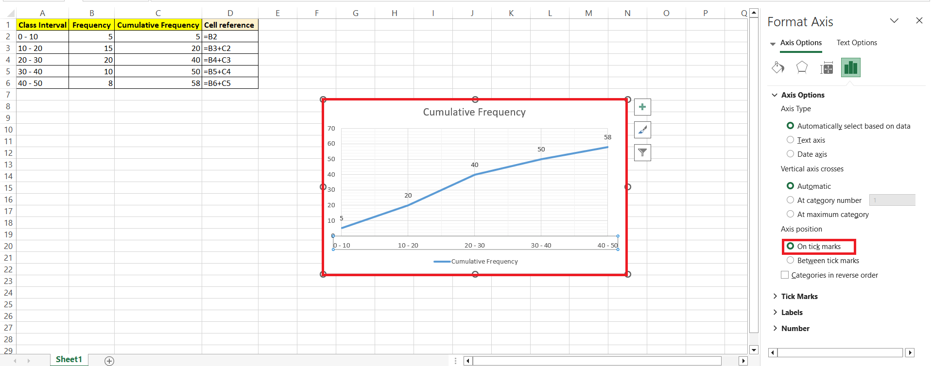
STEP 5: Here’s where you set the bounds — start with the minimum being your lowest class limit and cap it off at the highest class limit. The major unit value should align with your class width, ensuring that the intervals on the graph match your data structure seamlessly.
Type of Ogive Graph
Less Than Ogive Graph-
When creating a “less than” ogive graph, use the upper limits of the class intervals. This means plotting cumulative frequencies against the upper class limits to illustrate the cumulative distribution of data up to each interval’s maximum value.
Let’s have a look at the steps below to understand better:-
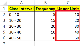
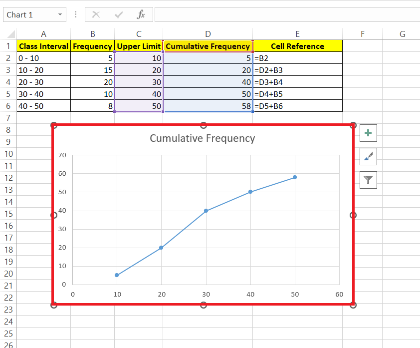
STEP 1: Add a new column labeled “Upper Limit.” In cells C2 to C6, enter the upper limit for each marks range. For instance, if cell B2 contains the range 0-10, enter 10 as the upper limit. Continue this process for the entire column.
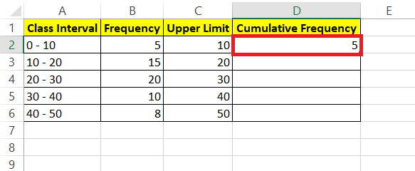
STEP 2: Add a new column labeled “Cumulative Frequency.” In cell D1, enter the value of the first frequency, which is the value from cell B2.
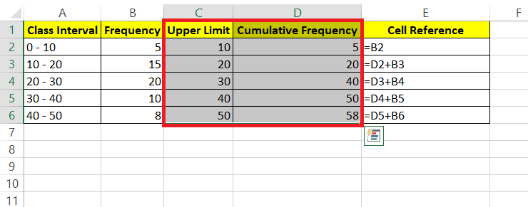
STEP 3: Now, you need to present a formula to fill D3:D6. Cell value D3 is the sum of D2 + B3. The formula is the sum of the current frequency plus the frequency added previously. Copy the formula for the rest of the cells D4:D6.
STEP 4: The final step is to create the table. Select range D1:E6.
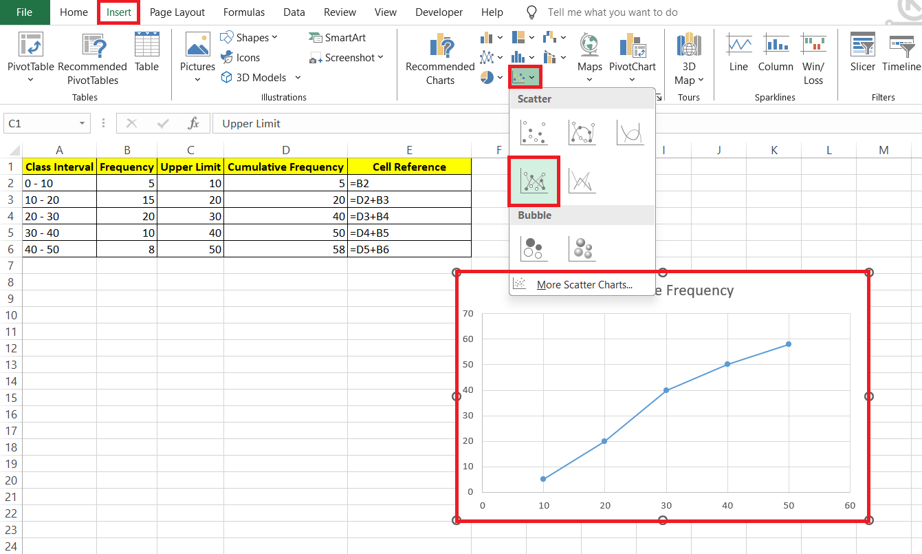
STEP 5: Navigate to the “Insert” tab, and in the “Charts” section, choose “Scatter with Straight Lines and Markers.”
RESULT: Less-than ojive graph is made.
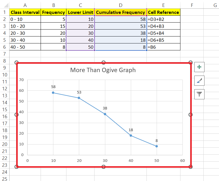
More Than Ogive Graph-
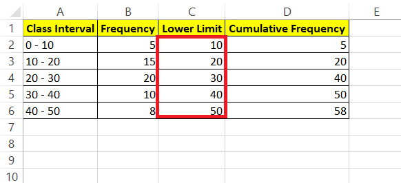
When creating a “more than” ogive graph, you use the lower limits of the class intervals. This approach involves plotting cumulative frequencies against the lower class limits to illustrate the distribution of data greater than each specified value.
Let’s have a look at the steps below to understand better:-
STEP 1: Add a new column labeled “Lower Limit.” In cells C2 to C6, enter the upper limit for each marks range. For instance, if cell B2 contains the range 0-10, enter 0 as the lower limit. Continue this process for the entire column.
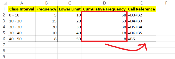
STEP 2: Add a new column, named Cumulative Frequency. This step is the opposite of the less than ogive graph. As the graph type is more than ogive graph, we will start filling the cumulative frequency from the last row. In Cell D6, fill the value of the last frequency i.e. the cell value of B6. Now, you need to present a formula to fill D2:D5. Cell value D5 is the sum of D6 + B5. The formula is the sum of the current frequency plus the frequency added previously. Copy the same formula to the rest of the upper cells.
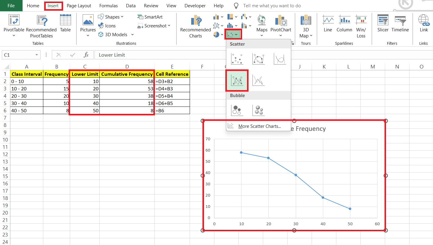
STEP 3: Now, the final step is to create the table. Select the range C1:D6, then go to the “Insert” tab. In the “Charts” section, choose “Scatter with Straight Lines and Markers.”
RESULT: More than ogive graph is created.
Customizing Your Ogive Graph
Improving Readability with Data Labels and Titles
Boosting the readability of your ogive graph isn’t just about aesthetics; it’s about making your data speak clearly and concisely to anyone who looks at it. Begin by adding data labels that underscore key data points and give instant context. Once selected, take care to format them so they’re not jumbled up with the graph line—setting the position to “Above” prevents this. Labels should also be bolded to pop out at the viewer. Next is the chart title, which you should tailor it to concisely reflect what the data represents.
Styling Tips for a Professional-Looking Chart
To elevate your ogive graph to professional standards, consider the chart’s overall style. Use a color scheme that’s aligned with the context—muted colors for formal presentations or brighter ones for educational purposes. Simplify the axes to avoid clutter, and apply a consistent font style throughout. Make sure to enlarge the chart as needed to avoid squeezing data points too close together, which enhances visual appeal and readability.
Common Mistakes and How to Avoid Them
Data Preparation Pitfalls
When prepping your data for an ogive graph, pitfalls can derail your analysis if they’re not caught early. Watch out for incorrectly defined class intervals—this can skew your data representation. Also, ensure that your frequencies are accurately calculated; even a small error can affect the resulting graph. Double-check for any missing data points because an ogive graph is sensitive to gaps in a dataset. Preventing these mistakes requires careful scrutiny and could save you from drawing erroneous conclusions later on.
Chart Formatting Faux Pas
On the chart formatting front, you want to avoid a few common blunders. Overlooking the uniformity of your class intervals in the axis can lead to a misrepresentative ogive. Neglecting to format your data labels to prevent overlap with the chart line could make your graph look congested and confusing to read. Also, using default color schemes and styles without considering your audience and purpose might result in a chart that fails to engage or, worse, misinform viewers.
FAQs on Ogive Graphs in Excel
How to make an ogive graph?
To make an ogive graph, enter your dataset in Excel and calculate the cumulative frequency for each class interval. Next, highlight the data and insert a Scatter with Straight Lines and Markers chart. Adjust your axis scales and add necessary labels to complete the ogive.
What is an ogive graph used for?
An ogive graph is used to display the cumulative frequency of data points in a dataset, helping to visualize how many values fall below a particular level. This is particularly useful for understanding the distribution and identifying central tendencies like median or percentiles within the data.
Can I make an ogive for non-numeric data?
Creating an ogive for non-numeric data isn’t typically possible because ogives require numerical values for cumulative frequencies. You would need to convert the non-numeric data into numerical values or categories that can be tallied and cumulated for such a graph.
How do I modify the class intervals on my ogive?
To modify class intervals on an ogive, adjust the range of values in your dataset’s class limits column. Make sure to update the cumulative frequency calculations accordingly, and then refresh your ogive graph to reflect these new intervals.
How to do a cumulative frequency graph in Excel?
To create a cumulative frequency graph in Excel, input your data, calculate cumulative frequencies for your class intervals, and then plot these values on a Scatter chart with smooth lines. Adjust your axes, add labels, and format your graph to complete the process.
John Michaloudis is a former accountant and finance analyst at General Electric, a Microsoft MVP since 2020, an Amazon #1 bestselling author of 4 Microsoft Excel books and teacher of Microsoft Excel & Office over at his flagship MyExcelOnline Academy Online Course.

