Pie charts are a classic way to show proportions and percentages. Sometimes, you need to visualize results in a detailed way, such as displaying progress toward a goal, survey results, or gamified trackers. Creating a pie chart with 100 sections in Excel is a powerful technique for dashboards, scoreboards, or habit tracking. This guide will show you how to quickly build a 100-segment pie chart that updates dynamically as your data changes.
Key Takeaways
- You can build a pie chart with exactly 100 equal sections by creating a data range from 1 to 100.
- Dynamic formatting (colors, labels) can highlight progress or specific groups of sections.
- Pie charts with 100 segments are perfect for progress trackers, completion charts, and visualizing small percentages.
- With helper columns and conditional formatting, you can create interactive or animated effects.
- Advanced techniques like VBA and Power Query allow even more customization for specialized dashboards.
Table of Contents
About Pie Charts with 100 Sections in Excel
A standard pie chart divides a circle into slices based on your data values. To create a chart with 100 equal slices, you need a data range containing 100 values (usually all set to 1). You can then use formulas or conditional formatting to highlight a certain number of these slices, for example, to show a percentage complete.
Visualize completion percentage as “filled” slices
Show progress toward a goal (like “55 out of 100 completed”)
Display survey or poll results where each respondent is a section
Create gamified scoreboards or habit trackers
How to Make a Pie Chart with 100 Sections in Excel
Step 1: Set Up Your Data Range
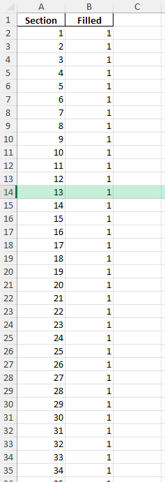
In column A, enter numbers 1 through 100 (A2:A101).
In column B, enter the value 1 next to each number (B2:B101). This will make 100 equal-sized slices.
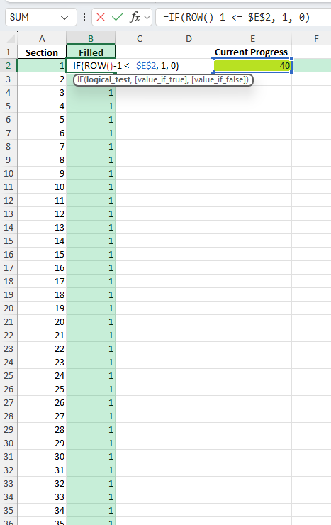
Step 2: Add a Helper Column for Progress (Optional)
If you want to show progress (e.g., 37%), create a helper column B:
=IF(ROW()-1 <= $E$2, 1, 0)
Where cell E2 holds your current progress (e.g., 37). This will set the first 37 slices to “1” (filled) and the rest to “0” (empty).
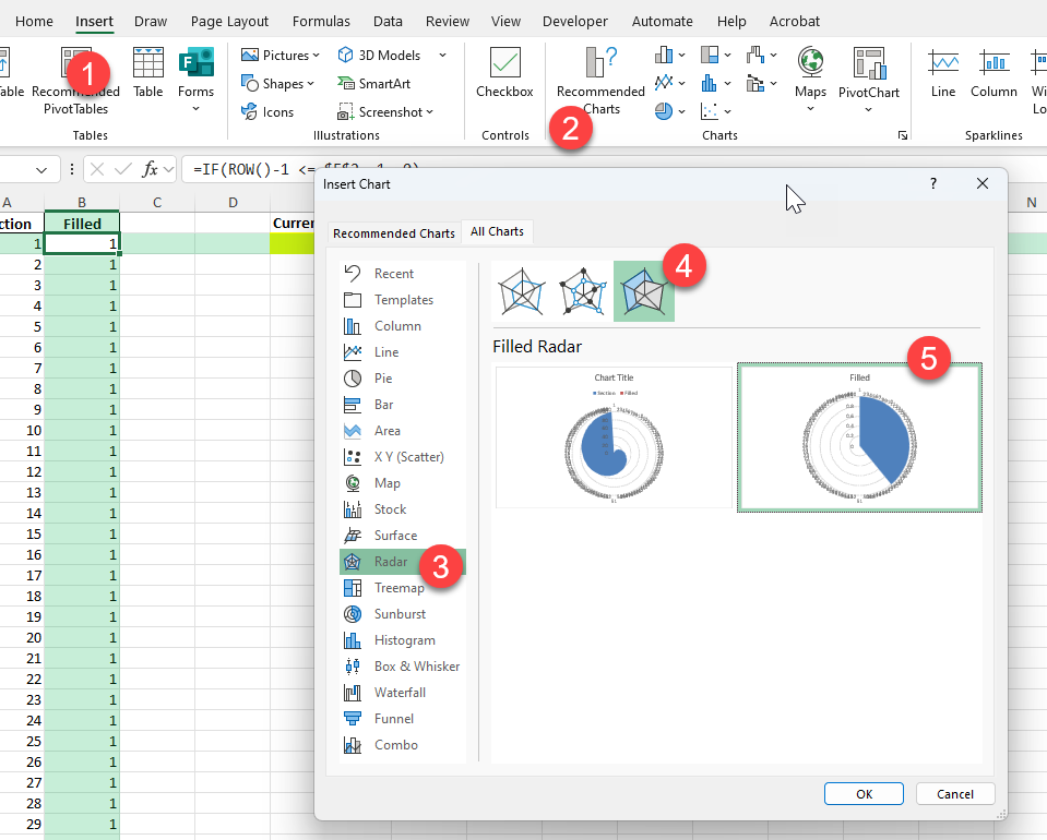
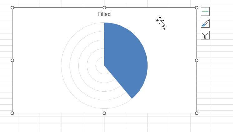
Step 3: Create the Pie Chart
Select your data (B2:B101 or C2:C101 if using a helper column).
Go to Insert > Radar Chart > Filled Radar Chart.
The chart will display 100 equal slices.
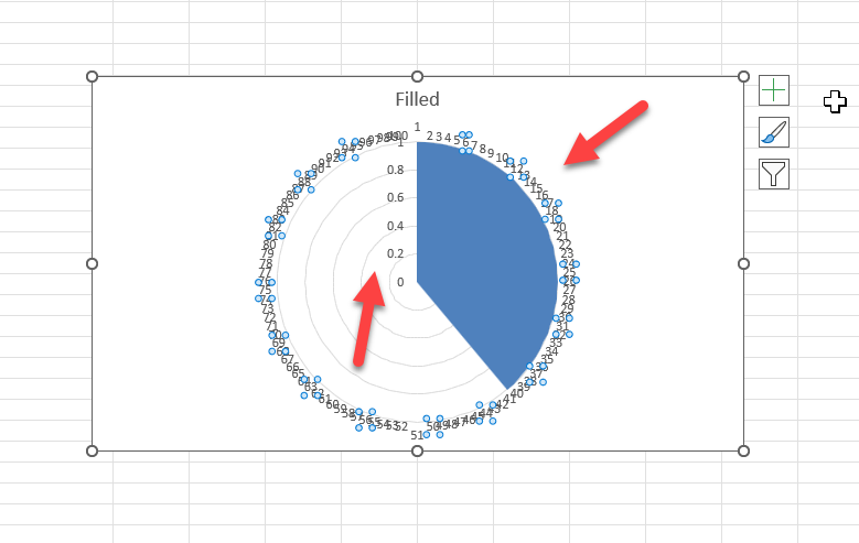
Step 4: Format the Chart
Click on the data labels and delete it.
Common Mistakes and Tips
Mistake: Using only a few data points
For 100 segments, ensure your data range includes exactly 100 rows.
Mistake: Not formatting helper columns as numbers
Blank or text cells can cause chart errors. Always use numeric values.
Tip: Use data labels for special sections (e.g., completed vs. not completed)
Tip: Resize or remove the legend to focus on the chart itself
Bonus Tips and Advanced Scenarios
Power Query: Generate a Table of 100 Rows Automatically
Use this M code:
= List.Transform({1..100}, each [Section=_])
This creates a table with 100 sections, no manual entry required.
Conditional Formatting: Data Bars or Color Scales for Progress
You can use conditional formatting in the data table to visualize progress before charting.
Applications and Examples
Business Insights from Detailed Charts
Detailed pie charts with multiple sections can provide invaluable insights for business analysis and strategy planning. When executed thoughtfully, these charts reveal patterns and trends that might not be immediately apparent in raw data tables.
For example, a pie chart with 100 sections can help identify market share distribution among a large number of competitors. By visualizing this data, businesses can quickly pinpoint which players hold dominant positions and where market opportunities might exist for new entrants or expansion.
Detailed charts are also beneficial in customer segmentation analysis. By categorizing customers based on behavior, preferences, or demographics, businesses can tailor marketing strategies to specific segments that are visually identifiable within the chart. This can drive targeted marketing efforts and improve customer engagement.
Furthermore, resource allocation is another area where detailed pie charts can offer insights. By comparing expenses or resource use across different departments or projects, businesses can spot inefficiencies or areas needing further investment.
These visual tools not only enhance comprehension for stakeholders at all levels but also facilitate more informed discussions and strategic decisions. When communicating complex data to decision-makers, detailed pie charts provide a clear overview while enabling deep dives into specific areas, fostering a well-rounded analysis that might be missed in textual reports alone.
Additionally, using detailed charts in presentations to investors or partners can convey transparency and an in-depth understanding of the business landscape. By visually summarizing vast amounts of data, stakeholders can grasp the strategic direction and performance with ease, promoting confidence in the company’s vision and operations.
Ultimately, when used effectively, detailed pie charts transform data into actionable insights that empower businesses to make strategic choices and drive growth.
Educational Uses and Visual Learning
Pie charts with numerous sections can be a powerful educational tool, catering to diverse learning styles and enhancing visual learning. In an educational context, these detailed charts help break down complex information into digestible segments, aiding students in understanding multifaceted topics.
For instance, a detailed pie chart can be used in a geography class to illustrate the percentage of land use across various countries or regions, enabling students to visually compare and contrast geographic data effectively.
In mathematics or statistics courses, detailed pie charts serve as practical tools to teach data analysis and interpretation. They provide a visual dimension to theoretical concepts, making abstract ideas more tangible. Students can manipulate data themselves, using software like Excel to create their own charts, thus enhancing their comprehension of data visualization techniques.
Furthermore, detailed charts can support literacy in interpreting graphical data, a crucial skill across educational curricula. By engaging with visual materials, students develop critical thinking skills and learn to derive insights, an essential capability in today’s data-driven world.
Moreover, integrating detailed pie charts into digital platforms or interactive whiteboards can make learning more engaging and accessible, catering to diverse classroom needs and promoting inclusivity. This approach not only supports auditory or kinesthetic learners by providing visual context but also prepares students to engage with complex data in their future academic or professional pursuits.
Ultimately, the use of detailed pie charts in educational settings enriches the learning experience by translating complex theory into understandable, relatable visuals, thereby fostering a deeper understanding and appreciation for data-driven insights.
FAQ
Q: Can I show any percentage of the pie as “filled”?
A: Yes, use a helper column to “fill” the first N slices for your percentage, and the rest as “empty.”
Q: Can I use different colors for milestones (like every 10%)?
A: Yes, manually format each group of slices, or use VBA for automation.
Q: How do I update the chart if the number of sections changes?
A: Adjust your data range and chart source to match your new number of sections.
Q: How do I avoid labels for every single slice?
A: Remove data labels or show only for highlighted sections for clarity.

John Michaloudis is a former accountant and finance analyst at General Electric, a Microsoft MVP since 2020, an Amazon #1 bestselling author of 4 Microsoft Excel books and teacher of Microsoft Excel & Office over at his flagship MyExcelOnline Academy Online Course.


