A Bubble Chart is an extension of the XY Scatter Chart. Bubble Chart with 3 variables adds a 3rd variable to each point in the XY Scatter Chart. XY Scatter plots x and y values and Bubble Chart plots x values, y values, and z (size) values. Bubble Chart is extremely useful to graphically represent three dimensions of data and show the relationship between them.
Key Takeaways:
- Visualizing Three Dimensions: A bubble chart is ideal for displaying relationships among three variables. The X and Y axes represent two variables, while the bubble size represents the third, adding an extra layer of data visualization.
- Customizing Bubble Sizes: The size of each bubble corresponds to the value of the third variable. Carefully scaling the bubble size ensures better clarity and prevents overlap, making the chart easier to interpret.
- Highlighting Data Trends: Bubble charts help identify patterns, clusters, or outliers among three variables simultaneously, making them a valuable tool for comparing datasets and visualizing complex relationships.
Table of Contents
What is a Bubble Chart?
Bubble Chart is used to visualize data with three dimensions. Instead of plotting just two variables (x and y) in a traditional chart, Bubble Chart lets you add a third variable as well. The first variables are visualized as coordinates, the third as the size of the bubble.
This chart can be used when you have a third value that can be used to determine the relative size of the bubble. Higher the value, the bigger will be the size of the bubble.
For example, if you have a Scatter Chart that shows the relationship between the age of a house and its proximity to the city and want to add the value of the house (the 3rd variable), then a Bubble Chart will get you there.
How to Create a Bubble Chart?
This Excel graph with 3 variables is very easy to create in Excel. Let’s see how to create a scatter plot in Excel with 3 variables with the help of some examples.
Example 1:
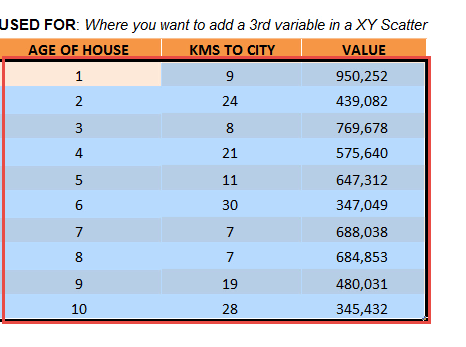
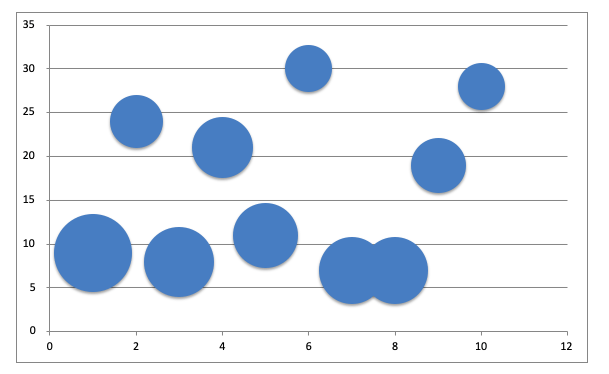
In the table, you have the age of the house, proximity to the city (in km) and the value of the house. So, using Bubble Chart with 3 variables, you can plot the age of the house on the X-axis, the proximity to the city is on the Y-axis and the value of the house (the 3rd variable) as the size of the bubble.
Follow the steps below to understand how to create a bubble chart with 3 variables:
STEP 1: Select the table on where we want to create the chart.
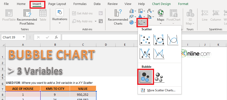
STEP 2: Go to Insert > Insert Scatter Chart or Bubble Chart > Bubble.
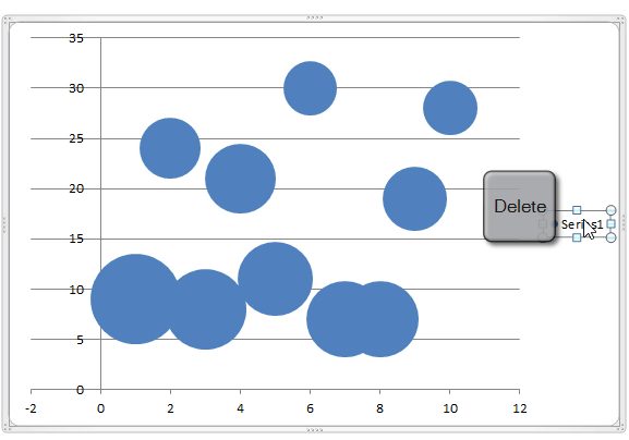
STEP 3: Click on Series1 and Click Delete to remove it.
The horizontal axis contains negative values as well. Since X-axis represents the age of the house, it cannot be negative. Formatting this axis to restrict negatives value is a good idea to avoid confusion.
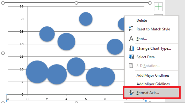
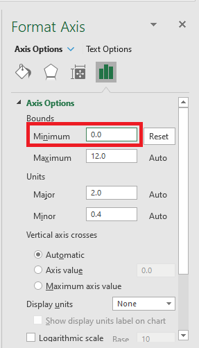
STEP 4: Right Click on the axis and select Format Axis to open the Format Axis Panel.
STEP 5: Under Axis Options > Minimum >Set the value to 0.
This is how the chart will look:
Example 2:
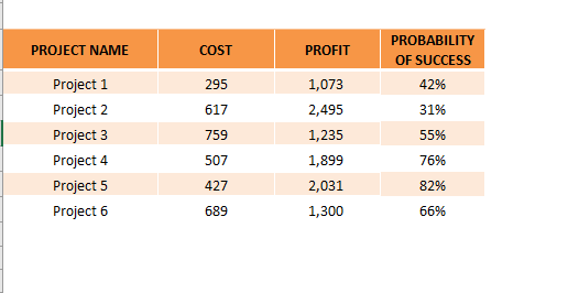
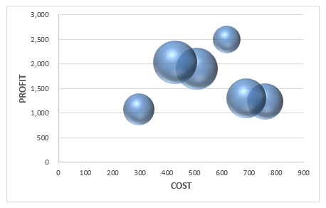
In this data table, you have project-wise data including cost, profit, and probability of success.
Using this data, let’s try to create a 3D Bubble Chart with 3 variables!
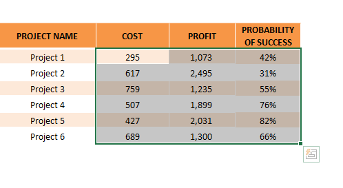
STEP 1: Select the table on where we want to create the chart.
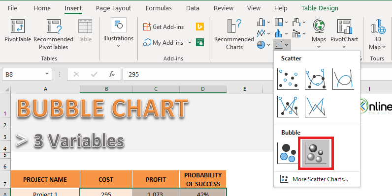
STEP 2: Go to Insert > Insert Scatter Chart or Bubble Chart > 3D Bubble.
STEP 3: Add the horizontal and vertical axis title.
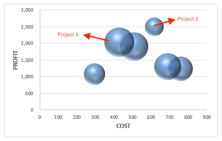
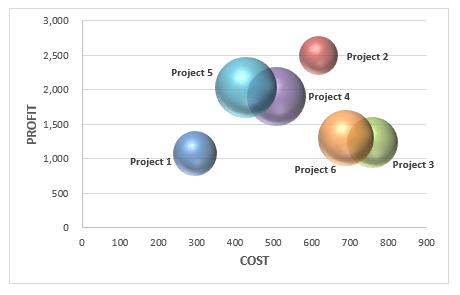
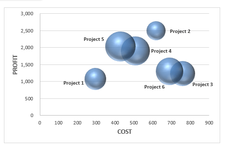
As you can interpret from this chart that even though Project 2 has the maximum profit the chance of success is low. So, it is better to opt for Project 5 which has a high probability of success and high profits as well.
Formatting a Bubble Chart
Formatting a Bubble Chart is vital to enhance the visual appearance of the chart. You can add colors, data labels, axis titles, etc. to make the data really stand out.
Add Axis Title to the Bubble Chart
STEP 1: Select the Chart
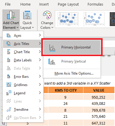
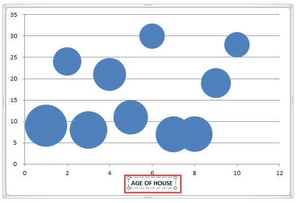
STEP 2: Got to Chart Design > Add Chart Element >Axis Titles > Primary Horizontal
STEP 3: Type Age of House.
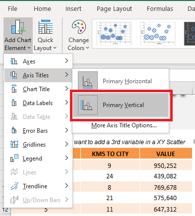
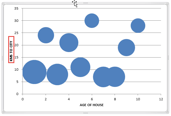
STEP 4: Got to Chart Design > Add Chart Element >Axis Titles > Go to Primary Vertical.
STEP 5:Type KMs to City.
Add Colors to the Bubble Chart
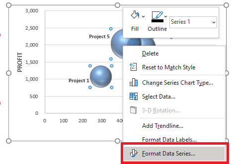
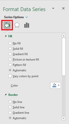
STEP 1: Right-click on a bubble and click on Format Data Series.
STEP 2: In the Format Series Panel, Select the Fill icon.
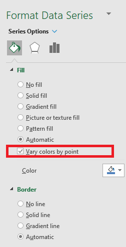
STEP 3: Check Vary colors by point.
STEP 4: Your desired Bubble Chart with 3 variables is ready!
Add Data Labels to Bubble Chart
STEP 1: Select the Chart
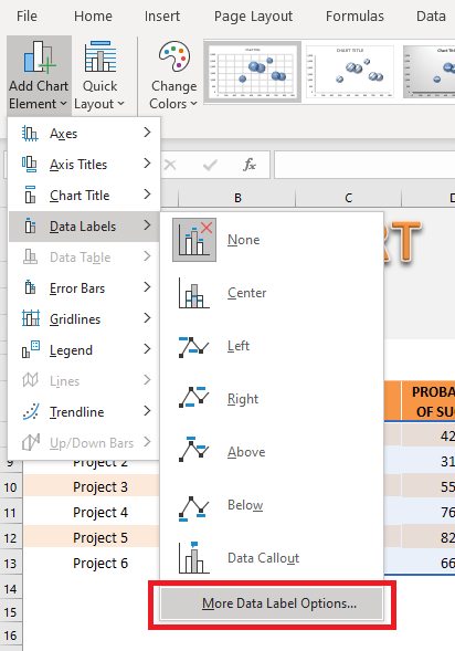
STEP 2: Go to Chart Options > Add Chart Elements > Data Labels > More Data Label Options
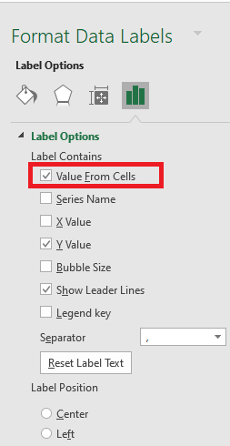
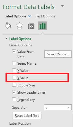
STEP 3: From the Format Label Panel, Check Value from Cell
STEP 4: Select the column Project
STEP 5: Uncheck Y value.
This is how the chart will look:
Pros and Cons of using Bubble Chart
Now that you understood how to make a graph with 3 variables (Bubble Chart), it is important to know the pros and cons of using it.
Advantages:
- It lets you add a third dimension to the data set.
- It can be used to depict the relationship between the data sets.
- It can be used to convey a lot of information at once.
Disadvantages:
- Too many bubbles can make the graph unreadable.
- Overlapping bubbles may create hindrance.
Frequently Asked Questions
How do I create a bubble chart with three variables in Excel?
To create a bubble chart, arrange your data in three columns where each column represents the X-axis, Y-axis, and bubble size, respectively. Select the data, go to the Insert tab, choose Scatter Chart, and then select Bubble Chart. Once the chart is created, you can customize it by adding axis titles, formatting the bubbles, and applying labels.
Can I add labels to the bubbles in my chart?
Yes, you can add labels either manually or dynamically. To do this, click on the chart, select a bubble, and use the Add Data Labels option under Chart Tools. For custom labels, you can use a helper column with your desired text and link it to the data labels using Excel’s advanced formatting features.
What can I do if the bubbles overlap too much?
If bubbles overlap, you can adjust the size scaling by right-clicking on the chart, choosing Format Data Series, and modifying the bubble scale under size options. Another approach is to filter or segment the dataset to focus on smaller groups, which reduces visual clutter and improves clarity.
John Michaloudis is a former accountant and finance analyst at General Electric, a Microsoft MVP since 2020, an Amazon #1 bestselling author of 4 Microsoft Excel books and teacher of Microsoft Excel & Office over at his flagship MyExcelOnline Academy Online Course.

