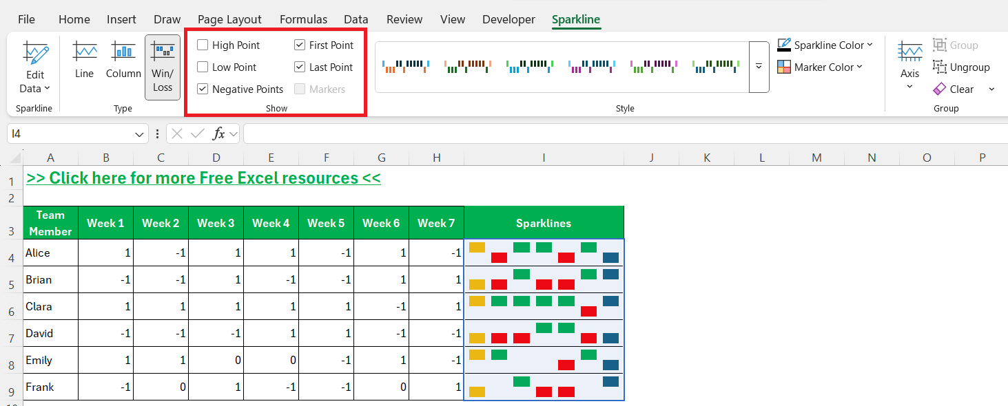
When I first discovered sparklines in Excel, I’ll admit—I underestimated them. I thought, “Great, mini-charts. How useful can that really be?” Fast forward a few years and now, win/loss sparklines are one of my favorite tools when I need a compact, visual way to identify patterns in performance data without cluttering up my worksheet. In this article, I’ll walk you through everything I’ve learned about win/loss sparklines in Excel, how to create them, and most importantly—how I use them to get instant insights.
Key Takeaways:
- Win/loss sparklines are ideal for visualizing binary outcomes.
- They condense complex sequences of results into an accessible format, making trends and patterns instantly visible.
- Sparklines require properly structured numbers (such as 1, -1, and 0) to function well and avoid misinterpretation.
- Adjusting colors, line thickness, and highlight features will help your sparklines communicate more effectively.
- Whether you’re tracking sports results, sales outcomes, or daily habits, win/loss sparklines add value wherever binary data is present.
Table of Contents
The Fundamentals of Win/Loss Sparklines
What Are Win/Loss Sparklines?
A sparkline is a tiny chart that fits in a single cell. Unlike their cousin, the line or column sparkline, win/loss sparklines condense binary data—such as wins versus losses, yes versus no, or on versus off—into a sleek, visual format. Each point represents an outcome: it’s either a win (displayed as a vertical bar pointing up) or a loss (a bar pointing down). Sometimes, if there’s a draw, that’s rendered as a flat line. These visuals are perfect for scenarios where the result is either positive or negative.
Contextual Strengths
I quickly realized that win/loss sparklines excel in contexts where the trend is just as important as the specifics—think sports teams’ performance, product launches, sales calls, or even test pass/fail results. Their beauty lies in their ability to show streaks and patterns with just a glance, without drowning the viewer in numbers. For binary outcomes, few visualization tools are as efficient. They make it easier for viewers to spot important runs or changes in performance. Even in dense datasets, these sparklines can cut through the clutter.
Getting Started with Sparklines in Excel
Preparing and Structuring Data
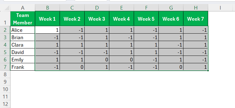
The first thing I did was to structure my data. In my case, each row represented a team member, and each column marked a week. The cells contained either a 1 (for win) or a -1 (for loss); you can use any binary system as long as it’s consistent. Zeroes often indicate a neutral result or a draw, depending on your scenario.
Clean, standardized data is the foundation for effective sparklines.
Inserting Win/Loss Sparklines
When you have a large data set with positive and negative numbers, a great way to visualize the trend is to add a Win/Loss Sparkline next to your data. That way you or the reader can easily spot the trends and patterns. To enter a Win/Loss Sparkline in Excel you first need to follow these steps:
STEP 1: Select your data.
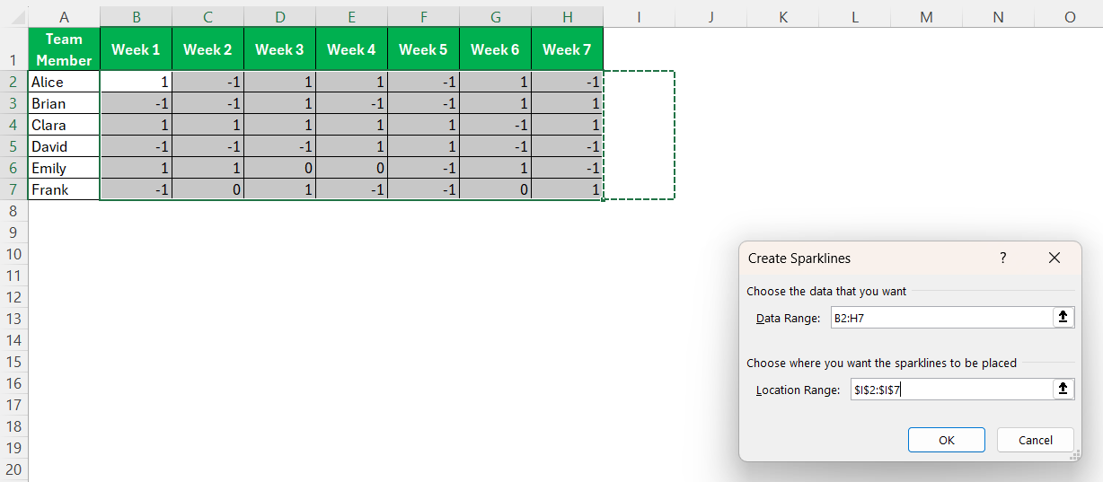
STEP 2: Insert > Sparklines > Win/Loss
STEP 3: Select the range that you want to insert the Win/Loss Sparklines (this is usually the next column after your data ends) and press OK.
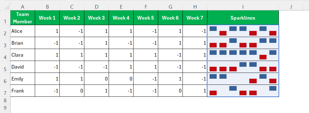
With a click, the sparkline appeared—a neat row of vertical bars, each mirroring my data.
Customizing and Interpreting Win/Loss Sparklines
Formatting and Color Coding
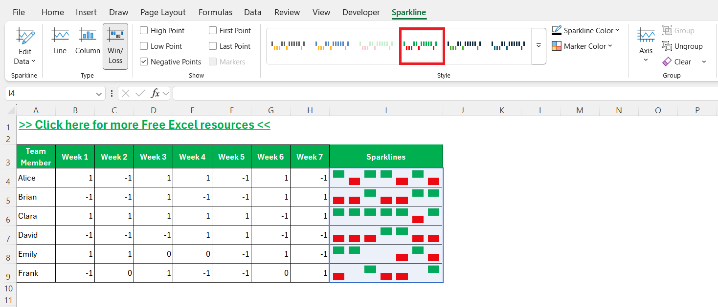
But I didn’t stop there. Excel offers a host of formatting options for sparklines, and I found that a little customization goes a long way. Using the Sparkline Tools menu that appears when a sparkline cell is selected, I tweaked the colors of my win and loss bars for instant visual clarity: green for wins, red for losses.
Effective formatting turns a simple sparkline into a powerful insight tool.
Recognizing Patterns and Highlights
The magic of these sparklines became evident as soon as I filled them across my data set. Suddenly, streaks of wins or losses leapt off the screen. I could see which team members were on a hot streak, where improvement was needed, and even spot anomalies—like sudden dips after several wins. Features like Show First Point, Show Last Point, Show High Point, and Show Low Point within the Sparkline Tools Design tab make it easier to draw attention to significant moments in the dataset.
FAQs
Q: What kind of data is best suited for win/loss sparklines?
A: Win/loss sparklines work best with binary data—scenarios where each entry is either a “win” or “loss,” “yes” or “no,” or similar. Examples include sports outcomes, pass/fail test results, or completed/incomplete tasks. The key is that the results can be clearly categorized into two (or occasionally three, with draws) distinct options. This makes them a great fit for performance tracking and trend spotting. Using them on non-binary data would diminish their effectiveness and clarity.
Q: How do I format sparklines for better visibility?
A: I recommend using the formatting options within the Sparkline Tools Design tab in Excel. You can change the color of win and loss bars (for example, green for wins, red for losses), adjust thickness, and highlight key points such as the highest or lowest values. Consistent formatting helps others quickly interpret the sparklines, especially in large sheets. Always preview your work as others would see it, especially if you plan to print or share your spreadsheet.
Q: Can I use sparklines to compare multiple data sets?
A: Yes, you can! In fact, grouping sparklines is one of the most powerful ways to compare trends across different people, teams, or periods. By aligning sparklines in adjacent rows and applying grouping, you ensure that their scales remain consistent, making visual comparison meaningful. Just make sure your data is structured in parallel so that each sparkline represents comparable information. Grouping also allows for bulk formatting adjustments, further streamlining your workflow.
Q: What are common mistakes to avoid when using win/loss sparklines?
A: One mistake I made early on was including blanks or inconsistent entries, which caused the sparklines to display incorrectly or not at all. Always clean your data before inserting sparklines. Another pitfall is failing to explain what different colors or lines represent, leading to confusion for viewers. Consistency in axis scaling is also vital when comparing multiple sparklines. Taking the time to document your visual choices and standardize your data will save trouble down the line.
Q: Are there alternatives to win/loss sparklines for data visualization in Excel?
A: Absolutely. While win/loss sparklines are superb for binary data, Excel also offers line and column sparklines, which are better for continuous or multi-value series. For more detailed analysis, you might consider conditional formatting, in-cell bar charts, or even traditional graphs like bar or line charts. Each tool has its strengths, so I choose based on the complexity and purpose of my data. Sparklines are unique in their ability to combine minimalism with instant insight right within the cell.
John Michaloudis is a former accountant and finance analyst at General Electric, a Microsoft MVP since 2020, an Amazon #1 bestselling author of 4 Microsoft Excel books and teacher of Microsoft Excel & Office over at his flagship MyExcelOnline Academy Online Course.


