Did you know that you can create a 3D Map in Excel to visualize your geographic and temporal data? You will be blown away by what it can show you, as it offers you a different perspective as compared to tables and charts. Once I learned how to transform raw data into an interactive, animated 3D visualization, I realized this tool was not just flashy—it was powerful. In this article, I’ll share my journey of exploring 3D Maps in Excel, breaking down each step, and showing you how you can use it to bring your data to life.
Key Takeaways:
- 3D Maps in Excel transform raw data into interactive geographic visualizations.
- They reveal trends over time using timeline animations.
- Business, education, government, and journalism benefit greatly from 3D Maps.
- Clean, structured data is essential for meaningful results.
- 3D Maps turn analysis into storytelling, making insights more engaging.
Table of Contents
Understanding What 3D Maps Are
Moving Beyond Flat Charts
Before 3D Maps, my visualizations were limited to static 2D charts. They got the job done, but often lacked the impact needed to tell a compelling story. 3D Maps gave me a way to place data points on a globe or map, add dimensions like height, category, and time, and watch trends unfold in motion. Suddenly, I wasn’t just analyzing numbers—I was experiencing them.
Why 3D Maps Matter for Data Analysis
3D Maps in Excel aren’t just for creating “pretty visuals.” They help uncover insights that traditional tables or charts often bury. For instance, you can spot regional growth patterns, compare company performance across different areas, and even track changes over time. What impressed me most was the storytelling aspect—it felt like building a mini documentary with my data.
Creating 3D Map in Excel
STEP 1: Ensure you have clicked on your data. Go to Insert > Tours > 3D Map
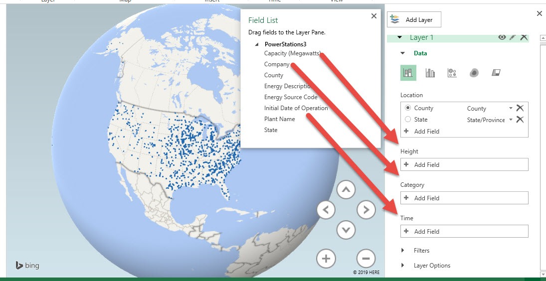
STEP 2: All of a sudden you have a bare 3D Map!
Let us do the following, drag the following fields:
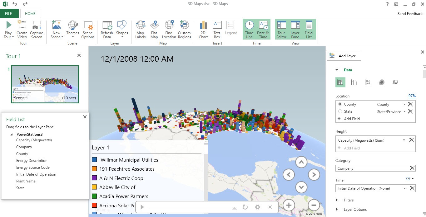
- Capacity (Megawatts) to Height – to show a tall bar per location according to the value
- Company to Category – to color code the bar according to the company’s portion
- Initial Date of Operation to Time – you will see something cool later, wherein an animation of a timeline will be generated!
And just like that your 3D Map is now ready for your analysis!
STEP 3: Wait there’s more! Go to Home > Tour > Play Tour
You will see an animation of the timeline on the growth of Capacity has went over time per location!
Practical Applications of 3D Maps
- Business Insights – For business contexts, 3D Maps are invaluable. I used them to show market penetration by region, compare competitors, and even forecast trends. The visual impact made my presentations more persuasive, helping me highlight opportunities and risks with clarity.
- Educational and Personal Uses – Beyond work, I found 3D Maps useful in educational settings too. Imagine teaching students about renewable energy capacity growth worldwide or showing the spread of technology adoption. It turns abstract numbers into a tangible journey, making learning engaging and memorable.
- Government and Public Policy – Governments can apply 3D Maps for public health tracking, like vaccination rollouts, or urban planning, such as mapping traffic, housing, or energy use. The ability to view change over time makes planning and crisis response far more effective.
- Research and Data Journalism – Researchers and journalists use 3D Maps to simplify complex data stories. From illustrating global migration patterns to showing climate change impacts like rising sea levels, these maps turn abstract numbers into visuals that audiences actually connect with.
FAQs
1. What is a 3D Map in Excel and why should I use it?
A 3D Map in Excel is a visualization tool that allows you to plot geographic and time-based data on a globe or map. Unlike flat charts, it adds depth by incorporating location, categories, and timelines. This makes trends much easier to spot and understand. You should use it if you want to create impactful presentations that go beyond static graphs. It’s particularly powerful when storytelling is as important as the analysis itself.
2. Do I need any special version of Excel to access 3D Maps?
3D Maps are available in Excel 2016 and later, as well as in Microsoft 365. If you’re using Excel 2013, the tool is called Power Map, but it works almost the same way. Unfortunately, older versions of Excel like 2010 or 2007 don’t include this feature. To check if you have it, look for the Insert > Tours > 3D Map option in your ribbon. If it’s there, you’re good to go!
3. What kind of data works best with 3D Maps?
3D Maps perform best with datasets that include geographic locations, numerical values, and time or categories. For example, sales data by city, renewable energy capacity by country, or disease cases by region over several years. The cleaner and more structured your data is, the better your visualization will be. Excel needs to recognize your location fields (like city, state, or latitude/longitude) to plot them correctly. Adding time-based data unlocks animations that make your map even more insightful.
4. Can I customize how my 3D Map looks and behaves?
Yes, 3D Maps allow a lot of customization. You can change the globe view, zoom into specific regions, adjust colors, and switch between themes for better clarity. You can also add multiple layers, each showing a different aspect of the same dataset—for example, capacity growth and number of plants. The timeline animation can also be customized to control the playback speed and range of years. These adjustments make your map more engaging and tailored to your audience.
5. How can 3D Maps be applied in real-world scenarios?
There are countless applications across industries. Businesses use them for sales analysis, supply chain optimization, and forecasting. Educators use them to teach history, geography, and environmental change in an engaging way. Governments leverage them for urban planning and public health tracking, while journalists use them to illustrate migration or climate change trends. In short, 3D Maps turn complex data into clear stories that people actually understand.

Bryan
Bryan Hong is an IT Software Developer for more than 10 years and has the following certifications: Microsoft Certified Professional Developer (MCPD): Web Developer, Microsoft Certified Technology Specialist (MCTS): Windows Applications, Microsoft Certified Systems Engineer (MCSE) and Microsoft Certified Systems Administrator (MCSA).
He is also an Amazon #1 bestselling author of 4 Microsoft Excel books and a teacher of Microsoft Excel & Office at the MyExecelOnline Academy Online Course.


