Microsoft Excel Pivot Tables transform daunting data analysis tasks by offering a powerful tool to summarize and manipulate extensive datasets efficiently. As a vital resource for data analysts, pivot tables simplify complex analysis, such as month-over-month performance tracking, making strategic decision-making more accessible.
Key Takeaways:
- Efficient Data Summarization: Pivot tables provide quick and effective summarization of large datasets, enabling easy insight extraction.
- Enhanced Data Analysis: Pivot tables facilitate month-over-month comparisons, crucial for identifying trends and assessing performance over time.
- Easy Data Manipulation: Users can easily adjust data in pivot tables using simple drag-and-drop actions to meet analytical needs.
- Visual Data Representation: Pivot tables, combined with pivot charts, effectively visualize data trends, improving data interpretation and presentation.
- Customizable Data Exploration: Pivot tables allow for detailed customization in data analysis, from high-level overviews to in-depth data breakdowns.
Table of Contents
Introduction to Excel Pivot Table Mastery
Understanding the Power of Pivot Tables
Excel pivot tables are not mere features; they are the gateways to insightful data analysis. If you’ve ever faced the daunting task of sifting through extensive data in Excel, then you’ll appreciate how pivot tables can be your saving grace. They allow you to process and summarize massive amounts of information quickly and efficiently—making them a favorite among data analysts.
Pivotal Role of Month-over-Month Analysis
Month-over-month analysis is the diagnostic heartbeat of business analytics. It’s how stakeholders can track progress, identify trends, and make strategic decisions based on short-term performance data. By comparing data from one month to the next, you can discern whether sales numbers, website traffic, or any other metric is improving, staying stable, or declining.
Excel pivot tables maximize this analysis by enabling you to manipulate and drill down into your data with just a few clicks.
Setting Up Your Data for Success
Preparing Your Dataset for Pivot Table Conversion
Before performing any magic with pivot tables, ensure your dataset is impeccably organized. This means having your sales data, or any other subject of analysis, structured with consistent headings and clean from any blanks or errors.
Each column should represent a single category (e.g., Date, Sales, Store, Region), and every row, an individual record. This precondition enables the pivot table to interpret your data correctly and return the most accurate and insightful results.
Best Practices for Data Integrity and Structure
To maintain the integrity of your data when preparing for a pivot table, adhere to the following best practices:
- Unique Column Titles: Ensure each column has a unique title, and avoid any special characters that might confuse Excel.
- Uniform Data Entries: Consistency in data entry is crucial. For dates, choose a format and stick with it throughout the dataset.
- Fill In Blanks: Pivot tables can misinterpret blank cells, so fill them in with a zero or ‘N/A’ where applicable.
- Remove Duplicates: Duplicate entries can skew your analysis. Use Excel’s ‘Remove Duplicates‘ feature to clean your data.
- Data Validation: Apply data validation rules to prevent future erroneous data entries.
Crafting the Month-over-Month Pivot Table
Initiating the Pivot Table for Monthly Insights
Follow the steps below to initiate the Pivot Table –
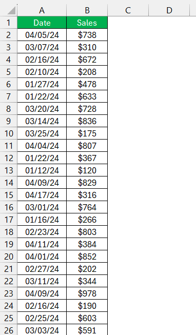
STEP 1: To gain monthly insights from your dataset using a pivot table, you start by selecting your data range and clicking on the ‘Insert’ tab, followed by ‘Pivot Table’ on Excel’s ribbon.
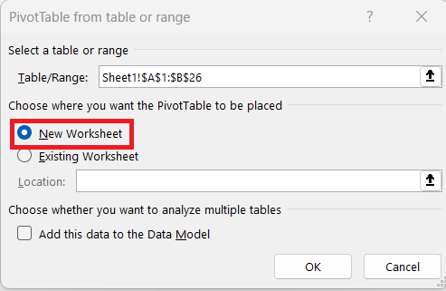
STEP 2: Choose where you want the pivot table report to be placed, whether on a new worksheet or an existing one.
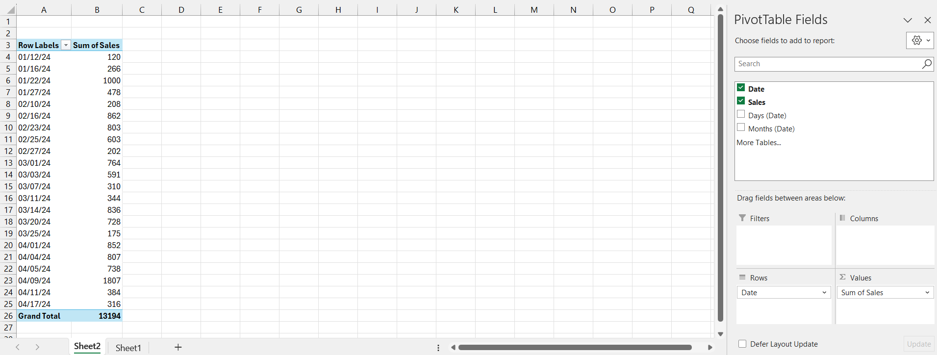
STEP 3: After creating the pivot table, drag the ‘Date’ field into the Rows area and the ‘Sales’ field to the Value area.
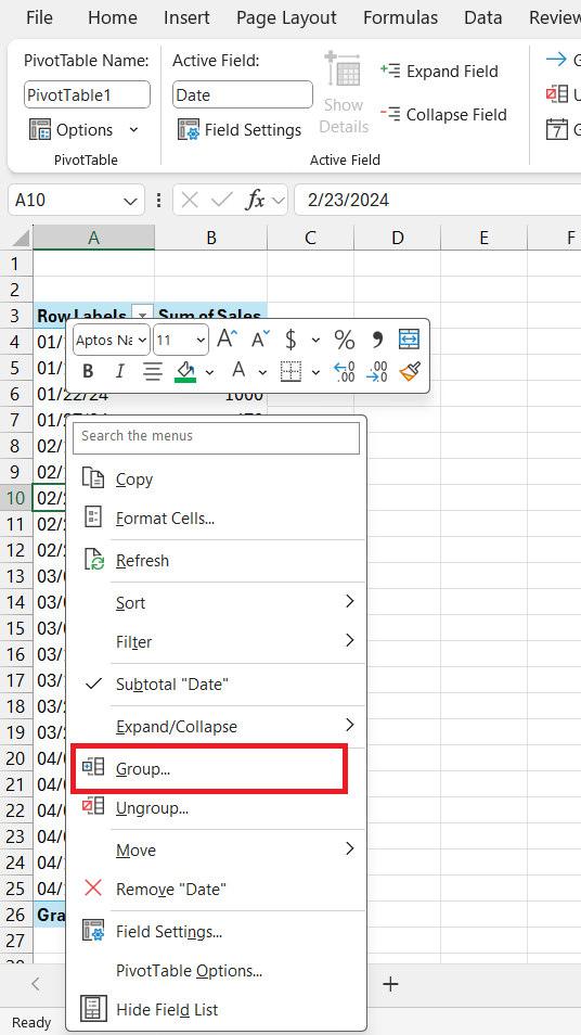
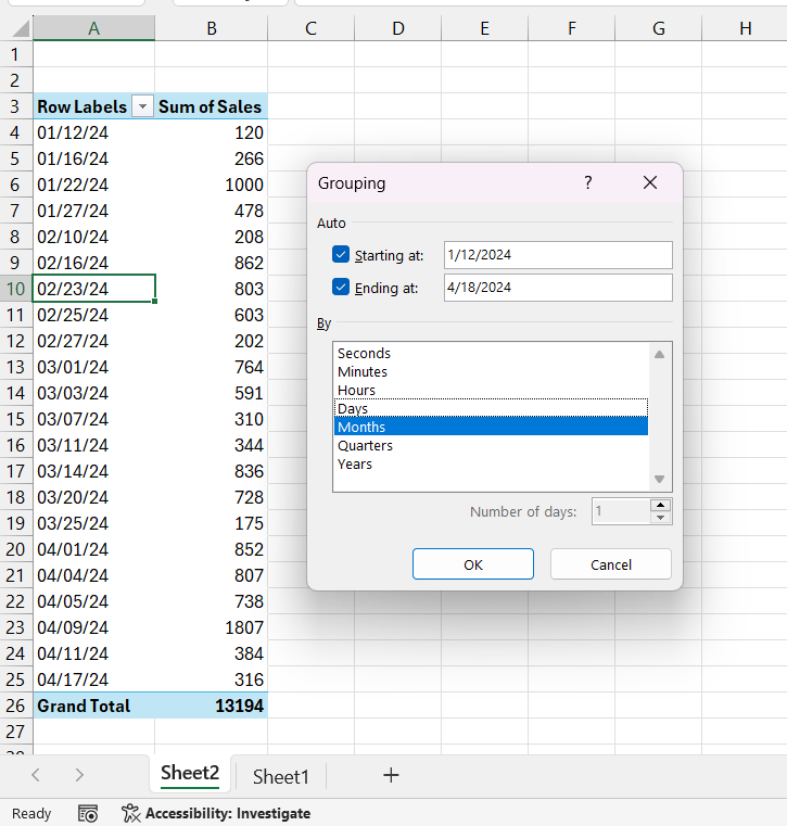
STEP 4: Right-click on the dates column and select Group.
STEP 5: Select Month.
You may also want to add Years for clearer comparison, depending on the range of your data.
Visualizing Data Trends with Pivot Charts
Creating Impactful Charts for Month-over-Month Comparisons
To elevate your month-over-month analysis, you can create impactful charts directly from your pivot table. After setting up the comparison in your pivot table:
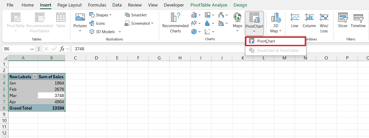
STEP 1: Select your pivot table, navigate to the Insert tab, and choose ‘PivotChart.’
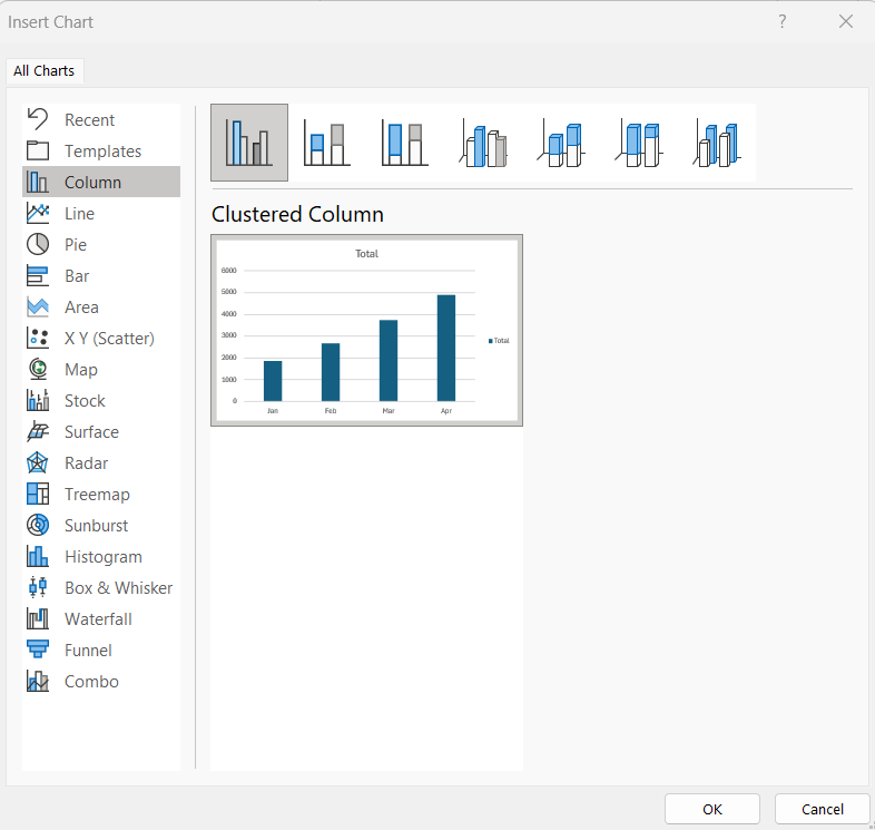
STEP 2: From the Insert Chart dialog box, select a chart type that best represents your data, like a line or column chart for temporal data.
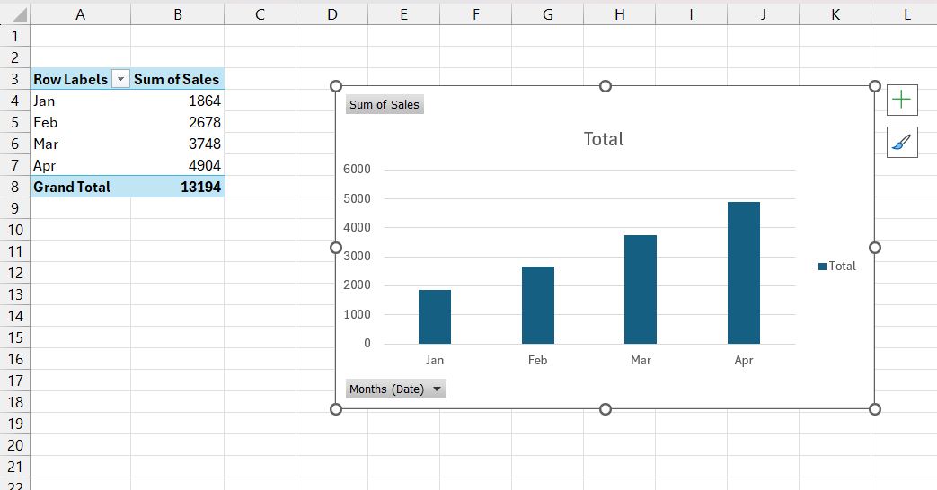
STEP 3: Click ‘OK’ to insert the chart, and you’ll see your monthly comparisons come to life visually.
By creating charts, you bring a dynamic component to your analysis that can make trends and changes more evident at a glance.
Customizing Charts for Clearer Data Storytelling
To tell a clear data story with your PivotCharts, customization is key:
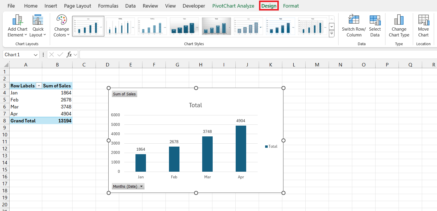
- Chart Design: Play with the ‘Chart Design’ tab to modify the color scheme and style, making it more readable and visually appealing.
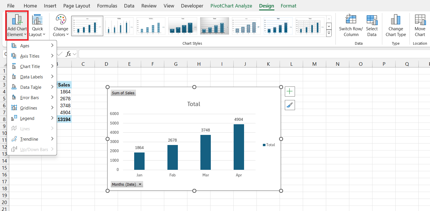
- Chart Elements: Use the ‘Add Chart Element’ dropdown menu to include titles, data labels, and more, which can provide essential context for viewers.
Through these enhancements, you’re not just showing numbers; you’re telling a compelling story with your data.
Navigating Common Challenges in Pivot Tables
Solving Grouping Issues When Comparing Different Months
When analyzing multiple months, you might encounter issues like grouped dates not reflecting the monthly periods you intend to analyze. Here’s how to resolve them:
- Check Data Format: Ensure all dates in your dataset are formatted correctly (as dates), so Excel can group them properly.
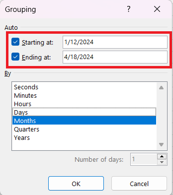
- Specify Group Range: When grouping by months, manually set the ‘Starting at’ and ‘Ending at’ fields to make sure all intended data is included.
- Ungroup and Regroup: If the groups don’t seem right, you can ungroup the data and regroup it, which can sometimes reset any anomalies that occurred the first time.
With these fixes, your pivot table should accurately reflect the month-over-month comparison.
Overcoming Data Refresh Hurdles for Accurate Comparisons
Refreshing your pivot table’s data is crucial to ensure month-over-month comparisons are up to date. Here are the steps and tips to overcome common data refresh hurdles:
- Data Source Expansion: If you’ve added more data to your dataset, adjust the pivot table’s data source range either manually or by creating a dynamic named range in Excel.
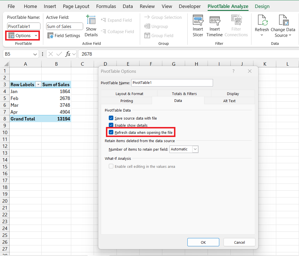
- Refresh on Open: Set your pivot table to refresh automatically every time the Excel workbook is opened by going to PivotTable Options and checking the ‘Refresh data when opening the file’ option.
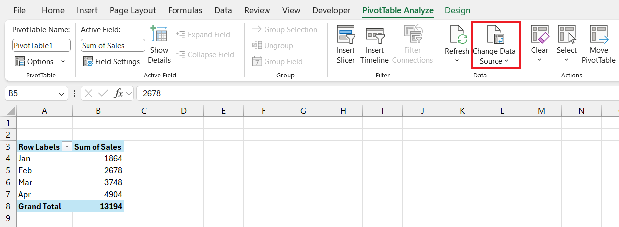
- Change Data Source: If your data source has moved or changed, you can update the source by going to the ‘Change Data Source’ button under the ‘PivotTable Analyze’ tab.
FAQ: Frequently Asked Questions
How do I get the month over month in Excel?
To get the month-over-month change in Excel using a pivot table:
- Create a pivot table from your data.
- Group data by month by right-clicking on a date value and selecting ‘Group’.
- Add the value field (e.g., sales) to the ‘Values’ area, set ‘Show Values As’ to ‘Difference From’, and choose the previous month as your comparison base.
How do I pivot by month instead of date?
To pivot by month instead of date in Excel:
- Right-Click any date in your pivot table.
- Select ‘Group’ from the contextual menu.
- In the Grouping dialog, check ‘Months’ and optionally ‘Years’ for clarity.
- Click ‘OK’ to apply the grouping.
Your data will now be displayed and summarized by month.
What is the formula for month to month variance in Excel?
In Excel, the formula for month-to-month variance is:
= (Current Month’s Value - Previous Month's Value) / Previous Month's Value
Replace “Current Month’s Value” and “Previous Month’s Value” with cell references that hold these values to calculate the variance percentage.
How Can I Ensure Data Consistency Across Monthly Reports?
To ensure data consistency across monthly reports in Excel:
- Use table formats for your data to maintain structure and formulas across additions.
- Apply data validation rules to standardize entries.
- Create a consistent pivot table template to use each month.
- Use dynamic named ranges to account for data updates.
What Are Some Techniques to Highlight Significant Month-over-Month Variations?
To highlight significant month-over-month variations in Excel:
- Use Conditional Formatting to visually mark data that meets certain criteria, such as variances above a particular threshold.
- Add a calculated field in your pivot table to show percentage changes and use data bars or icon sets from Conditional Formatting.
- In PivotCharts, apply different colors or markers to significant data points for instant recognition.
John Michaloudis is a former accountant and finance analyst at General Electric, a Microsoft MVP since 2020, an Amazon #1 bestselling author of 4 Microsoft Excel books and teacher of Microsoft Excel & Office over at his flagship MyExcelOnline Academy Online Course.

