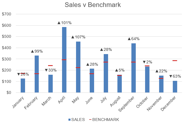
In a previous blog post we created a Benchmark Chart using Excel 2013. We are going to extend this concept and add some cool looking custom chart labels to make our chart more informative.
View the Benchmark Chart using Excel 2013
Download excel workbookCustom-Chart-Labels.xlsx
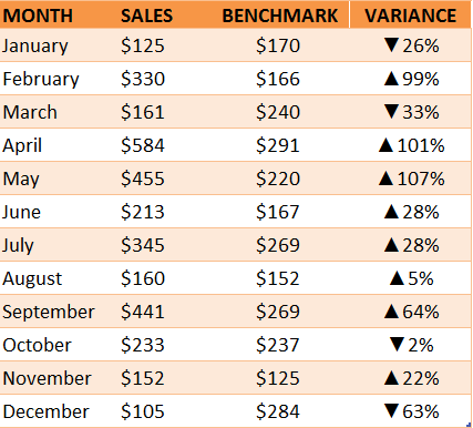
STEP 1: We added a % Variance column in our data and inserted symbols ▲▼ to show a negative and positive variance
** You can see the tutorial of how this is done here **
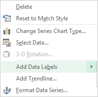
STEP 2: In our graph we need to select the Sales chart and Right Click and choose Add Data Labels
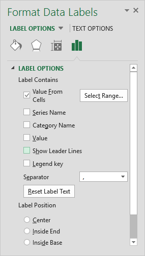
STEP 3: We then need to select one Data Label with our mouse and press CTRL + 1 to bring up the Format Data Labels dialogue box
STEP 4: From the Format Data Labels dialogue box we need to select the Value From Cells box only and make sure no other boxes are ticked
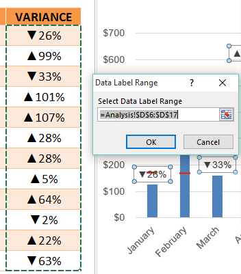
STEP 5: This will bring up a Data Label Range dialogue box. If it does not show, then you need to select the Select Range… button. From here you need to select the Variance data range and press OK.
Your cool looking chart labels are now on your chart!
John Michaloudis is a former accountant and finance analyst at General Electric, a Microsoft MVP since 2020, an Amazon #1 bestselling author of 4 Microsoft Excel books and teacher of Microsoft Excel & Office over at his flagship MyExcelOnline Academy Online Course.


