Pinterest Pixel

The Ultimate Guide to Grouped Frequency Distribution in Excel

John Michaloudis
Microsoft Excel's capabilities extend far beyond simple calculations, providing powerful tools for data organization and analysis.
One essential feature is the creation of grouped frequency distributions, which categorize data into intervals for easier interpretation.

This technique is invaluable for identifying patterns and trends within large datasets, making it a vital skill for effective data analysis and business intelligence.

With Excel, you can transform raw data into structured insights effortlessly. Key Takeaways:
The Ultimate Guide to Grouped Frequency Distribution in Excel | MyExcelOnline The Ultimate Guide to Grouped Frequency Distribution in Excel | MyExcelOnline

  • Pivot Tables for Quick Setup: Use Pivot Tables to create grouped frequency distributions easily, enabling swift and flexible summary reports.
  • Data Analysis ToolPak for Precision: For detailed statistical analysis, the Data Analysis ToolPak offers advanced options to customize your frequency distributions.
  • COUNTIF and COUNTIFS Functions: These functions help in creating precise frequency distributions based on single or multiple criteria, perfect for detailed data analysis.
  • Custom Bins: Tailoring bin ranges to fit your specific needs enhances the relevance and clarity of your data insights.
  • Real-World Applications: Mastering frequency distributions in Excel is crucial for uncovering trends, identifying outliers, and making informed decisions in various professional fields.


Unveiling the Power of Excel in Grouped Frequency Distribution

Excel Mastery: The Key to Data Organization

Excel is not just about plugging numbers and basic calculations; it’s a robust tool that can help you organize and understand your data with greater depth. Through its various functions and features, Excel enables you to group data into frequency distributions, which is a pivotal technique in statistical analysis and business intelligence. With Excel, you’ve got a clear path to tidy and categorize information that’s prime for insights.

Understanding Grouped Frequency Distribution

A grouped frequency distribution is like a data whisperer, effortlessly categorizing raw data into intelligible sets. Imagine you’re juggling a multitude of data points. Grouped frequency distributions help by sorting these into intervals, or bins, so you can see patterns and trends at a glance.

Each bin represents a range of values, and the distribution shows how many data points fall within each range. It’s essential for dealing with large datasets where detailing each score would be impractical. With these distributions, analyzing a massive amount of data becomes manageable, giving you the ability to discern the big picture without losing yourself in the numbers.


Step-by-Step Instructions for Crafting Distributions

Method 1: Pivot Tables – Your Go-To for Quick Setup

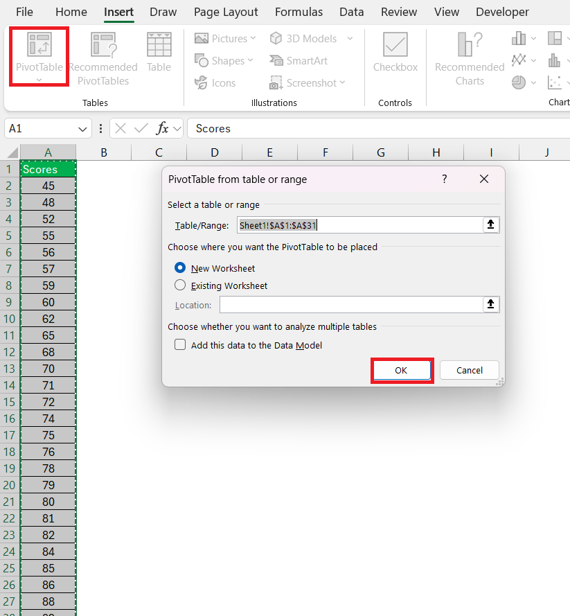
Pivot Tables in Excel are like your data’s best friend, allowing for swift and flexible summary reports. They make setting up grouped frequency distributions a breeze. To get started, you’ll insert a pivot table by clicking on the Insert > Pivot Table. In the PivotTable dialog box, select OK.

Grouped Frequency Distribution in Excel

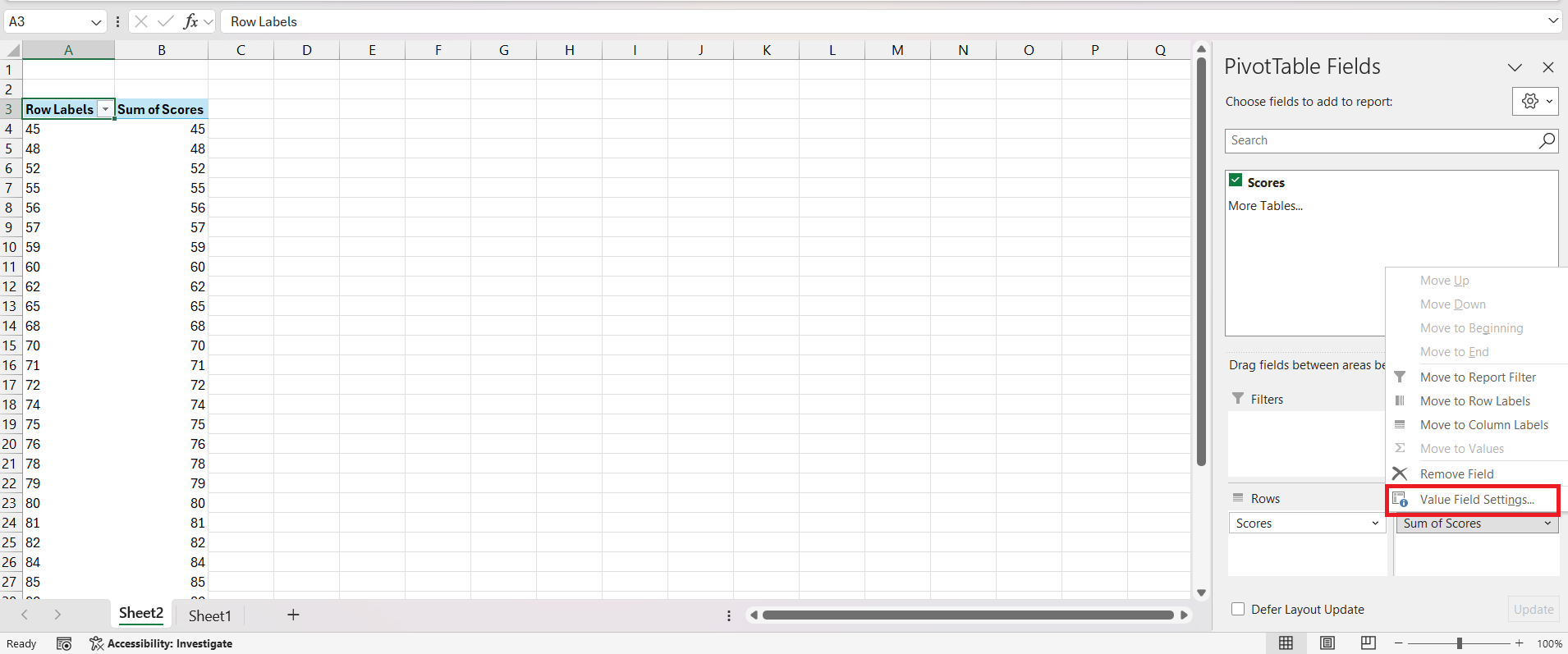
You can drag desired fields to specific areas and adjust value settings to count occurrences. For instance, let’s say you’re dealing with student’s scores. After creating your pivot table, you’ll drag the ‘Sales’ field into the Rows area and again into the Values area. Click on the arrow next to the value field and select ‘Value Field Settings.

Grouped Frequency Distribution in Excel

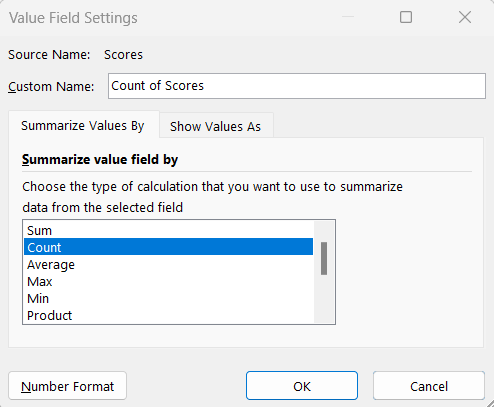
You can change the calculation from ‘Sum’ to ‘Count’.

Grouped Frequency Distribution in Excel

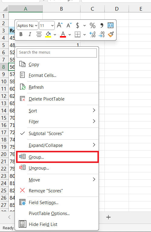
Next, you’ll group your data into bins by right-clicking on the Row Labels, and selecting ‘Group’.

Grouped Frequency Distribution in Excel

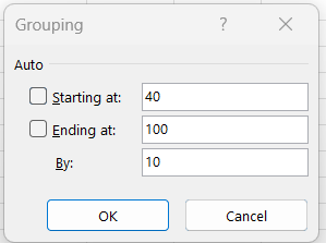
You can define your desired range and bin width.

Grouped Frequency Distribution in Excel

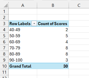
Excel does the rest, neatly counting the frequency of data points per bin, giving you an instant grouped frequency distribution. Voilà!

Grouped Frequency Distribution in Excel

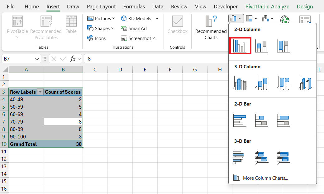
Now, go to Insert > Insert Column or Bar Chart > Clustered Column.

Grouped Frequency Distribution in Excel

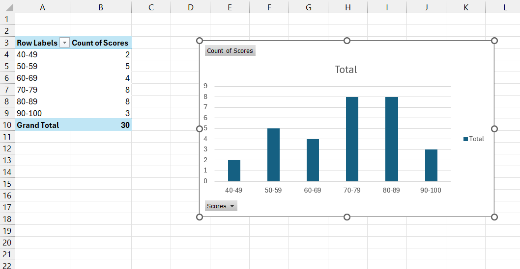
The chart for grouped frequency distribution will be inserted into the worksheet.

Grouped Frequency Distribution in Excel

Method 2: Data Analysis ToolPak – For the Detail-Oriented

The Data Analysis ToolPak is your secret weapon for more intricate statistical analysis, including crafting grouped frequency distributions. If you’re the type who loves details and customization, this will be your preferred method. It’s not on by default, so your first step is enabling this feature. Once you’ve set your sights on that shiny Data Analysis icon under the Excel Data tab, you’re ready to plunge into a world of options.

Grouped Frequency Distribution in Excel

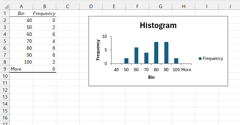
To create your distribution, select the appropriate data range including the column header, hit the Data Analysis icon, and pick ‘Histogram‘ from the menu.

Grouped Frequency Distribution in Excel

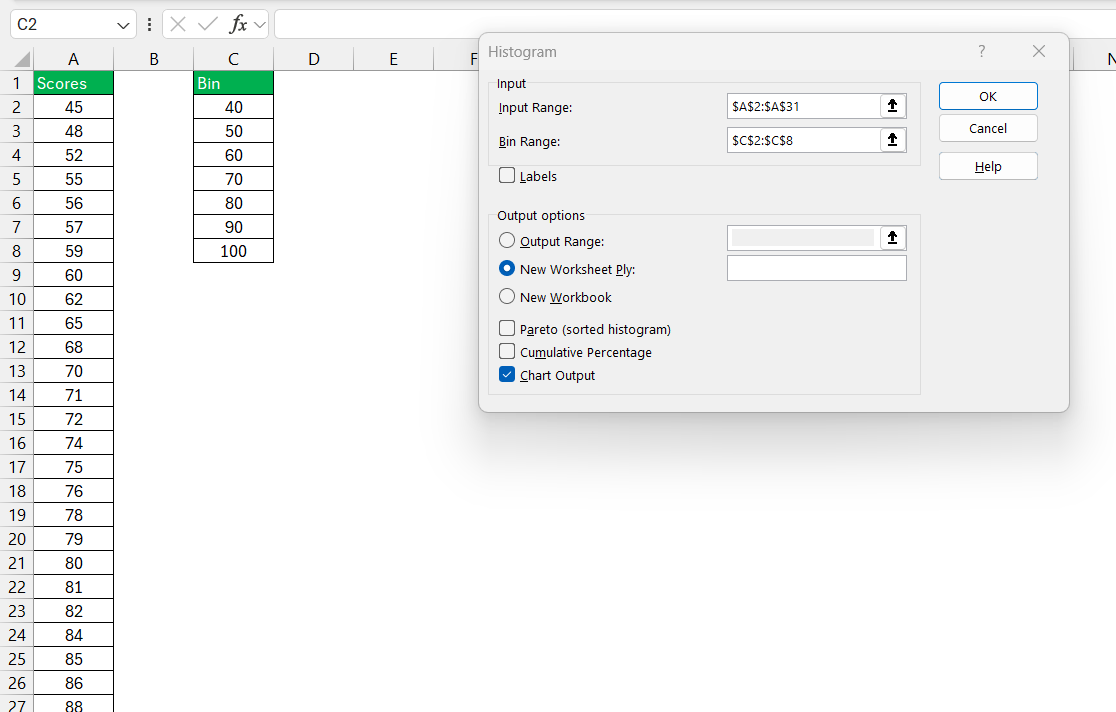
Customize the input range and bin range, select ‘New Worksheet’ for outputs and check

Grouped Frequency Distribution in Excel

Let Excel work its magic to reveal your frequency distribution in a new worksheet.

Grouped Frequency Distribution in Excel

This approach is perfect for those who appreciate precision and the ability to fine-tune their analysis. Remember, this technique offers additional statistical outputs, which can be extremely beneficial in your data analysis journey.


Tools and Tricks for Efficient Frequency Analysis

Harnessing COUNTIF() and COUNTIFS(): When Precision Matters

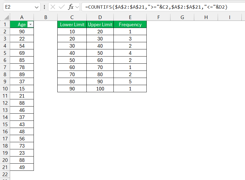
When your data demands accuracy, embracing the COUNTIF() and COUNTIFS() functions in Excel is like having a GPS for navigating through a sea of information. COUNTIF() is your single-criterion-counter for those times you only need to focus on one condition. On the flip side, COUNTIFS() is your multifunctional tool, capable of handling several criteria at once.

These functions are particularly handy for creating frequency distributions when you’re working with specific ranges or conditions. To paint a picture: If you’re evaluating survey data, COUNTIF() helps you find out how many respondents are 20 years old or younger, while COUNTIFS() leaps in to determine the number of people within each age bracket, like 21-30, 31-40, and so on, by counting values that meet these layered criteria.

Grouped Frequency Distribution in Excel

Keep in mind for best results, you’ll want to predefine your bin ranges when using these functions. Precision does come at a slight cost of convenience, as any changes in the range require updating the formulas. However, for detailed, custom analyses, COUNTIF() and COUNTIFS() are stellar allies.

Creating Custom Bins: Tailoring Data to Fit Your Needs

Venturing into the world of custom bins means you’re not settling for one-size-fits-all when displaying your data. By tailoring bins to fit your needs, you maneuver through Excel with finesse, spotlighting only the most relevant insights. Custom bins are especially handy when the default bin sizes don’t encapsulate the story you’re trying to tell with your data.

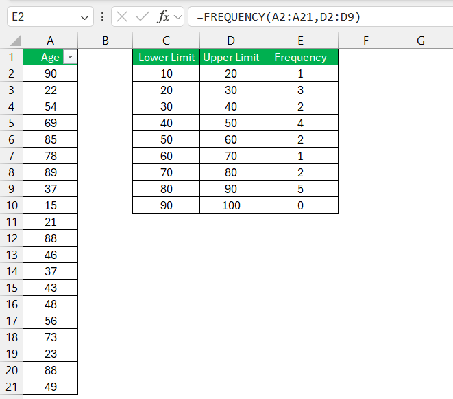
You modify them with ease – start by deciding on the best bin range that speaks to your dataset’s uniqueness. Using the FREQUENCY() function, you can then redefine your bins as needed, grouping data points to reflect the actual trends and patterns. For example, rather than sticking with default increments, you might combine certain intervals to emphasize a range where most data points fall.

Grouped Frequency Distribution in Excel

Custom bins thus add a layer of sophistication to your analysis, allowing for the most meaningful interpretation of data. Remember, though, the secret sauce to custom bins is in the balance – not too broad, not too narrow.


Real-World Applications and Key Takeaways

Why Mastering Frequency Distributions is Essential for Data Analysis

Mastering frequency distributions is to data analysis what sharpening a pencil is to drawing – it prepares your tools to carve out the details of your data’s narrative. Frequency distributions are foundational in understanding the ‘what’ and ‘how often’ which are crucial to making informed decisions. With this technique, you distill large and unruly datasets into digestible, organized tables and charts.

Whether spotting sales patterns, measuring performance metrics, or analyzing survey results, frequency distributions help reveal the underlying structure and behaviors within your data. They enable you to identify outliers, trends, and common occurrences that can guide strategic business decisions, research conclusions, and even help in forecasting.

Igniting such a powerful function within Excel elevates your analytical capabilities, ensuring you’re not just collecting data but converting it into actionable wisdom.

How Excel Simplifies Complex Data Interpretation

Excel acts as your data navigator, translating complex datasets into comprehensible formats with its array of features. At the heart of this transformative tool are functions like PivotTables and chart options that convert columns of numbers into visual stories, while conditional formatting highlights significant points, making complex interpretation much less daunting.

Take advantage of formulas that can automate calculations across large datasets, reducing the potential for human error and saving time. Excel’s grid layout itself simplifies the organization and manipulation of data, and features like sorting and filtering allow you to zero in on the data that matters without getting lost in the numbers.

From financial analysts to marketing managers, professionals rely on Excel’s powerful capabilities to make sense of intricate data every day. It’s no wonder that proficiency in Excel is synonymous with proficiency in data interpretation.


Frequently Asked Questions

How do I group frequency distributions in Excel?

To group frequency distributions in Excel, you can utilize the Group feature in Pivot Tables. Select your dataset, insert a Pivot Table, and drag your desired values to both the Rows and Values sections. Adjust to ‘Count’ and then right-click one of the Row Labels in the pivot table and hit ‘Group’. Define your intervals, and Excel will group your data accordingly.

How to create a grouped frequency distribution?

To create a grouped frequency distribution in Excel, first select your dataset and decide on suitable bin ranges. Then, either:

Don’t forget to label your bins clearly for the best insights!

How can I create unequal bins for frequency distribution in Excel?

To create unequal bins for frequency distribution in Excel, you start by manually defining your custom bin ranges on the spreadsheet. Next, use the COUNTIFS() function to calculate the frequency for each of your defined ranges. This function will allow you to set different criteria for each bin, accommodating the unequal intervals. Ensure that each bin is mutually exclusive to maintain data integrity.

What are some limitations of using the COUNTIF function for frequency distributions?

The COUNTIF function is fantastic for single-criteria counting, but it does come with spoilers. For frequency distributions, one limitation is that each condition must conform to a single criterion, restricting its use for more sophisticated analysis that involves multiple criteria. Additionally, with preset bin ranges required directly in the formula, any changes in data range demand formula adjustments, which can be time-consuming. It’s count-on-demand but not ideal for dynamic data scenarios.

How do frequency distributions work?

Frequency distributions work by organizing data into categories, or bins, and then counting the number of values that fall into each bin. It’s a way to understand how often certain values occur within the data set, providing insights into patterns, trends, and outliers. In essence, they turn a sea of numbers into an orderly array that’s much easier to interpret and use for analysis.

If you like this Excel tip, please share it
Founder & Chief Inspirational Officer at

John Michaloudis is a former accountant and finance analyst at General Electric, a Microsoft MVP since 2020, an Amazon #1 bestselling author of 4 Microsoft Excel books and teacher of Microsoft Excel & Office over at his flagship MyExcelOnline Academy Online Course.

See also  Evaluate Formulas Step By Step in Excel
30+ Excel & Office Courses
One Dollar Trial

$1 Trial for 30 days

Access for $1

Cancel Anytime

Star 30 Days - Full Access Star

One Dollar Trial

$1 Trial for 30 days!

Access for $1

Cancel Anytime

One Dollar Trial
  • Get FULL ACCESS to all our Excel & Office courses, bonuses, and support for just USD $1 today! Enjoy 30 days of learning and expert help.
  • You can CANCEL ANYTIME — no strings attached! Even if it’s on day 29, you won’t be charged again.
  • You'll get to keep all our downloadable Excel E-Books, Workbooks, Templates, and Cheat Sheets - yours to enjoy FOREVER!
  • Practice Workbooks
  • Certificates of Completion
  • 5 Amazing Bonuses
Satisfaction Guaranteed
Accepted paymend methods
Secure checkout

Get Video Training

Advance your Microsoft Excel & Office Skills with the MyExcelOnline Academy!

Dramatically Reduce Repetition, Stress, and Overtime!
Exponentially Increase Your Chances of a Promotion, Pay Raise or New Job!

Learn in as little as 5 minutes a day or on your schedule.

Learn More!

Share to...