When I first started working with Excel, I thought of it as just a place to store numbers, run formulas, and build tables. Over time, I realized that Excel is also one of the most powerful tools for visualizing data. Among all the chart types, pie charts quickly became one of my favorites for showing proportions and comparisons.
In this article, I’ll take you through my experience of working with pie charts in Excel, step by step. I’ll share how I built one for a market share dataset, how I customized it, and why pie charts are both useful and sometimes tricky.
Key Takeaways:
- Pie charts in Excel are one of the simplest ways to visualize proportions and comparisons.
- Clean, well-structured data is essential before creating a pie chart to avoid misleading results.
- Pie charts work best with smaller datasets (5–7 categories) to maintain clarity.
- Adding data labels, percentages, and clear colors greatly improves readability.
- While pie charts are powerful for storytelling, they have limitations when categories are too many or values are too similar.
download workbookPie-Chart.xlsx
Table of Contents
Understanding the Basics of Pie Charts
What is a Pie Chart?
A pie chart is a circular chart divided into slices, where each slice represents a part of a whole. In Excel, each slice’s size is proportional to the percentage it represents. For example, when I plotted my dataset of five companies’ market shares, the largest slice immediately pointed to the market leader, and the smallest slice revealed the company with the lowest presence.
Why Pie Charts Are Popular in Excel
Pie charts are everywhere—business reports, presentations, and even social media infographics. The reason is simple: they are easy to interpret at a glance. Instead of looking at a table and calculating differences, a pie chart tells the story visually. I’ve often used pie charts to quickly show stakeholders how resources are distributed, which category dominates, or how market shares stack up.
Preparing Data for a Pie Chart
Cleaning and Organizing the Data
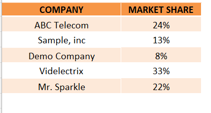
Before creating any chart, I always make sure my data is clean and structured. For my market share example, I had a simple two-column dataset: one column for company names and the other for their market shares. I avoided including totals, empty cells, or duplicate values because these can distort a pie chart.
Choosing the Right Dataset
Not every dataset is suited for a pie chart. I realized that pie charts work best when dealing with a limited number of categories—ideally 5 to 7. Any more, and the chart starts looking cluttered. My dataset of five companies was perfect:
- ABC Telecom – 24%
- Sample, Inc – 13%
- Demo Company – 8%
- Videlectrix – 33%
- Mr. Sparkle – 22%
Creating a Pie Chart in Excel
STEP 1: Enter your data in two columns — one for categories (e.g., company names) and one for values (e.g., percentages).
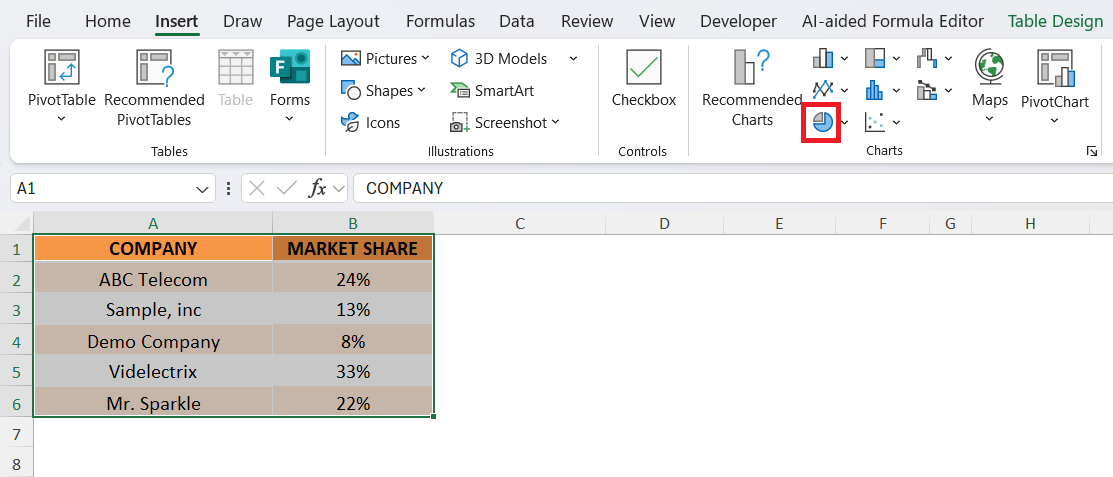
STEP 2: Select the data range including both columns. Go to the Insert tab on the ribbon and choose the Pie Chart option.
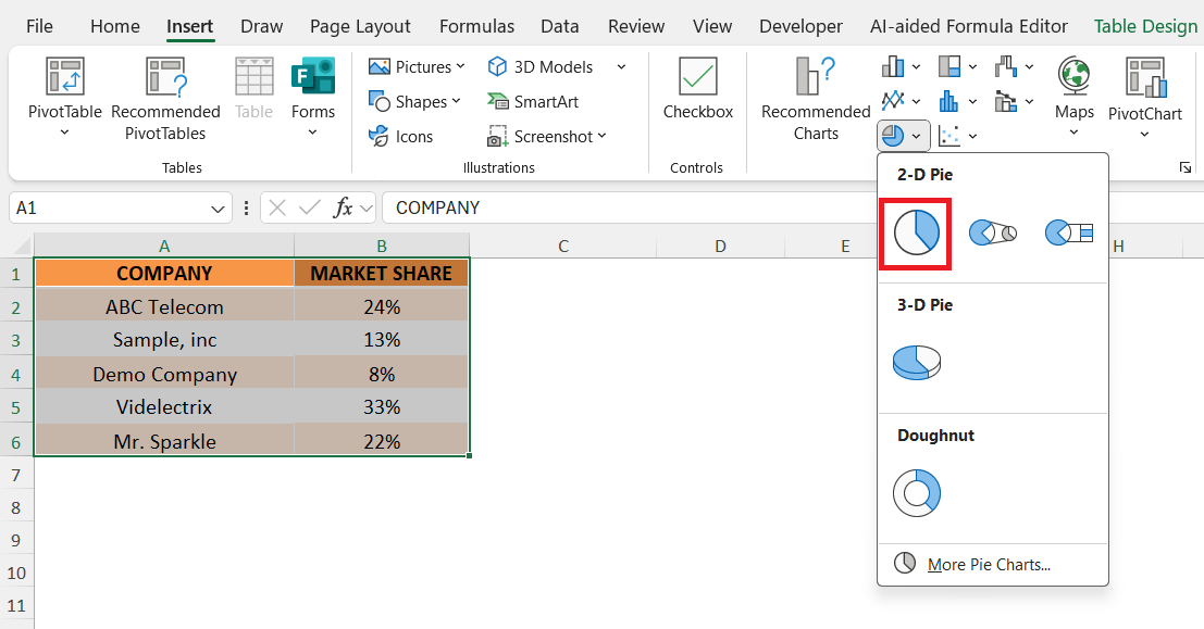
STEP 3: Pick the chart style you want, such as a 2-D Pie or 3-D Pie.
STEP 4: Add data labels to show percentages directly on the slices.
The pie chart for your data will be created.
Advantages and Disadvantages of Using Pie Charts
Advantages of Pie Charts
- Simplicity and Quick Understanding – Pie charts are one of the simplest ways to visualize proportions. In my experience, they are the go-to choice when I need to make a point quickly without overwhelming the audience.
- Great for Storytelling in Presentations – Whenever I prepare reports or slides for stakeholders, pie charts help me tell a story. They allow me to say, “This company dominates,” or “These two are neck and neck” with just one glance.
Limitations of Pie Charts
- Difficulties with Too Many Categories – If I had 15 companies in my dataset, the pie chart would have looked like a messy pizza with too many toppings. Pie charts simply aren’t good for large datasets. I’ve learned to keep them for situations where the categories are limited.
- Hard to Compare Similar Values – Pie charts struggle when values are very close. For example, if two companies had market shares of 21% and 22%, the slices would look almost identical. In such cases, a bar chart might work better.
FAQs
Q1. When should I use a pie chart in Excel?
I use a pie chart when I want to show how different parts contribute to a whole. It’s ideal for small datasets where categories are limited to a handful. For example, showing company market share or budget allocation works perfectly with a pie chart. However, when dealing with too many categories, a bar or column chart is usually a better choice.
Q2. What are the common mistakes to avoid when making a pie chart?
One mistake I’ve seen (and made myself early on) is using pie charts with too many slices. This makes the chart look cluttered and confusing. Another mistake is failing to add data labels, which forces people to guess values. Finally, choosing colors that are too similar can reduce readability. Keeping things simple is always the key.
Q3. How do I make my pie chart more professional-looking?
I always start by adding clear percentage labels to each slice. Then I choose distinct, contrasting colors for every category so that no two slices look alike. Adjusting the legend placement and chart title also makes the chart more polished. Sometimes, I even “explode” a slice to highlight a particular value, which works great in presentations.
Q4. Can pie charts handle large or complex datasets?
Not really. Pie charts are best for showing proportions in small, simple datasets. Once you start plotting more than 7–8 categories, the slices get too thin and hard to interpret. If I need to display larger datasets or compare many values, I usually switch to bar charts, stacked columns, or line charts.
Q5. Are pie charts always the best choice for showing proportions?
No, and that’s something I had to learn over time. Pie charts are excellent for quick, simple comparisons, but they aren’t perfect for precise analysis. If two values are close, like 21% and 22%, the difference is hard to see in a pie chart. In such cases, bar charts or stacked bar graphs communicate the message much better.
John Michaloudis is a former accountant and finance analyst at General Electric, a Microsoft MVP since 2020, an Amazon #1 bestselling author of 4 Microsoft Excel books and teacher of Microsoft Excel & Office over at his flagship MyExcelOnline Academy Online Course.


