Microsoft Excel is a powerhouse when it comes to data analysis. But while tables of numbers are excellent for calculation and summarization, nothing beats a well-designed chart for spotting trends, patterns, and anomalies at a glance. This is where Pivot Charts come into play. In this article, we’ll explore what Pivot Charts are and how to insert a Pivot Chart in Excel.
Key Takeaways:
- Pivot Charts are linked directly to Pivot Tables and update automatically when the Pivot Table changes.
- They help visualize data trends, patterns, and anomalies clearly and effectively.
- Pivot Charts support dynamic filtering and can be made interactive using slicers.
- Customizing chart layout, titles, labels, and colors improves readability and presentation.
- Pivot Charts save time and effort, making them ideal for large datasets and professional reporting.
Table of Contents
Understanding Pivot Charts
What Is a Pivot Chart in Excel?
A Pivot Chart is directly linked to a Pivot Table. Every time you add filters, move fields, or change values in your Pivot Table, the associated Pivot Chart updates in real time. This dynamic relationship makes Pivot Charts a perfect tool for data exploration.
For example:
- If your Pivot Table shows monthly sales by region, a Pivot Chart can display that same data as a column or line chart.
- If you filter the Pivot Table to show only a specific region, the Pivot Chart will instantly adjust to reflect that region’s data.
Think of the Pivot Table as the “data engine” and the Pivot Chart as the “dashboard” that shows the output visually.
Why Use Pivot Charts?
Before diving into the steps, let’s highlight why Pivot Charts are so useful:
- Visual Storytelling – Numbers alone can be overwhelming. A Pivot Chart helps communicate the story behind the data quickly and effectively.
- Dynamic Filtering – Unlike static charts, Pivot Charts respond instantly to filters and slicers. This makes them interactive tools for exploration.
- Efficiency – You don’t need to recreate a chart every time data changes. Pivot Charts automatically reflect updates in the Pivot Table.
- Clarity – Charts make it easier to spot outliers, growth patterns, or problem areas.
- Professional Presentation – Pivot Charts are a polished way to share insights with managers, clients, or stakeholders.
In short: if you’re already using Pivot Tables, not using Pivot Charts is like having a car with no headlights—you’re moving, but you’re not seeing clearly.
How to Insert Pivot Charts in Excel
Here is our Pivot Table:

STEP 1: Click on your Pivot Table and go to Options > PivotChart

STEP 2: Select a Chart type and click OK.

You now have your cool Pivot Chart!

Customizing Your Pivot Chart
Change Chart Layout and Style
Go to the Design tab in the Ribbon. You can:
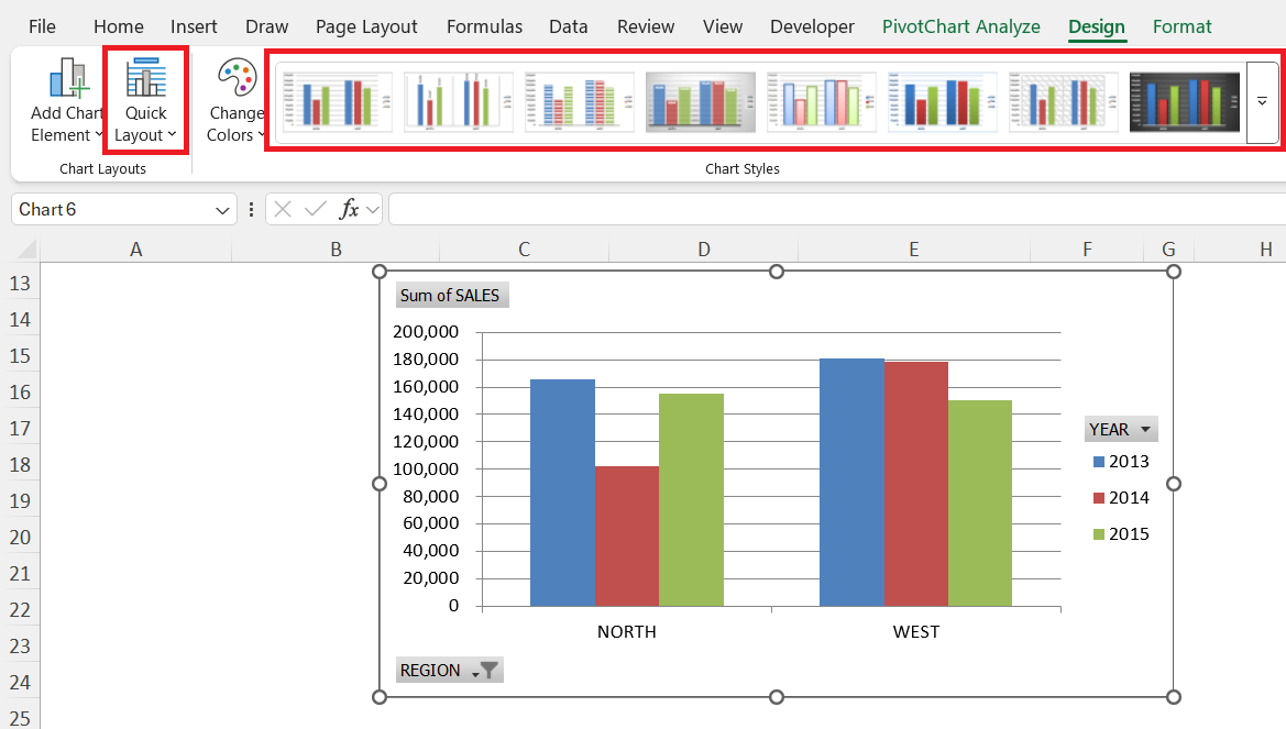
- Switch between layouts that add titles, data labels, or legends.
- Apply different visual styles and color themes.
Add Chart Titles and Labels
A clear chart title helps viewers understand what they’re looking at.
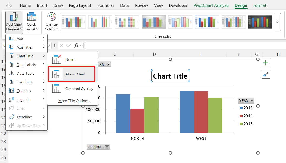
Use descriptive titles like:
- “Quarterly Sales by Region”
- “Revenue Trends Over 12 Months”
Adding data labels makes numbers explicit without having to hover over the chart.
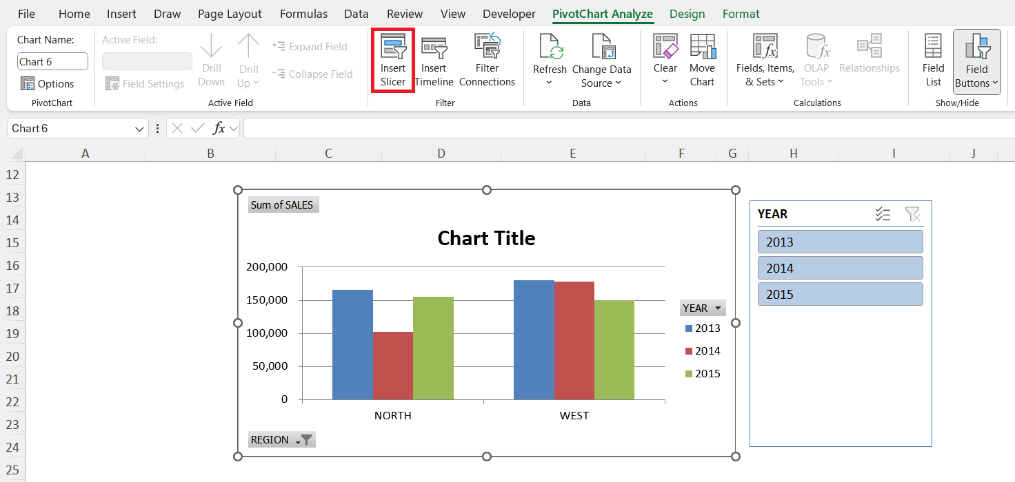
Use Slicers for Interactivity
Slicers are clickable filters that make your Pivot Chart interactive. For example, you can add slicers for Year or Product Category, and then filter the chart with a single click.
Adjust Axes and Legends
Make sure your axes are clear and easy to read. For example:
- Format the Y-axis to show currency.
- Simplify the X-axis labels so they don’t overlap.
Move the legend to a spot where it doesn’t clutter the chart.
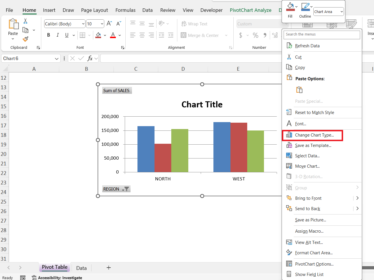
Change Chart Type
Not happy with the way your chart looks? Right-click on it and choose Change Chart Type. You can easily switch from a column chart to a line chart without starting over.
Why and Where to Use Pivot Charts
Advantages of Pivot Charts Over Regular Charts
- Pivot Charts are linked directly to Pivot Tables, while regular charts are not.
- Pivot Charts support dynamic filtering, updating automatically when you change filters in the Pivot Table. Regular charts have limited filtering options.
- Pivot Charts can be interactive with slicers, whereas regular charts cannot.
- Fields in Pivot Charts can be easily rearranged, while regular charts do not allow this flexibility.
- Pivot Charts are especially strong for summarizing large datasets, whereas regular charts are less effective in such cases.
Practical Use Cases for Pivot Charts
Here are some real-world ways Pivot Charts can be applied:
- Sales Performance – Compare sales across products, regions, or sales reps over time.
- Financial Reporting – Visualize expenses, revenue, and profit margins.
- HR Analytics – Track employee counts, attrition rates, or training completion.
- Inventory Management – Monitor stock levels, reorder points, and supplier performance.
- Customer Insights – Analyze purchase behavior across different demographics.
FAQs
1. What is a Pivot Chart in Excel?
A Pivot Chart is a graphical representation of a Pivot Table. It updates automatically whenever the Pivot Table is filtered or changed. Pivot Charts are linked to the Pivot Table, so any adjustment in the table reflects in the chart. They make it easy to spot trends, patterns, and anomalies. Essentially, the Pivot Table is the data engine, and the Pivot Chart is the visual dashboard.
2. How do I insert a Pivot Chart in Excel?
Click anywhere inside your Pivot Table to activate the PivotTable Tools tab. Then go to Options > PivotChart (or Analyze > PivotChart in newer versions). Choose the chart type you want, such as column, line, or pie, and click OK. Your Pivot Chart will appear linked to the Pivot Table. It is ready to update dynamically as you interact with your Pivot Table.
3. Can I customize my Pivot Chart?
Yes, you can customize almost every aspect of a Pivot Chart. You can change chart layouts, add titles, labels, and legends, and apply different styles or color themes. You can also adjust axes, move the legend, and change the chart type if needed. Slicers can be added to make your chart interactive. Customization ensures your Pivot Chart is clear and professional-looking.
4. What are the advantages of using Pivot Charts over regular charts?
Pivot Charts are linked directly to Pivot Tables, which makes them dynamic. They support filtering and interactive slicers, unlike regular charts. Fields can be rearranged easily without recreating the chart. They are especially strong for summarizing large datasets. Overall, Pivot Charts save time and make data analysis and presentation more efficient.
5. Where can Pivot Charts be practically used?
Pivot Charts can be applied in sales performance analysis to compare products, regions, or sales reps. They are useful for financial reporting, showing revenue, expenses, and profit trends. HR teams can use them to track employee counts, attrition, or training completion. Inventory management teams can monitor stock levels and reorder points. Pivot Charts also help in analyzing customer insights across demographics or purchasing behavior.

John Michaloudis is a former accountant and finance analyst at General Electric, a Microsoft MVP since 2020, an Amazon #1 bestselling author of 4 Microsoft Excel books and teacher of Microsoft Excel & Office over at his flagship MyExcelOnline Academy Online Course.


