The default Pivot Table styles in Excel is very bland and boring, stemming from a lack of creativity from the nerds over at Microsoft! You can give some life to your Excel Pivot Table by simply changing the Pivot Table Style! In this article, I’ll walk you through my process, tips, and personal experiences on how to change Pivot Table styles.
Key Takeaways:
- Default Pivot Table styles are dull, but you can easily change them.
- Styling makes data more readable and professional.
- Custom styles let you match your brand or personal taste.
- Simple tweaks like row shading and bold totals improve clarity.
- Styling takes seconds but makes a huge impact on presentation.

Table of Contents
Why Pivot Table Styles Matter
First Impressions Count
The default Pivot Table style in Excel is bland and boring, like something left over from Windows 98. Sure, it works, but visually it screams “unfinished.” People are visual by nature, and a plain gray Pivot Table makes your analysis feel half-hearted—even if the insights are brilliant.
When I apply a polished style, the whole report instantly feels more professional. It’s the same effect as showing up to a meeting in a neat shirt instead of sweatpants—presentation influences perception. Styling tells people I’ve put thought into the details, not just the math.
Readability is Everything
Readability is the other big win. A wall of plain numbers makes eyes glaze over, and I’ve seen plenty of people zone out during meetings because of it. But once I add alternate row shading, bold totals, and clear headers, the data becomes easy to follow.
With large reports, especially, styles act like road signs—they guide the eye and highlight key figures. Even for me, revisiting an old Pivot Table is much smoother when I’ve styled it; I can understand it at a glance instead of wading through chaos.
Getting Started with Pivot Table Styles
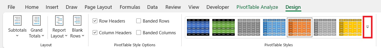
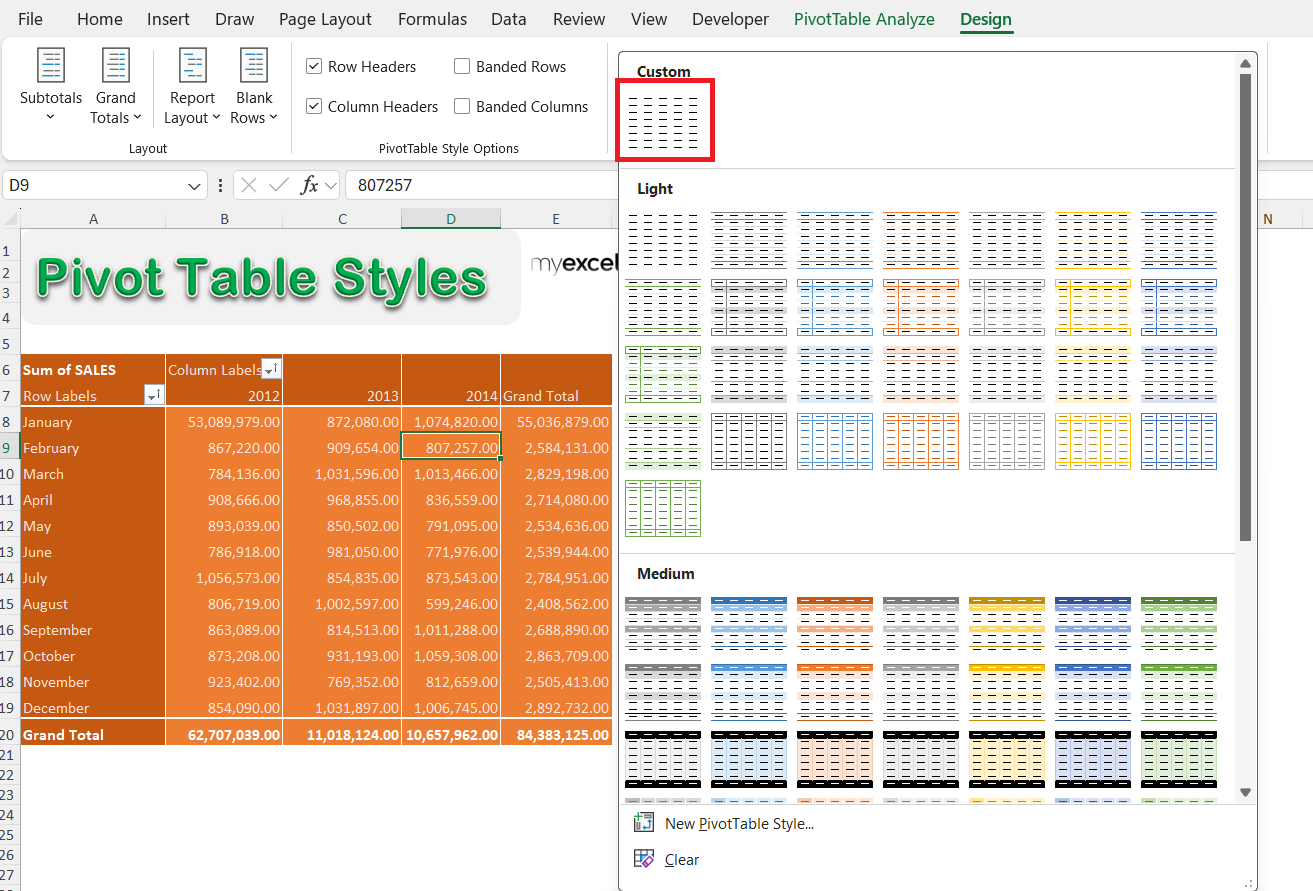
STEP 1: Make sure you have your Pivot Table selected. Go to PivotTable Tools > Design > PivotTable Styles

STEP 2: Expand the styles list and have fun selecting your preferred style! You can see I selected the orange style below, as today is a hot day 🙂

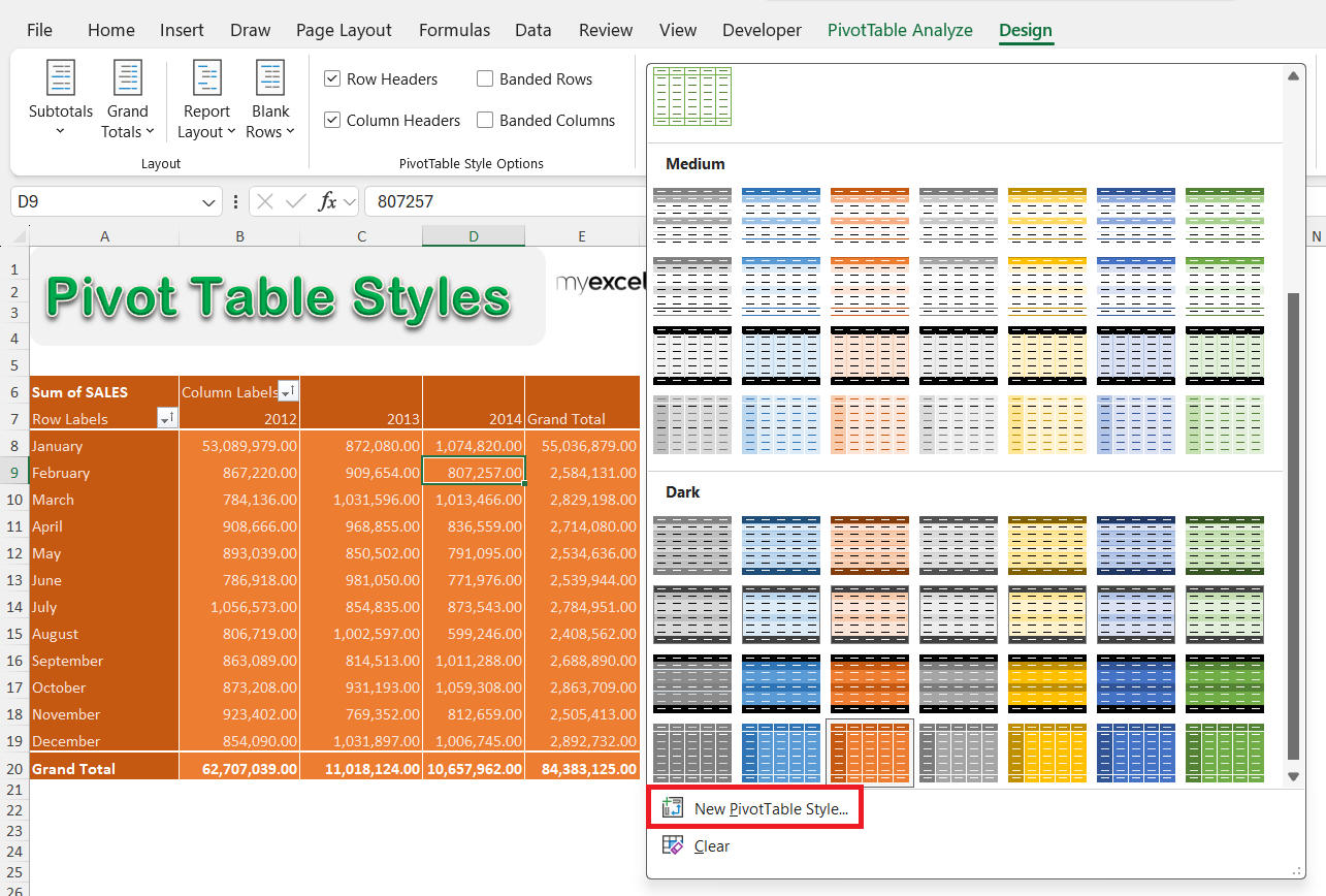
You now have your Excel Pivot Table with your new warm style!

Tips & Tricks
Creating Custom Pivot Table Styles
Sometimes the preset styles just don’t cut it. That’s when I create a custom style:
STEP 1: Go to the Design tab and open the PivotTable Styles gallery.
STEP 2: Scroll to the bottom and click New PivotTable Style.
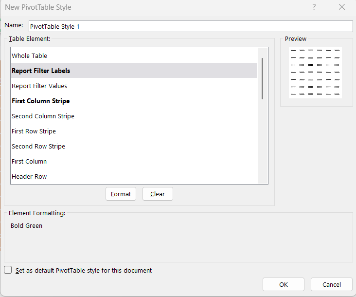
STEP 3: Customize each element—such as headers, totals, and rows—to your liking.
STEP 4: Give your new style a name and hit OK.
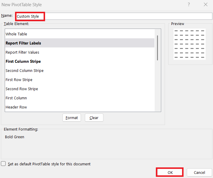
STEP 5: Your custom style will now appear in the styles list, ready to use anytime.
By doing this, I get complete control over fonts, colors, and borders, allowing me to design a Pivot Table that actually fits my needs and looks the way I want.
One lesson I’ve learned: just because you can style every single element doesn’t mean you should. Early on, I went wild with colors and ended up with something that looked like a circus tent. Now, I stick to two main colors and subtle shading. Clean and professional beats flashy every time.
Practical Styling Tips I Use
- Use alternate row shading for readability.
- Keep totals bold, but don’t bold everything.
- Avoid neon colors unless you want to blind your audience.
- For financial or management reports, stick to calm, professional tones.
- For personal tracking or informal reports, try vibrant styles that keep you motivated.
- Sometimes, I even match colors with the season or my mood (orange in summer, cool blues in winter).
FAQs
Why should I bother styling a Pivot Table?
Styling a Pivot Table isn’t just about making it look “pretty.” It improves readability, highlights key numbers, and keeps your audience engaged. People are more likely to pay attention to well-presented data because it looks intentional and polished. A dull Pivot Table can make even good insights feel unimportant, almost like hiding a diamond in a pile of dust. In short, styling makes your hard work shine and ensures your audience doesn’t miss the story behind the numbers. Plus, it shows professionalism—you cared enough to polish your work, not just crunch the data.
How do I change a Pivot Table style in Excel?
It’s a simple two-step process: select your Pivot Table, then go to PivotTable Tools > Design > PivotTable Styles. From there, you’ll see a gallery of options you can apply instantly. I recommend hovering over each style to preview it before clicking—it saves time and helps you visualize. Within seconds, your Pivot Table will look completely different. It’s the fastest way to upgrade your report’s appearance.
Can I create my own custom Pivot Table style?
Yes, and I do it often! Go to the Design tab, open the style gallery, and click New PivotTable Style at the bottom. You’ll get a window where you can format headers, totals, and rows however you like. This is great for matching company branding or creating a consistent look across multiple reports. Just remember not to overdo it—too many colors or borders can make your table harder to read.
What are some mistakes to avoid when styling Pivot Tables?
The biggest mistake I’ve seen (and made myself) is going too colorful. Neon green headers with red rows? Not a good look. Another mistake is bolding everything, which defeats the purpose of highlighting key totals. And sometimes people skip alternate shading, which makes large tables hard to follow. My advice: keep it clean, simple, and functional. Your data should stand out, not your rainbow color palette.
Does styling affect the actual data in my Pivot Table?
Not at all. Styling is purely cosmetic—it changes how your Pivot Table looks, but the data and calculations remain untouched. Think of it like putting a frame around a photo: the picture doesn’t change, but the presentation does. That means you can safely play around with styles without worrying about breaking your formulas. And if you don’t like a style, you can switch it back in seconds

Bryan
Bryan Hong is an IT Software Developer for more than 10 years and has the following certifications: Microsoft Certified Professional Developer (MCPD): Web Developer, Microsoft Certified Technology Specialist (MCTS): Windows Applications, Microsoft Certified Systems Engineer (MCSE) and Microsoft Certified Systems Administrator (MCSA).
He is also an Amazon #1 bestselling author of 4 Microsoft Excel books and a teacher of Microsoft Excel & Office at the MyExecelOnline Academy Online Course.


