When I first started using Excel, pivot tables seemed intimidating and overly complex. But with time and practice, I discovered that they’re one of the most powerful tools for making sense of large datasets, especially when it comes to summarizing, analyzing, and presenting data. One key aspect I wish I’d learned sooner was how the Show Field and Value Settings work. These settings, often overlooked by beginners, can transform your data analysis and give you exactly the insights you need.
Key Takeaways:
- Value Field Settings define how data is summarized (sum, count, average, etc.).
- Show Values As transforms how results are displayed (percentages, differences, running totals).
- I can add the same field multiple times to compare different calculations side by side.
- Formatting values (currency, decimals, percentages) enhances readability and professionalism.
- Refreshing the pivot table keeps results up to date when source data changes.

Table of Contents
Pivot Tables in Excel
What is a Pivot Table?
A pivot table in Excel is a dynamic tool that lets me quickly summarize and analyze large amounts of data. Rather than sifting through endless rows and columns, I can use a pivot table to organize, group, and filter data with just a few clicks. This ability to restructure and condense information makes complex datasets much more manageable.
Why Do I Use a Pivot Table?
Whether I’m tracking sales figures, monitoring project progress, or examining survey responses, a pivot table allows me to rearrange and recalculate data on the fly. I rely on it to spot trends, make meaningful comparisons, and produce professional-looking reports—ultimately saving myself hours of manual work and gaining deeper insights from my data
Show Field and Value Settings: Why They Matter
Two features make pivot tables especially powerful: Value Field Settings and Show Values As. These settings allow me to control not just how the data is summarized, but also how it’s displayed. Mastering both is vital for creating reports that are not only accurate but also meaningful and easy to interpret.
Value Field Settings
When I add a field to the Values area in a pivot table, Value Field Settings determine how Excel summarizes the data—by sum, count, average, min, max, and more. I can customize these settings for each field, even adding the same field multiple times to compare different calculations side by side.
Show Values As
Show Values As lets me transform the summarized results further. Instead of displaying the raw numbers, I can show each value as a percentage of a total, a running total, a difference from another value, or even as a calculated index. This feature is a game changer for comparative analysis and visual storytelling.
Step-by-Step Guide: Using Show Field and Value Settings
STEP 1: Let us have a look at the existing Pivot Table. To view the Field Settings, we can do the following:
Under PivotTable Fields > Rows > Field Settings

You can also right click on a Row Label and select Field Settings.

Or while having a row label selected, you can go to PivotTable Tools > Analyze > Active Field > Field Settings

And now you have your Field Settings open!

STEP 2: Now let us see how to access the Value Field Settings.
Go to PivotTable Fields > Values> Value Field Settings

You can also right click on a Value and select Value Field Settings.

Or while having a value selected, you can go to PivotTable Tools > Analyze > Active Field > Field Settings

You now have your Value Field Settings!

Tips & Tricks
- Use Multiple Value Fields: I often add the same field twice (e.g., Sales), then set one to ‘Sum’ and another to ‘Average’ for a more complete view.
- Rename Fields for Clarity: I double-click field headings in the pivot table to rename them, making my reports easier for others to understand.
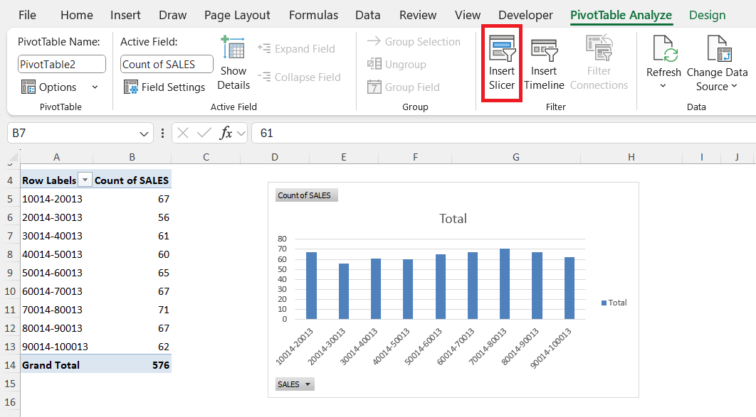
- Apply Filters: Using Pivot Table filters and slicers, I can focus on just the data I want, such as specific regions or time frames.
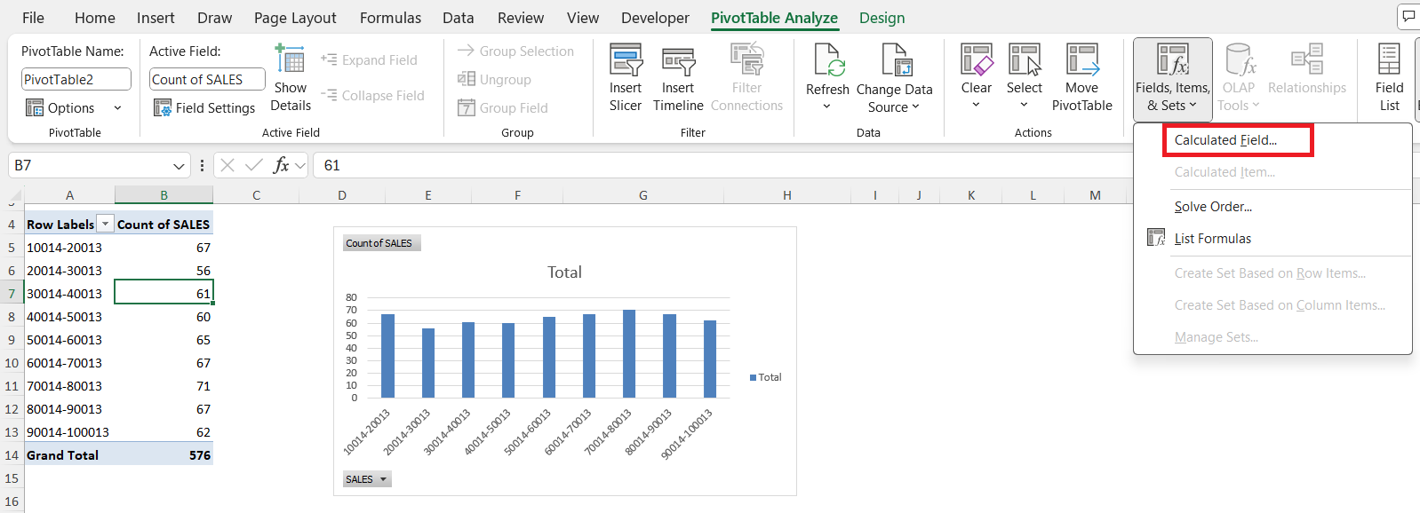
- Explore Calculated Fields: I use calculated fields in the PivotTable Analyze tab for custom formulas right within the pivot table.
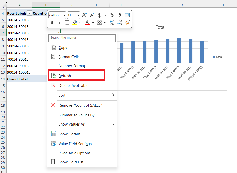
- Refresh Often: Whenever my source data changes, I make sure to right-click and refresh the pivot table so my insights are always up to date.
‘
FAQs
1. What is the difference between Value Field Settings and Show Values As?
Value Field Settings control how data is summarized in the pivot table (for example, by summing, counting, or averaging values). Show Values As, on the other hand, determines how the results are displayed—for example, as a percentage of the total, a running total, or a difference from another value. I use both together to deliver powerful, customized analyses.
2. Can I use more than one calculation for the same field in a Pivot Table?
Yes! I frequently add the same data field multiple times to the Values area, then change the Value Field Settings for each. For instance, I can display both the total and the average for a sales column, or compare counts and sums side by side for deeper insight.
3. How do I display values as percentages in my pivot table?
To show values as percentages, I right-click on the value, select ‘Show Values As,’ and then choose ‘% of Grand Total,’ ‘% of Row Total,’ or ‘% of Column Total’ depending on what I need. This is especially useful for visualizing proportions and making comparisons much clearer in my reports.
4. What should I do if my pivot table doesn’t update when source data changes?
Whenever I change the underlying data, my pivot table doesn’t refresh automatically. I right-click anywhere inside the pivot table and choose ‘Refresh,’ or use the ‘Refresh All’ button under the PivotTable Analyze tab. This ensures that all calculations and summaries reflect the latest data.
5. Can I customize the number formatting in my pivot table values?
Absolutely! Within the Value Field Settings dialog, I click ‘Number Format’ and select the formatting that matches my needs—currency, percentage, decimal places, and more. Custom formatting makes my pivot tables easier to read and understand, especially when sharing with others.

Bryan
Bryan Hong is an IT Software Developer for more than 10 years and has the following certifications: Microsoft Certified Professional Developer (MCPD): Web Developer, Microsoft Certified Technology Specialist (MCTS): Windows Applications, Microsoft Certified Systems Engineer (MCSE) and Microsoft Certified Systems Administrator (MCSA).
He is also an Amazon #1 bestselling author of 4 Microsoft Excel books and a teacher of Microsoft Excel & Office at the MyExecelOnline Academy Online Course.


