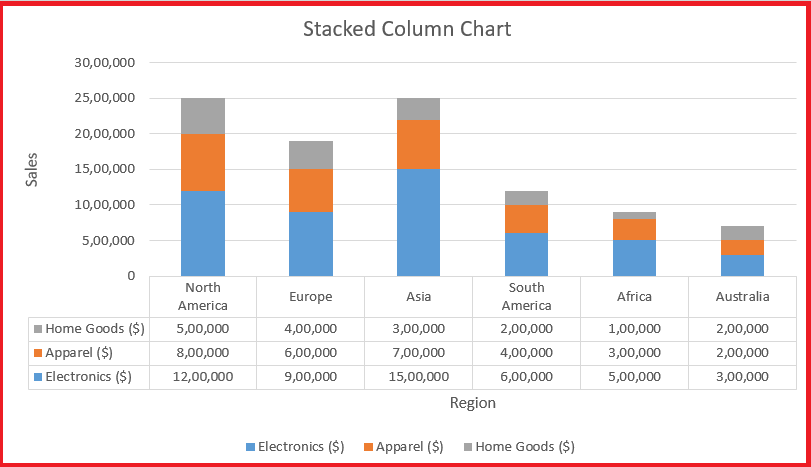
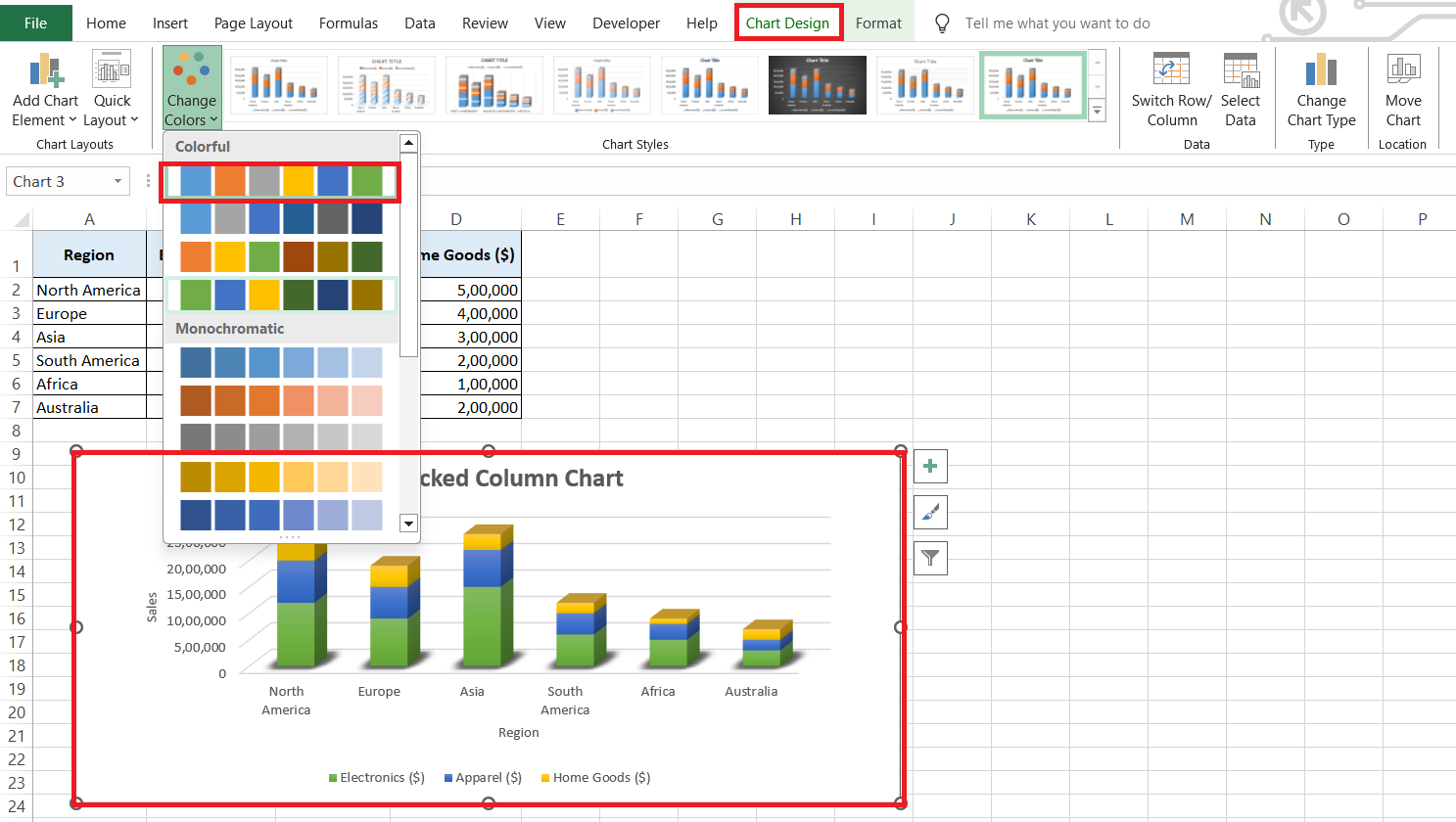
In the realm of data visualization, stacked bar charts stand out as a powerful tool in Excel. They transform complex datasets into clear, segmented visuals that reveal both the overall picture and its individual components at a glance. By stacking multiple data points within each bar, these charts make it easy to compare and analyze contributions across categories. Whether tracking changes over time or highlighting differences, stacked bar charts simplify data interpretation and enhance visual appeal.
Key Takeaways:
- Stacked bar charts in Excel efficiently reveal both overall trends and detailed component breakdowns in a single visual.
- They simplify complex data by stacking multiple segments within each bar, making comparisons across categories straightforward.
- Using color coding enhances the clarity of stacked bar charts, allowing for easy differentiation between data segments.
- These charts are particularly effective for tracking changes over time and analyzing how different parts contribute to the whole.
- Customizing chart design and avoiding overcrowding are crucial for maintaining clarity and ensuring the chart effectively communicates the data story.
Table of Contents
Introduction to Stacked Bar Charts in Excel
What Is a Stacked Bar Chart?
When I’m faced with a mountain of data and need to present it clearly and insightfully, I turn to the stacked bar chart—a real game-changer in data visualization, especially in Microsoft Excel. Unlike regular bar charts, stacked bar charts combine multiple data points into a single bar, with each segment color-coded for easy differentiation. With a single glance, I can understand both the whole and its parts—talk about multitasking for the eyes!
Having a visual tool that lets me interpret complex data through colorful segments makes data analysis not just simpler, but engaging. Stacked bar charts take the traditional bar chart to the next level by stacking related data points on top of each other, allowing me to quickly see how different parts contribute to the whole.
The Advantages of Using Stacked Bar Charts
Stacked bar charts aren’t just visually appealing; they’re powerful tools for delivering information with both elegance and clarity.
- Firstly, they simplify complex data: Trying to understand separate ingredients in a dish just by taste can be challenging. Similarly, stacked bar charts let me “taste” each component’s contribution to the whole without overwhelming me.
- Secondly, they make comparing different categories easy: Just like identifying standout flavors in a blend, stacked bar charts highlight the ‘heavier’ flavors in my data set.
- The visual impact is undeniable: The array of colors grabs my attention and makes key data points stand out, turning a simple chart into a memorable snapshot of information.
- Lastly, tracking changes over time becomes a breeze with stacked bar charts: I can watch how my data “layers” evolve and notice subtle shifts that might go unnoticed with other chart types.
Step-by-Step Instructions for Creating a Stacked Bar Chart
Selecting the Right Data
When it comes to crafting the perfect stacked bar chart, selecting the right set of data is akin to picking ingredients for a top-notch meal. It’s important that you handpick data that’s relevant and represents different segments of the information you want to showcase.
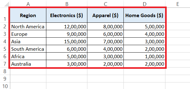
Here’s a quick scoop on selecting data: aim for categorical data. This could be things like sales numbers across different regions or customer satisfaction ratings by department. And remember, each category will have subdivisions that stack on top of each other, so ensure they’re related and proportional—kind of like building levels in a video game, where each level is a step up from the last.
Also, be vigilant about the time periods or variables you’re comparing. Consistency here is key — you wouldn’t want to compare apples to oranges unless you’re aiming to show the difference between fruit sales, of course!
Inserting Your First Stacked Bar Chart
Now that you’ve got the perfect data set, it’s time to roll up your sleeves and dive into the creation of your very first stacked bar chart. Think of it as an art project where your data paints a colorful picture.
STEP 1: Start by entering your data in a table format within Excel, making sure it’s clean and organized.
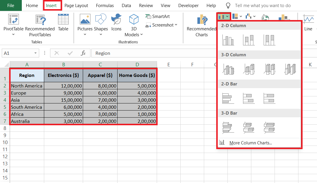
STEP 2: Highlight the cells containing the data you want to illustrate and head over to the “Insert” tab. Here you’ll spot various chart options—go ahead and click on “Bar Chart.”
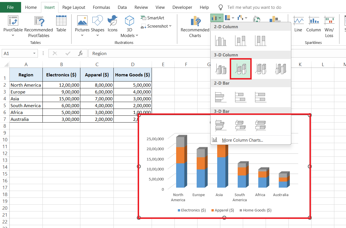
STEP 3: A dropdown will appear with different bar chart styles. Choose the stacked option that best suits your data story—whether it’s a simple 2D stacked bar or a more dynamic 100% stacked bar for comparative purposes.
Just like that, Excel will work its magic and a stacked bar chart will appear, ready for its moment in the spotlight.
Tips and Tricks for Perfect Stacked Bar Charts
Customizing Chart Design for Clarity
Once your stacked bar chart is on the Excel canvas, think of it as a living piece of art that you can fine-tune and adjust to your heart’s content. Giving your chart a custom design isn’t just about aesthetics—it’s about making your data crystal clear to anyone who lays eyes on it.
Begin by dressing your chart appropriately with a solid color scheme. Avoid a kaleidoscope of hues that might confuse the viewer; instead, use colors that differ enough to distinguish the data, but complement each other like a well-thought-out outfit.
You can tinker with the design elements under the “Chart Tools” tab. Here, you can change patterns, apply shape styles, and adjust the visual flair to the level you need.
Think about those who’ll be reading the chart and adjust the text size, font, and even the colors for legibility—especially if color blindness is a consideration.
Avoiding Common Pitfalls in Chart Creation
When crafting your stacked bar chart, it’s easy to fall into a few common traps that can turn your data masterpiece into a confusing mess. Let’s dodge those mistakes like a pro and ensure your chart communicates effectively.
- Keep an eye out for the notorious overcrowding: Cramming too many elements into your chart is like inviting too many guests to a party—it just gets messy. Where possible, limit the number of segments in each bar to less than five. This keeps everything readable and your audience won’t need a magnifying glass to understand your chart.
- Also, don’t let your chart set sail without a compass: Make sure your axes are clearly labeled, as forgetting to do so is like leaving your audience without a map. Include a legend that defines what each color represents; this is the key to decoding your chart.
Beware of inconsistent scales, especially if you’re comparing multiple stacked bar charts side by side. Different y-axis scales can distort the truth faster than a funhouse mirror. Keep things aligned to ensure a fair and accurate comparison.
Troubleshooting Common Issues
Fixing Data Display Problems
When data in your stacked bar chart looks off, it’s a bit like having a puzzle with mismatched pieces—it simply doesn’t tell the correct story. But fret not! Most display hiccups in Excel can be mended with a few clicks.
If it seems like some data isn’t showing up, first check your data range. Did you include all the rows and columns you intended? You can adjust the range by dragging the blue outline box to the correct boundaries, or by right-clicking the chart, selecting “Select Data,” and then modifying the range in the dialog box that appears.
Adjusting Layout and Style Conflicts
Encountering layout and style issues in your Excel stacked bar chart is like having a wardrobe malfunction on an important day. But with a few tweaks, you can iron out these problems and have your chart looking sharp in no time.
If your chart feels cluttered, adjust the layout by resizing the chart elements. For instance, shrinking the legend or increasing the plot area can make everything breathe a bit easier. Just like tailoring a suit for the perfect fit, resizing chart elements can give your data the space it needs to stand out.
Real-world Applications for Stacked Bar Charts
Case Studies: Effective Business Reporting
Across the boardrooms and cubicles, effective business reporting is pivotal, and stacked bar charts have starred in many success stories. Let’s pull the curtain back on a couple of case studies that showcase just how powerful these charts can be when it comes to business reporting.
First, visualize a national retailer who tapped into stacked bar charts to dissect their sales data. By breaking down monthly sales into product categories displayed as distinct segments, management was able to spot trends—like a hiking gear boom each spring—that informed inventory decisions.
Financial Analysis with Stacked Bar Charts
When it comes to navigating the sea of numbers inherent in financial analysis, stacked bar charts serve as an indispensable compass. They bring clarity to complex data, helping financial analysts and stakeholders alike pinpoint the essentials at a glance.
Consider, for instance, how a financial analyst at an investment firm uses stacked bar charts to illustrate the diversified portfolio of a mutual fund. By stacking different asset classes—like stocks, bonds, real estate—each bar provides a snapshot of the portfolio’s composition over time. This makes it abundantly clear how the allocations shift, tapping into where the growth lies or where risk is being managed.
Best Practices for Data Presentation
When to Choose Stacked Bar Chart over Other Types
Choosing the right chart is like picking the perfect pair of shoes for an outfit — it needs to match the occasion. Stacked bar charts have their own sweet spot when it comes to showcasing data. They shine brightest when you need to demonstrate part-to-whole relationships or when tracking how individual segments change over time within a whole.
Take budget allocations, for instance. If you want to show how different departments share the financial pie, a stacked bar chart lets you see each department’s slice against the total budget in one glance. Another example is sales performance over quarters. A stacked bar chart can clearly illustrate not just the total sales per quarter but also how each product contributed to those totals.
Insert Comparisons between Chart Types
However, when comparison between individual segments is the goal, or if the data has too many segments, you might want to step away from the stacked bar chart. In these cases, line charts for trend analysis or clustered bar charts for segment comparison may take the lead.
Key Takeaways for Presenting Impactful Data Visualizations
Visualizations are the paintbrush in your storytelling toolkit, so here’s how to ensure your data masterpiece resonates and remains memorable. Think of these takeaways as your golden rules:
- Use color with purpose: Choose a palette that’s visually distinct yet harmonious to help differentiate data segments clearly while maintaining an aesthetic balance.
- Less can be more: Simplify where you can, focusing on removing noise that distracts from the main narrative of your data. This could involve trimming down on excessive labels or refining your color scheme.
- Highlight the story: If there’s a particular trend or anomaly in your data that’s crucial to your point, use visual cues like contrasting colors, annotations, or even breaking the stacked bar to direct your audience’s attention there.
- Keep it consistent: The style and design of your visualizations should be uniform across a presentation or report. A consistent look not only appears professional but also helps your audience follow along without getting lost in translation due to style changes.
- Remember accessibility: Not everyone sees color the same way; designing with color vision deficiencies in mind ensures no one is left out of the conversation. Tools like color blindness simulators can help you test your visualizations for clarity.
By adhering to these principles, you create data visualizations that not just stand out for their looks, but also for their ability to clearly communicate the data story. This blend of art and insight transforms rows of numbers into meaningful, actionable information.
FAQs
How do you create a stacked bar chart in Excel?
To create a stacked bar chart in Excel, first select the data you wish to visualize, including the row and column headers. Then, navigate to the “Insert” tab, click on the “Bar Chart” dropdown in the “Charts” section, and choose either “Stacked Bar” or “Stacked Column,” depending on your preference. Excel will generate the chart, which you can then customize and format to suit your needs.
When should you use a stacked bar chart?
Use a stacked bar chart when you need to show how individual components combine to form a whole across different categories. It’s ideal for comparing the composition of different groups, like product sales across regions or expenses per department within a budget, especially when you want to see the total values as well as the segment breakdown.
How can you update data in a stacked bar chart easily?
You can update data in a stacked bar chart easily by linking it to a data source. If you alter the data in the table or range your chart is based on, the chart will automatically reflect these changes. To set this up, just right-click on the chart, select “Select Data,” and then adjust the cell range for the chart data. This keeps your chart synced with your data source, ensuring it’s always up-to-date.
Are stacked bar charts suitable for all kinds of data comparison?
No, stacked bar charts are not suitable for all kinds of data comparison. They work best for visualizing part-to-whole relationships within categories over time. Stacked bar charts are less effective when you need precise comparisons between individual segments across bars, or when there are too many segments, which could make the chart cluttered and hard to interpret.
How to make a stacked bar graph in Excel with 3 variables?
To make a stacked bar graph in Excel with 3 variables, start by arranging your data with each variable in its own column. Select the full data set, including headers. Go to the “Insert” tab, click on “Column or Bar Chart,” and select “Stacked Bar.” Each variable will be represented as a different series, and the segments will stack on top of each other within the bars, showing the contribution of each variable to the total.
John Michaloudis is a former accountant and finance analyst at General Electric, a Microsoft MVP since 2020, an Amazon #1 bestselling author of 4 Microsoft Excel books and teacher of Microsoft Excel & Office over at his flagship MyExcelOnline Academy Online Course.

