Ever had a lot of historical stock data closing prices and you want to visualize how it is going so far? You can actually use the good old Line Chart in Excel to create your own Stock Line Chart!
Key Takeaways
-
Track Price Trends Visually – A stock line chart helps you monitor stock prices over time with a clean visual trendline.
-
Works Best with Date-Driven Data – Organizing stock data by date ensures accurate plotting on the X-axis.
-
Use Close Price for Simplicity – Most stock line charts use the closing price to represent daily movement clearly.
-
Customize Axes and Labels – You can format axes, gridlines, and markers to enhance clarity and comparison.
-
Ideal for Performance Over Time – This chart is perfect for analyzing long-term stock or investment performance.
Table of Contents
Our Data Setup
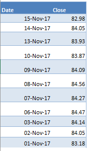
Below is the data source that we are going to use to create our Stock Line Chart in Excel:
We need 2 data points to create this chart, the Date and the Close Price.
In this example I show you how easy it is to insert a Stock Line Chart using Excel.
How to Create Stock Line Chart Using Excel
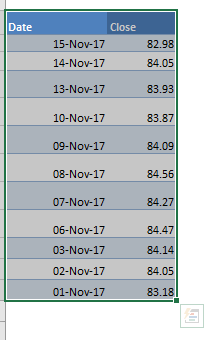
STEP 1: Highlight your data of stock prices:
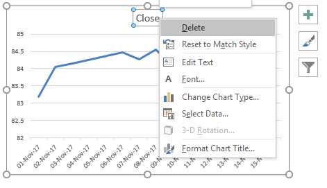
STEP 2: Go to Insert > Line Charts > Line
STEP 3: Right click on your Title and choose Delete as we do not need this.
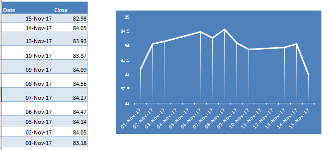
STEP 4: Go to Chart Tools > Design and select the preferred design to make your chart more presentable!
And there you have it! Your own Stock Line Chart in Excel!
Frequently Asked Questions
What is a stock line chart in Excel?
It’s a type of line chart that displays stock price data over time, typically using the closing price.
Which stock data is needed to create a line chart?
You usually need a column for dates and another for stock prices (typically closing prices).
Can I create a stock line chart with live data?
Yes, you can use Excel’s “Stock Data” type or connect to external sources like Power Query for real-time updates.
How is a line chart different from a stock chart in Excel?
A line chart shows a single data series like closing price, while a stock chart can show open, high, low, and close values.
Can I customize the look of my stock line chart?
Absolutely—you can change line colors, add data markers, format axis scales, and apply chart styles to suit your needs.

Bryan
Bryan Hong is an IT Software Developer for more than 10 years and has the following certifications: Microsoft Certified Professional Developer (MCPD): Web Developer, Microsoft Certified Technology Specialist (MCTS): Windows Applications, Microsoft Certified Systems Engineer (MCSE) and Microsoft Certified Systems Administrator (MCSA).
He is also an Amazon #1 bestselling author of 4 Microsoft Excel books and a teacher of Microsoft Excel & Office at the MyExecelOnline Academy Online Course.


