Double Line Graph in Microsoft Excel offers a dynamic way to compare and contrast two datasets on the same chart, making it simpler to identify trends and correlations over time. This tutorial guides you through creating these insightful visual tools quickly and efficiently.
Key Takeaways:
- Double line graph excels in showcasing trends and patterns across two different datasets, making them indispensable for comparative analysis.
- Organizing and verifying your data before chart creation ensures accuracy and clarity in your double line graphs.
- Tailoring your graph’s colors, styles, and scales can significantly improve readability and impact, making complex data more accessible.
- Utilizing annotations like data labels and legends turns a good chart into an exceptional one by guiding the viewer through the data narrative.
Table of Contents
Introduction to Double Line Graph in Excel
Understanding the Basics of Line Graph
A Line Chart, commonly known as a line graph, is your go-to method when you need to display information as a series of data points connected by straight lines. It’s particularly handy for indicating trends and patterns over time, where the x-axis represents intervals such as dates or times, and the y-axis displays numerical values.
The Advantage of Double Line Graphs for Data Comparison
Double Line Graphs in Excel amp up the utility of regular line charts by allowing you to visualize and compare two distinct datasets on the same graph. This comparison can shed light on how one data set relates to another — perhaps they follow a similar trend, or maybe they diverge at critical points.
You become a data detective, effortlessly pinpointing correlations and contrasts that might go unnoticed in separate charts. It’s a smart choice when both data sets relate to a common axis, such as time, making it easier for your audience to follow the narrative woven by your numbers.
Setting the Stage for Your Double Line Graph
Organizing Your Data Effectively
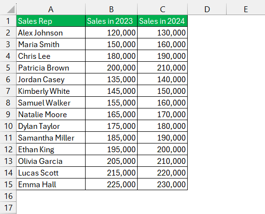
Before diving into the graph-making process, you need to lay the groundwork by organizing your data effectively. Start with a clean and well-structured dataset in Excel, ensuring that your rows and columns are neatly labeled and your two sets of data are clearly separated yet aligned with the common axis they share.
Preliminary Steps Before Creating Your Graph
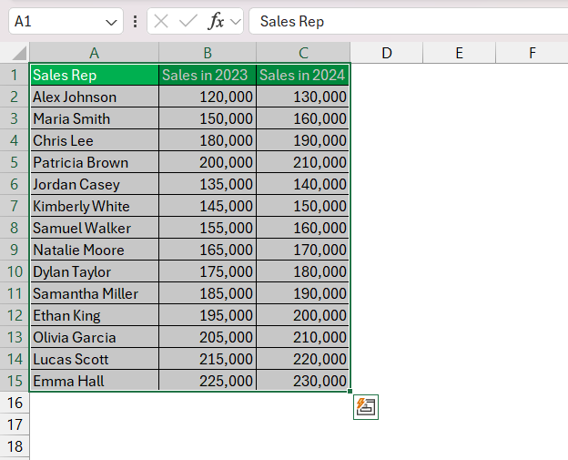
To set the stage for your masterpiece double line graph, it is crucial to complete a few preliminary steps. First, inspect the data for accuracy and completeness to avoid misleading graphs. Then, select the entire range of data you plan to use, including both datasets along with their corresponding labels.
Finally, ensure that your Excel program is updated to avoid compatibility issues. Think of these steps as sketching the outline for a painting — necessary groundwork for the art to follow.
Crafting Your Double Line Graph Step by Step
Inserting the Dual Line Chart
Creating a dual line chart in Excel is quite straightforward. Once your data is organized:
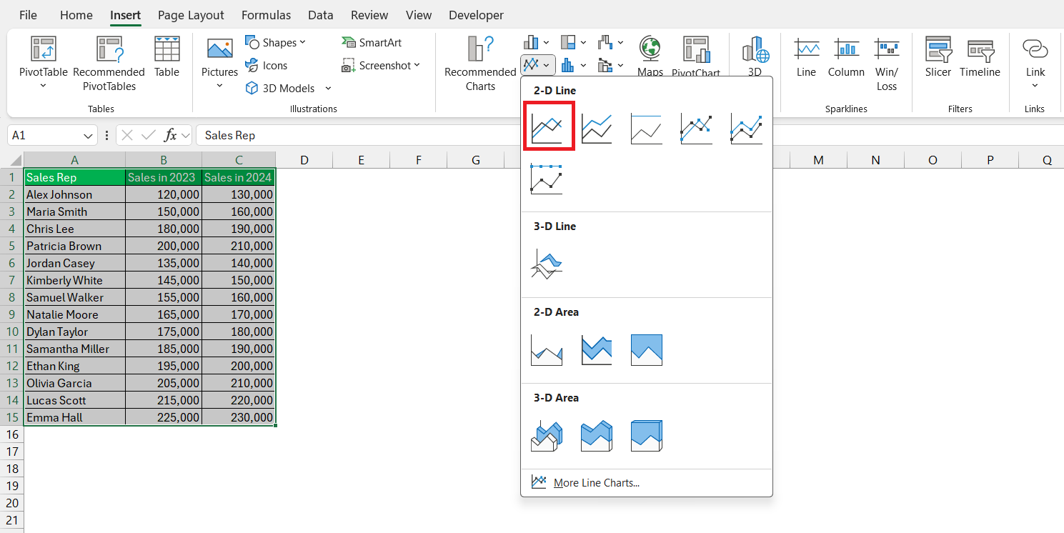
STEP 1: Go to the ‘Insert’ tab on the Excel ribbon.
STEP 2: Under the ‘Charts’ group, click on ‘Line’ and select the style of line chart that suits your data best.
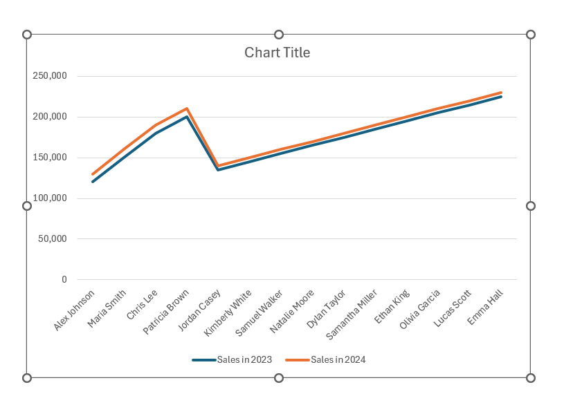
Excel will generate a basic line graph, but it will display only one set of data to start.
This initial graph serves as the canvas for your double line graph, and you’ll add the second data set in the following steps.
Modifying the Axis and Scale
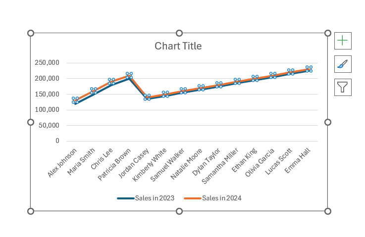
The second step is critical: modifying the axis and scale to accommodate your data sets accurately. If they share a similar scale, you’d adjust the axis to fit both data sets comfortably. However, when the scales differ significantly, it’s wise to employ a secondary y-axis.
STEP 1: Click on the data series you wish to assign to the secondary axis.
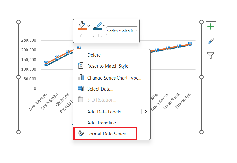
STEP 2: Right click to open the context menu and select ‘Format Data Series.’
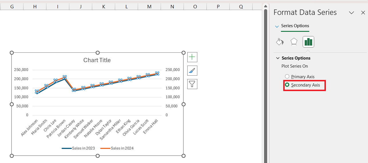
STEP 3: Choose ‘Secondary Axis.’ Now the selected data series has its own axis for clear comparison.
Fine-tune the scales for both y-axes so they reflect the true nature of the data. Ensuring that tick marks are appropriately spaced enhances readability and precision in the comparison.
Enhancing Your Double Line Graph
Customization Techniques for Clarity and Style
Great graphs speak volumes visually. To ensure your double line graph communicates clearly, consider these customization techniques:
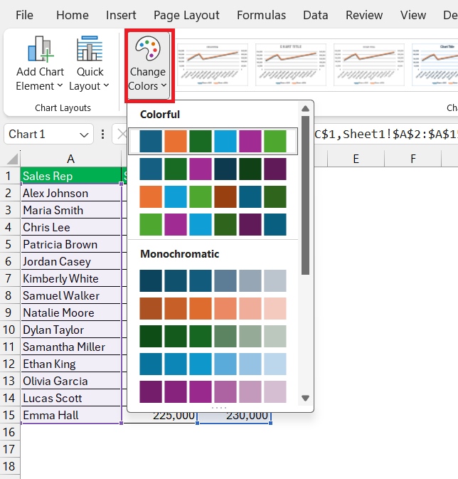
- Assign distinct colors or line styles to each data set so they effortlessly stand out from each other.
- Change the overall chart style for a more appealing look by going to the ‘Chart Design’ tab and exploring the style options.
- Customize the axis tick marks — this not only makes your chart easier to read but also streamlines comparison between the different data sets.
Always prioritize clarity — your graph’s style should enhance comprehension, not complicate it.
Annotating for Enhanced Comprehension
Annotations are your secret weapon to transform a good graph into a great one. Here’s how to annotate for better understanding:
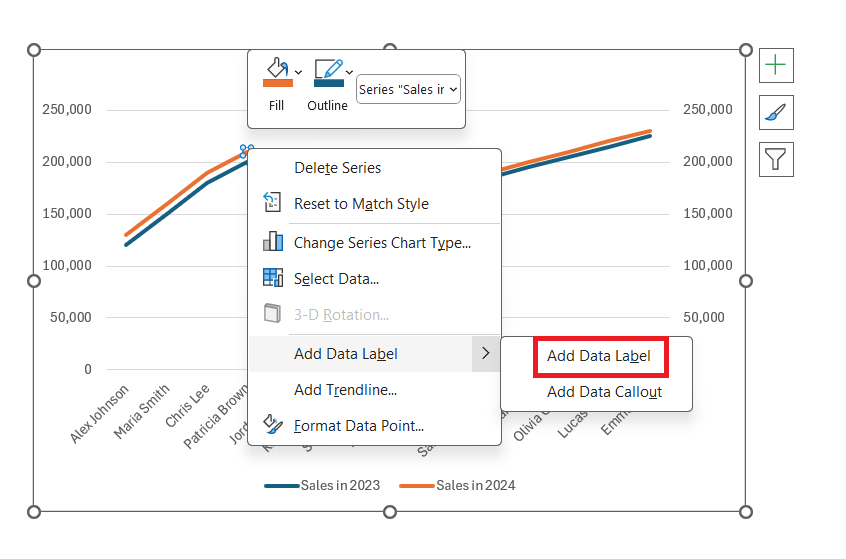
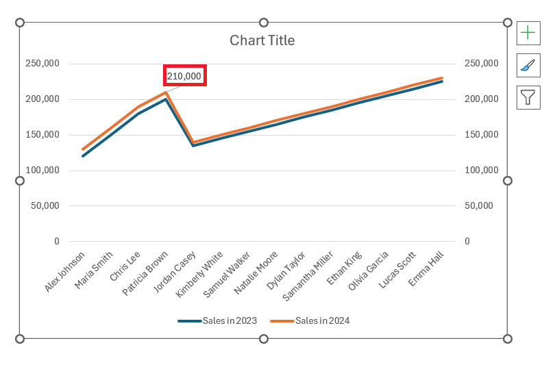
- Add data labels to emphasize specific points. Click on a data point and select “Add Data Label” to show its actual value.
- Use markers or data labels to highlight important trends or outliers.
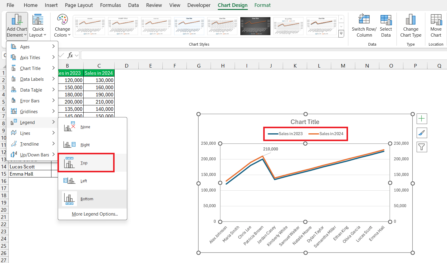
- Include a chart legend to define which line represents each dataset. This is usually added by default, but ensure it’s positioned for easy reference.
Annotations are like signposts that guide viewers through the information landscape of your graph.
Practical Examples and Applications
Example 1: Tracking Progress and Trends Over Time
Consider a company tracking its annual revenue and customer growth over five years. Using a double line graph in Excel, they can plot revenue on one line and customer numbers on another, each evolving over time.
- The trendlines reveal both growth rates and allow a visual intersection analysis, which may indicate how revenue is hit by customer acquisition.
- Data annotations at crucial inflection points help viewers note when significant changes occurred.
This example can serve as a potent tool in strategic planning and presentations, turning raw numbers into actionable insights.
Example 2: Visualizing Relationships Between Two Data Sets
Imagine a scenario where a health researcher wants to visualize the relationship between exercise frequency and blood pressure levels within a group over six months. By employing a double line graph:
- They can plot exercise frequency on one line and blood pressure levels on another, both against the same timeline.
- This visual comparison might reveal how increases in exercise correlate with changes in blood pressure, highlighting potential causal relationships.
This type of graph could be invaluable for illustrating findings in research papers or health-related presentations, making complex correlations more digestible.
Frequently Asked Questions (FAQ)
How do you plot a double line graph in Excel?
To plot a double line graph in Excel, first enter your two datasets. Click on ‘Insert’, select ‘Line Chart’, and choose a style. After the initial chart appears, right-click one data series to format it, and assign it to the secondary axis for better comparison. Adjust colors and styles for distinction.
How do I show two lines on a graph in Excel?
To show two lines on a graph in Excel, input your data in two columns, highlight them, go to the ‘Insert’ tab and choose ‘Line’ chart. Excel will automatically create a graph with two lines, one for each data set. Adjust the styling as needed for clarity.
What is a line graph?
A line graph is a type of chart that displays information as a series of data points connected by straight lines. It’s especially useful for showing trends over time, with data points plotted along the x-axis and their corresponding values along the y-axis.
How Do You Add a Secondary Axis in Excel?
In Excel, to add a secondary axis, click on the data series you want on the new axis, go to the ‘Chart Design’ tab, and select ‘Add Chart Element’. Choose ‘Axes’, and then pick either ‘Secondary Horizontal’ or ‘Secondary Vertical’. Adjust your data series onto this new axis for clear visualization.
Can You Plot More Than Two Lines on a Single Graph?
Yes, you can plot more than two lines on a single graph in Excel. Simply include additional datasets in your selection when creating the graph, and Excel will assign a new line for each dataset. Customize each line’s style and color for differentiation as needed.
John Michaloudis is a former accountant and finance analyst at General Electric, a Microsoft MVP since 2020, an Amazon #1 bestselling author of 4 Microsoft Excel books and teacher of Microsoft Excel & Office over at his flagship MyExcelOnline Academy Online Course.

