With a focus on annualized growth, YoY comparisons deliver a transparent and accurate reflection of a company’s health, free from the obfuscating effects of short-term fluctuations.
Understanding the Basics of YoY Calculations
To grasp the concept of Year-over-Year calculations, one doesn’t need to be a math wizard; a basic understanding will suffice. YoY computations involve comparing figures from two time periods that are exactly one year apart. At their core, these calculations check the pulse of your business’s growth trajectory by pinpointing the change between these intervals and expressing it as a percentage.
This essential calculation can reveal whether a business metric, such as revenue or user growth, has increased or decreased over the year, thereby offering a snapshot of performance and long-term trends. To put this into context, if we have a revenue increase from $100,000 last year to $130,000 this year, the YoY growth percentage would illustrate a healthy jump of 30%.
Preparing Your Excel Sheet for YoY Analysis
Organizing Data Effectively
As the adage goes, “Well begun is half done.” This perfectly captures the essence of preparing data for YoY analysis. Begin by ensuring your dataset is methodically arranged. Values should be sorted chronologically, with each year occupying a separate column to streamline subsequent calculations.
This setup allows us to harness Excel’s full potential, making formula application and result interpretation much more straightforward. It’s a good practice to include clear headers, such as ‘Year’ and ‘Metric,’ to keep your spreadsheet legible.
In my experience, an uncluttered dataset not only simplifies the YoY analysis but also minimizes errors during the calculation process. A well-organized Excel sheet is akin to a solid foundation for a robust analytical building allowing one to track growth trends reliably over time.
Enabling Necessary Excel Functions
Before diving into the analysis, it’s crucial to ensure Excel is geared up with the required functions. A fundamental command at your disposal will be the formula bar, the nerve center where all calculations take place. For YoY computations, the subtraction operator (-) and percentage format are the primary tools. Additionally, Excel offers a plethora of built-in functions that can automate and refine your YoY analysis.
For instance, the SUMIF function can be a lifesaver when you need to sum data based on specific criteria, like total annual sales. The AVERAGEIF function is equally vital for averaging yearly data points, and essential for reducing the impact of outliers. You may also find it effective to familiarize yourself with conditional formatting, pivot tables, and Excel charts, as they will be instrumental in later stages of analysis and reporting.
Step-by-Step YoY Growth Formula Tutorial
Method 1: Utilizing the Traditional YoY Growth Calculation
For those who appreciate the classics, the traditional YoY growth calculation is both elementary and effective. This original method relies on a straightforward formula:
YOY growth = ((new value – old value) / old value) * 100
By taking the current period’s value, subtracting the corresponding value from the prior year, and then dividing this difference by the previous year’s value, we derive a decimal. Multiplying this result by 100 gives us the YoY percentage growth, elegantly capturing the essence of change over a year.
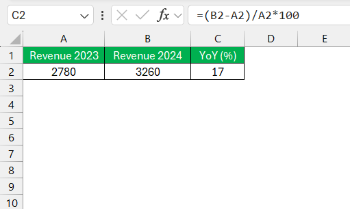
To apply this in Excel, simply input your values into designated cells and construct the formula referencing those cells. A practical example: if cell A2 holds last year’s revenue and B2 contains this year’s, your formula in cell C2 would be:
=((B2-A2)/A2)*100
This computation, replicated across your dataset, provides a clear, year-to-year comparison of growth percentages for your chosen metric.
While simple, this method has proven invaluable for countless businesses in assessing their year-by-year performance in a variety of domains.
Method 2: Implementing the Modern Approach to YoY Formula
With the evolution of Excel capabilities, a modern take on the YoY growth calculation has emerged, offering a robust alternative to the traditional method. This approach pivots on the principle of ratio comparison, mathematically articulated through a different formula:
YOY Growth = (Current Year Value / Previous Year Value) – 1
When this ratio exceeds one, it indicates growth, while a ratio below one denotes a contraction. Expressing this result as a percentage gives us a clear depiction of the growth dynamics. To integrate this into your Excel sheet, you’d compare your values similarly by referencing cells in your formula.
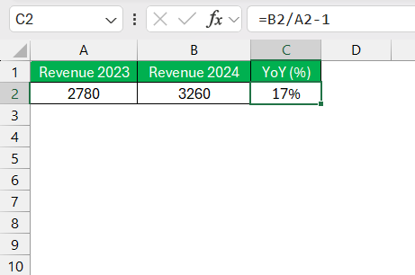
In an illustrative scenario where B2 is this year’s value and A2 the previous year’s, the formula in C2 would be:
=(B2/A2)-1
This method’s beauty lies in its ability to provide a more streamlined way of looking at growth, represented by a ratio that can be further analyzed or compared across different datasets.
By adopting this modern method, data analysts can streamline their comparisons, particularly when they wish to investigate broader trends across various datasets or metrics, as it sets a uniform standard of growth representation.
Visualizing and Interpreting YoY Growth in Excel
Using Conditional Formatting to Highlight Trends
One of Excel’s immensely powerful features for visualizing data trends is conditional formatting – a dynamic tool that can bring your YoY analysis to life. It enables you to apply formats to a cell or range of cells based on specific criteria, such as highlighting values that meet certain conditions. For instance, we can illustrate positive growth trends with green shading and negative trends with red.
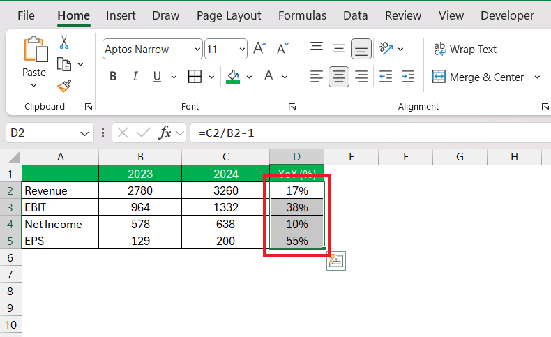
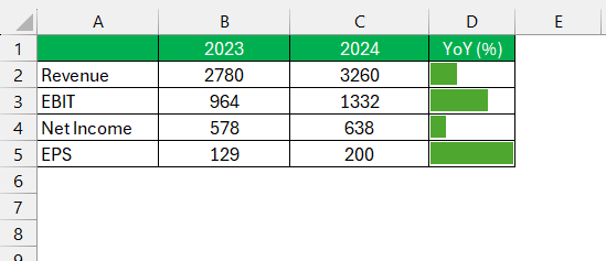
To implement data bars via conditional formatting which visually indicate positive and negative year-over-year changes:
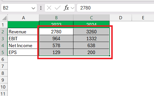
STEP 1: Select the range of cells containing YOY changes you wish to highlight.
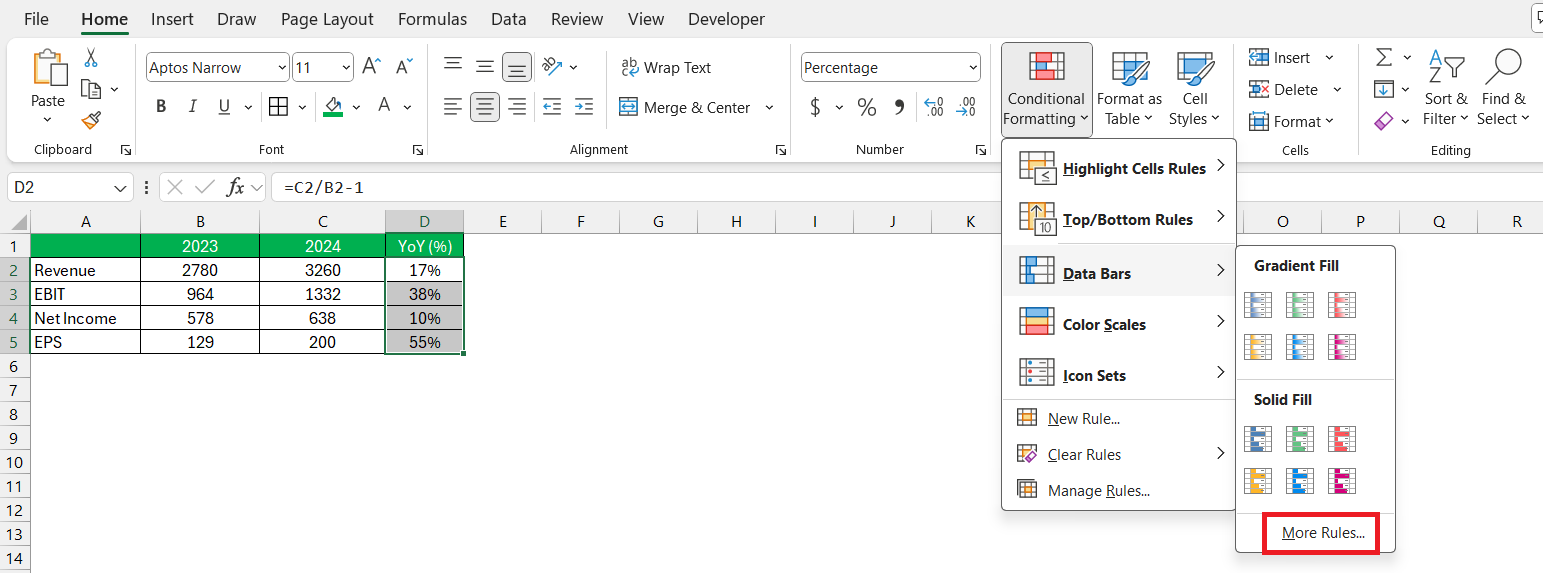
STEP 2: Click on the “Home” tab and choose “Conditional Formatting” from the ribbon.
STEP 3: Navigate to the ‘Data Bars’ section and select ‘More Rules…’ to define your custom formatting criteria.
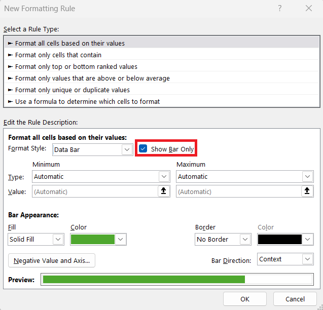
STEP 4: Within the settings, there’s a handy option to display only the data bar, omitting numerical values, which can create a cleaner look for quick visual analysis.
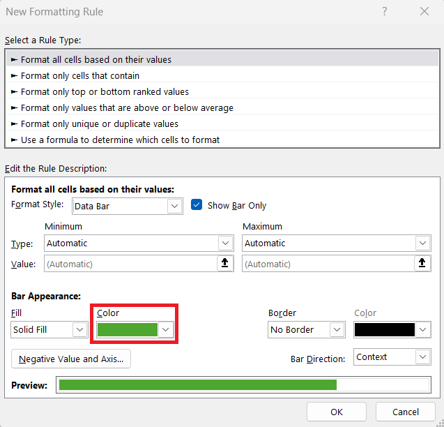
STEP 5: Set a specific fill color for positive growth to visually affirm upward trends..
By converting numerical data into a graphical format, conditional formatting facilitates an immediate comprehension of trends and changes, allowing stakeholders to quickly discern areas of success and concern without needing to sift through numbers minutely.
This visualization technique is not only aesthetically pleasing but also a fundamental step in data interpretation and decision-making.
Creating Charts to Visualize Year-over-Year Changes
Visualizing YoY changes can vastly improve the way we interpret and present our findings. Excel offers a host of chart options for this very purpose. A well-designed chart can spell the difference between a data sheet that confuses and one that clarifies.
To create a visual representation of YoY growth, follow these steps:
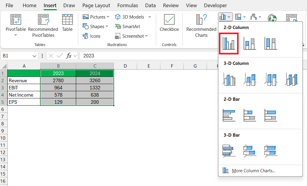
STEP 1: Start by selecting the range of data you intend to chart.
STEP 2: From the “Insert” tab, navigate to the “Charts” group, where options like Column, Line, or even Combination charts offer various ways to showcase YoY trends.
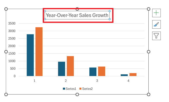
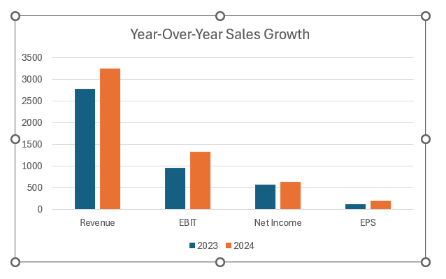
STEP 3: Further customize the chart by adding a title that succinctly encapsulates the data’s narrative, such as “Year-Over-Year Sales Growth”.
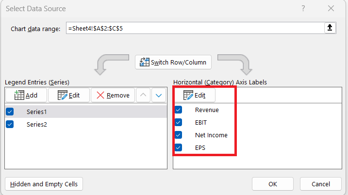
STEP 4: Click on the Chart Design tab and Select Data.
STEP 5: In the dialog box, click on the edit button on the Horizontal Axis Labels section and select the range.
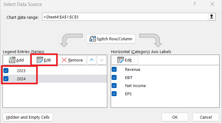
STEP 6: Click on the edit button on the Legend Entries section and select the range.
The column chart will look like this –
Charts act as visual stories, telling the tale of your data in a way that’s digestively insightful. By spotlighting YoY growth through charts, we not only synthesize complex data into intuitive insights but also enable stakeholders to make informed decisions based on clear, graphic evidence of trends and performance.
FAQ: Mastering YoY Calculations in Excel
What is the YoY formula?
The YoY formula, or Year-over-Year growth formula, is calculated by taking the current year’s value, subtracting the previous year’s value, and then dividing the difference by the previous year’s value. Finally, multiply the result by 100 to get a percentage. The formula looks like this:
YOY Growth (%) = ((Current Year Value – Previous Year Value) / Previous Year Value) * 100
This formula helps to determine the growth rate from one year to the next in percentage terms. It’s a widely used metric for comparing a company’s financial performance over annual periods.
What does yoy mean?
YoY stands for Year-over-Year. It’s a method of evaluating two or more measured events to compare them at one point in time across consecutive years. In the context of business and finance, YoY data comparisons are used to assess the pace of company growth, performance, and other measurable interests over time.
How can I ensure accuracy in my YoY calculations?
To ensure accuracy in your YoY calculations, verify that data used for comparison is accurate and consistently measured across periods. Double-check your figures, maintain uniformity in accounting methods, and use a well-organized Excel spreadsheet. Regular audits of the data source and error checks can prevent calculation mistakes.
What is a good YoY growth rate?
A “good” YoY growth rate is relative and varies based on industry norms, company size, and market conditions. Rather than a one-size-fits-all number, a good YoY growth rate is often one that outpaces inflation, exceeds industry averages, aligns with company objectives, and reflects positive trends when benchmarked against previous periods within the company.
How does YoY compare to QoQ and MoM analyses?
Year-over-Year (YoY) analysis spans annual intervals and neutralizes seasonal variations, reflecting the long-term performance and overall trend of a business. Quarter-over-Quarter (QoQ) offers a more granular view, isolating quarterly business cycles and seasonal trends, while Month-over-Month (MoM) provides the highest frequency of data points, ideal for swiftly identifying emerging trends or the impact of short-term strategic decisions.
Comparing these, YoY offers stability against seasonal swings, QoQ captures incremental shifts with a balance of immediacy and strategic outlook, and MoM provides the up-to-date pulse of a business’s trajectory.
John Michaloudis is a former accountant and finance analyst at General Electric, a Microsoft MVP since 2020, an Amazon #1 bestselling author of 4 Microsoft Excel books and teacher of Microsoft Excel & Office over at his flagship MyExcelOnline Academy Online Course.

