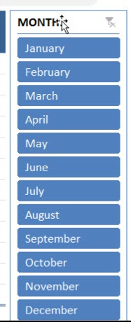
Excel offers powerful tools for quick, effective data analysis, with Pivot Tables being one of the most useful. Pivot Tables summarize large datasets instantly, but presenting that data interactively is just as important. That’s where Slicers come in. Slicers are visual filters for Pivot Tables, letting you dynamically display only the data you need. By default, they appear as a single vertical column, which can get unwieldy for long lists like months or product names.
Fortunately, you can change the layout to multiple columns, making your Slicer more compact and easier to navigate. This article explains how to add columns to Pivot Table Slicer buttons in Excel, with practical examples, tips, and dashboard-friendly techniques.
Key Takeaways:
- Pivot Table Slicers are visual filters that allow quick, intuitive data filtering.
- By default, Slicers appear in one column, which can look cluttered with many items.
- You can easily change the layout to multiple columns for better readability.
- Multi-column Slicers improve dashboard design, clarity, and usability.
- You can customize Slicer styles, sizes, and layouts for a professional presentation.
Table of Contents
Understanding Pivot Table Slicers
What Are Slicer Buttons?
Each Slicer button represents a unique item from your Pivot Table field — for example, each month, region, or product name. Clicking a button filters the Pivot Table instantly to show only that item’s data. By default, these buttons stack vertically in one column. While fine for short lists, it’s far from ideal when you’re dealing with dozens of values. That’s where multiple columns come to the rescue — compact, easy to scan, and visually balanced.
Why Modify Slicer Layout?
While a single-column Slicer is functional, it can become unwieldy for datasets with many items. Modifying the layout to multiple columns offers benefits like:
- Improved readability: Users can see all options at a glance.
- Space efficiency: Multi-column Slicers take up less vertical space.
- Logical grouping: For example, months can be grouped into quarters.
- Enhanced interactivity: Users can navigate large datasets more easily.
Add Columns to Pivot Table Slicer Buttons
STEP 1:Select your Slicer.
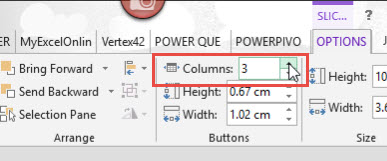
STEP 2: Go to Slicer Tools > Options > Buttons > Columns
Select Columns to 3.
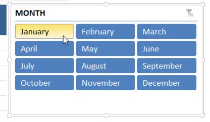
Your slicer now has a 3-column button layout!
Customizing Multi-Column Slicers
Button Size and Style
Once you have multiple columns, you can:
- Resize buttons for better readability.
- Apply Slicer styles (color themes, borders) to match your dashboard.
- Align Slicers neatly beside Pivot Tables for a polished look.
Enhancing Interactivity
- Enable multi-select to filter multiple items simultaneously.
- Combine Slicers with other filters or timelines for dynamic dashboards.
- Use clear labeling for easier understanding of grouped items (like quarters or categories).
Advanced Tips
- Optimal Column Count – Avoid overloading the Slicer with too many columns; 2–4 is typically ideal. Too many columns can make the layout cluttered and confusing.
- Logical Grouping and Accessibility – Group items meaningfully, like months by quarter or products by category. Ensure buttons are readable, with clear text and sufficient spacing for easy interaction.
- Consistent Slicer Sizes – If you use multiple Slicers, keep their button sizes and column counts consistent. This gives your report a cleaner, professional look and avoids user confusion.
- Combine with Timelines – Timelines are like Slicers but specifically for date fields. Using both together gives your audience quick, flexible control — for instance, filtering by a specific year using a timeline while selecting months from a Slicer.
FAQs
Q1: Can I set different column numbers for different Slicers?
Yes. Each Slicer in Excel is completely independent, meaning you can customize them individually based on your data needs and dashboard layout. For example, you might set your “Month” Slicer to 3 columns to show all months in a compact grid, while your “Region” Slicer might only need 2 columns. This flexibility helps you design clean, well-balanced dashboards without one Slicer overpowering the rest. It’s all about visual harmony and usability.
Q2: Does changing the column layout affect the data?
No — the column layout only affects the appearance of the Slicer, not the underlying data or Pivot Table results. Whether you use one column or four, your Pivot Table calculations remain exactly the same. The change is purely cosmetic, designed to make your report easier to read and interact with. It’s like rearranging furniture in your living room — the room stays the same, it just feels better to move around in.
Q3: Can I use this in Excel Online?
Yes, Slicers and multi-column layouts also work in Excel Online, but with a few limitations. You can adjust basic layout options, such as resizing or formatting Slicers, but some advanced styling tools (like custom Slicer styles or VBA-based automation) may not be available. Still, for most users who just need quick filtering and multi-column organization, Excel Online performs beautifully. It’s also great for shared dashboards since team members can interact with Slicers directly in their browser.
Q4: What’s the maximum number of Slicer columns I can use?
There’s technically no strict upper limit, but Excel’s layout starts to look cluttered if you push beyond 5 or 6 columns. Think of it this way: more columns mean smaller buttons and less breathing room, which can make the Slicer harder to read and use. Stick to the “2–5 column” rule for a clean, professional appearance. If you have a large number of items, consider grouping them by category (like regions, quarters, or product types) or using multiple smaller Slicers instead of one overloaded one.
Q5: Can I connect one Slicer to multiple charts or tables?
Absolutely! This is one of Excel’s best interactive features. If you have multiple Pivot Tables or Pivot Charts that are based on the same dataset, you can link one Slicer to all of them. That means when you select a filter — say, “Q1” or “North Zone” — every connected chart and table updates instantly. To set this up, go to Slicer Tools → Report Connections (or PivotTable Connections in older versions), and check all the Pivot Tables you want to sync. It’s a game-changer for creating cohesive dashboards where everything responds in real time.
John Michaloudis is a former accountant and finance analyst at General Electric, a Microsoft MVP since 2020, an Amazon #1 bestselling author of 4 Microsoft Excel books and teacher of Microsoft Excel & Office over at his flagship MyExcelOnline Academy Online Course.


