A relative frequency histogram in Microsoft Excel is a graphical representation that displays the distribution of data points as proportions of the total dataset. Unlike a standard histogram, which shows the absolute frequency, a relative frequency histogram shows the percentage of the total number of observations that fall into each bin. In this article, we will guide you through the process of creating a relative frequency histogram in Microsoft Excel.
Key Takeaways:
- A relative frequency histogram displays data as a proportion of the total number of observations, providing a comparative view that simplifies the comparison of datasets of different sizes.
- Ensure your data is organized in a single column in Excel and create bins to group the data points effectively before calculating frequencies.
- Utilize Excel’s FREQUENCY function to calculate the number of data points in each bin and then compute the relative frequencies by dividing these counts by the total number of observations.
- Insert a clustered column chart to represent the relative frequency data, and customize it by editing the chart title, axis titles, and formatting the histogram for better visual appeal.
Table of Contents
Introduction to Relative Frequency Histograms in Excel
What is a Relative Frequency?
A relative frequency histogram is a powerful tool for visualizing the distribution of data in terms of relative frequency. Unlike a simple histogram that shows the absolute frequency of data points within certain ranges, a relative frequency histogram shows the proportion of the total number of observations that fall into each bin, making it easier to compare datasets of different sizes.
Navigating Excel for Histogram Creation
When navigating Excel to create a histogram, your journey begins with a smooth sail through the ribbon to the “Insert” tab; here, you find the chart section brimming with options. Seek out the histogram symbol, which usually nests under the “Bar Chart” dropdown.
Remember, patience is key – Excel’s interface is user-friendly, but it can be a treasure trove of menus and options, needing a touch of exploring to find the tools needed for your histogram masterpiece.
Step-by-Step Guide
How to Create Relative Frequency Histograms in Excel
STEP 1: Prepare Your Data
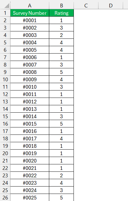
Before creating a histogram, ensure your data is well-organized in a single column in an Excel worksheet. For example, let’s assume you have a list of ratings mentioned in column B for each survey.
STEP 2: Create Bins
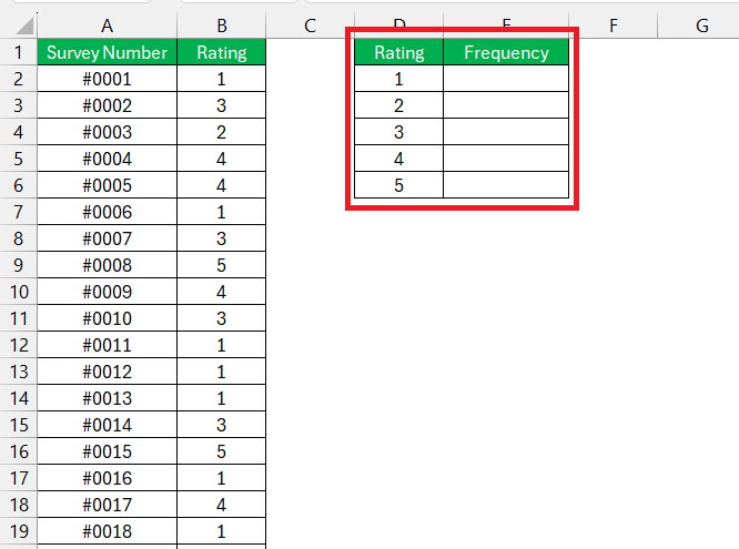
Bins are intervals that help group your data. You can define your own bins or let Excel suggest them. In this example, we can use the ratings as bins.
STEP 3: Calculate Frequency
- Select the column where you want the frequency counts to appear.
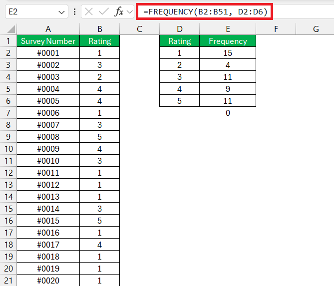
- Use the FREQUENCY function to calculate how many data points fall into each bin. If your data is in column B (B2:B51) and your bins are in column D (D2:D6), you would:
- Enter the formula =FREQUENCY(B2:B51, D2:D6) and press Ctrl+Shift+Enter to create an array formula.
STEP 4: Calculate Relative Frequency
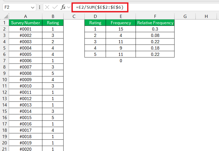
Relative frequency is the frequency of each bin divided by the total number of observations. In a new column, say column F, calculate the relative frequency using the formula =E2/SUM($E$2:$E$6) and drag this formula down to apply it to all bins.
STEP 5: Insert the Histogram
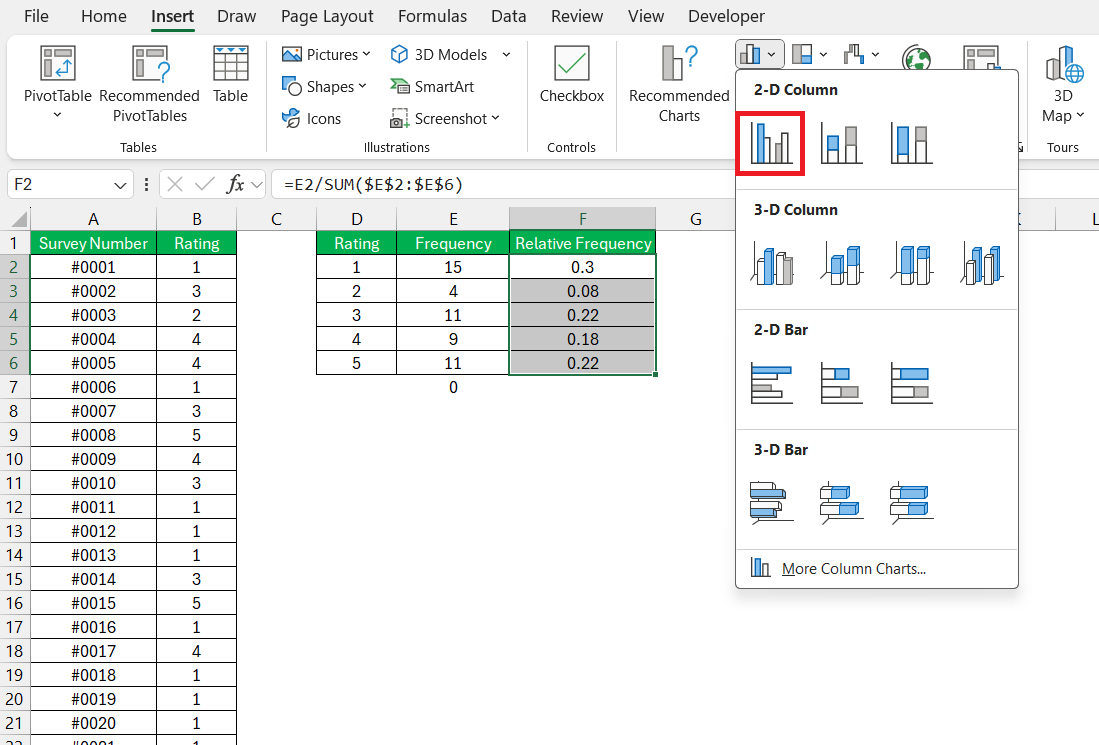
- Select the relative frequency data (F2:F6).
- Go to the Insert tab on the Excel ribbon.
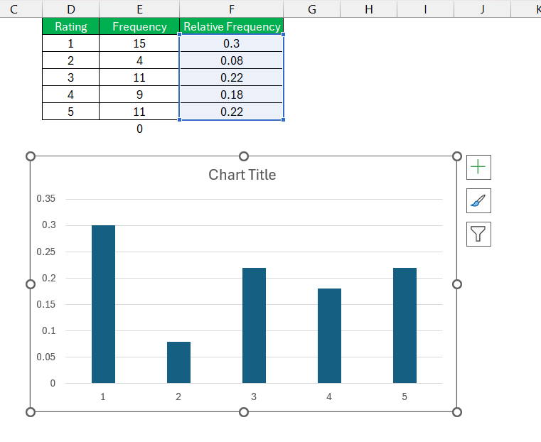
- Choose Insert Column or Bar Chart and select a Clustered Column chart.
Your Relative frequency histogram is now ready!
Customize the Histogram
Once the chart is created, you can customize it to better represent your data.
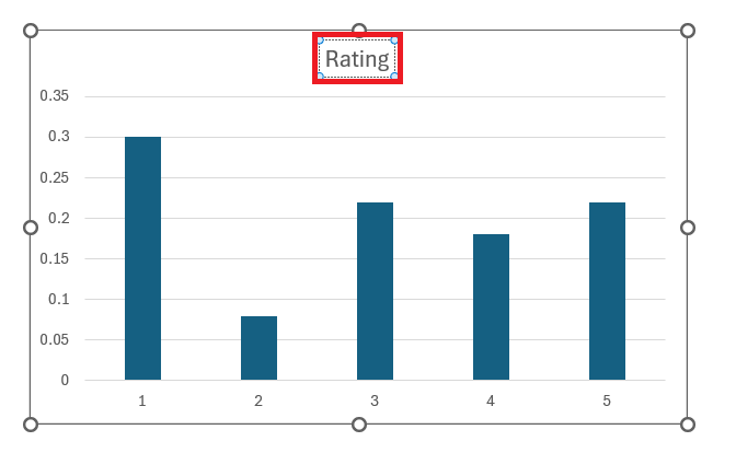
- Change Chart Title: Click on the chart title to edit it.
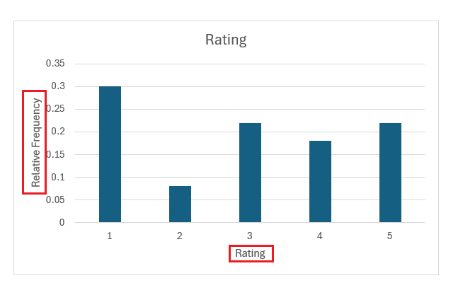
- Axis Titles: Add axis titles for clarity. For example, “Rating” for the X-axis and “Relative Frequency” for the Y-axis.
Format the Histogram
To make your histogram more visually appealing and easier to interpret:
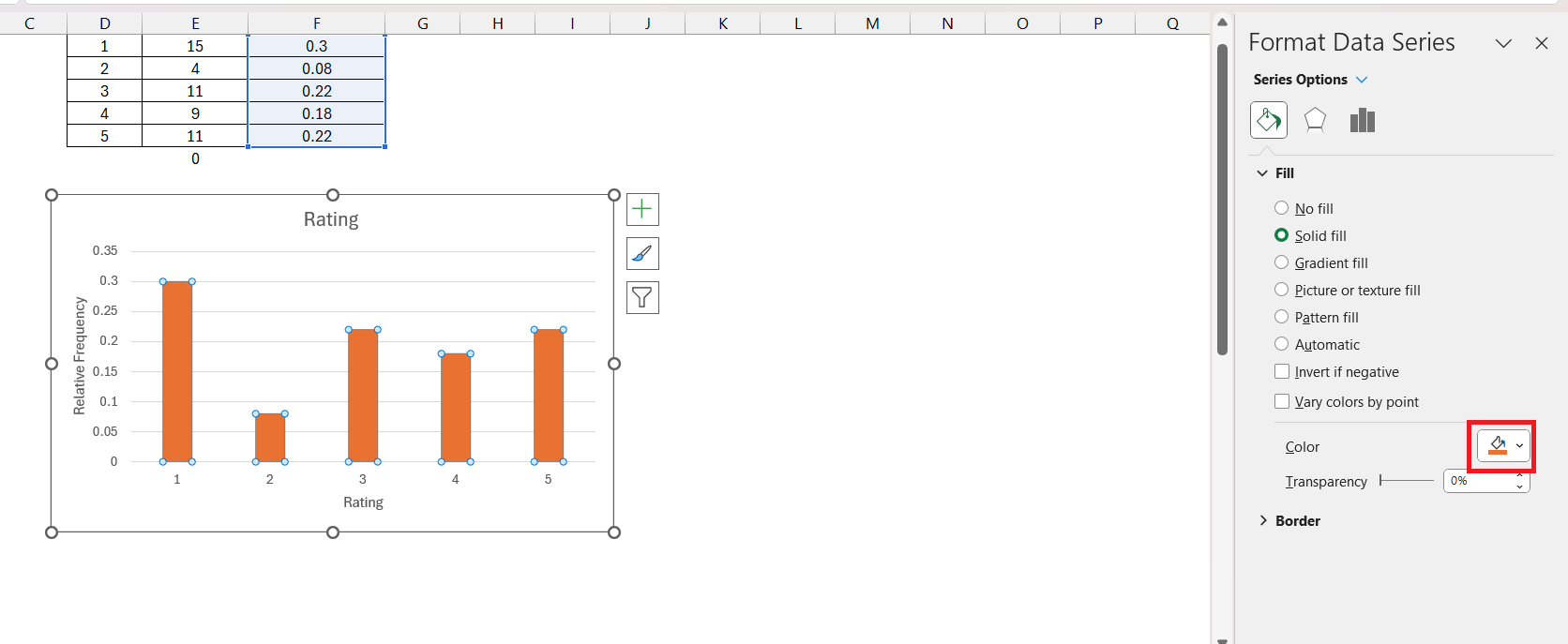
- Bar Colors: Right-click on the bars, select Format Data Series, and choose your preferred fill color.
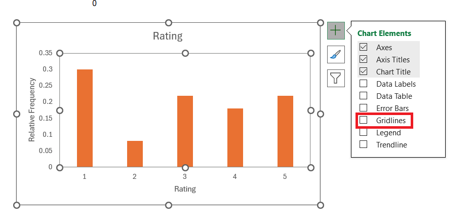
- Gridlines: Adjust gridlines for better readability. You can remove minor gridlines or change the style of major gridlines.
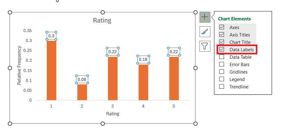
- Labels: Add data labels if necessary for each bar to show the exact relative frequency values.
Conclusion
Creating a relative frequency histogram in Excel is straightforward once you understand the steps. This type of histogram provides a clear and comparative view of data distributions, making it a valuable tool for data analysis in various fields. By following the outlined steps, you can create an effective and informative histogram that helps in visualizing the relative frequencies of your data.
Frequently Asked Questions
How to do a relative frequency histogram in Excel?
To calculate relative frequency in Excel, first total up the frequencies using =SUM(range), then divide each category’s frequency by this total. Place the formula =individual_frequency/cell_of_total_frequency (for example, =B2/$B$6) in a new column beside your data and auto-fill down the column. Format this column as a percentage for easy visualization.
What is the purpose of a relative frequency histogram?
A relative frequency histogram helps visualize the distribution of data as proportions of the total dataset, making it easier to compare different datasets by normalizing the data.
How do I create bins in Excel for my histogram?
To create bins, list the upper limits of each range in a new column. For example, if you want bins for scores 0-10, 11-20, etc., enter these values sequentially in a column.
Can I customize the appearance of my histogram in Excel?
Yes, you can customize your histogram by editing the chart title, adding axis titles, adjusting the bin labels, and changing the colors and styles of the bars for better readability.
Is relative frequency the same as frequency histogram?
No, they aren’t the same. A frequency histogram shows the number of occurrences in each bin—think of it as a headcount at a concert, while a relative frequency histogram displays these counts as a proportion of the total—the percentage of the audience in each seating section. Both give insights into data distribution, but they tell different stories: one about quantity and the other about proportionality.
John Michaloudis is a former accountant and finance analyst at General Electric, a Microsoft MVP since 2020, an Amazon #1 bestselling author of 4 Microsoft Excel books and teacher of Microsoft Excel & Office over at his flagship MyExcelOnline Academy Online Course.

