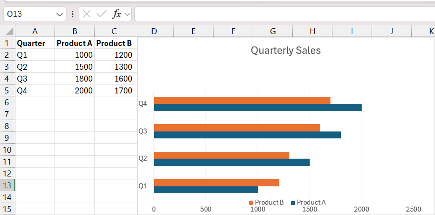
Double Bar Graphs are powerful tools in data visualization, enabling simultaneous comparison of two datasets side by side. From analyzing sales data over different years to tracking market trends, this article delves into the key benefits of utilizing Double Bar Graphs for comparative analysis, offering a step-by-step guide to crafting them in Microsoft Excel and elevating their impact with advanced techniques.
Key Takeaways
- Double bar graph offer immediate comparison between two datasets, aiding in understanding key metrics and identifying trends over time or between groups.
- With an intuitive layout, even less data-savvy team members can engage with insights, making Double Bar Graphs accessible for various applications.
- From data organization to customization and advanced techniques, the article provides a comprehensive roadmap for creating impactful Double Bar Graphs in Excel.
- Attention to details like color schemes, bar width, axes clarity, and gridlines ensures the graph stands out and effectively communicates complex information.
Download the workbook and follow along the article on how to create double bar graph in Excel – Download excel workbookExcel-Mastery-How-to-Make-Double-Bar-Graph-in-Excel.xlsx
Mastering Excel’s Double Bar Graph Feature
Unraveling the Purpose of Double Bar Graphs in Data Visualization
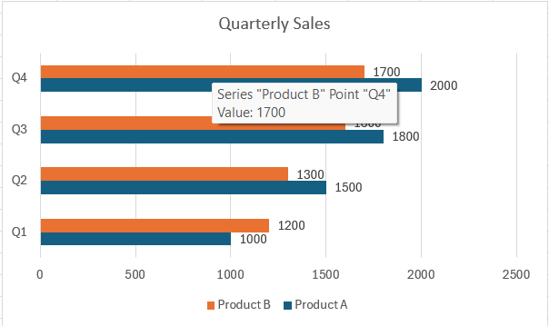
Double Bar Graphs serve a special role in data visualization by allowing you to compare and contrast two sets of data side by side. Imagine having the ability to look at two different years of sales data for several products at once; this is the clarity that a double bar graph brings to data analysis.
Key Benefits of Using Double Bar Graphs for Comparative Analysis
Double Bar Graphs redefine comparative analysis by slicing through the complexity of data and presenting it in a format that’s straightforward and informative. Here’s why they’re highly favored:
- Immediate Comparison: They make comparing key metrics like profits vs. costs not just possible but instantly understandable.
- Trend Visualization: Patterns and trends over time or between groups stand out vividly, helping identify the growth or decline at a glance.
- Diverse Applications: They’re versatile enough for business reports, academic research, and any scenario where relative performance matters.
- User-Friendly Design: The layout is intuitive, inviting even the less data-savvy team members to engage with the insights.
- Enhanced Communication: Using Double Bar Graphs in presentations ensures your message is backed by visually compelling evidence that grabs attention.
By leveraging the advantages of Double Bar Graphs, you can transform bulky datasets into clear, actionable insights that drive informed decision-making.
The Step-by-Step Guide to Crafting a Double Bar Graph
Data Organization: Laying the Foundation for Your Graph
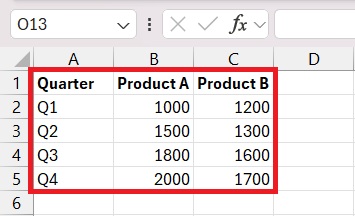
Before you unleash the power of a Double Bar Graph in Excel, you need to get your data in order. A well-organized dataset is the cornerstone of a clear and effective graph. Here’s how you can lay the perfect foundation:
STEP 1: Collect Data: Assemble all relevant data that you want to compare. Ensure accuracy as this will determine the graph’s reliability. And arrange your data into two main columns or groups, which represent the different categories or time periods you’re comparing with consistent formatting.
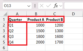
STEP 2: Label Appropriately: Clearly label each column and row. This will help Excel and others understand what each set of data represents.
With these steps, your data will be primed for a transformation into a visually engaging and informative Double Bar Graph.
Chart Wizardry: Inserting and Customizing Your Double Bar Graph
Once your data is neatly arranged, it’s time to work some chart wizardry in Excel to bring your Double Bar Graph to life. Here’s a straightforward guide to get you from data to diagram:
Inserting Your Double Bar Graph:
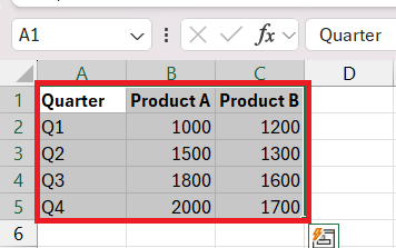
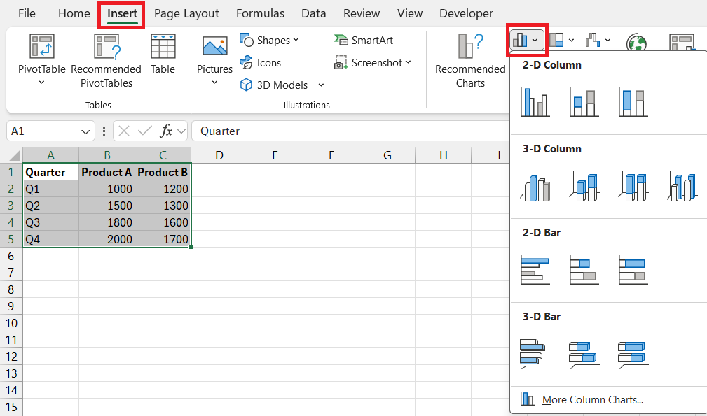
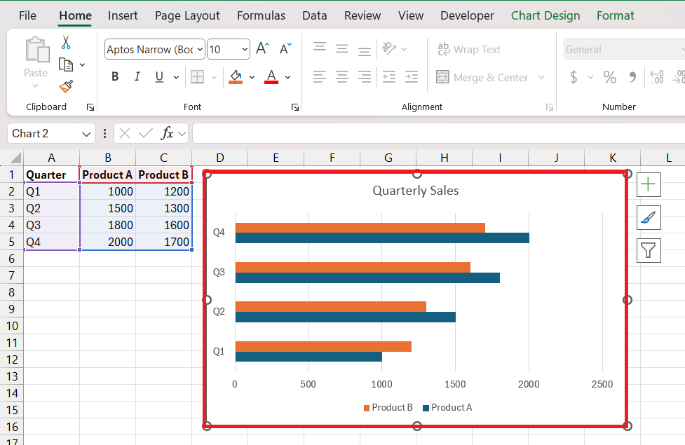
STEP 1: Select your organized data.
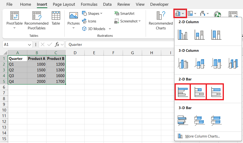
STEP 2: Navigate to the “Insert” tab and choose “Bar Chart“ from the charts group.
STEP 3: From the dropdown, select “Clustered Bar” or “Stacked Bar” depending on your preference for a double bar graph representation.
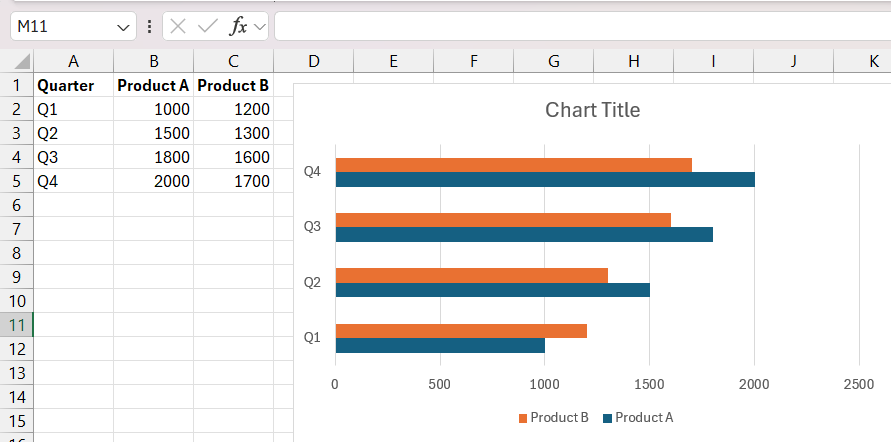
STEP 4: Congratulations, your Double Bar Graph has been created!
Customizing Your Double Bar Graph:
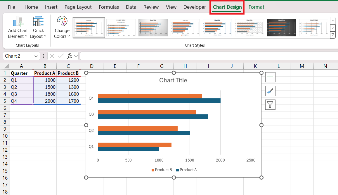
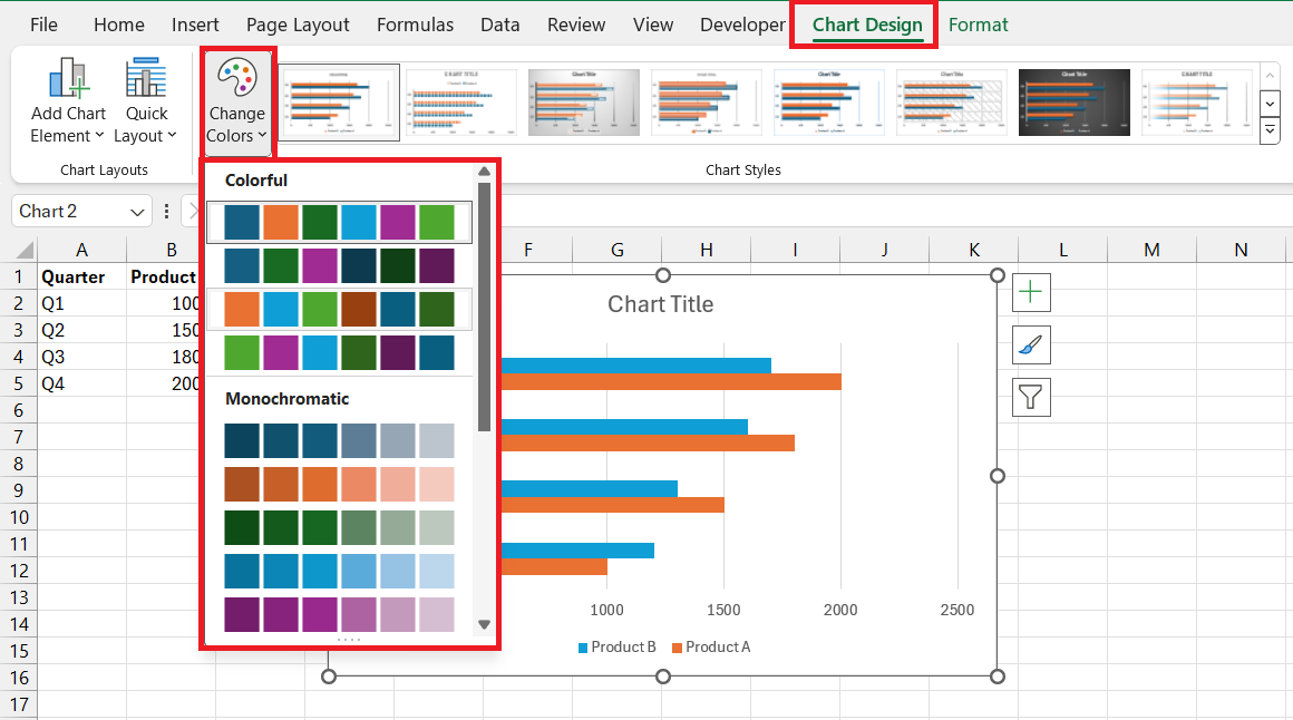
STEP 1: Click on the “Chart Design” tab to open up customization options.
STEP 2: Adjust Colors and Styles: Choose from the color palettes to differentiate data sets clearly.
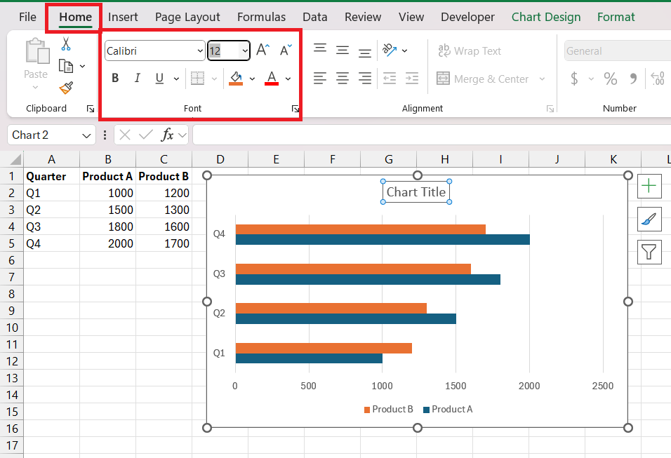
STEP 3: Modify Fonts and Sizes: Ensure that text is legible and stands out against the background for easier interpretation. Select the text and modify the font as usual from the Home tab.
STEP 4: Tweak Axis Titles and Labels: Make them descriptive to provide context to your data.
Remember, customization is not just for aesthetics—it’s about making your Double Bar Graph clearer and more impactful for whoever is reading it.
Elevating Your Graph with Advanced Techniques
Adding Depth with Data Labels and Titles
Enhancing your Double Bar Graph with labels and titles isn’t just about making it look professional—it’s about adding layers of meaning and accessibility. Here’s how to enrich your graph:
Adding Data Labels:
STEP 1: Click on your graph to select it.
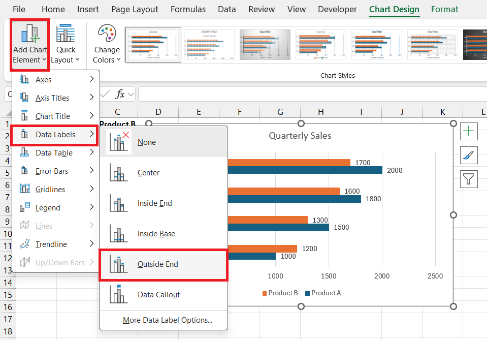
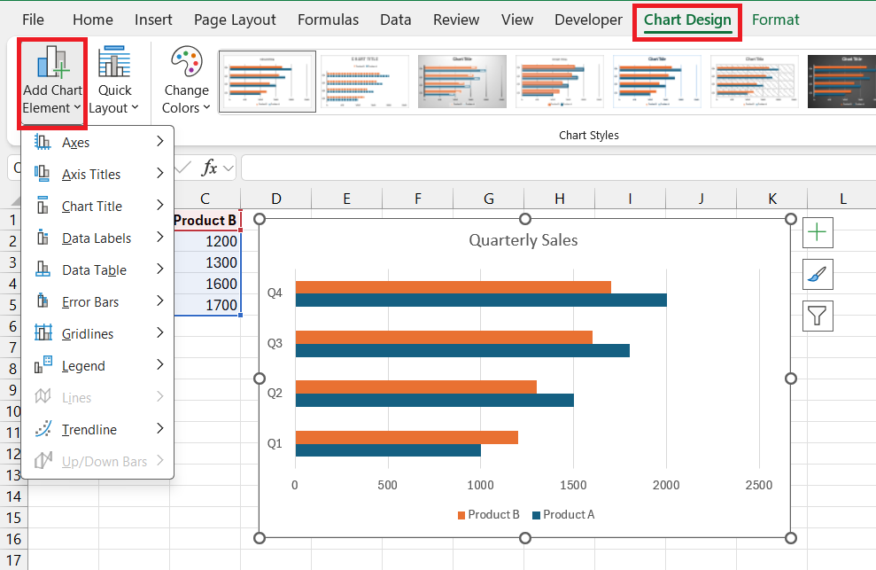
STEP 2: Go to the “Chart Design” tab and select “Add Chart Element”.
STEP 3: Choose “Data Labels” and decide on their placement—like “Outside End” to display them prominently.
STEP 4: Your graph will now show the exact values for each bar, clarifying differences in your data at a glance.
Incorporating Titles:
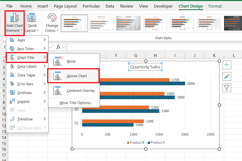
STEP 1: Still on the “Chart Design” tab, click “Add Chart Element” again.
STEP 2: Select “Chart Title” and place it above your graph.
STEP 3: Double-click on the default title text and type in a concise, descriptive title that conveys the essence of your graph.
By clearly labeling data points and giving your chart a defining title, you transform numbers into a narrative, making complex information digestible for anyone who sees it.
Fine-Tuning Visual Elements for Maximum Impact
To truly make your Double Bar Graph stand out and ensure it leaves an impact, you need to fine-tune its visual elements. Here’s what to focus on:
Consistency with Color Schemes: Stick to a color palette that’s not only appealing but makes logical sense for your dataset. High contrasting and lighter shades work best for clarity.
Adjustment of Bar Width: Regulate the gap and bar width for optimal readability. Too narrow, and the graph looks crowded; too wide, and the comparison loses its punch.
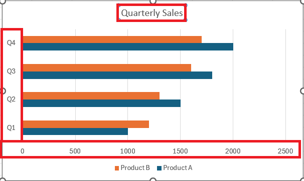
Emphasis on Axes: Make sure the X and Y axes are clearly marked and that any scale break is sensible, aiding to accurately reflect the data.
Gridlines for Precision: Light gridlines can guide the eye and help quantify the value of bars without distracting from the main content.
By paying attention to these nuances, you foster an engaging visual story that amplifies understanding and retains the audience’s attention.
Real-World Applications of Double Bar Graphs in Excel
Business and Market Trends Analysis through Comparison
Double Bar Graphs are particularly potent tools for analyzing business and market trends. Here’s how they can provide valuable insights:
- Revenue and Growth Tracking: By comparing sales over multiple periods, businesses can easily spot growth trends or areas needing attention.
- Product Performance: For businesses with multiple products or services, these graphs can swiftly highlight top performers and underperforming sectors.
- Market Share Visualization: Companies can compare their market share against competitors over different time frames to assess competitive standing.
The Double Bar Graph illuminates where a company has been, where it stands, and, by extrapolation, where it’s headed, equipping decision-makers with the clarity they need for strategic planning.
Academic and Scientific Data Presentation with Precision
In academic and scientific fields, Double Bar Graphs serve as a precision tool for presenting complex data. Here’s their value in this context:
- Experimental Results: They allow for the side-by-side comparison of control vs. experimental groups, highlighting differences in outcomes.
- Statistical Analysis: With these graphs, researchers can effectively display statistical information, such as means and variability across different groups or conditions.
- Educational Tools: In a teaching environment, they offer a visual mode for explaining concepts like comparative analysis or demonstrating real-world data trends.
Such precision in data presentation elevates the standard of academic inquiry and discourse, allowing for nuanced analysis and fostering a deeper understanding of the subject matter.
FAQs: Your Questions Answered
Q1. What is the difference between a bar graph and a double bar graph?
A bar graph displays one set of data using bars, while a double bar graph compares two sets by showing two bars for each category or group side by side, making it easier to compare and contrast the different datasets.
Q2. How can I add multiple data series to my double bar graph?
In Excel, you can add multiple data series to a double bar graph by clicking on the graph, selecting “Chart Design,” then “Select Data,” and using the “Add” button to include additional series from your worksheet.
Q3. Can I create a double bar graph in older versions of Excel?
Yes, you can create a double bar graph in older versions of Excel. The process is similar—select your data, go to the “Insert” menu, choose “Chart,” then “Bar,” and finally select the type of bar chart that suits your dataset.
Q4. What are some tips for making my double bar graph more readable?
To make your double bar graph more readable, use contrasting colors for clarity, apply data labels for precision, choose a clean layout to avoid clutter, keep your axis titles descriptive, and ensure your legend is clear and accurately positioned.
Q5. How do you change the color scheme of your double bar graph in Excel?
To change the color scheme of your double bar graph in Excel, click on the graph, then go to the “Format” tab, select the bars you wish to change, click on “Shape Fill,” and choose your new colors. Excel also offers a variety of preset color schemes under the “Design” tab.
John Michaloudis is a former accountant and finance analyst at General Electric, a Microsoft MVP since 2020, an Amazon #1 bestselling author of 4 Microsoft Excel books and teacher of Microsoft Excel & Office over at his flagship MyExcelOnline Academy Online Course.

