Free Practice Workbook
Pivot Charts give you a great visual representation of your Pivot Table data. If it contains multiple categories and subcategories, it may be difficult to read them. The Expand and Collapse Fields feature allows you to display detailed data when needed and hide it when you want a simpler view. This makes it easier to focus on the information that is important for your analysis. In this article, you will learn how to expand and collapse fields in a Pivot Chart in Excel.
Key Takeaways:
- Pivot Charts visually display data from a PivotTable.
- Expand fields to view more detailed data.
- Collapse fields to show summarized data.
- Use the Plus and Minus buttons to control data levels.
- Changes in a Pivot Chart are reflected in the connected PivotTable.

Table of Contents
What are Pivot Charts?
Pivot Charts are interactive charts in Excel that visually display data from a PivotTable. They make it easier to compare values, identify trends, and understand large amounts of data.
Unlike regular charts, Pivot Charts are directly connected to a PivotTable. When you filter, expand, collapse, or rearrange fields in the PivotTable or Pivot Chart, the chart automatically updates to reflect the changes.
This allows you to analyze your data from different perspectives without creating a new chart each time.
For example, a Pivot Chart may initially display sales figures by region. You can expand a field to view sales for individual customers within each region. This helps you move from a summary view to a more detailed view of your data.
How to Expand and Collapse Fields in Pivot Chart
Using Right Click
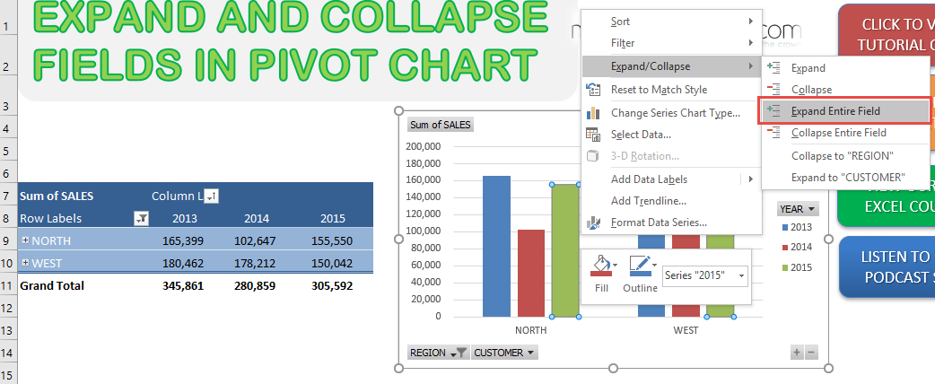
STEP 1: To expand your field, right-click on a part of the chart and go to Expand/Collapse > Expand Entire Field
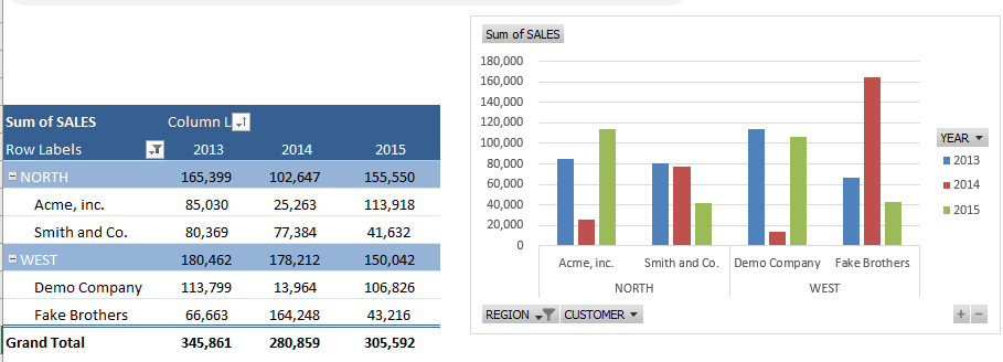
With just that, your Pivot Chart has now expanded to the Sales Figures per Customer!
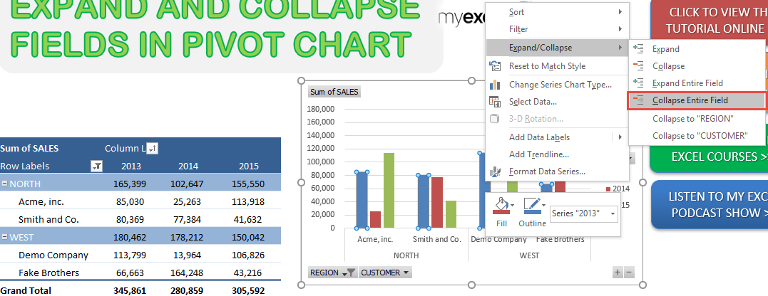
STEP 2: Now let us collapse this back, right-click on a part of the chart, and go to Expand/Collapse > Collapse Entire Field
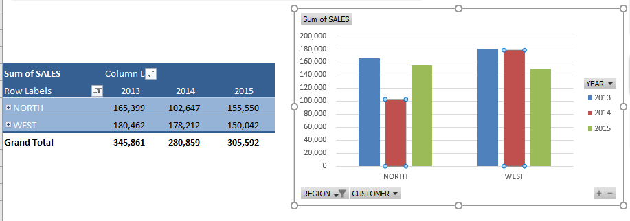
Now your Pivot Chart has gone back to showing the Sales Figures by Region!
Using the Expand/Collapse Button
STEP 1: Click on the Pivot Chart
STEP 2: Click on the Plus button to expand the category.
Excel will display the next level of data in the Pivot Chart.
STEP 3: Click on the Minus button to collapse the category.
Excel will hide the detailed data and display the summarized information.
This allows you to quickly switch between detailed and summarized views while analyzing your data
Tips & Tricks
- Arrange related fields in a logical hierarchy.
- Avoid displaying too many detail levels at once.
- Collapse fields before presenting a Pivot Chart.
- Expand specific areas when investigating unusual values.
- Keep the connected PivotTable organized.
- Refresh the PivotTable when the source data changes.
FAQs
What is a Pivot Chart in Excel?
A Pivot Chart is an interactive chart that visually displays PivotTable data. It makes it easier to compare values and identify trends in your data.
How to expand a field in a Pivot Chart?
Right-click on the chart and select Expand/Collapse > Expand Entire Field. Excel will display the next level of detailed data in the chart.
How to collapse a field in a Pivot Chart?
Right-click on the chart and select Expand/Collapse > Collapse Entire Field. This hides the detailed data and displays a summarized view.
What are Plus and Minus buttons in a Pivot Chart?
The Plus button expands a category to show more details. The Minus button collapses the category and hides the detailed data.
Does a Pivot Chart update when the PivotTable changes?
Yes. A Pivot Chart is connected to its PivotTable and reflects changes made to the data layout. Refresh the PivotTable if the source data has been updated. The connected Pivot Chart will also display the refreshed information.

Bryan
Bryan Hong is an IT Software Developer for more than 10 years and has the following certifications: Microsoft Certified Professional Developer (MCPD): Web Developer, Microsoft Certified Technology Specialist (MCTS): Windows Applications, Microsoft Certified Systems Engineer (MCSE) and Microsoft Certified Systems Administrator (MCSA).
He is also an Amazon #1 bestselling author of 4 Microsoft Excel books and a teacher of Microsoft Excel & Office at the MyExecelOnline Academy Online Course.

 30 Days - Full Access