A Pivot Table allows you to group your transactional sales values by any range that you want. You can then summarize each sales group and see the total sales and the number of transactions that they have produced. This is useful for pricing analysis. In this article, I’ll share how I use Pivot Tables to group sales data, showing you my process step by step with real lessons I’ve learned along the way. By the end, you’ll see why Pivot Tables have become my go-to tool whenever I want to understand how different groups are performing in sales.
Key Takeaways:
- Pivot Tables let me group sales into meaningful ranges for quick insights.
- Grouping sales helps identify small, medium, and large deals instantly.
- Adding fields like Region or Product uncovers hidden sales trends.
- Filters and slicers make the analysis interactive and presentation-ready.
- Grouped sales data is ideal for pricing analysis and performance tracking.
download workbookGroup-Sales.xlsx
Table of Contents
Introduction to Pivot Table
What is a Pivot Table?
In the simplest terms, a Pivot Table is Excel’s way of letting me rearrange and summarize data without changing the original dataset. It’s like a dynamic report builder where I can drag and drop fields to see totals, averages, counts, or comparisons in seconds. Unlike static formulas, Pivot Tables are flexible—I can swap out rows, columns, or filters instantly, almost like rotating a cube of data to view it from different angles (hence the word “pivot”). To me, it feels like having a conversation with my data: I ask a question, and the Pivot Table reshapes itself to give me the answer.
Why Grouping Sales Using a Pivot Table is Helpful
Grouping inside Pivot Tables makes sales data far more meaningful. Instead of only knowing the grand total, grouping lets me see ranges or categories that matter. For example, if I group sales into ranges of $0–$1000, $1001–$5000, and $5001–$10,000, I instantly know how many small, medium, and large deals I’m closing. Similarly, grouping by months or quarters reveals patterns over time. For me, grouping turns a mountain of transactions into clear business insights—insights I can share with my team or manager without overwhelming them.
Step-by-Step Guide to Group Sales with a Pivot Table
This is our set of data that we will use:

STEP 1: Drop Sales into Rows

STEP 2: Right click on your Pivot Table and select Group

STEP 3: You can start and end at any value. Click OK

STEP 4: Once the groupings are in place, drag Sales into Values twice

STEP 5: Right click on the first Count of Sales column and select Summarize Values By > Sum

You now have your grouped sales data ready! What was once a messy list of numbers is now a structured view showing both the total revenue and the number of transactions across your defined ranges.

Customizing and Expanding the Analysis
Adding More Fields
Once I have grouped sales, I can make the Pivot Table even more powerful by adding another field into Rows or Columns. For example, I can drop in Region as a column, so I see grouped sales by region.
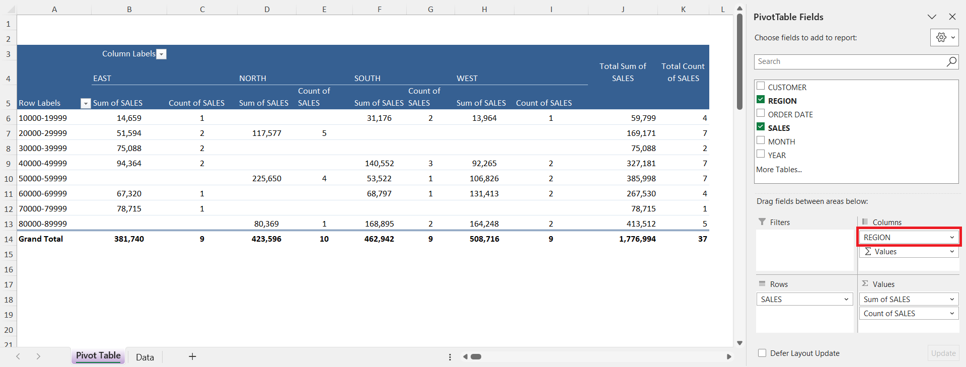
Suddenly, the table doesn’t just show deal sizes—it shows which regions are landing the big ones. I can also throw in Salesperson or Product Category to uncover who or what is driving results in each sales range. This layered analysis helps me spot trends I wouldn’t see if I only looked at sales amounts in isolation. It’s like zooming in on the story behind the numbers.
Using Filters and Slicers
I also love adding filters. Maybe I only want to see 2024 sales. Or maybe I want to slice the table by Product Category. Adding a slicer makes it easy to click and filter visually, which is especially handy when I’m presenting this to managers who don’t want to fiddle with Excel menus.
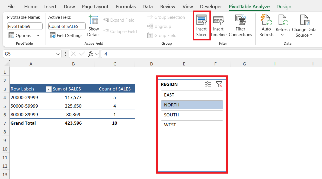
The best part is that slicers make the report interactive—my audience can explore the data themselves without changing the original Pivot Table. Combined with grouping, filters and slicers give me a dashboard-like experience that feels both flexible and professional.
FAQs
Q1. Why should I group sales in a Pivot Table instead of just using formulas?
Grouping in Pivot Tables saves time compared to building multiple formulas. With a few clicks, I can create ranges like $0–$1,000 or $5,000–$10,000 and see totals automatically. It’s more flexible because I can change or adjust the grouping without rewriting formulas. Plus, the Pivot Table shows both counts and sums in one place. This means I can analyze deal sizes and frequency all at once.
Q2. Can I group both numbers and dates in the same Pivot Table?
Yes, and that’s one of the biggest advantages of Pivot Tables. I can group sales numbers into ranges while also grouping dates into months, quarters, or years. This lets me see not only the size of sales but also when those sales are happening. For example, I might discover that high-value deals spike in Q4 every year. That combination of number and time grouping is incredibly powerful for planning.
Q3. What if my dataset changes—do I have to rebuild the Pivot Table?
No, I don’t have to rebuild it. When I add new sales data, I just refresh the Pivot Table, and the grouping stays intact. This makes it a “set it and forget it” kind of solution. If I need to adjust my ranges, I can right-click and regroup anytime. It’s dynamic, which means the structure adapts even as my data grows.
Q4. How do filters and slicers improve grouped sales analysis?
Filters and slicers allow me to narrow down the grouped data without altering the Pivot Table itself. For example, I can filter for only one year or one product category while still keeping my ranges intact. Slicers are even better because they’re visual—anyone can click through them during a meeting. This makes my report interactive and easy to explore. Managers love it because they can drill down without touching the data source.
Q5. Can I use grouped sales Pivot Tables for a pricing strategy?
Absolutely, and that’s one of my favorite uses. By grouping deals into ranges, I can see if most of my sales are clustered in low-value or high-value brackets. If I notice that the majority of sales are stuck in the lower bracket, it tells me my pricing or upselling strategy may need work. On the other hand, a healthy spread across ranges suggests balanced sales performance. This insight directly supports better decision-making in pricing and promotions.

John Michaloudis is a former accountant and finance analyst at General Electric, a Microsoft MVP since 2020, an Amazon #1 bestselling author of 4 Microsoft Excel books and teacher of Microsoft Excel & Office over at his flagship MyExcelOnline Academy Online Course.


