If you’ve ever had to present monthly sales data to your team or your boss, you know the pain: raw numbers just don’t pop. Sure, they’re technically correct and full of valuable information, but unless you can make trends visually obvious, you risk losing your audience’s attention in the first 15 seconds.
That’s exactly why I started using directional icons in Excel Pivot Tables to show the difference from the previous month. With just a few clicks, I can make it crystal clear which months are climbing and which ones are slipping — and I do it in a way that makes the data almost speak for itself.
Let me walk you through exactly how I do this, step-by-step, so you can copy it for your own reports.
Key Takeaways:
- Directional icons in Excel make month-over-month changes instantly clear.
- They’re applied using Conditional Formatting’s Icon Sets feature.
- Pivot Tables can calculate differences from the previous month automatically.
- You can customize icons to show only when values increase, decrease, or stay the same.
- This method works for sales data, web traffic, budgets, inventory, and more.
Table of Contents
Introduction to Directional Icons
Directional icons in Excel are small arrow symbols (or similar shapes) that visually indicate whether a value has gone up, down, or stayed the same compared to another value.
They’re part of Conditional Formatting → Icon Sets and are commonly used to show trends at a glance.
Here’s what they usually look like:
- Green Up Arrow (▲) → Value increased compared to a baseline (e.g., this month’s sales are higher than last month’s).
- Red Down Arrow (▼) → Value decreased compared to a baseline.
- Yellow Side Arrow (►) → Value stayed about the same or had only a tiny change.
You can customize:
- Which icons appear (arrows, triangles, traffic lights, etc.)
- When each icon is shown (e.g., only show a green arrow when the value is greater than zero).
- Whether numbers are hidden so only the icons show.
Basically, they’re a visual shorthand — instead of reading numbers, you just glance at the arrows to see the direction of change.
If you want, I can show you all the different directional icon styles Excel offers so you can pick the one that fits your report best.
Step-by-Step guide to show the Difference From Previous Month with Directional Icons
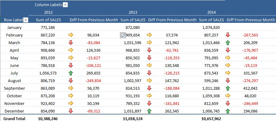
STEP 1: Click on any variance value in the Pivot Table and go to Home > Conditional Formatting > Icon Sets > Directional
STEP 2: This will bring up the Apply Formatting Rule to dialogue box. Choose the 3rd option as this will apply the conditional format on all the values except the Subtotals
Your Pivot Table will look like this:
STEP 3: Now we need to make some edits in the Conditional Formatting Rule in order to get the Icons right.
Go to Home > Conditional Formatting > Manage Rules > Edit Rule
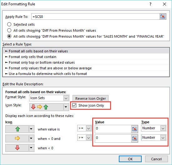
STEP 4: Inside the Edit Formatting Rule box you need to make the following changes:
Value = 0
Type = Number
“Check” the Show Icon Only box and press OK to confirm the changes:
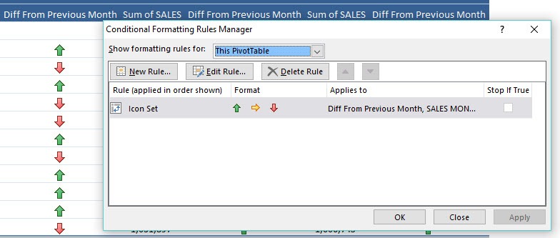
STEP 5: In the next screen you will get the Conditional Formatting Rules Manager. Hit Apply to see the changes and OK to confirm them:
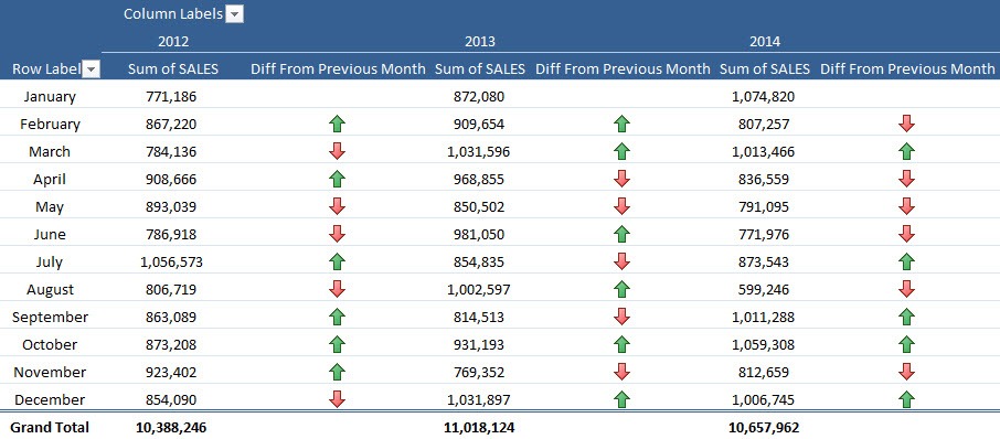
Now you have your Pivot Table showing the differences from the previous months with directional icons only!!!
Practical Tips I’ve Learned
Over the years of using this technique, I’ve picked up a few tricks that make it even better:
- Keep Your Icons Simple – Excel offers fancy icons like traffic lights and shapes, but I find arrows are the most intuitive for trends. Green = good, red = bad, yellow = neutral — easy.
- Use Separate Columns for Detail – If you still want to keep the variance numbers, just duplicate the field:
- One column shows numbers with no formatting.
- The other column shows only icons. This way, you get visual clarity without losing detail.
- Be Careful with Grand Totals – Sometimes conditional formatting accidentally applies to totals, which can be misleading. Always choose the option that applies the formatting to values excluding subtotals.
- Works Great Beyond Sales Data – I’ve used this for:
- Website traffic reports
- Inventory changes
- Budget vs. actual performance
- Even tracking my personal fitness stats (weight loss gets a green arrow!)
- Pair Icons with Sparklines – For a more advanced dashboard look, you can add sparklines (Insert > Sparklines) in the next column to show a mini trend graph alongside the icons.
FAQs
1. What are directional icons in Excel and why should I use them?
Directional icons are small arrow symbols (or similar shapes) that visually indicate whether values have gone up, down, or stayed the same compared to a baseline. They’re especially useful in dashboards and reports because they make trends immediately obvious without needing to read the numbers. By using them, you help your audience quickly identify positive or negative performance at a glance.
2. How do I show the difference from the previous month in a Pivot Table?
First, build your Pivot Table with your monthly data. Then, use the “Show Values As” option in Value Field Settings and select “Difference From.” Set the Base Field to “Month” (or your date field) and the Base Item to “(previous).” This will automatically calculate the variance for each month compared to the one before it.
3. How do I apply directional icons only to variance values in a Pivot Table?
Click any variance value, go to Home > Conditional Formatting > Icon Sets > Directional, and in the “Apply Formatting Rule to” dialog box, choose the third option to apply it only to the variance values (not subtotals). Then, edit the rule to set thresholds as numbers, not percentages, and check “Show Icon Only” if you want a cleaner look.
4. Can I customize which icons appear and when they’re shown?
Yes. In the Conditional Formatting Rule editor, you can pick which icons to use (e.g., arrows, traffic lights, shapes) and define exact thresholds for when each appears. For example, you might set green arrows for values greater than 0, yellow sideways arrows for exactly 0, and red arrows for anything less than 0. You can also hide the numbers so only the icons display.
5. Is this method only for sales reports?
Not at all. While it’s popular in sales dashboards, you can use it for any time-based comparison. Examples include website traffic growth, inventory changes, expense tracking, budget vs. actual performance, and even personal metrics like weight or exercise logs. Any dataset with sequential periods can benefit from directional icon visualization.
John Michaloudis is a former accountant and finance analyst at General Electric, a Microsoft MVP since 2020, an Amazon #1 bestselling author of 4 Microsoft Excel books and teacher of Microsoft Excel & Office over at his flagship MyExcelOnline Academy Online Course.


