A Tornado Chart in Microsoft Excel is a specialized bar chart used primarily for sensitivity analysis. They are used to visually compare the impact of different variables on a particular outcome. It has bars stacked horizontally and in decreasing order. This effectively shows data comparisons and evaluates the relative importance of variables.
Key Takeaways
- Tornado Charts are used to compare different factors that impact the result.
- Excel uses a stacked bar chart to create a tornado chart.
- They can be used in sensitivity or risk analysis.
- Each factor is sorted from highest to lowest impact.
- They make complex data easy to understand.
Download the Excel Workbook and follow along with the tutorial – Download excel workbookTornado-Chart-in-Excel.xlsx
Table of Contents
How to Create Tornado Charts
Preparing Data
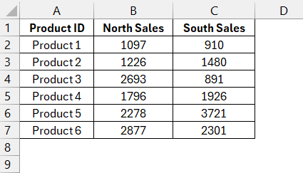
Before creating a tornado chart, make sure that the data is accurate.
- Define Your Variables: Decide which factor you want to analyze.
- Collect Data: Use accurate and relevant data for each variable.
- Organize Your Data: Arrange categories in one column and values in another.
- Sort Your Data: Sort the data based on its impact. with the largest value at the bottom.
Now that the data is ready, you can visualize it by creating the chart.
Crafting the Chart
Follow the steps below to create a tornado chart in Excel –
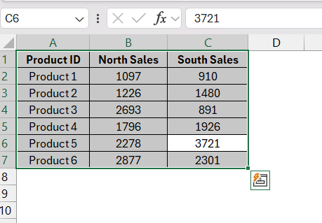
STEP 1: Highlight the table columns that contain your categories and corresponding values.
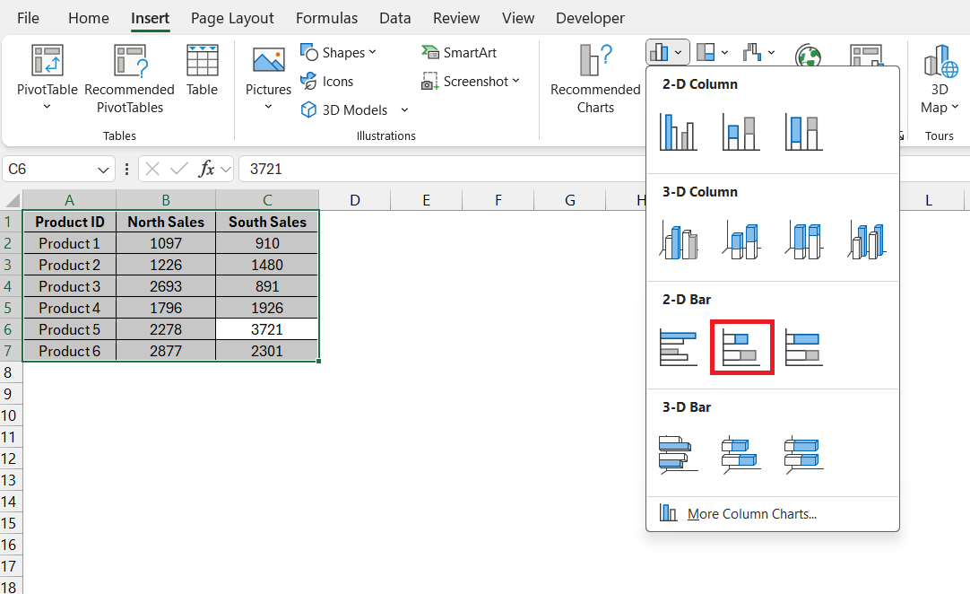
STEP 2: Go to Excel’s Insert tab, choose ‘2-D Bar,’ and select the ‘Stacked Bar’ option.
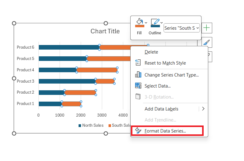
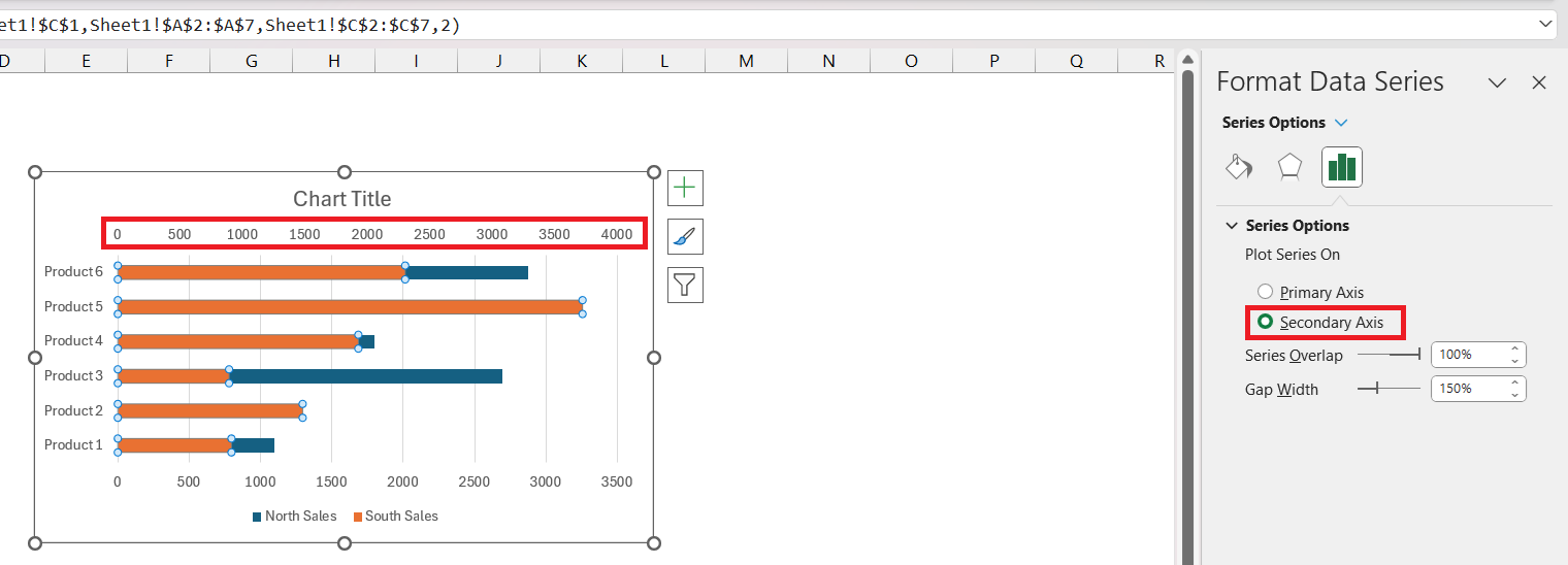
STEP 3: Right-click on the second variable chart and select ‘Format Data Series’.
STEP 4: In the Format Data Series dialog box, select ‘Secondary Axis’.
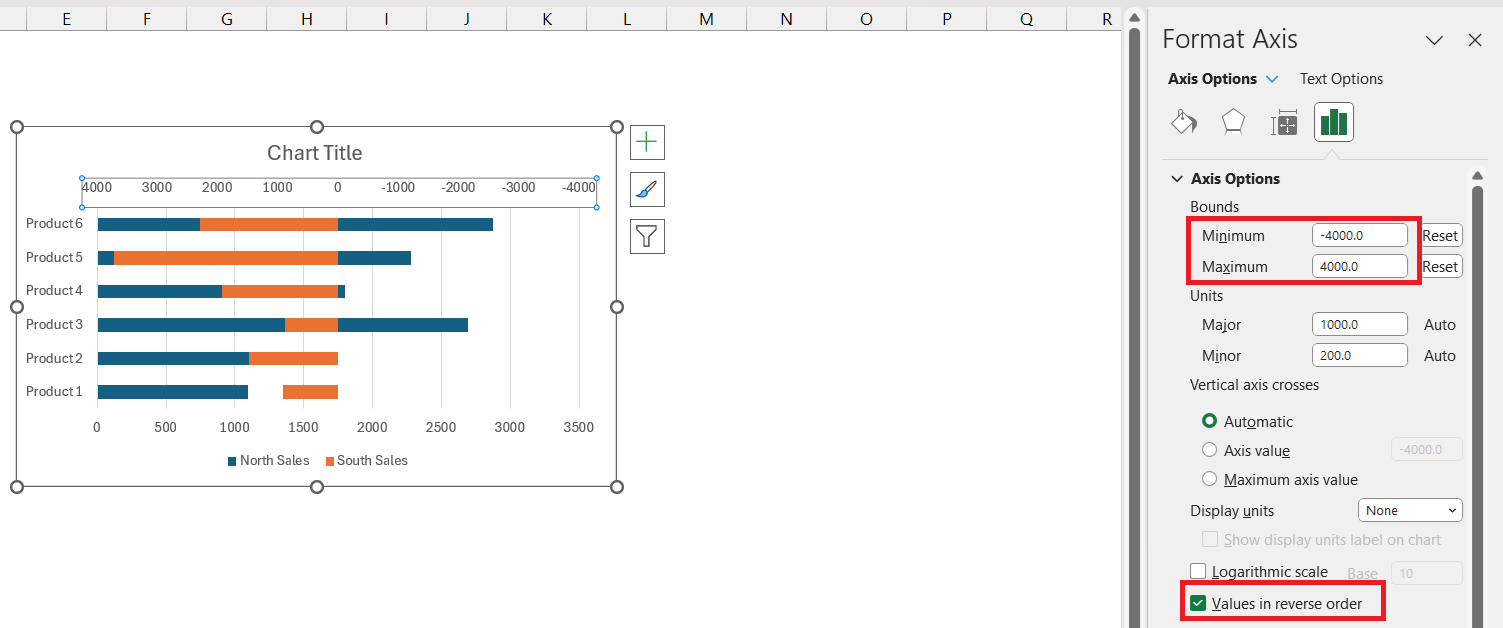
STEP 5: Right-click on the secondary axis and select ‘Format Axis’. Adjust the bounds to reflect –
- Maximum – The maximum value of your data.
- Minimum – To be the negative of the maximum value.
Also, check ‘Values in reverse order’.
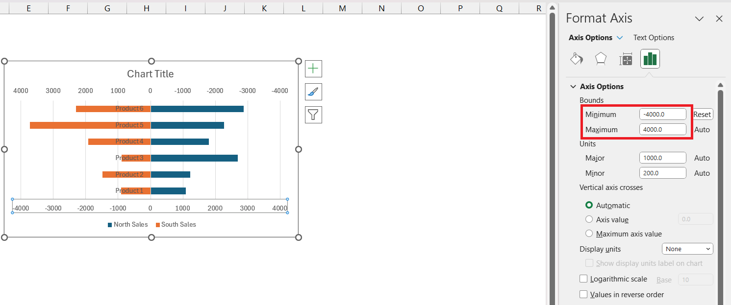
STEP 6: Right-click on the Primary Axis and select ‘Format Axis’. In the Format Axis dialog box, set the bounds the same as the secondary axis.
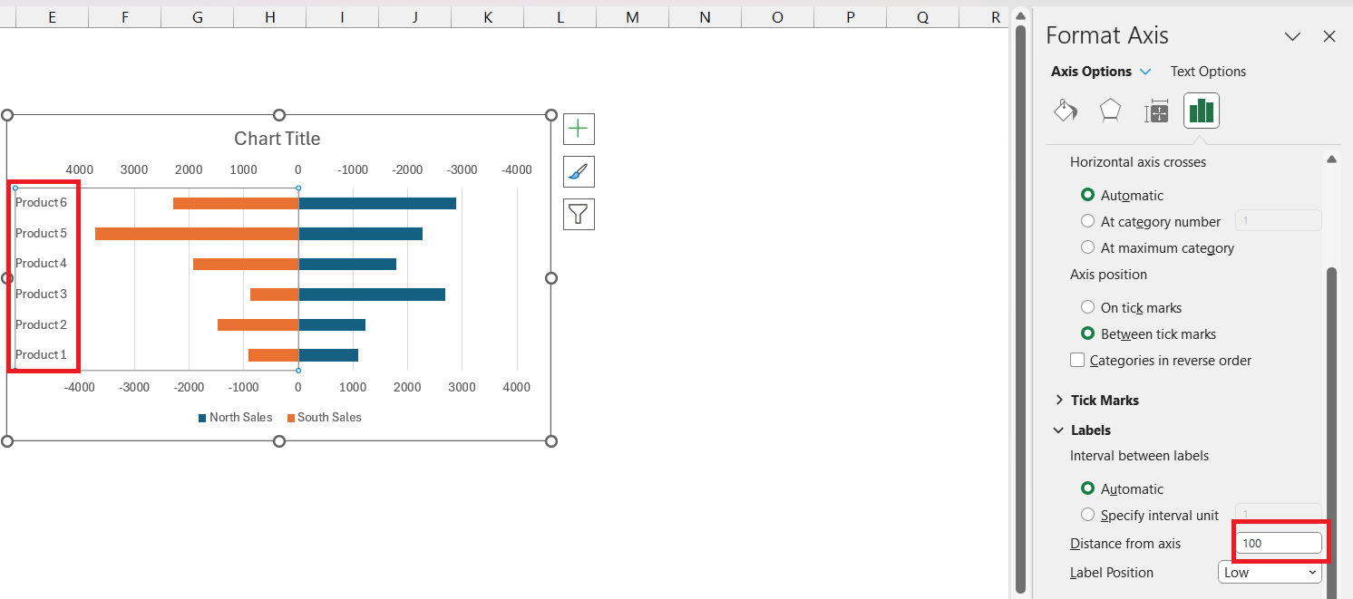
STEP 7: Right-click on the Vertical Axis and select ‘Format Axis’. Set ‘Label Position’ to ‘Low’.
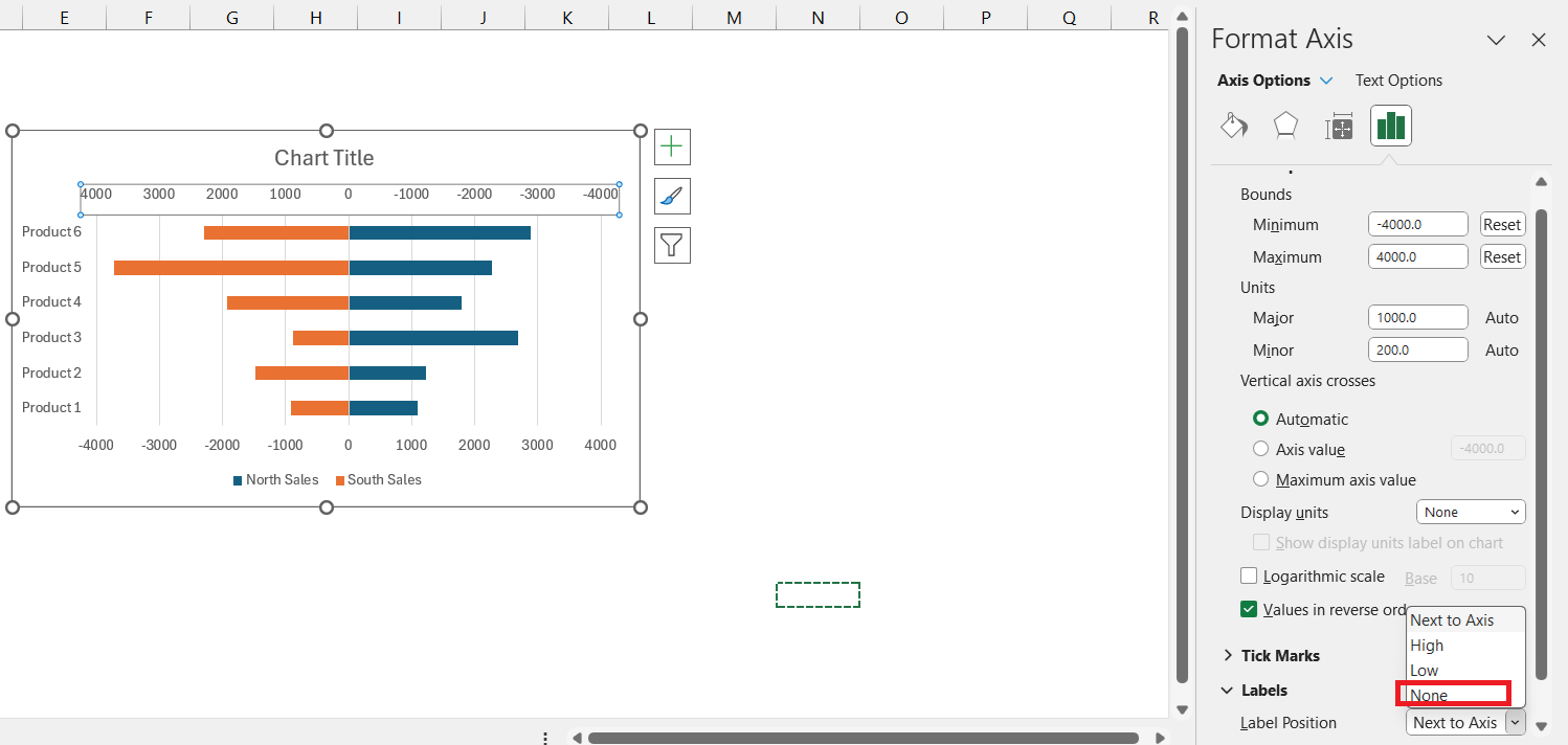
STEP 8: Right-click on the ‘Primary Axis’ and select ‘Format Axis’. Now, select Label Position as ‘None’. Repeat the same step for the Secondary Axis.
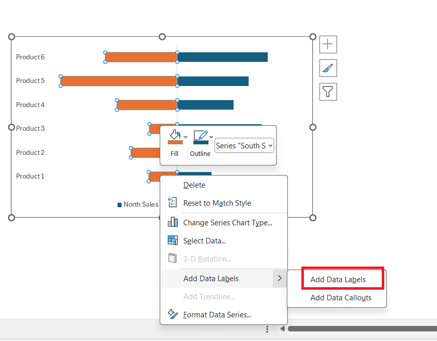
STEP 9: Right-click on the bar and select ‘Add Data Labels’.
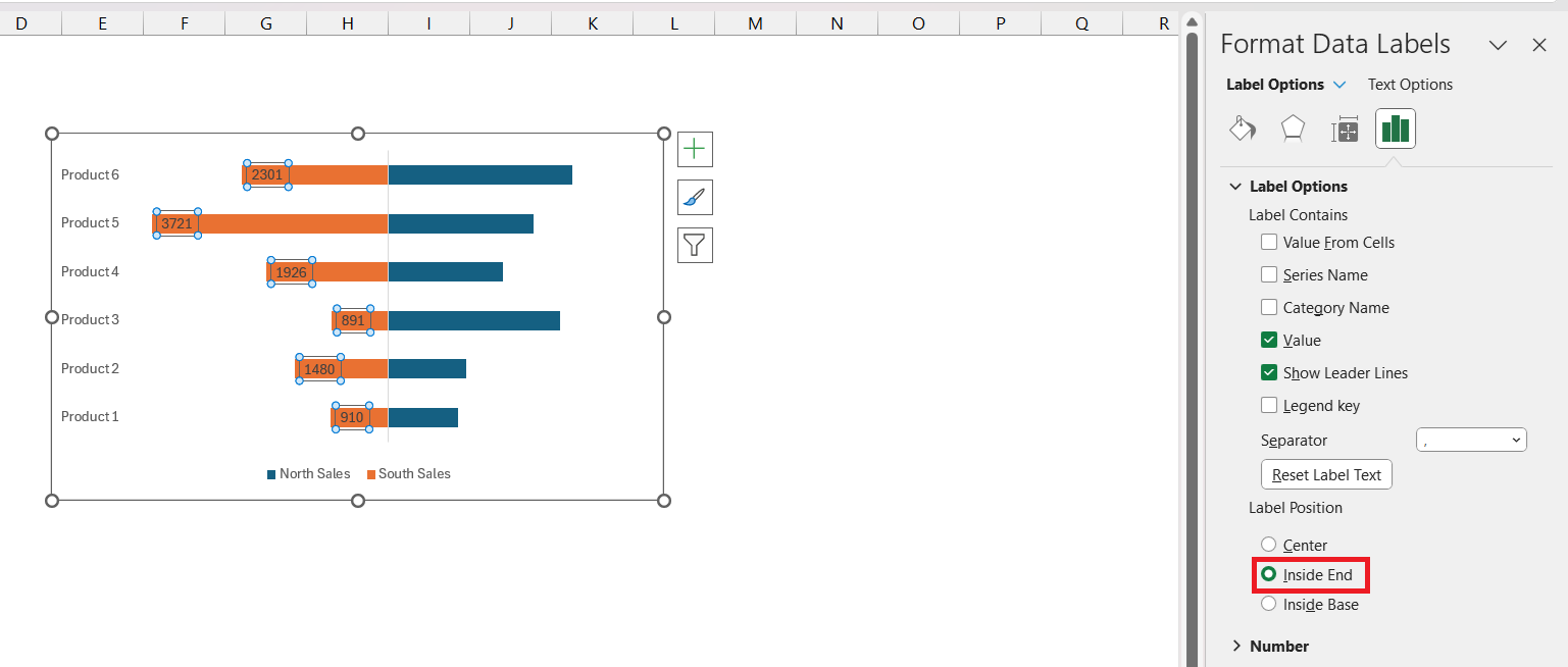
STEP 10: Right-click and select ‘Format Data Label’ and select Inside End as Label Position.
Repeat the same steps for the second variable as well to add data labels.
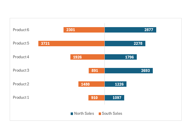
STEP 11: Format the data labels if necessary and format your chart accurately.
By following these steps, you’ll transform a simple data table into an insightful Tornado Chart, suitable for a vast array of analytical purposes.
Tips and Tricks for Effective Tornado Charts
Customizing Tornado Chart Appearance for Better Clarity
Enhancing the clarity of your Tornado Chart in Excel can be achieved with a few customization tweaks:
- Add Data Labels: For precise value reading, right-click on a bar and select “Add Data Labels.” This puts the exact figures at the tips of each bar for immediate comprehension.
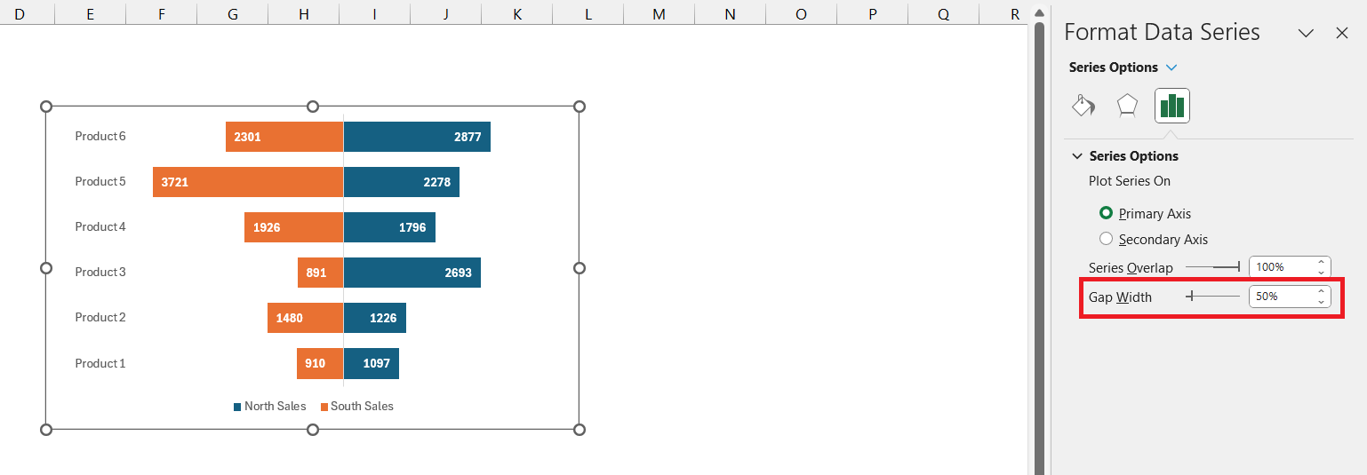
- Adjust Bar Width: To make the chart bolder and the values stand out, decrease the “Gap Width” under “Format Data Series” to 50%, giving the bars a fuller appearance.
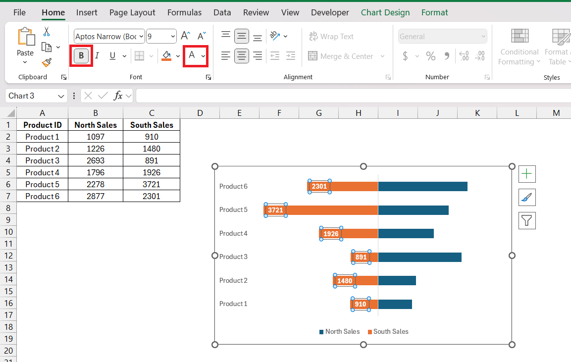
- Improve Readability: Consider changing the text color to white if the bars are dark and making it bold.
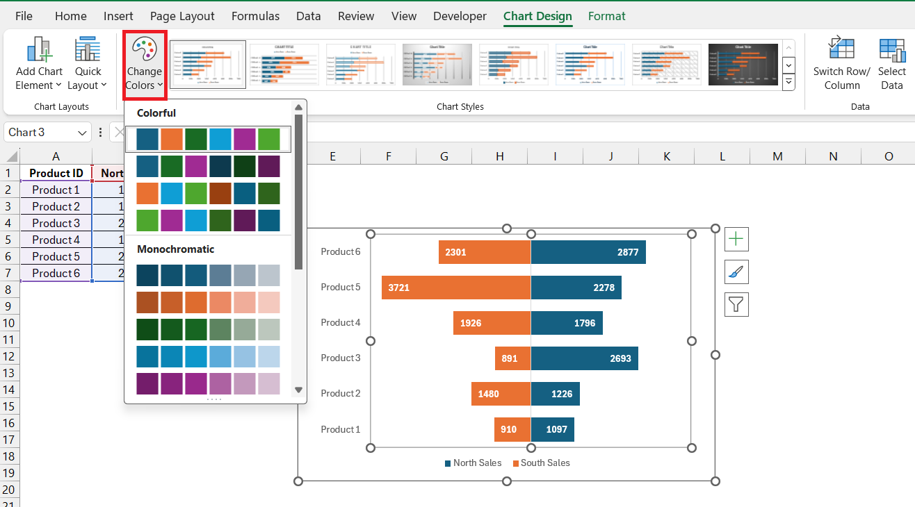
- Harmonize Style: Match the chart to your branding or report theme by customizing the chart color scheme. Consistent chart styling can really improve the presentation’s look and feel.
FAQs
What is a Tornado Chart?
A Tornado Chart is a type of bar chart that enables sensitivity analysis, often used in risk management to compare the impact of variables. It lays out variables side by side in descending order, like a tornado. It’s especially helpful in decision-making where understanding the relative importance of variables is important.
Can Tornado Charts Be Created Automatically in Excel?
While Excel doesn’t have a built-in feature for Tornado Charts, they can be created using a Stacked Bar Chart and customizing it accordingly.
How Do You Interpret Results from a Tornado Chart?
To interpret results from a Tornado Chart, look at the length and position of bars, which indicate the variable’s impact. Longer bars mean greater impact, and their order helps understand which variables are most important. This allows you to assess risks or make decisions based on their potential effect on the outcome.
What type of chart did we use to build a tornado chart?
To build a Tornado Chart, you typically start with a Stacked Bar Chart in Excel. Then, by customizing and formatting it, you convert the standard bar chart into a Tornado Chart, which displays variables in descending order to analyze their sensitivity or impact.
John Michaloudis is a former accountant and finance analyst at General Electric, a Microsoft MVP since 2020, an Amazon #1 bestselling author of 4 Microsoft Excel books and teacher of Microsoft Excel & Office over at his flagship MyExcelOnline Academy Online Course.

