The Importance of Color in PowerPoint Presentations
Choosing the right colors for your PowerPoint presentations can significantly impact their effectiveness. Color doesn’t just beautify; it conveys mood, highlights key information, and assists in storytelling. When you align colors with your message, you grab attention and make your content more memorable. Plus, using your unique brand colors strengthens corporate identity, making every presentation a cohesive part of your brand image.
Imagine a scenario where your colors do the speaking. They support your words, make graphs more understandable, and tables more readable. With these visual cues, your audience doesn’t just see your presentation; they experience it.
Learn about Excel with our Free Microsoft Excel Online Course!
Key Takeaways
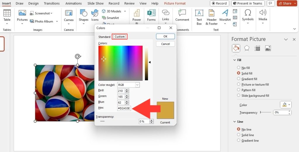
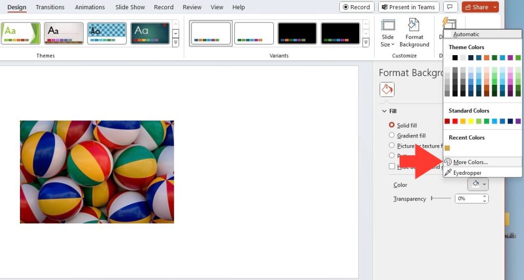
- To use hex color codes in PowerPoint, access the color slider by clicking on the “Shape” or “Font Color” option, then select “More Colors…” to open the color popup. Choose the “Color Sliders” button and from there select the “RGB Slider” to access the Hex Colors input field.
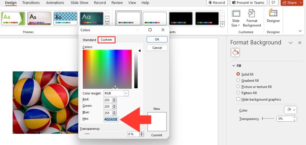
- Once in the Hex Colors input field within the Colors dialog box, directly input the six-digit Hex Color Value (e.g., #1F1F1F) to apply the desired color for text, shapes, or background elements in PowerPoint slides.
- This feature, which allows the direct entry of Hex Color Values without conversion to RGB values, is available to users running Insider Fast version 2003 (Build 12607.20000) or later in various Microsoft Office applications including PowerPoint, enhancing color customization and consistency across digital media.
Understanding Hex Codes and Their Role in Design
Hex codes are the silent whispers in the world of digital design that translate your color preferences into a language computers understand. In essence, a hex code defines the blend of red, green, and blue (RGB) light that creates virtually every color imaginable on digital screens.
Just like each color has its unique shade, each hex code offers a precise formulation of RGB values, ensuring that you can replicate the exact same hue every time you use it. They form a crucial part of a designer’s toolkit when they aim for consistency and accuracy across various platforms and documents.
When you wish to mirror a specific tone from your brand palette or match colors between different elements in your presentation, knowing and using hex codes is fundamental. The ability to input these codes directly into PowerPoint means no more guesswork or color mismatches – just perfect, precise shades every single time.
Table of Contents
Step-by-Step Guide to Finding Hex Color Codes
Utilizing Online Color Tools
Gone are the days when you’d spend countless hours guessing and eyeballing for the perfect color. Online color tools are a dynamic asset at your fingertips that helps you easily identify, create, and store color palettes for any project.
For instance, the website Color Hunter allows you to generate a color palette from an uploaded image, translating visuals into a usable palette for your designs. Flatuicolors, another online aid, showcases a spectrum of colors where you can select shades and receive their hex codes, along with RGB values and more, ideal for those PowerPoint graphics or themes you’re keen on customizing.
These tools amplify your design process, ensuring you can fashion just the right color schemes for PowerPoint presentations, website themes, or graphic design ventures with minimal effort. They’re not only intuitive but also incredibly time-saving, making the journey from inspiration to implementation as smooth as possible.
Extracting Hex Codes from Existing Graphics or Brand Logos
When you’re aiming to maintain brand integrity in your presentations, it’s crucial that the colors you use are spot-on. Extracting hex codes from your existing graphics or brand logos ensures this level of consistency. PowerPoint’s 2013 incarnation introduced a game-changer for this task—the EyeDropper tool.
To extract hex codes from a picture in PowerPoint:
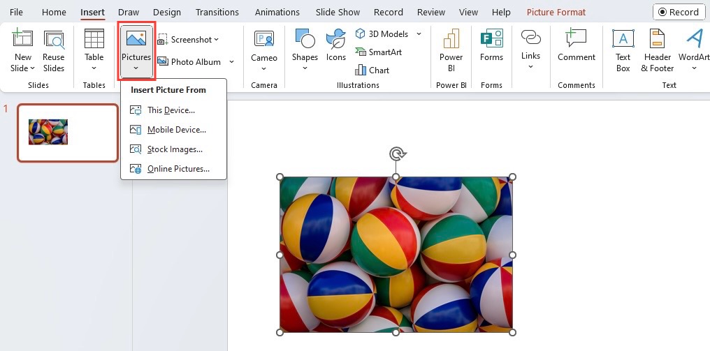
STEP 1: Insert the picture into your PowerPoint slide by clicking on the “Insert” tab in the ribbon, then selecting “Picture.”
STEP 2: Once the picture is inserted, select it by clicking on it.
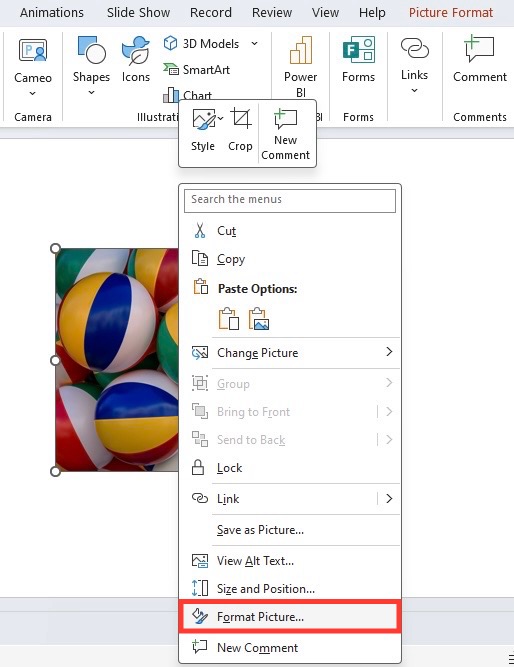
STEP 3: Right-click on the selected picture to open the context menu. Choose “Format Picture” or “Format Shape,” depending on your version of PowerPoint.
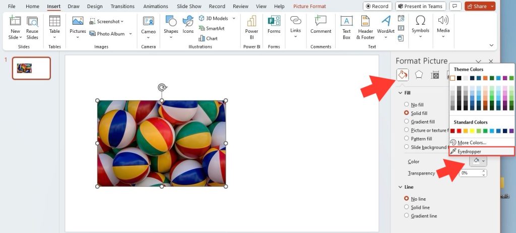
STEP 4: A sidebar or dialog box will appear on the right side of the screen. Look for an option related to colors or color settings. Find the color picker tool within the color settings. It may appear as an eyedropper or similar icon.
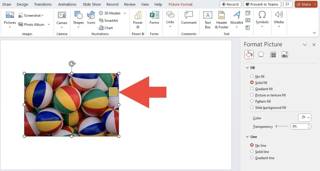
STEP 5: Click on the color picker tool, then hover over the area of the picture where you want to extract the hex code. Click once to select the color.
STEP 6: The hex code for the selected color should now be displayed in the color picker or in the sidebar/dialog box. Make a note of this code for later use.
STEP 7: Repeat the process if you need to extract hex codes from other areas of the picture.
STEP 8: Once you have all the hex codes you need, you can close the Format Picture sidebar/dialog box and continue working on your presentation.
With the EyeDropper, you can pinpoint and capture the exact color from any element within your slide or even from other open windows on your screen. This means you can easily match the colors from your company’s logo or any other graphic, providing you with the accurate hex codes needed to reproduce these colors in your slides.
Applying Hex Color Codes in PowerPoint
Customizing Your Slide Backgrounds with Precision
Precision is key in creating a presentation that resonates with professionalism and brand identity. By incorporating hex color codes, you can customize your slide backgrounds in PowerPoint with the exact shades that align with your company’s brand palette.
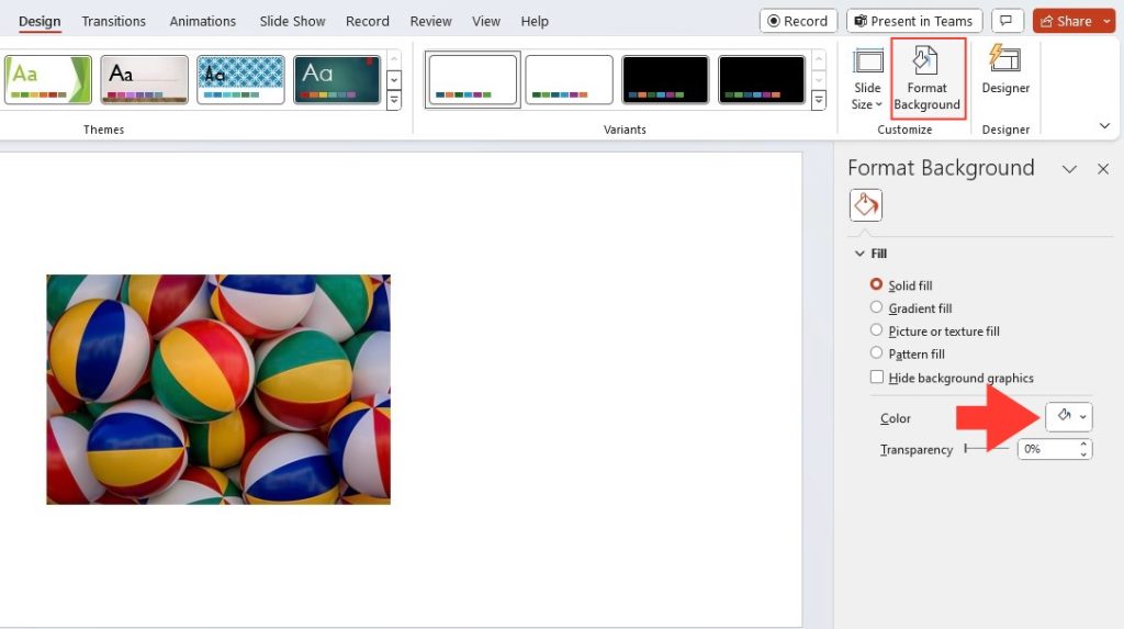
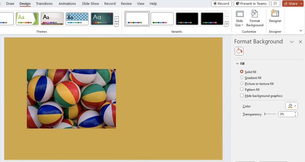
It’s quite straightforward to adjust: just navigate to the Design tab > ‘Format Background’ > ‘Solid Fill’ > ‘Color’ option to input your specific hex code. Instantly, the background of your slide transforms to the color you’ve chosen, a pixel-perfect reflection of your brand.
These custom backgrounds provide a seamless canvas on which your content can shine, ensuring a professional look that’s consistent with your corporate identity. With each slide, you’re not just sharing information; you’re reinforcing your brand’s image and message.
Designing Eye-Catching Charts and Graphs using Hex Colors
An eye-catching chart or graph can be what sets your presentation apart. By using hex colors, you can ensure these elements are not only visually appealing but also conform to your chosen color scheme. Hex codes allow you to customize the individual elements of your charts and graphs in PowerPoint with precision, promoting brand consistency and visual impact.
Whether it’s a pie chart that needs to match your logo colors or a bar graph that plays into the aesthetics of your presentation theme, simply right-click on the chart element you want to color, select ‘Format Shape’, then ‘Fill’, and enter your hex code. This level of customization can make your data displays more engaging and memorable to your audience.
This deliberate use of color can also aid in data interpretation, helping to distinguish different data sets and making your information easier to digest at a glance. It’s a simple touch that speaks volumes about your attention to detail and the quality of your presentation.
Tips for Creating a Cohesive Color Scheme
Balancing Color Harmony and Contrast
When it comes to crafting a cohesive color scheme, it’s vital to strike a delicate balance between harmony and contrast. Harmonious colors create a pleasing aesthetic and ensure readability, while contrast draws the eye to key elements within your PowerPoint slides.
To balance these two, visualize your slide as a canvas where colors play different roles – some recede as background shades while others pop as accents. Use tools like the color wheel to find complementary colors that provide contrast, or analogous colors for a more harmonious scheme.
A touch of contrast can highlight important points and call-to-action buttons, while harmony can keep your slides looking unified and professional. Remember, the goal is to direct your audience’s attention selectively, without overwhelming them visually.
Maintaining Brand Consistency Across Slides
Maintaining brand consistency across your PowerPoint slides isn’t just about looking good — it’s about building recognition and trust. Each slide should feel like part of a cohesive story, tied together with a common thread of color.
To achieve this, always refer to your corporate brand guide. Consistently using your brand’s hex color codes on titles, bullets, graphs, and diagrams is key. Also, have a standard set of templates that incorporate your brand colors which can be used for various presentations. This ensures no matter who’s designing the deck, they’re adhering to the brand identity.
But it’s not just about sticking to a few colors. Consistency means applying the same color logic throughout — if you use a particular color for emphasis on one slide, it should be used similarly across others. This coherence in design helps strengthen your message and plant the seeds of brand recognition in your audience’s minds.
Troubleshooting Common Color Challenges
Ensuring Accurate Color Representation During Presentations
Ensuring that the colors in your PowerPoint presentation display accurately across different screens can be challenging, but it’s crucial for maintaining the integrity of your visual message. The last thing you want is for your carefully selected colors to appear drastically different when presented, leading to a mismatch in your intended design aesthetics.
One essential step is to check the projector or display settings before your presentation. Screens should be calibrated for color accuracy, with considerations made for lighting conditions which can affect how colors are perceived. Moreover, converting your presentation to a PDF format can prevent colors from altering when shared or viewed on different devices.
Often, the best practice is to test your slides on the devices you’ll use before the actual presentation. This helps to identify any discrepancies in color representation and allows you to make adjustments ahead of time.
Adjusting Colors for Accessibility and Visibility
Creating an accessible and visible PowerPoint presentation requires more than just appealing color choices. It’s vital to select colors that everyone, including individuals with visual impairments, can perceive and distinguish.
For text and background, ensure there is enough contrast. Tools such as WebAIM’s Color Contrast Checker can help you verify that the text stands out against the background, meeting accessibility standards. When it comes to color combinations, avoid those known to cause issues for those with color vision deficiencies, like greens and reds or blues and yellows.
Additionally, don’t rely solely on color to convey information. Use patterns, textures, or labels to ensure that content is understandable without color cues. By making these considered adjustments, your presentation becomes inclusive, ensuring that your message reaches and resonates with a wider audience.
FAQ
How do I find the Hex color in Powerpoint?
To find the hex color in PowerPoint, select a shape with the color you want to identify, right-click, choose ‘Fill’ (or ‘Outline’ for border colors), and then ‘More Fill Colors’. In the Colors dialog, at the bottom, you’ll see the hex code for that color. Copy this code for future use.
How do I add custom hex codes to PowerPoint templates?
To add custom hex codes to PowerPoint templates, go to the ‘Design’ tab and click on ‘Customize Colors. Click on the paint bucket icon and then ‘More Colors’. Enter your hex code directly into the field labeled as ‘Hex’ or ‘RGB’ and apply it to your template elements.
What is the quickest way to apply a color scheme throughout my presentation?
The quickest way to apply a color scheme throughout your presentation is by using the Slide Master. Go to the ‘View’ tab, select ‘Slide Master’, and apply your chosen colors to the master slides. These changes will reflect across all your slides for a consistent color scheme.
John Michaloudis is a former accountant and finance analyst at General Electric, a Microsoft MVP since 2020, an Amazon #1 bestselling author of 4 Microsoft Excel books and teacher of Microsoft Excel & Office over at his flagship MyExcelOnline Academy Online Course.