Discover the Quick Analysis Tool in Microsoft Excel, your shortcut to streamlined data insights. With just a click, unlock a treasure trove of functionalities to enhance your data analysis experience. From formatting to charting and calculating totals, Excel’s Quick Analysis Tool is your go-to ally for efficient data exploration.
Key Takeaways:
- Effortless Access: Locate the Quick Analysis Tool in Excel at the bottom-right corner of your selected data range, ready to empower your analysis with a single click.
- Visual Enhancement: Apply conditional formatting effortlessly using Quick Analysis, turning your data into visually appealing and informative displays with just a few clicks.
- Charting Made Simple: Create compelling charts instantly with the Quick Analysis Tool, selecting from a curated set of options tailored to your data type.
- Total Control: Perform calculations like sum, average, and more with ease, empowering you to derive meaningful insights from your data in moments.
- Table Transformation: Convert data ranges into tables or PivotTables with a single click, elevating your data organization and analysis to new heights of efficiency.
Table of Contents
Introduction to Quick Analysis in Excel
What is the Quick Analysis Tool?
The Quick Analysis Tool in Excel is a handy feature that accelerates your data analysis tasks. Imagine having a set of powerful tools at your disposal that can turn tedious tasks into a couple of clicks. That’s the beauty of the Quick Analysis Tool — it acts like a Swiss Army knife for your data in Excel, providing quick access to functionalities such as formatting, charting, and calculating totals.
The Magic of Quick Data Insights with Excel
Dive into the magic of Excel’s Quick Analysis tool, and unlock quick data insights that could enhance your decision-making process. This feature is like having a crystal ball; you select your data and Excel offers a variety of analysis options, giving you the power to see patterns, trends, and summaries with minimal effort. It’s a magic wand for your spreadsheets, allowing you to bring forward the important narratives from your numbers.
Navigating the Excel Quick Analysis Feature
Locating the Quick Analysis Tool on Your Spreadsheet
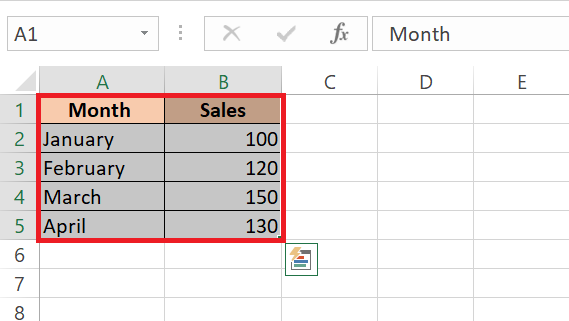
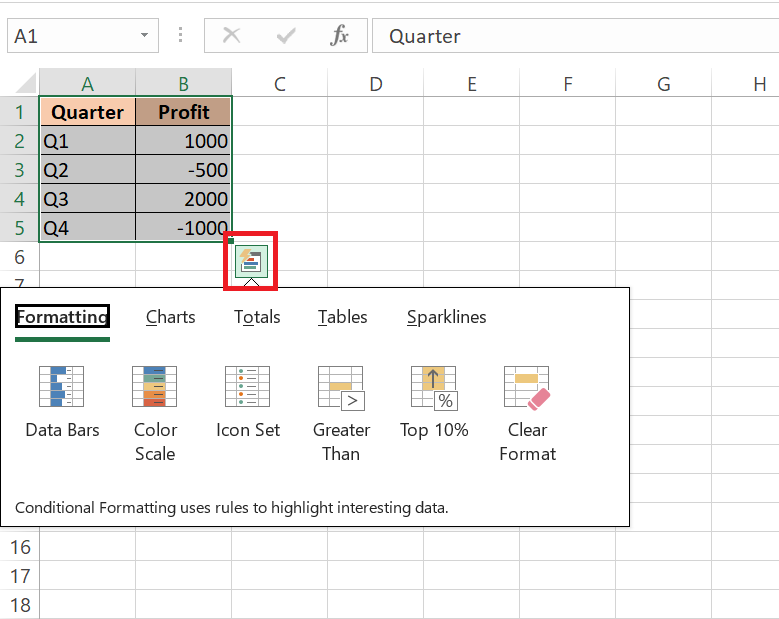
To locate the Quick Analysis Tool on your spreadsheet, first ensure that you have some data selected. Once you have a range of cells highlighted, keep your eyes peeled for a tiny icon that seems like a flash in a box — that’s your Quick Analysis button. Found in the bottom-right corner of the selection, it’s your gateway to a plethora of analytic possibilities waiting for you to explore with just one click.
Essential Tips for Accessing Quick Analysis Functions
Accessing Quick Analysis functions can be a breeze with these essential tips:
- Always begin by selecting the cells with the data you want to analyze; Quick Analysis won’t pop up for empty cells or entire columns or rows.
- Look out for the Quick Analysis icon in the form of a small lightning bolt or press Ctrl + Q if it’s playing hide and seek.
- Hover over the analysis options to get a sneak preview of how your data will be presented before making a selection.
- Embrace trial and error – experiment with different functions to find out which offers the most valuable insight.
Remember, if an action doesn’t quite work out, the ‘Undo’ command (Ctrl + Z) is your best friend.
Transform Your Data with Instant Formatting Options
Applying Conditional Formatting Using Quick Analysis
Applying Conditional Formatting via the Quick Analysis tool can significantly streamline how you make sense of your data. Start by selecting the cells containing the numbers you want to highlight; then, click the Quick Analysis icon that pops up.
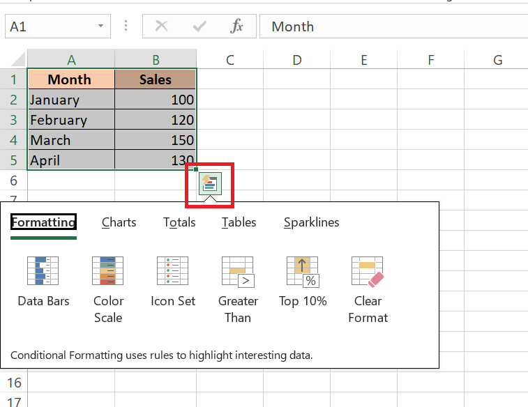
Choose ‘Formatting,’ and you’ll see a rainbow of options to beautify and clarify your data. With previews on hover, you can test drive the visuals before committing. Pick one, and watch your data transform into a canvas of information that instantly communicates value and difference.
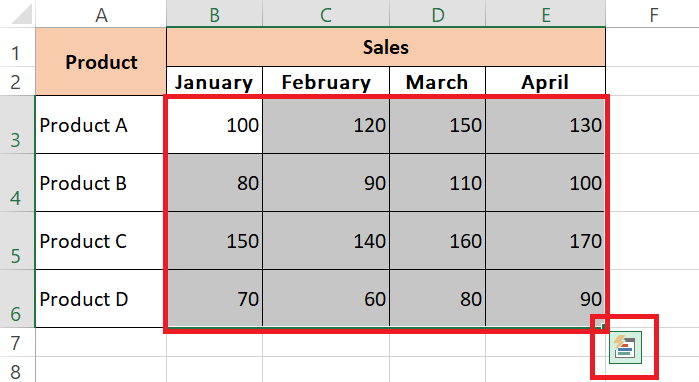
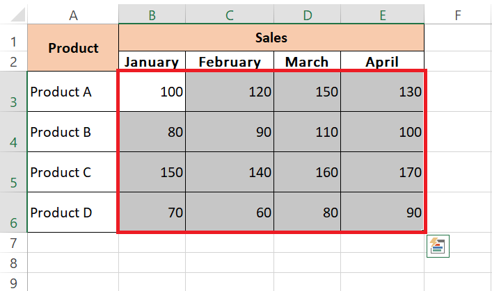
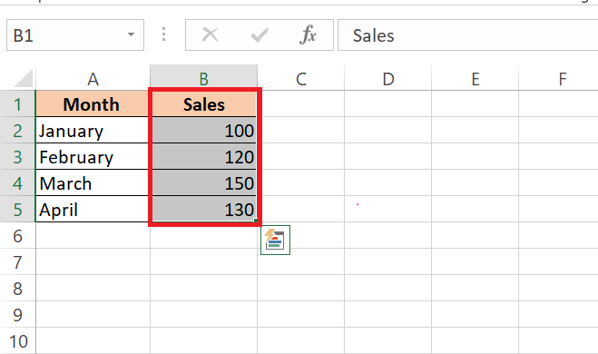
STEP 1: Select the cells containing the sales figures in your dataset.
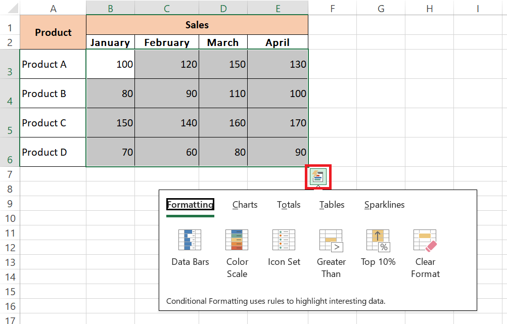
STEP 2: Click on the Quick Analysis icon that appears in the bottom-right corner of the selected range.
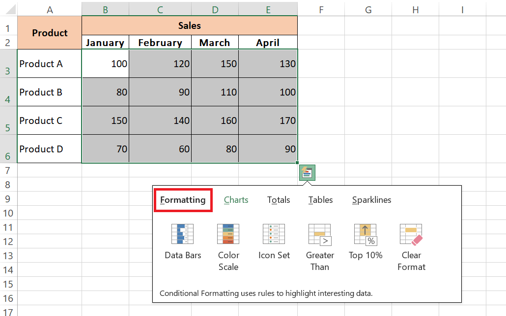
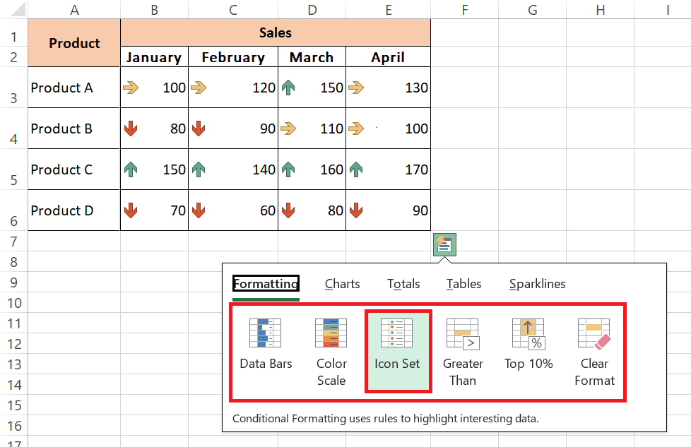
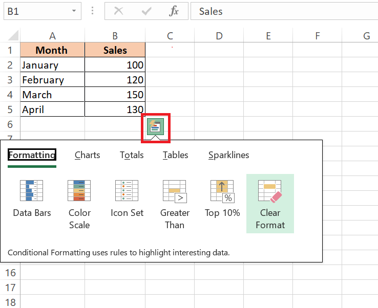
STEP 3: In the Quick Analysis menu, choose the “Formatting” option.
STEP 4: Explore the variety of formatting options available, including color scales, data bars, and icon sets, to visually highlight important insights in your data. Hover over each option to preview how it will appear, then select the one that best suits your needs.
Visualizing Patterns and Trends with Data Bars and Color Scales
Data Bars and Color Scales are visual cues that can remarkably pinpoint patterns and trends in your spreadsheet. These features within the Conditional Formatting options add a layer of color intuition to help you visually digest information.
Data Bars fill cell backgrounds with horizontal bars, giving a quick measure of value magnitude — the longer the bar, the higher the value. Conversely, Color Scales apply a color gradient across your cells, with different hues indicating the range of values, making hotspot identification an intuitive process.
Crafting Compelling Charts in a Flash
Creating Instant Charts with the Quick Analysis Tool
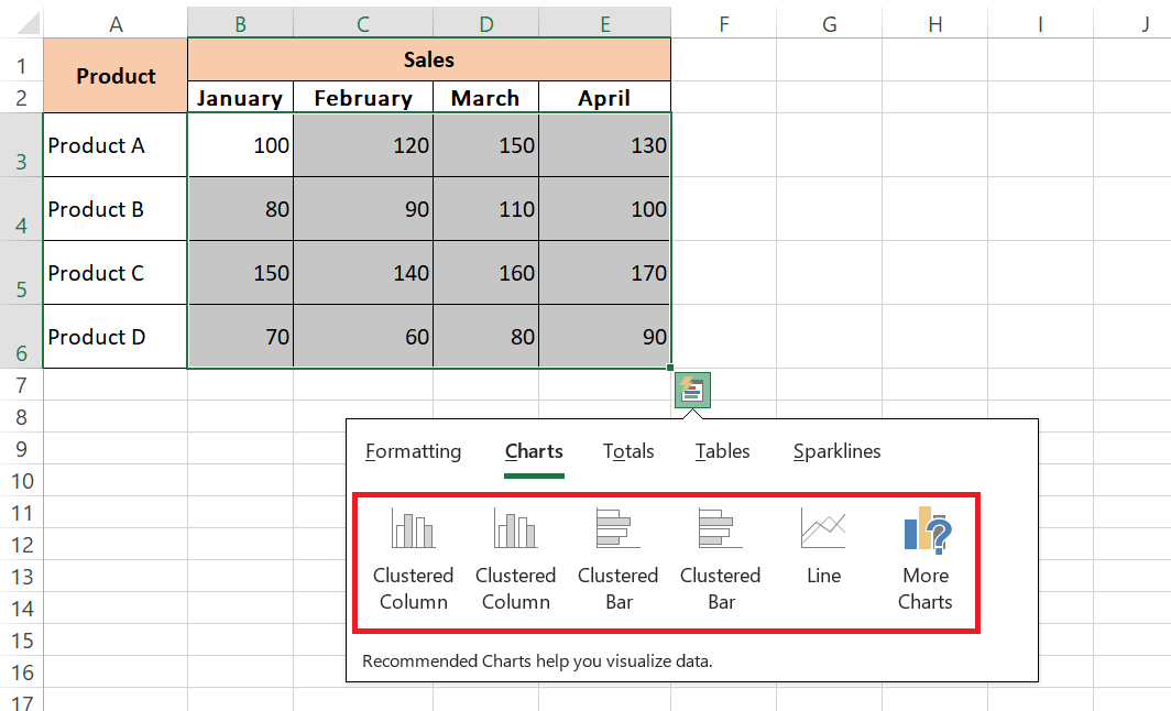
When you’re itching to present your data visually, the Quick Analysis Tool is your secret weapon for creating instant charts. Just select your data and click the Quick Analysis icon. From here, the ‘Charts’ tab reveals a curated set of chart options tailored to your data type.
You can hover over each chart style to preview your data transformed into stunning visuals. With a single click, a chart materializes, ready to tell the story of your data. This feature not only saves time but also adds a professional touch to your presentations in moments.
STEP 1: Select the dataset you want to visualize in your spreadsheet.
STEP 2: Click on the Quick Analysis icon that appears in the bottom-right corner.
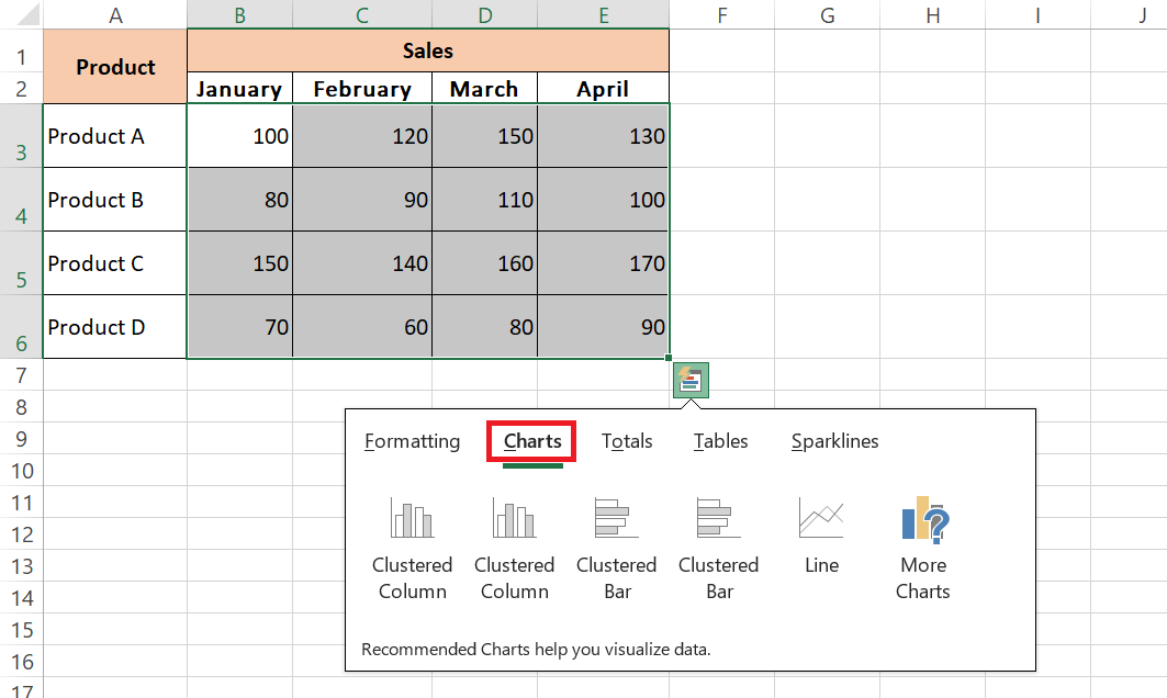
STEP 3: Navigate to the ‘Charts’ tab within the Quick Analysis menu.
STEP 4: Hover over different chart options to preview how your data will appear visually, then select the chart style that best communicates your message.
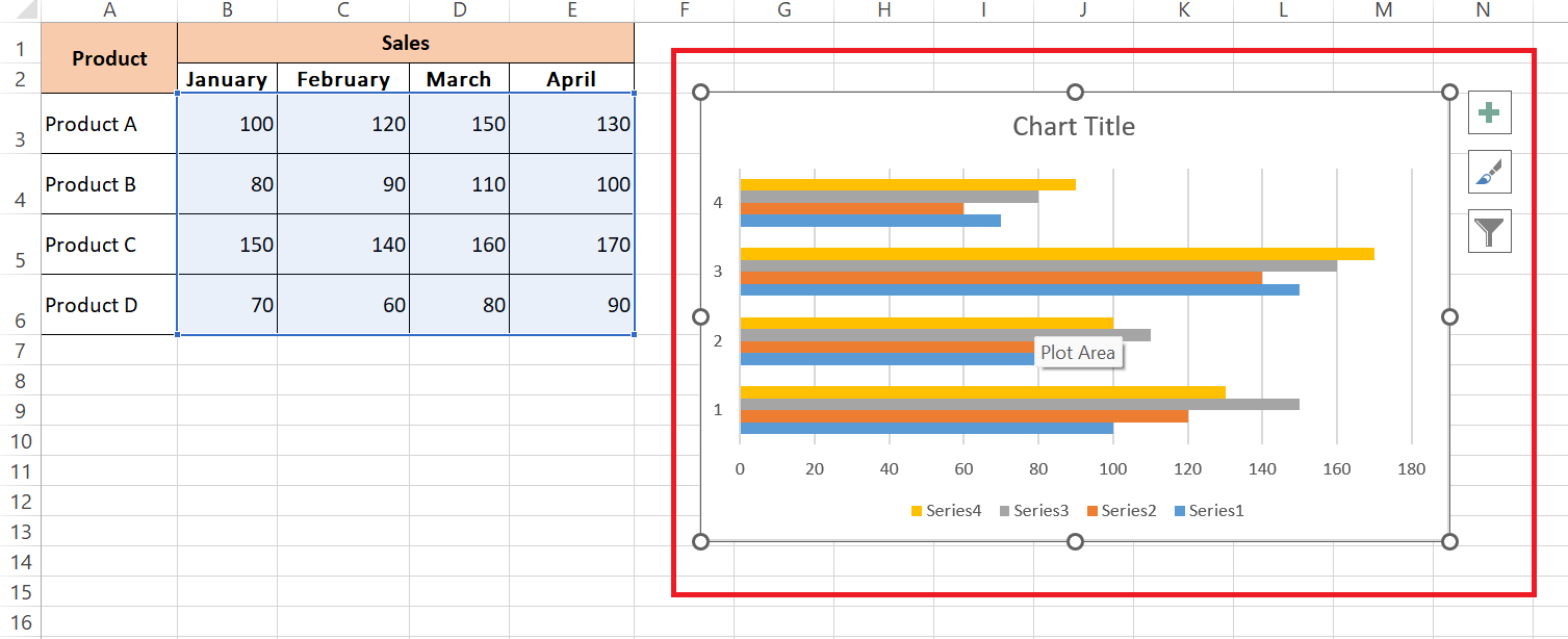
STEP 5: With a single click, the chosen chart will be generated, ready for inclusion in your presentation.
Selecting the Right Chart Type for Your Data Snapshot
Selecting the right chart type for your data snapshot is vital to convey the right message. Consider the nature of your data — is it categorical or continuous? Is comparison or trend analysis your goal? Bar charts excel at showcasing differences between groups, while line charts are prime for tracking changes over time.
Pie charts offer a slice of clarity when demonstrating parts of a whole. Thanks to the Quick Analysis Tool, not only can you access a variety of chart types suited for your data, but you also get recommended options that Excel deems most fitting, making sure your snapshot hits the bullseye.
Crunch Numbers Like a Pro with Totals
Effortless Calculations for Sum, Average, and More
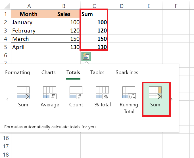
Calculations for Sum, Average, and more are a walk in the park with Excel’s Quick Analysis Tool. Just select your data and click for Quick Analysis; under ‘Totals,’ you’ll find an array of functions ready to deploy.
Whether you need a quick tally with ‘Sum’, want to find the ‘Average’, get a ‘Count’ of entries, or more intricate measures like ‘Max’ or ‘Min’, the calculations are just a click away. In no time, you can derive meaningful figures that tell the deeper stories behind your numbers.
STEP 1: Highlight the cells containing your dataset of sales figures.
STEP 2: Click on the Quick Analysis icon that appears in the bottom-right corner of the selected range.
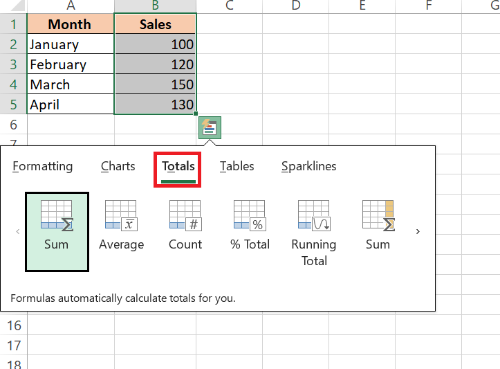
STEP 3: In the Quick Analysis menu, navigate to the ‘Totals’ tab.
STEP 4: Choose from a variety of functions such as ‘Sum’, ‘Average’, ‘Count’, ‘Max’, or ‘Min’ to perform the desired calculation on your data with just one click.
Adding Running Totals and Percentage Breakdowns Easily
Adding running totals and percentage breakdowns shouldn’t be a marathon task. Excel’s Quick Analysis feature allows you to effortlessly append these calculations to your data. Just select the range you’re working with and hit the Quick Analysis icon.
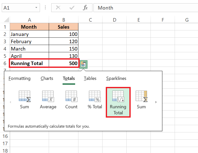
Within the ‘Totals’ selection, you’ll find ‘Running Total‘ which tallies up values cumulatively, giving you an evolving total as you move down the rows. For insights relative to the whole, the ‘% Total’ option is your go-to, breaking down each value’s contribution to the sum in percentages. It’s an easy and effective way to get a robust understanding of your data’s dynamics.
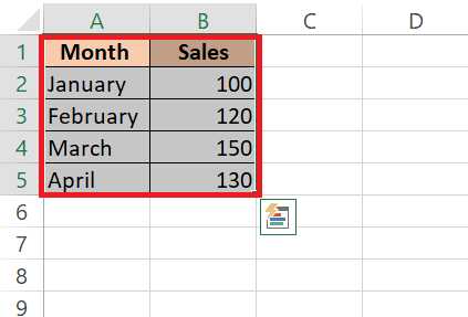
STEP 1: Highlight the cells containing your dataset, including both the month names and sales figures.
STEP 2: Click on the Quick Analysis icon that appears in the bottom-right corner of the selected range.
STEP 3: Under the ‘Totals’ tab, choose either ‘Running Total’ to calculate cumulative totals or ‘% Total’ to display each value’s contribution as a percentage of the total sum.
Tabular Wizardry with Quick Analysis Tables and PivotTables
Converting Data Ranges into Tables with a Single Click
Transforming your data ranges into fully functional tables is almost magical with a single click using the Quick Analysis Tool. Once you’ve got your range selected, a tap on the Quick Analysis button followed by a click on ‘Tables’ brings forth the option to create a classic Excel table.
This single action elevates your data, dressing it in a stylish format and equipping it with features like filter arrows for every column, making your data sortable and filterable in an instant. What’s more, any new data you add gets seamlessly incorporated into the existing table structure, keeping everything in sync.
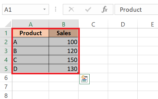
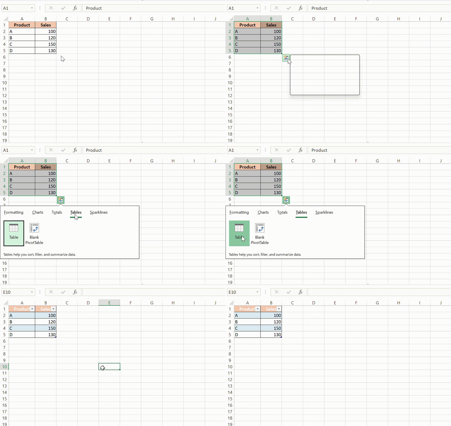
STEP 1: Highlight the cells containing your dataset, including both the product names and sales figures.
STEP 2: Click on the Quick Analysis icon that appears in the bottom-right corner of the selected range, then choose ‘Tables.’ This instantly converts your data into a stylish Excel table with filter arrows for each column, making sorting and filtering a breeze.
PivotTable Generation for In-Depth Data Analysis
PivotTable generation becomes a piece of cake with the Quick Analysis Tool for those deep dives into data analysis. By selecting your desired dataset and clicking the Quick Analysis icon, navigate to ‘Tables’ and then select ‘PivotTable’.
Instantly, a new worksheet springs to life with an empty PivotTable, ready for you to tailor and tease out patterns, relationships, and insights that may not be immediately apparent in a standard table format. PivotTables empower you to dynamically arrange and aggregate your data, making complex data more manageable and meaningful.
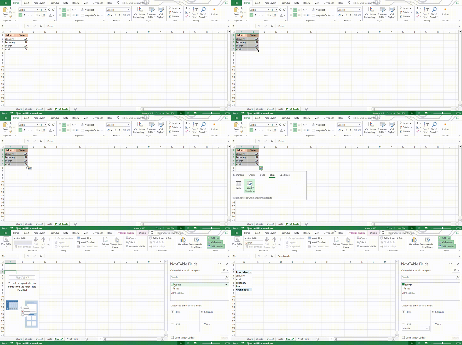
STEP 1: Highlight the cells containing your dataset, including both the product names and sales figures.
STEP 2: Click on the Quick Analysis icon that appears in the bottom-right corner of the selected range, then choose ‘Pivot Table.’ This instantly converts your data into a stylish Excel table with filter arrows for each column, making sorting and filtering a breeze.
Enrich Your Data Story with Sparklines
Generating Mini Graphs Within Cells
Generating mini graphs within cells, also known as Sparklines, is effortlessly achievable with the Quick Analysis tool. These nifty little visuals are an excellent way for you and your audience to follow trends at a micro level.
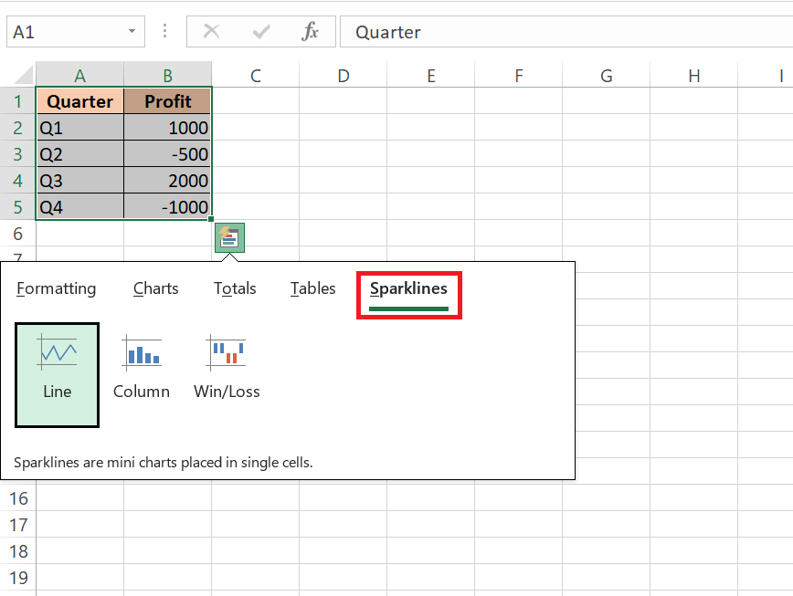
After selecting the data for which you want to create Sparklines, prompt Quick Analysis and head to the ‘Sparklines’ category. Choose from Line, Column, or Win/Loss types, and watch as Excel condenses complex data into simple, yet informative, in-cell charts that will take your data storytelling to the next level.
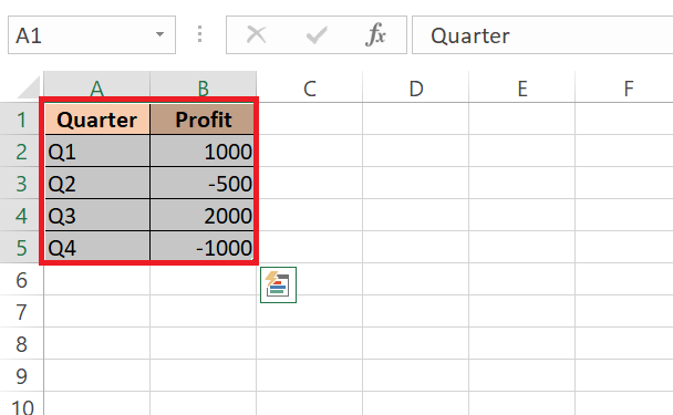
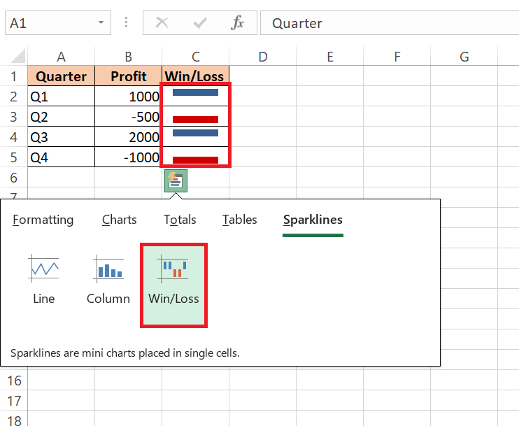
To create Win/Loss Sparklines for the dataset below, follow the steps to know more:
STEP 1: Highlight the cells containing your dataset, including both the quarters and profit/loss figures.
STEP 2: Click on the Quick Analysis icon that appears in the bottom-right corner of the selected range.
STEP 3: In the Quick Analysis menu, navigate to the ‘Sparklines’ category.
STEP 4: Choose the ‘Win/Loss’ option to generate Sparklines that represent the profit/loss trends for each quarter.
Comparing Data Trends at a Glance with Sparklines
Comparing data trends across rows or columns becomes intuitively visual with Sparklines, courtesy of the Quick Analysis Tool. Whether it’s sales over months, website traffic, stock market trends, or any other time series data, adding Sparklines next to your data helps you, and stakeholders, to spot trends and make comparisons at a glance.
It’s like giving each data point its heartbeat monitor, allowing you to see the rises and falls right where the action is. When placed side by side, Sparklines offers a compact and comprehensive story of performance across different metrics or entities.
FAQs
What is Excel quick analysis tool?
The Excel Quick Analysis tool is a powerful feature that offers a variety of data analysis options right at your fingertips. It helps you visualize, summarize, and format your data quickly, all with just a few clicks. From creating charts and tables to applying conditional formatting and calculating totals — it’s designed to save you time and make your data analysis tasks more efficient.
Where is the quick analysis tool in Excel?
You’ll find the Quick Analysis Tool in Excel at the bottom right of your selected data range. Just highlight the cells you want to analyze and watch for the small icon that looks like a lightning bolt inside a box. Give it a click, and a menu of analysis options will appear, ready for your use. If the icon remains elusive, simply right-click your selected data and look for ‘Quick Analysis’ in the context menu, or you can use the keyboard shortcut Ctrl + Q as a quick alternative access method.
Can I Add More Options to My Quick Analysis Toolbox?
As of the current update, you’re not able to add more options to the Quick Analysis Tool in Excel. However, Microsoft does value user feedback, so additional options may be considered for future updates. For now, if customization is key, you may explore using the Quick Access Toolbar, which allows you to add a wide variety of custom shortcuts to your Excel functionality, including macros.
What If the Quick Analysis Button Doesn’t Show Up?
If the Quick Analysis button doesn’t show up, it’s usually because it’s disabled or the data hasn’t been selected properly. Make sure to highlight the cells with content, as blank cells or entire columns without focus won’t trigger the icon. If it’s still missing in action, you can enable it manually in Excel options: go to ‘File’, then ‘Options’, find the ‘General’ section, and check ‘Show Quick Analysis options on selection’. If you need instant access, the trusty Ctrl + Q shortcut will also bring up the tool.
How do you use the quick analysis tool to apply the data bars?
To apply data bars using the Quick Analysis tool in Excel, first select the range of cells containing numerals you’d like to visualize. Then, click the Quick Analysis button that appears at the bottom right of your selection. Navigate to the ‘Formatting’ tab and select ‘Data Bars’. Excel will add gradient-filled bars within the cells, giving you a visual representation of the values at a glance.
John Michaloudis is a former accountant and finance analyst at General Electric, a Microsoft MVP since 2020, an Amazon #1 bestselling author of 4 Microsoft Excel books and teacher of Microsoft Excel & Office over at his flagship MyExcelOnline Academy Online Course.

