Free Practice Workbook
If you spend hours trying to clean and sort a large dataset in Excel, you can use Copilot to automate this process. You type a question in plain English, and it sorts, filters, charts, or summarizes the data for you. In this article, you will learn how to analyze data with Copilot in Excel.
Key Takeaways:
- Copilot in Excel can help analyze large datasets using plain-language prompts.
- You can use Copilot to summarize data and find the highest or lowest values.
- Copilot can compare sales, targets, regions, products, and other categories.
- You can ask Copilot to spot trends and unusual values in your dataset.
- Copilot can create charts to make your data easier to understand.
Table of Contents
Introduction to Copilot
What is Copilot in Excel?
Copilot in Excel is an AI assistant that helps you work with data in a workbook. You can ask questions about your data using normal language instead of writing complex formulas.
For example, if you have a sales dataset, you can ask Copilot:
- Which product has the highest sales?
- Which region generated the most profit?
- What are the main sales trends?
- Which products are below the sales target?
- Create a summary of this data.
- Show monthly sales trends.
Copilot can then analyze the available data and provide a response based on your workbook.
Prerequisites for using Copilot
- You need a Microsoft 365 Copilot license.
- Workbook needs to be saved to OneDrive or SharePoint
- Autosave must be turned on.
How to Analyze Data with Copilot
Prepare Data
Before you start analysing the data,
- Organise the data properly
- Add clear column headings
- Use consistent values
- Convert data into table
To convert data into a table,
STEP 1: Select a cell in the dataset.
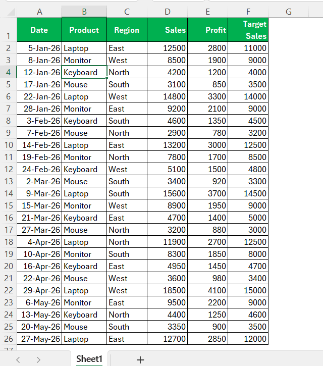
STEP 2: Press Ctrl + T.
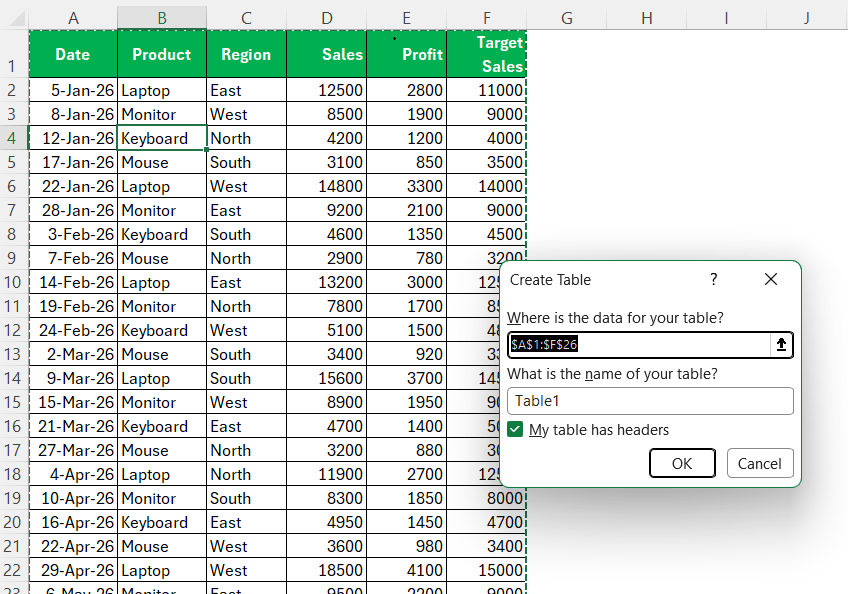
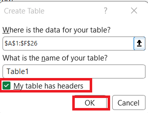
STEP 3: Make sure My table has headers is selected and click OK.
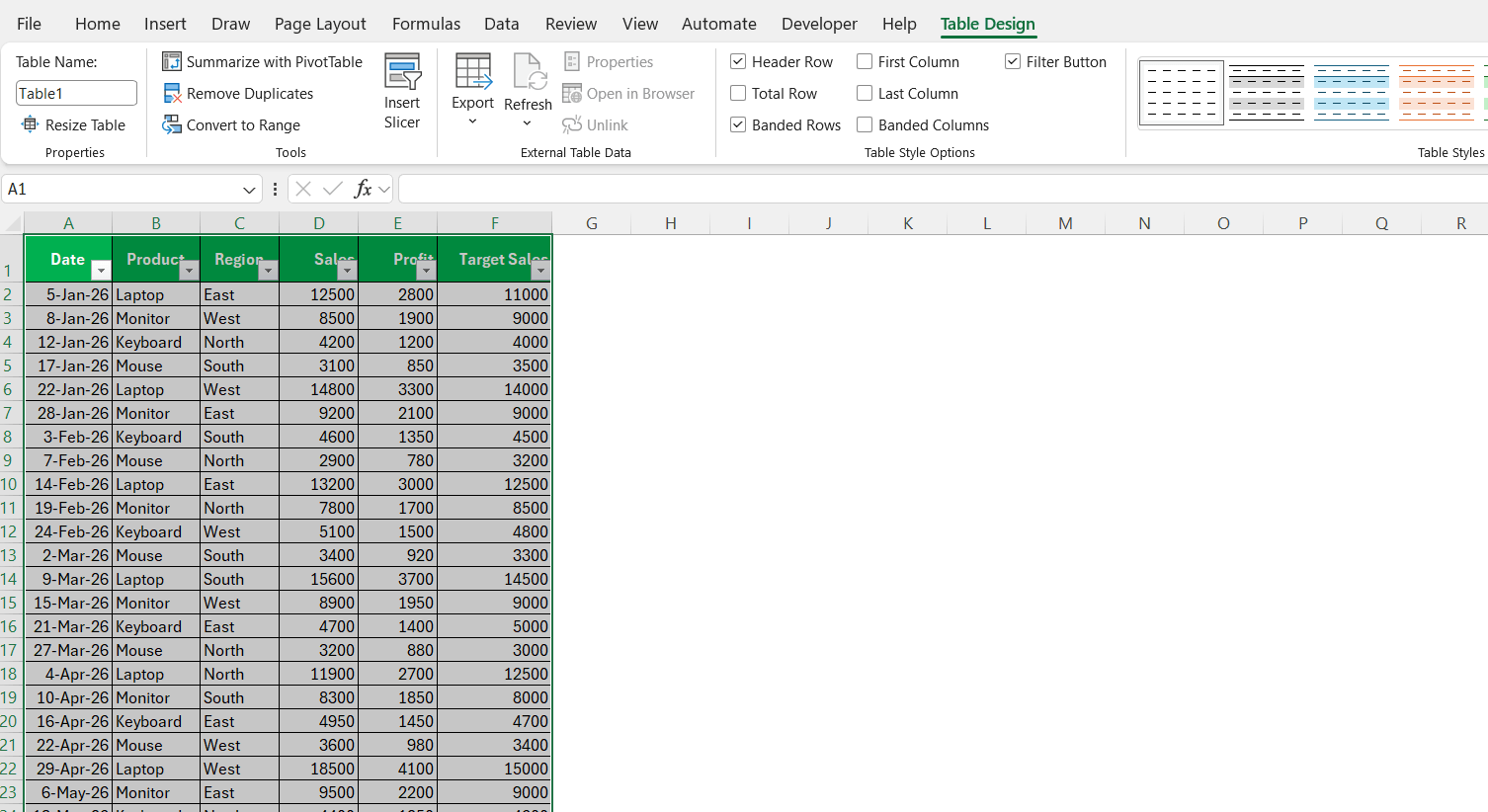
Once your table is ready, you can now provide specific prompts to analyze data.
Summarize Data
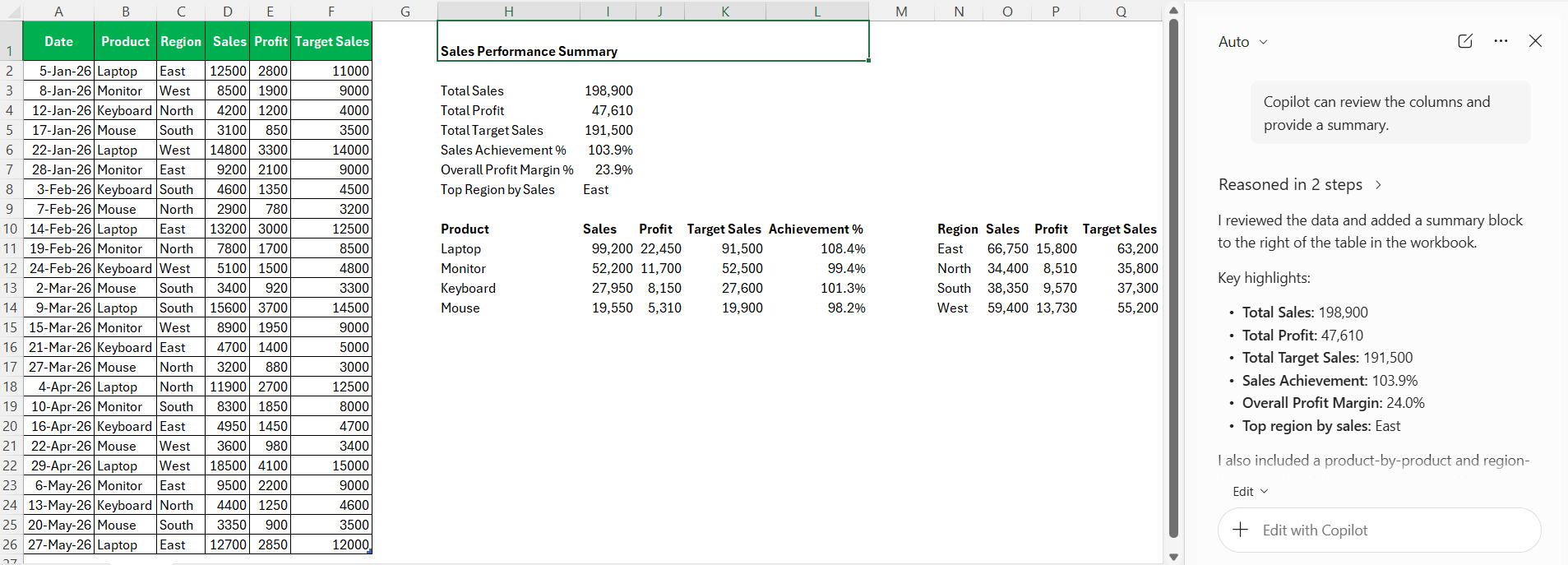
Copilot can review the columns and provide a summary.
Find the Highest and Lowest Values
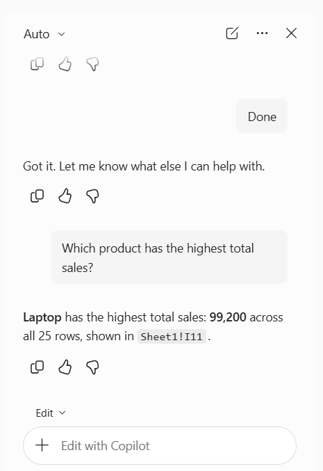
Copilot can help you find the highest or lowest values without manually sorting the dataset. For example, you can ask:
“Which product has the highest total sales?”
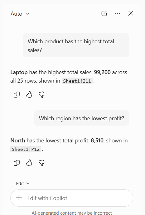
“Which region has the lowest profit?”
Analyze Sales by Region
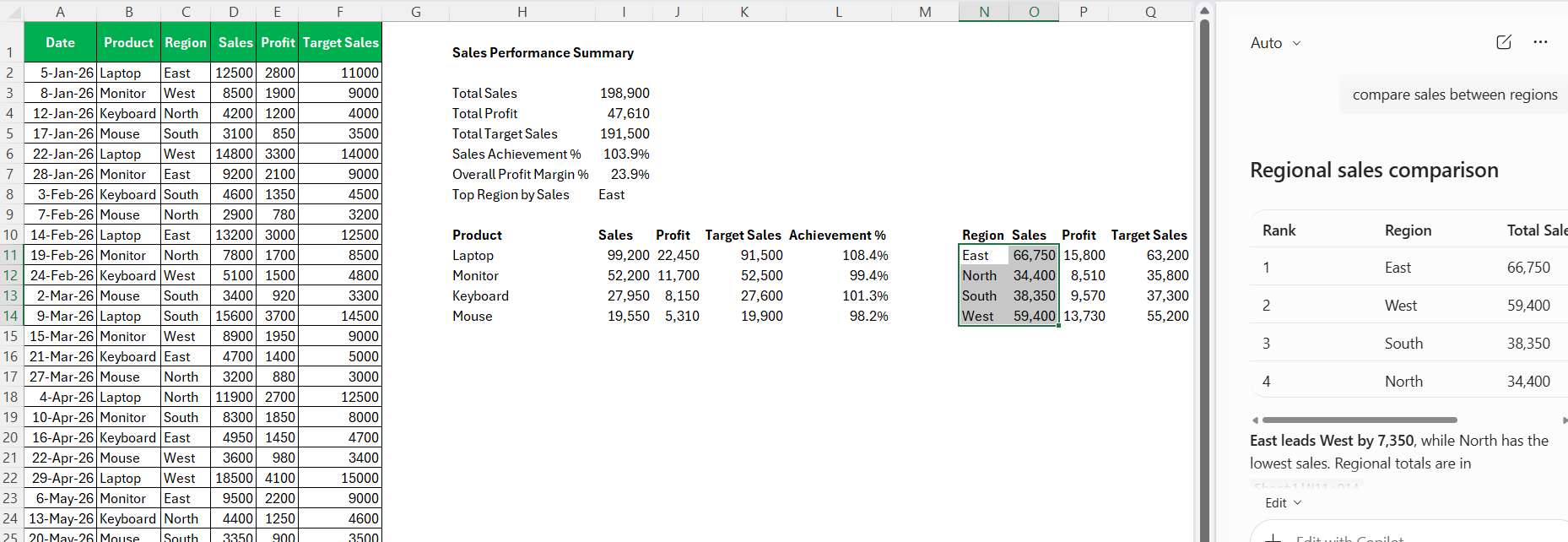
If your dataset contains a Region column, you can ask Copilot to compare sales between regions.
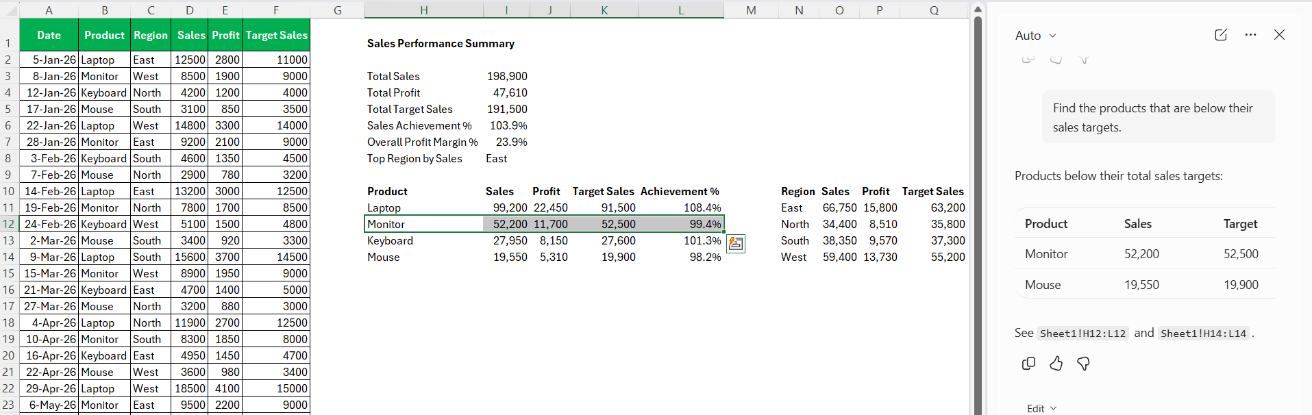
Compare Actual Sales with Targets
Copilot can check if the target sales have been met by comparing them with the actual sales.
For example, ask:
“Find the products that are below their sales targets.”
Find Outliers
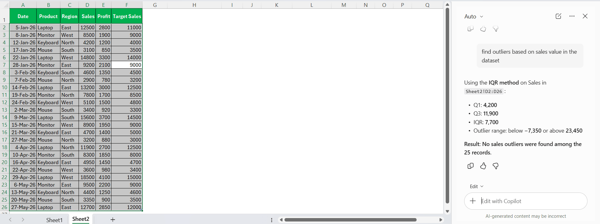
Outliers are values that are significantly different from the rest of the data.
For example, one shipment may have a much higher cost than the others. In a sales dataset, one transaction may also be unusually large.
Create Chart
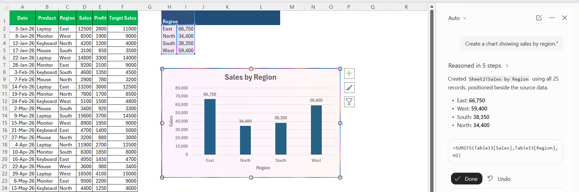
Charts make it easier to understand large datasets visually.
You can ask Copilot to create a chart based on your data.
For example:
“Create a chart showing sales by region.”
FAQs
1. What is Copilot in Excel used for?
Copilot in Excel can help analyze data using natural-language prompts.
2. Can Copilot analyze a large dataset in Excel?
Yes, Copilot can help analyze large datasets when the data is properly organized in an Excel table.
3. Can Copilot find the highest and lowest values?
Yes, you can ask Copilot to find the highest or lowest sales, profit, or other values in your dataset.
4. Can Copilot create charts in Excel?
You can ask Copilot to create charts based on your data. For example, you can create charts for sales by region or sales over time.
5. Can Copilot spot trends in Excel data?
Yes, you can ask Copilot to analyze your data and identify important patterns or unusual values.

John Michaloudis is a former accountant and finance analyst at General Electric, a Microsoft MVP since 2020, an Amazon #1 bestselling author of 4 Microsoft Excel books and teacher of Microsoft Excel & Office over at his flagship MyExcelOnline Academy Online Course.

 30 Days - Full Access