Pinterest Pixel

Top 10 Best Fonts in Microsoft Word for 2024 Documents

Elevate your documents with top Microsoft Word fonts for 2024. Discover classics & modern picks that boost... read more

John Michaloudis
Posted on

Overview

Top 10 Best Fonts in Microsoft Word for 2024 Documents | MyExcelOnline

The Importance of Choosing the Right Font

Using the best fonts in Microsoft Word is more than just making documents look pretty; it’s about establishing an impactful connection with your audience. A wise choice in fonts can significantly transform how your message is received.

Key Takeaways

  • The choice of font in a Microsoft Word document is crucial for establishing the tone and professionalism of the content. Professional and academic writing often favors serif fonts such as Times New Roman, Garamond, and Arial, due to their neat appearance and ease of readability.
  • For more artistic or creative documents, experimenting with script fonts like Harlow Solid Italic or Brush Script MT can add a personal and unique touch. While these may not be suitable for all professional applications, they can enhance the visual appeal of specific types of documents.
  • If the standard Microsoft Word font library does not meet specific needs, users have the option to download and install custom fonts.

Download our 141 Free Excel Templates and Spreadsheets!

How Fonts Can Transform Your Document’s Look and Feel

Fonts are the silent amplifiers of written expression. They are not mere design elements; they set the tone, evoke emotions, and can even influence the reader’s perception of your message. Think of them as the garments of words — crucial for making that first impression! With the right font, your document can exude professionalism, creativity, or solemnity, depending on your intention. So, don’t underestimate the power of a well-suited font to transform your document’s look and feel.

Curated List of the Top 10 Fonts for Microsoft Word in 2024

1. Helvetica – Timeless Elegance

When it comes to marrying elegance with functionality, Helvetica stands unmatched. Its seamless blend of classical and modern design elements commands respect in any textual context, making it a venerable choice for your Word documents in 2024.

Best For: Those who require a dependable, universally recognized font that communicates with unambiguous clarity, be it in corporate brochures, academic papers, or creative portfolios.
Best Fonts in Microsoft Word

2. Garamond – Classic Readability

Embodying a timeless aesthetic, Garamond is your go-to font if you’re aiming to convey classic sophistication. Its roots in 17th-century France breathe a historical charm into your documents, without sacrificing readability.

See also  A Beginners Guide for Microsoft PowerPoint

Best For: Writers and professionals who produce academic papers, articles, and business proposals, and want their content to appear polished and erudite.
Best Fonts in Microsoft Word

3. Arial – Modern Versatility

Arial is the epitome of a contemporary staple, and its presence in Microsoft Word’s font library makes it a solid pick for a variety of 2024 documents. With its straightforward and clean lines, Arial ensures that your text is digestible and accessible to all readers.

Best For: People looking for a no-fuss, versatile font—suitable for everything from business documents to casual flyers—where reader-friendliness is paramount.
Best Fonts in Microsoft Word

4. Verdana – Clarity at Any Size

Verdant in its clarity, Verdana is the paragon of legibility, especially on digital screens. It shines when it comes to Microsoft Word documents intended for on-screen viewing, thanks to its generous spacing and robust character design.

Best For: Individuals in need of a font that performs excellently on digital platforms, including websites, e-books, and online publications.
Best Fonts in Microsoft Word

5. Georgia – The Web-Friendly Choice

Georgia, designed with digital screens in mind, stands out as a reader-friendly serif font. It ensures clarity and comfort, demonstrating that a serif font can be just as readable online as its sans-serif counterparts.

Best For: Web designers, bloggers, and anyone who’s crafting documents meant for on-screen consumption or wanting to bring a touch of elegance to their digital presence.
Best Fonts in Microsoft Word

6. Calibri – A Contemporary Standard

Currently the darling of the Microsoft Office suite, Calibri is a sans-serif font that embodies modern, humanistic characteristics with its rounded edges and warm overtones, making it an agreeable choice for a myriad of document types.

Best For: Users who prefer a contemporary, clean aesthetic without sacrificing personality, from office memos to academic papers, digital presentations, or casual blog posts.
Best Fonts in Microsoft Word

7. Futura – The Geometric Favorite

Futura, with its notable geometric shapes and near-perfect circles, exudes a modern aura that’s both sleek and forward-looking. Favored for its stylistic purity, this font can add an ultramodern touch to your Microsoft Word documents in 2024.

Best For: Creative professionals who want their documents to make a bold statement, from graphic design portfolios to architectural presentations, or any platform where design takes the spotlight.
Best Fonts in Microsoft Word

See also  How to Write a Term Paper in Microsoft Word

8. Times New Roman – The Academic Staple

Times New Roman is the quintessential font for academic and professional writing. Heralded for its formal elegance and widespread acceptance, this serif font is traditionally a top choice for those seeking a classic and authoritative look in their documents.

Best For: Scholars, lawyers, and professionals who value tradition and reliability in their writings, such as research papers, legal documentation, and formal correspondence.
Best Fonts in Microsoft Word

9. Cambria – Designed for On-screen Reading

Cambria takes the podium as a thoughtful choice for those wanting a font that’s easy on the eyes when reading from a screen. As a serif font that stays clear and legible even in small sizes, it’s tailored for the digital age and diverse document types.

Best For: Modern professionals and students who spend hours glued to screens and require a font that won’t tax their eyesight — great for reports, dissertations, and any on-screen reading material.
Best Fonts in Microsoft Word

10. Consolas – Ideal for Technical Documents

Consolas champions the arena of monospaced fonts with its clear, consistent spacing, designed specifically for coding environments and technical documents. Its legibility and straightforward character make it a top-tier choice for precision-required content.

Best For: Developers, programmers, and technical writers, or anyone dealing with coding, data presentation, and technical schematics where consistent character spacing is essential.
Best Fonts in Microsoft Word

Elevating Your Documents with the Best Fonts

Impact on Readability and Accessibility

Selecting the right font has a profound impact on both readability and accessibility, key components in creating inclusive content. Readability ensures that text is comfortable to interpret, while accessibility guarantees that users with visual impairments or cognitive disabilities can also comprehend the content. Microsoft Word fonts like Arial and Verdana, with clear, simple letterforms, are particularly beneficial for readers with dyslexia; their uniformity aids in distinguishing individual characters and words, thereby reducing reading errors and eye strain. It’s essential to pick fonts that support these principles to cater to a broader audience and to create documents that are not only visually appealing but universally functional.

Matching Fonts with Document Purpose

The secret sauce to impactful writing extends beyond the words themselves; it’s in matching the font to the document’s purpose. Whether you’re drafting a resume in Calibri to convey modern professionalism or a party invitation in Futura for a touch of avant-garde fun, aligning font style with intent can elevate your message. For corporate reports, consider the timeless authority of Times New Roman. For digital reading, Cambria and Georgia can offer on-screen comfort. When applied thoughtfully, fonts become an invisible hand guiding the reader’s engagement and shaping the perception of your content. Remember, fonts are to writing what tone is to speech—they give nuance and clarity to your voice on paper.

See also  3 Ways to get MS Teams for FREE

Tips and Tricks

Ready to make your Word documents stand out? Here are some helpful tips and tricks:

  • Emphasize Key Points: Sometimes, you may want to highlight specific words or phrases. To make the text bold, click the “B” icon in the “Home” tab or press “Ctrl + B”. For italics, click the “I” icon or use the shortcut “Ctrl + I”.
  • Pairing Fonts: Combine a serif with a sans-serif for contrast in headings and body text. For instance, match Helvetica’s clean lines in headings with Garamond’s timeless elegance in the body.
  • Consistency is Key: Stick to a maximum of two or three fonts in a document to maintain a cohesive look.
  • Creating Hierarchy: Use font size, weight (boldness), and style (italicization) to create a visual hierarchy that guides the reader’s eye through the content.
  • Color Usage: When using color, ensure there’s enough contrast between the text and background for readability.
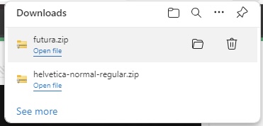
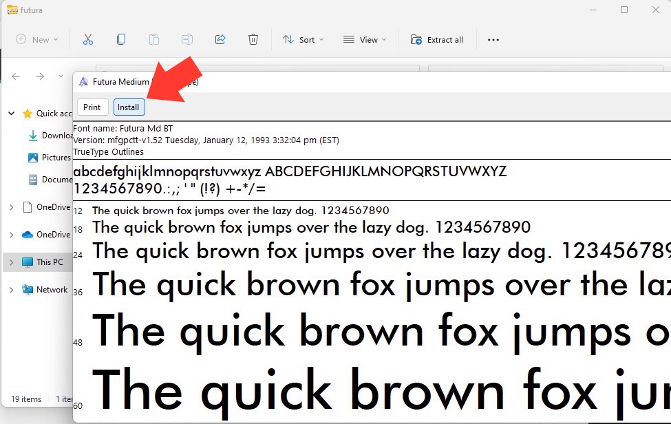
  • Custom Fonts: Want to add personality? You can install new fonts into Word by downloading them and right-clicking the file to install.
  • Proofing: Always review your document or have another set of eyes glance over it to ensure the fonts look good and serve their purpose.

With these tips, your documents will not only look professional but will also be engaging to your readers.

FAQs About Using Fonts in Microsoft Word

What Makes These Fonts Suitable for 2024 Documents?

These fonts are deemed suitable for 2024 documents due to their timeless design, versatility, and widespread compatibility. They achieve a balance between traditional and modern aesthetics and are created with legibility in mind, which is crucial as we increasingly shift between paper and digital screens. These fonts have also been refined over time to meet evolving standards of readability and accessibility. Furthermore, with the evolving workplace and the need for clear communication, these fonts provide the professionalism and adaptability required for future-oriented documents.

See also  Best Guide: Delete OneNote Notebooks on Any Device

Are These Fonts Available for All Versions of Microsoft Word?

Most of the fonts listed, such as Times New Roman, Arial, and Calibri, come pre-installed in Microsoft Word and are available across different versions. However, some fonts may not be included in older versions or may be part of newer updates or font packages. Always check your version of Word and, if needed, you can easily download additional fonts from reputable sources to ensure you have the desired typeface for your documents.

How Can I Install New Fonts into Microsoft Word?

Installing a new font in Microsoft Word is straightforward. Download the font file of your choice from a reliable source, then right-click the file and select ‘Install‘. It will automatically add to your font library in Word. On a Mac, open the font file and click ‘Install Font‘. Restart Word, and your new font will be ready to use.
Best Fonts in Microsoft Word

Where can I get fonts?

For a fantastic variety of fonts that can elevate your Word documents, explore Google Fonts for a treasure trove of downloadable options suitable for nearly any context. Websites like DaFont, Font Squirrel, and FontSpace also offer an abundance of fonts for all kinds of projects. Just make sure that the fonts you choose come with the appropriate licenses for your intended use.

If you like this Excel tip, please share itEmail this to someone

email

Pin on Pinterest

Pinterest

Share on Facebook

Facebook

Tweet about this on Twitter

Twitter

Share on LinkedIn

Linkedin

Top 10 Best Fonts in Microsoft Word for 2024 Documents | MyExcelOnline
Founder & Chief Inspirational Officer at MyExcelOnline.com

John Michaloudis is a former accountant and finance analyst at General Electric, a Microsoft MVP since 2020, an Amazon #1 bestselling author of 4 Microsoft Excel books and teacher of Microsoft Excel & Office over at his flagship Academy Online Course.

Get Video Training

Advance your Microsoft Excel & Office Skills with the MyExcelOnline Academy!

Dramatically Reduce Repetition, Stress, and Overtime!
Exponentially Increase Your Chances of a Promotion, Pay Raise or New Job!

Learn in as little as 5 minutes a day or on your schedule.

Learn More!