Excel Pivot Tables have heaps of calculations under the SHOW VALUES AS option and one that gets the most use is the Calculate Difference between Two Pivot Tables option. You can show the values as the Difference From previous months, years, day, etc. This is just great when your boss asks you how you are tracking to the previous months, years, days.
Key Takeaways
- The “Show Values As” option in Excel Pivot Tables includes a feature to calculate the difference from previous periods, such as years, months, or days, which is invaluable for analyzing trends and tracking performance against past data.
- No additional calculated fields are required to compare differences between columns; Excel’s built-in pivot table functionality allows users to display differences or percentage differences easily, with options to specify the base item for comparison, such as a previous date, a specific date, or a specific region.
- The “Difference From” setting is flexible and can be adjusted or removed as needed, and various tips and error troubleshooting guidance are available to optimize the use of this feature, helping to enhance presentations with clear year-over-year comparisons in both pivot tables and pivot charts.
Table of Contents
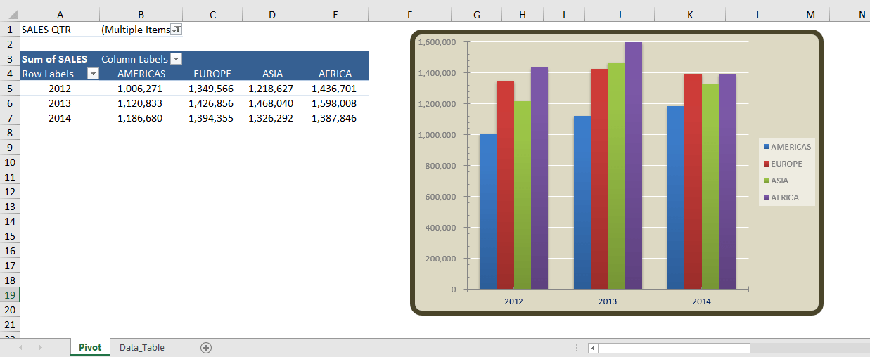
Calculate Difference Between Two Columns
You can use the Pivot Table difference between columns function to calculate Year on Year variance in absolute values. Below is the data that you will be using:

Follow the step-by-step tutorial on How to Calculate Difference between Two Pivot Tables and download this Excel workbook to practice along:
STEP 1: Insert a Pivot Table by clicking on your data and going to Insert > Pivot Table

STEP 2:In the Create PivotTable dialog box, Select Table range and then click on New Worksheet. Click OK.

STEP 3: In the ROWS you have to put the Months field, in the COLUMNS the Years field and in the VALUES area the Sales field twice, I explain why below:

STEP 4: Now click on the second Sales field’s (Sum of SALES2) drop down and choose Value Field Settings

STEP 5: Now you need to select the Show Values As tab and from the drop-down choose the Difference From

STEP 6: You need to select the Base Item: (previous) and Base Field: Financial Year and press OK. So it will read the “Difference from the previous Financial Year”

STEP 7: To format the values you need to select the Pivot Table and go to Pivot Table Tools > Analyze/Options > Select > Entire Pivot Table

Then you need to once again go to Pivot Table Tools > Analyze/Options > Select but this time select the Values

Now press CTRL+1 to bring up the Format Cells dialogue box and make your formatting changes within here and press OK.
NB: This will fix the number format permanently and any new field that get added into the Pivot Table will have this format.

STEP 8: To change the Sum of SALES2 name within the Pivot Table, you need to click on a cell in the Pivot Table that contains Sum of SALES2 and manually make the change, and press Enter

STEP 9: You need to select the whole column that contains the empty values and Right Click and select Hide

You now have your Pivot Table, all formatted and showing the Difference from the previous Year:

This will provide you with a Pivot Table year over year comparison in absolute terms!
Calculate % Difference Between Two Columns
You can also show values as % Difference From. This will display the variance between two years in form of percentage instead of absolute value!
Follow the steps below for pivot table calculated field difference between two columns:
STEP 1: Insert a Pivot Table by clicking on your data and going to Insert > Pivot Table
STEP 2:In the Create PivotTable dialog box, Select Table range and then click on New Worksheet. Click OK.
STEP 3: Drag and down the following fields in the PivotTable Field dialog box:
- Sales Month in Rows Area
- Financial Year in Columns Area
- Sales in Values Area (Twice)

STEP 4: Right Click on the Sum of Sales2 column and select Show Value As > % Difference From.

STEP 5: In the Show Value As dialog box, Select Financial Year as Base Field and (previous) as Base Item. Click OK.

Sum of Sales2 will now display the difference in sales between 2 years in percentage!

STEP 6: Hide the blank Column C. Select Column C > Right Click and Select Hide.

And Voila! Your Pivot Table difference between two columns is now ready!

Enhancing Pivot Table Insights
Visualization Techniques for Clearer Understanding
When dealing with large sets of data, understanding the broader trends and changes can become somewhat of a headache. Fortunately, Excel’s pivot tables can turn that jumble of numbers into insights that tell a story. Think of pivot tables as your data’s interpreter, translating numbers into meaningful trends and comparisons.
One potent feature is their ability to visualize year-over-year changes, which provides a birds-eye view of progress or decline over time.
By using Pivot Charts alongside your pivot tables, you can amplify this effect. Simply create a pivot chart from your pivot table and witness how Excel brings data to life. Such visuals can help spot underperforming months or highlight a successful quarter at a glance. You can also use conditional formatting within pivot tables to color-code data points, making significant variances stand out.
For a detailed walkthrough on setting this up, imagine a screenshot here, showing step-by-step instructions on creating pivot charts and using conditional formatting to streamline the visual comparison process.
Advanced Tips to Refine Your Year-over-Year Analysis
Diving deeper into year-over-year analysis with pivot tables, there are several advanced tips that you can implement to refine your insights even further. One way to approach this is by creating calculated fields to assess custom equations directly within your pivot tables. These fields can be leverage points for you to calculate metrics that aren’t directly provided in the raw data, such as growth rates or compound averages over multiple years.
Another crucial aspect is to segment your data effectively using slicers. Slicers act as interactive filters for your pivot table, allowing you to drill down into specific layers of your data, such as product lines or regions, for a more precise year-over-year comparison.
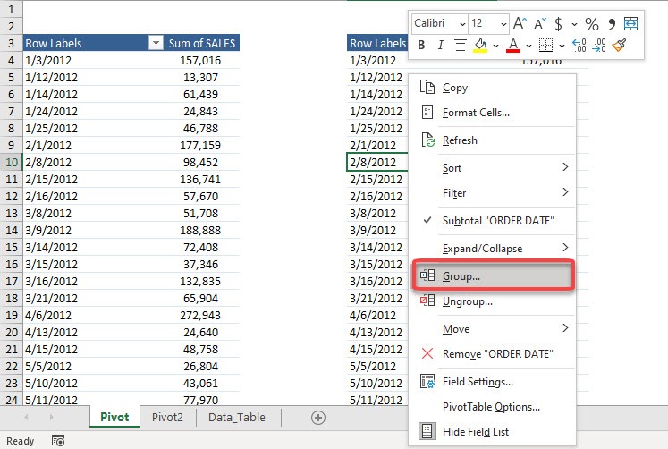
Don’t forget the usefulness of sorting and grouping options. For instance, you could group your data by months instead of viewing daily entries, giving you a cleaner comparison without the noise of daily fluctuations.
Now, visualize a case study showing the impact of these advanced techniques, where calculated fields, slicers, and sorting transformed raw data into a strategic dashboard.
Real-World Applications of Yearly Comparisons
Business Intelligence and Performance Tracking
For businesses, year-over-year analysis is not just about numbers—it’s a way to tell a story of growth, identify persistent problems, and pinpoint opportunities. Pivot tables are crucial for translating this data into actionable business intelligence.
Imagine comparing two fiscal years of sales data. With a pivot table, you can quickly show which product lines improved and which need attention. You might add a timeline to track performance peaks, adjust strategies before the slow season, or prepare inventory for upcoming demand surges.
In performance tracking, pivot tables can be set up to monitor KPIs across different departments. For example, in a manufacturing setup, pivot tables can clearly illustrate the efficiency of different production lines, or in a service industry scenario, they can be used to compare customer service metrics such as response times and resolution rates.
Personal Finance and Budgeting with Pivot Tables
On a more personal level, managing finances and adhering to a budget can be greatly simplified with pivot tables. By tracking your expenses and income month-by-month and year-over-year, you can gain exceptional insights into your spending habits and financial health.
For instance, categorize your expenses into groups such as utilities, groceries, and entertainment. With a pivot table, you can then trace where your dollars are going across months and compare it with the previous year. This comparison helps in understanding seasonal spikes in certain categories or catching creeping increases in regular expenses that may require your attention.
Pivot tables can also play a key role in retirement planning or savings goals. By displaying your financial performance over time, they can guide you in adjusting allocations or setting more realistic targets based on past trends.
Overall, whether you’re running a company or managing household finances, pivot tables empower you to make informed decisions, visualize financial trends, and stay on track with your goals.
Frequently Asked Questions (FAQ)
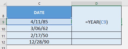
How Do I Add a Year Column to My Pivot Table?
To add a Year column to your pivot table, start by ensuring your data source has a date column. If it doesn’t, you may need to first insert the dates manually. Then, add a new column adjacent to your data, and label it “Year.” In the first cell of this new column, use a formula like =YEAR(date_cell) where date_cell is the cell reference containing the date. Drag this formula down to fill the rest of the cells in the column with the corresponding years.
Afterward, refresh your pivot table data source to include the newly added Year column. When you open the PivotTable Field List, you should now see the Year field available. You can then add this to the Rows or Columns area of your pivot table layout to start analyzing your data by year.
Remember, this Year column is crucial for performing year-over-year analysis, so having it in your pivot table setup is essential.
Can Pivot Tables Calculate Percentage Differences Automatically?
Absolutely, pivot tables can automatically calculate percentage differences without you needing to do the math. Once you have your pivot table set up, you can use the “Show Values As” feature to compare two periods. For example, to show the percent difference in sales between two years, you would:
- Add your Sales data to the Values area of the pivot table twice.
- Right-click on the second instance of your Sales data in the pivot table.
- Choose “Show Values As” then select “% Difference From.”
- In the dialog box that appears, select the base field, such as the Year, and choose the specific year or “(previous)” to compare against the previous period.
Your pivot table will now display the percentage differences for you. This is particularly useful for analyzing trends over time, giving you a clear view of growth or decline.


John Michaloudis is a former accountant and finance analyst at General Electric, a Microsoft MVP since 2020, an Amazon #1 bestselling author of 4 Microsoft Excel books and teacher of Microsoft Excel & Office over at his flagship MyExcelOnline Academy Online Course.


